Editor's Note: The following opening remarks were given by Dr. Caroline Fuchs, Curator at Kuratorin bei Die Neue Sammlung The Design Museum / Pinakothek der Moderne, Munich at the opening of Paula Scher's new retrospective, "Paula Scher: Type is Image".
In the exhibition you are about to visit you will find a display case standing not on simple table legs, but on letters: letters which read the word BOLD. On the one hand, Bold is the designation of a font style. Along with Thin, Sans, and Serif, this display case is one of four standing on a base of typographic terms. But BOLD can also be read in a different way, namely as a description of people's behavior or their works. In this case, the word means something like: courageous, powerful, or expressive. It is words like these that spring to mind upon entering the exhibition space, and for me, and I assume for many of you too, they very much characterize Paula Scher's work — which is bold in multiple and refreshing ways. So, for the next few minutes, I would like to draw your attention to three manifestations of Paula's courage.
The first, most obvious courage tonight is the courage of abundance.
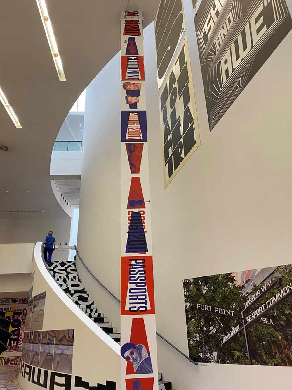
Paula Scher knows how to use the space that is available to her. As you will see in a moment, she has designed the exhibition space in all its dimensions as a large walk-in artwork. Her work can be seen not only on the walls and in the display cases, but also on the floor and in the space above our heads.
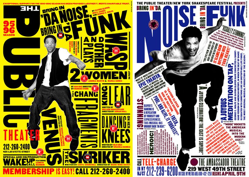
This ability to ingeniously fill two- as well as three-dimensional spaces — sometimes to the brim — is one of Paula Scher's trademarks. Right at the beginning, for instance, we are greeted by a long wall dedicated to The Public Theater in New York City. Paula Scher has been involved in this theater's visual identity for almost 30 years now. Where the exhibition opens into the large hall you can see one of Paula Scher's most famous posters for The Public Theater. This shows a man appearing to dance with the letters surrounding him. Typography and the cut-out photography of a dancer form a supreme unity. Sometimes the text plays around the dancer's photograph, sometimes it overlaps it, sometimes it is covered by the person's right leg. Everything pulsates here, the movement of the dancer, the dynamics of the music — all of this can be experienced here visually in an ingenious way through the design alone, even without reading the text.
Indeed, this poster was so convincing that it has been copied multiple times since it first appeared. It would be wrong, however, to see the courage of abundance as the sole, essential characteristic of Paula Scher's work.
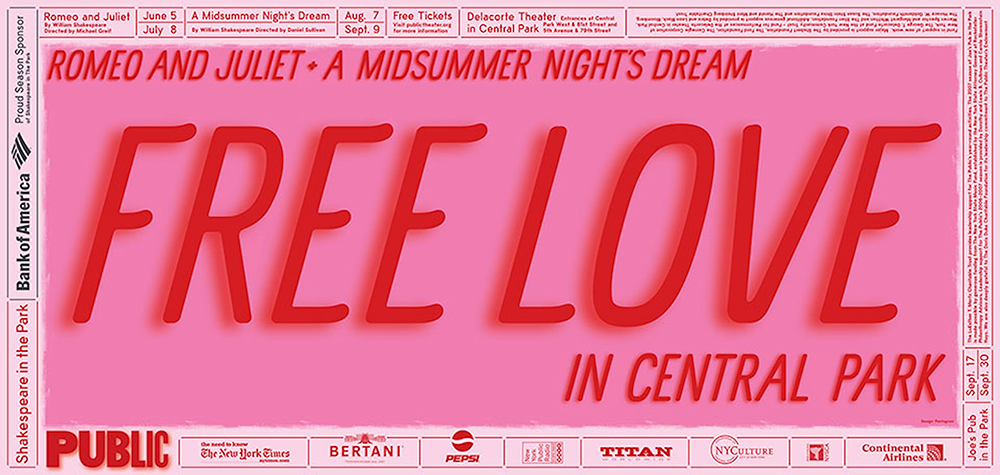
On the same wall, a short distance away, you will find another poster for The Public Theater that reflects a completely different approach — one that can be described as the courage of reduction. On a large surface we see only two words: Free and Love. No picture complements the words, they are all you read at first glance, and they are chosen to spark curiosity and evoke multiple associations. Reading the banderole on the edge of the poster, you understand that these words were chosen not only for their effect, but also very deliberately for their content. The poster advertises free performances of Shakespeare plays in Central Park, an annual highlight in The Public Theater's calendar of events and the kick-off to the theater season. The program that year included Romeo and Juliet and A Midsummer Night's Dream. Thus, the two words condense key features of the advertised events: Free, like the admission to the performances and free, like the space an open-air theater. Both plays are about love, a love that is free of social and family constraints. Thus, these plays can be summarized in extreme brevity with the two words Freedom and Love. What is so brilliant here is that, condensed as they are, despite the brevity, the two words leave room for the complexity of the plays. Paula Scher is — as you can see in this example — an expert of reduction and a master in the use of language.
She understands the impact of words and knows how to use them to their best effect. At the same time, she is one of the sharpest critics when it comes to a constricting, manipulative and aggressive use of language.
The third and final courage I would therefore like to address today is the courage to take a stand.
In addition to the visual identities she created for major clients, such as Microsoft, Citibank, and Coca-Cola, Paula has always placed great importance on being able to express herself freely. In many of her works, a different, and very personal courage of Paula Scher comes to the fore. This is the courage of pointing out the manipulative and judgmental use of language.
Often, she does this with an ironic reference to her own self. In "The Many Styles of Paula Scher", whose original drawing and mechanical print template you will find in the exhibition, she shows her own portrait with 13 different hairstyles and facial expressions. Coupled with one-word attributions like The Dork, The Geek or The Yuppie, these images question female types and stereotypes. By using her own image in this playful and fearless way, Paula draws attention to social and cultural pigeonholing, exposing their derogatory workings.
In another work, she collected comments from elected officials between January 2001 and August 2003 — a period that includes both the attack on the World Trade Center and the invasion of Iraq. Through the design and chronological progression of the phrases she cites, the shift in language and the pathway in preparation for war are exposed in a revealing way.
It is in such contemplative works, that the analytical, discerning and critical spirit of Paula Scher becomes apparent. It is this Paula Scher and her humor that — along with her talent as a graphic designer — commands our utmost respect.
In this sense, I hope that you will enjoy immersing yourself in Paula Scher's world this evening as much as we did during the preparation and realization of this exhibition. And perhaps we will succeed in being inspired by her vast and varied manifestations of courage.


