
July 29, 2013
Soft Machine’s Dysfunctional Mechanism
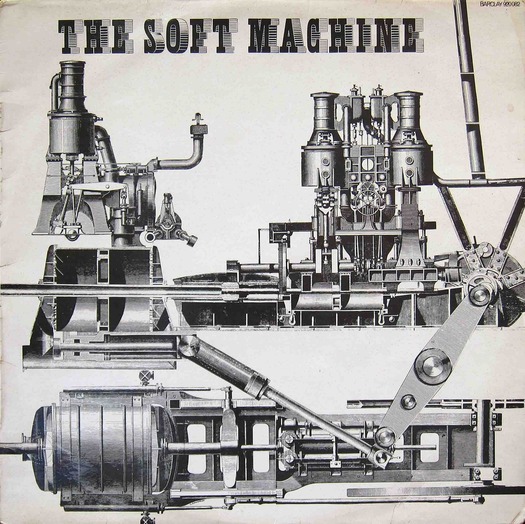
The Soft Machine by The Soft Machine, Barclay, 1968. Front cover design by Claude Caudron
Unless you happen to be a baby boomer, a progressive rock fan, a vinyl record collector and French into the bargain, it’s unlikely you will have seen the album cover above. I had never seen it myself until I noticed it pinned to the wall in a plastic wallet in a used book and record store in Spain. The album, the first by The Soft Machine (subsequently just Soft Machine), British contemporaries of Pink Floyd, was released in 1968 on the French record label Barclay. The original American release on Probe, the only version I knew about, has an entirely different front cover, with a rotatable die-cut disc covered in cogwheels; turning it produces different compositions against the sheet underneath. This device from the spare-no-expense glory days of the gatefold album cover was abandoned on later reissues, though the essential elements of the design stayed the same. The US-only first release is a rarity now.
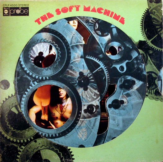
The Soft Machine, Probe, 1968. Design by Byron Goto, Eli Aliman and Henry Epstein
The original is striking but I much prefer the deadpan froideur of the French take on Soft Machine. It might seem obvious — let’s illustrate the idea of a machine with some machines! — but it’s actually quite subtle. The band took its name from William Burroughs’ novel The Soft Machine, first published in 1961. The verbal image is oxymoronic: machines are usually hard, not soft. In Burroughs’ novel the “soft machine” is the human body and this metaphor connects with the tendency in 1960s cybernetic thinking to visualize the workings of body and brain in terms of a computerized information system. The conceit conjures up all kinds of science fiction possibilities. The second Soft Machine album cover, Volume Two, has a woman who appears to be part machine, part sandy substance and Gorgon hairdo (not a good look), while the sixth goes for an unpleasantly literal fusion of shiny steel pipes penetrating a fleshy bag like a bloated body part.
It was a smart idea, then, to confound the group’s gooey name with some no-nonsense hardware from the days when machines were unequivocally machines. This Neo-Dadaistic visual gesture signals the album’s anarchic avant-pop, which still sounds fresh to me, and a quotation from the original goofy sleeve note by Arnold Shaw confirms the mood: “It’s a Now sound, swings like jazz, rocks like rhythm-and-blues, hairy with fuzz-box distortion, off-the-keyboard with electronic atonalities . . .” Track titles include “Why am I so short?”, “So boot if at all” and “Plus belle qu’une poubelle” (More beautiful than a trashcan). By the second album, the group’s Robert Wyatt, one of the 1960s’ great eccentric musical survivors, was enigmatically announcing an interest in Alfred Jarry’s proto-Dadaist philosophy of “pataphysics,” which the Frenchman defined as the “science of imaginary solutions.”
The collage on the French release is by Claude Caudron, who signs his name in tiny letters under the mechanical element at the bottom. He engineers the links between the old engravings so smoothly that it hardly looks like a collage at all. The vintage type comes from the catalogue of the Deberny et Peignot typefoundry in Paris (the font was digitized, as if new, in 2001 and named Shady Characters). Seen at full size, the lines in the shadowing are too heavy and widely spaced to make the letters a perfect match with the refined modeling of the original art, but the slight awkwardness of grain works anyway. I hoped Caudron would turn out to be an overlooked master of inspired Gallic alternatives to the classic rock covers we know and I did find a clunky interpretation of Jimi Hendrix’s Are You Experienced? (1967). He mainly seems to have specialized in cheesy pictures of French pop stars and sugary new wave design.
So it’s anybody’s guess whether Caudron intended his Soft Machine cover as a deliberate allusion to the history of the machine in 20th-century art. The subject was certainly in the air. In November 1968, a major survey exhibition curated by K.G. Pontus Hultén, titled The Machine as Seen at the End of the Mechanical Age, opened at the Museum of Modern Art.

Francis Picabia, Girl Born without a Mother, gouache and metallic paint on printed paper, ca. 1917.
Source: National Galleries Scotland
The most obvious reference points for The Soft Machine are some of the paintings that the French Dadaist Francis Picabia based on technical illustrations of machines, such as Machine Turn Quickly (1917) and Girl Born without a Mother (ca. 1917). “The genius of the modern world is in machinery,” Picabia declared, although his machine icons look more like satirical swipes at the subjugation of life to the demands of unstoppable technology. Caudron’s absurdist, inscrutable collage-mechanism has no obvious purpose and no world can be seen outside of it, only the white emptiness of the sleeve. It could be a dysfunctional system that exists merely to perpetuate itself. Terry Gilliam of Monty Python’s Flying Circus would soon make his name with animations of rampant comedy machines that come from the same antique visual tradition.
Thanks to Martin Coles
See also:
On My Shelf: A History of the Machine
John McHale and the Expendable Ikon
Observed
View all
Observed
Share on Social
By Rick Poynor
 Rick Poynor is a writer, critic, lecturer and curator, specialising in design, media, photography and visual culture. He founded Eye, co-founded Design Observer, and contributes columns to Eye and Print. His latest book is Uncanny: Surrealism and Graphic Design.


Recent Posts
Runway modeler: Airport architect Sameedha Mahajan on sending ever-more people skyward The New Era of Design Leadership with Tony Bynum Head in the boughs: ‘Designed Forests’ author Dan Handel on the interspecies influences that shape our thickety relationship with nature A Mastercard for Pigs? How Digital Infrastructure is Transforming Farming and Fighting Poverty