You know you’ve really made the big time when a children’s book commemorates your achievements, as has been done for George Washington, Madame Currie, Martin Luther King, John F. Kennedy, and now Massimo Vignelli. When I received the new children’s book, The Great New York Subway Map by Emiliano Ponzi (MoMA and New York Transit Museum) the title surprised me almost as much as when Vignelli’s original 1972 map was introduced. It was shockingly beautiful, but as Alice Rawsthorn wrote in the Times (2012) it was “indeed riddled with anomalies,” also noting “that was the point.” Vignelli had traded geographical precision for simplicity and accuracy in order to untangle the knot of intersecting train lines to make a clean diagram.
The Vignelli Map, as it came to be known (although he insisted it was a diagram), was controversial, ultimately modified, and returned to its cluttered state within seven years of its premiere. Yet over time its earned iconic status in MoMA and design history. It is not just in the MoMA permanent design collection (validation in and of itself), a few years ago it was revived for use on the MTA’s iphone app. The honor bestowed upon this piece of graphic design was well understood by graphic designers but the general public was indifferent as long as they got where they were going. And children? What do they care?
But why wouldn’t children be enthralled if they were introduced to the amazing process of conceiving something new that was also functional and pragmatic? Why wouldn’t they be interested in graphic design? If I had been introduced to design in this way, I’d be even more excited by its potential.
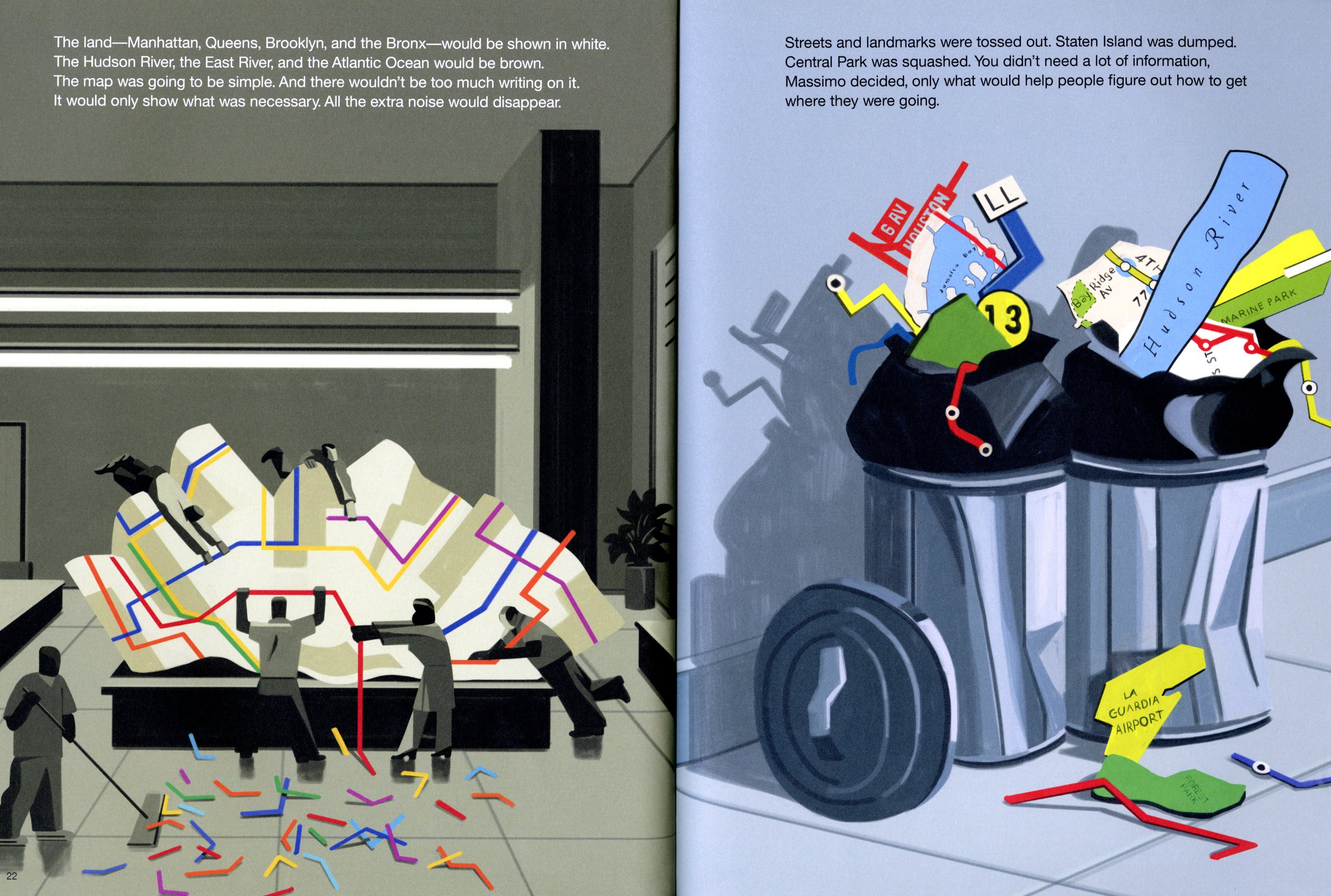
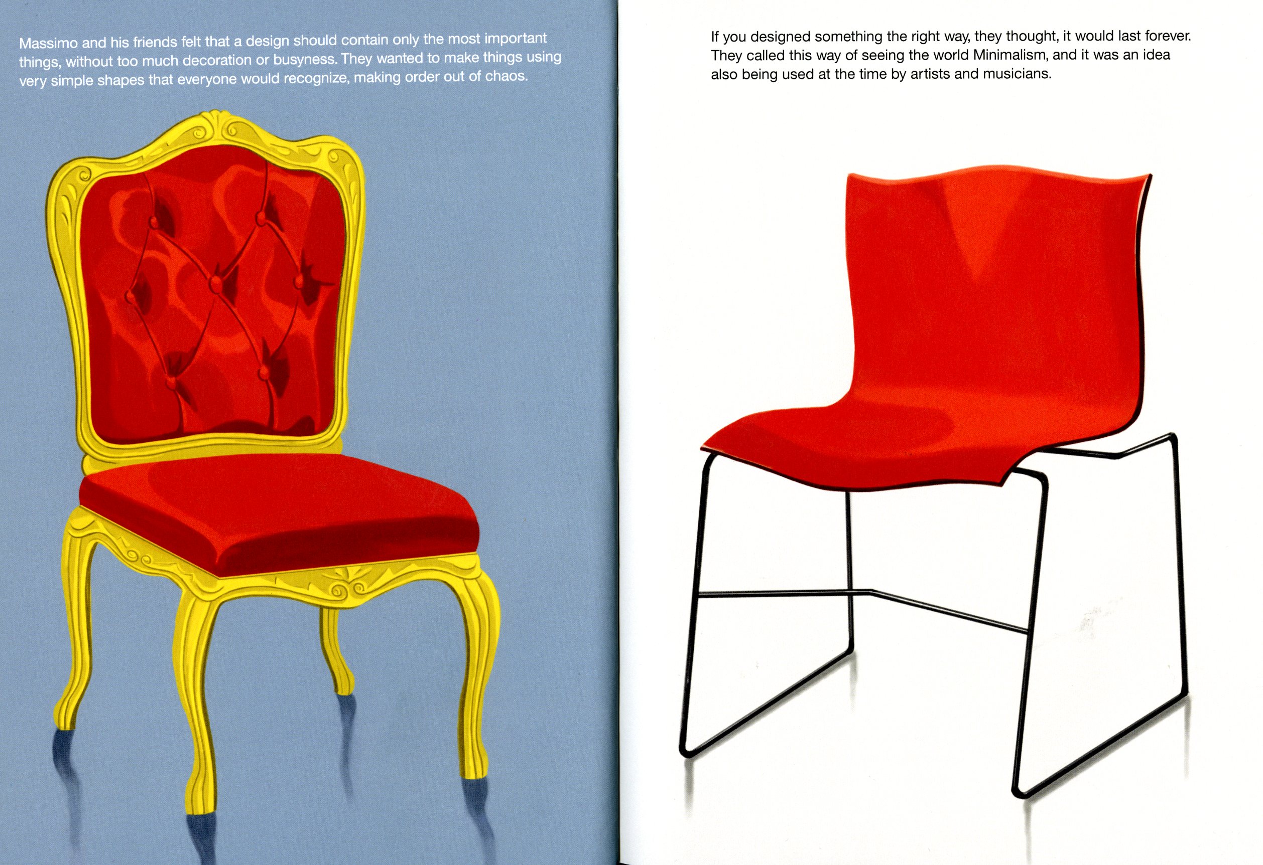
Ponzi’s hard-edged, contemporary vector drawings are just the perfect look for a young audience and fit neatly into the groove of today’s graphic style. And the story? Massimo would be amused. The reader learns that his name “comes from the Latin name Maximus, which means ‘the greatest.’” He moved to New York in 1965 and began a studio with five colleagues. “Massimo and his friends felt that a design should contain only the most important things, without too much decoration or busyness.”
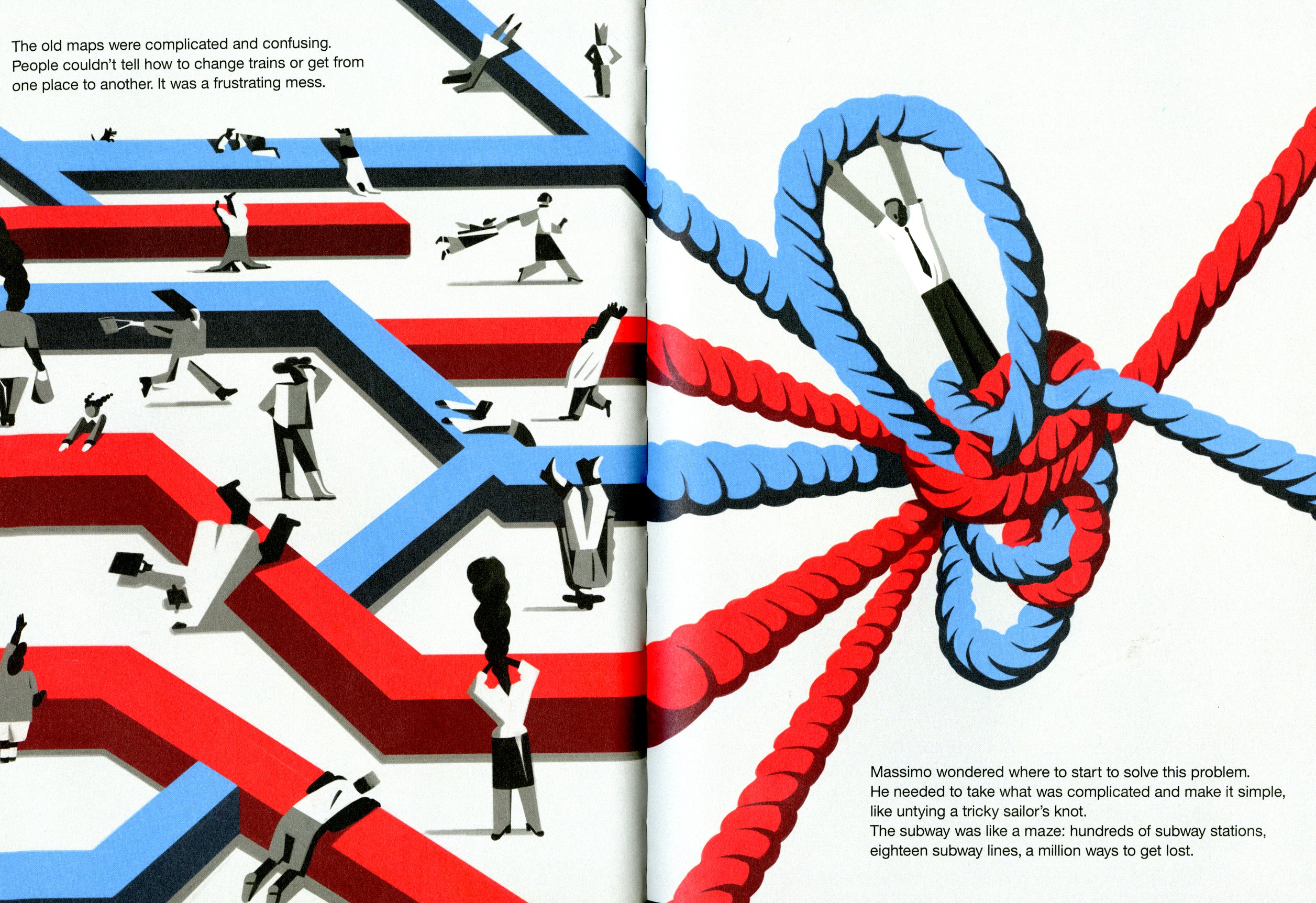
One day he received a call from the Metropolitan Transportation Authority to devise a new subway map. “This would be the most difficult project the designers had ever done.” Vignelli likened the problem of depicting the maze of tracks and lines to untying a “tricky sailor’s knot.” He attempted to discover how people actually used the subway before he stumbled upon the solution: “SPAGHETTI!” The subway lines would be represented by “multicolored spaghetti running in straight lines and making sharp turns, going horizontally, vertically, and diagonally.”
Bravissimo!
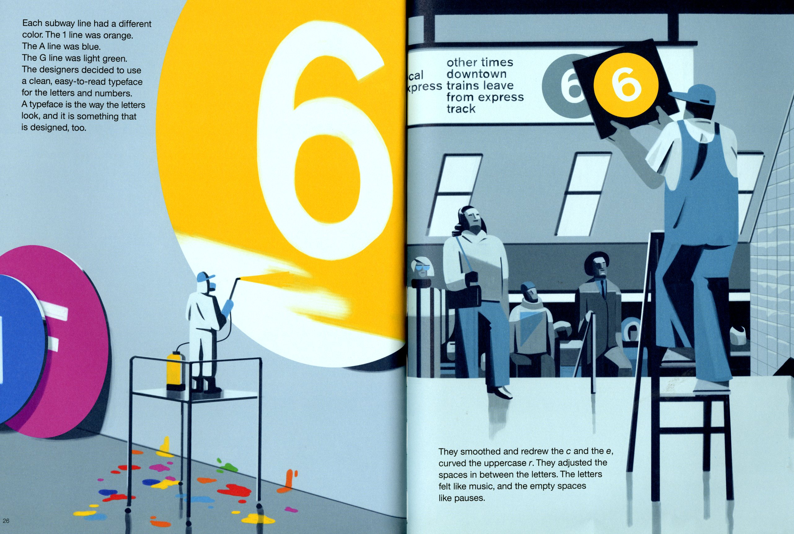
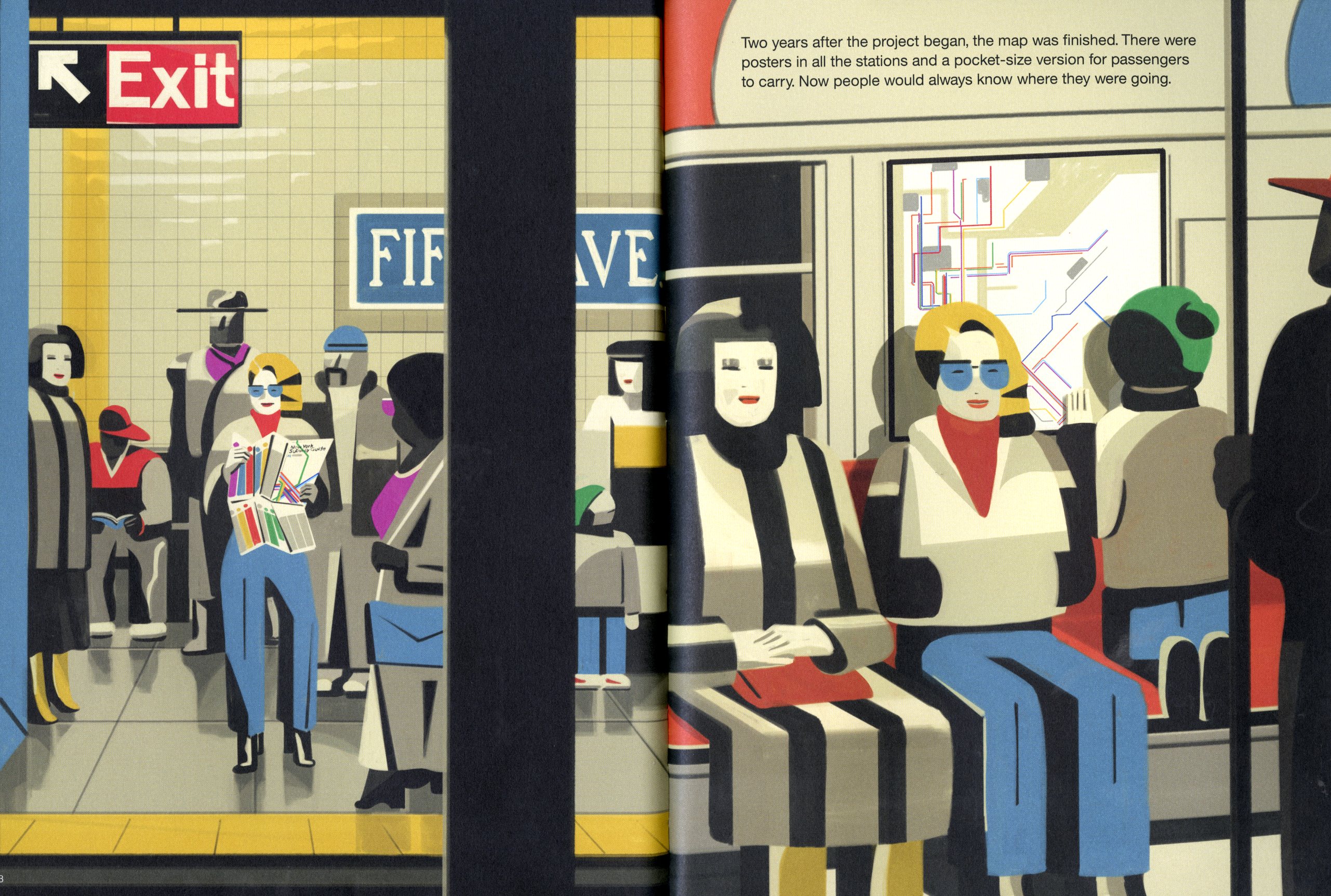
Ponzi effectively uses extreme light and shadow and schematic poster aesthetic to project the look and feel of the subway and emphasize the graphic strength of the map and wayfinding system. The reader—young and old—can relate to environment and people. Throughout there is also a graphic reminder of the multiple colors that comprise the spaghetti and define the subway lines.
Would Vignelli have liked seeing his most famous work celebrated as a children’s book? Probably yes. What better way to be immortalized? If it is so simple a child can understand it, then the argument that it was overly simplifying information is itself an over simplification. Vignelli understood that Rome wasn’t built in a day, and the map needed getting used to. Refinement is always the key. When things are ahead of their times they need time to settle in.