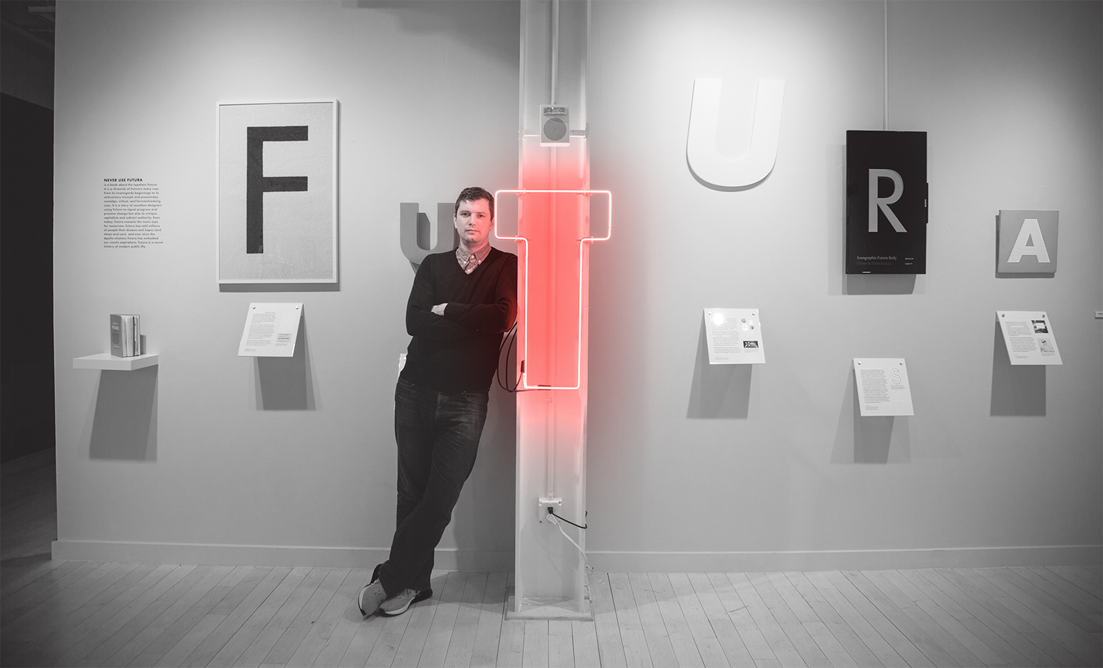
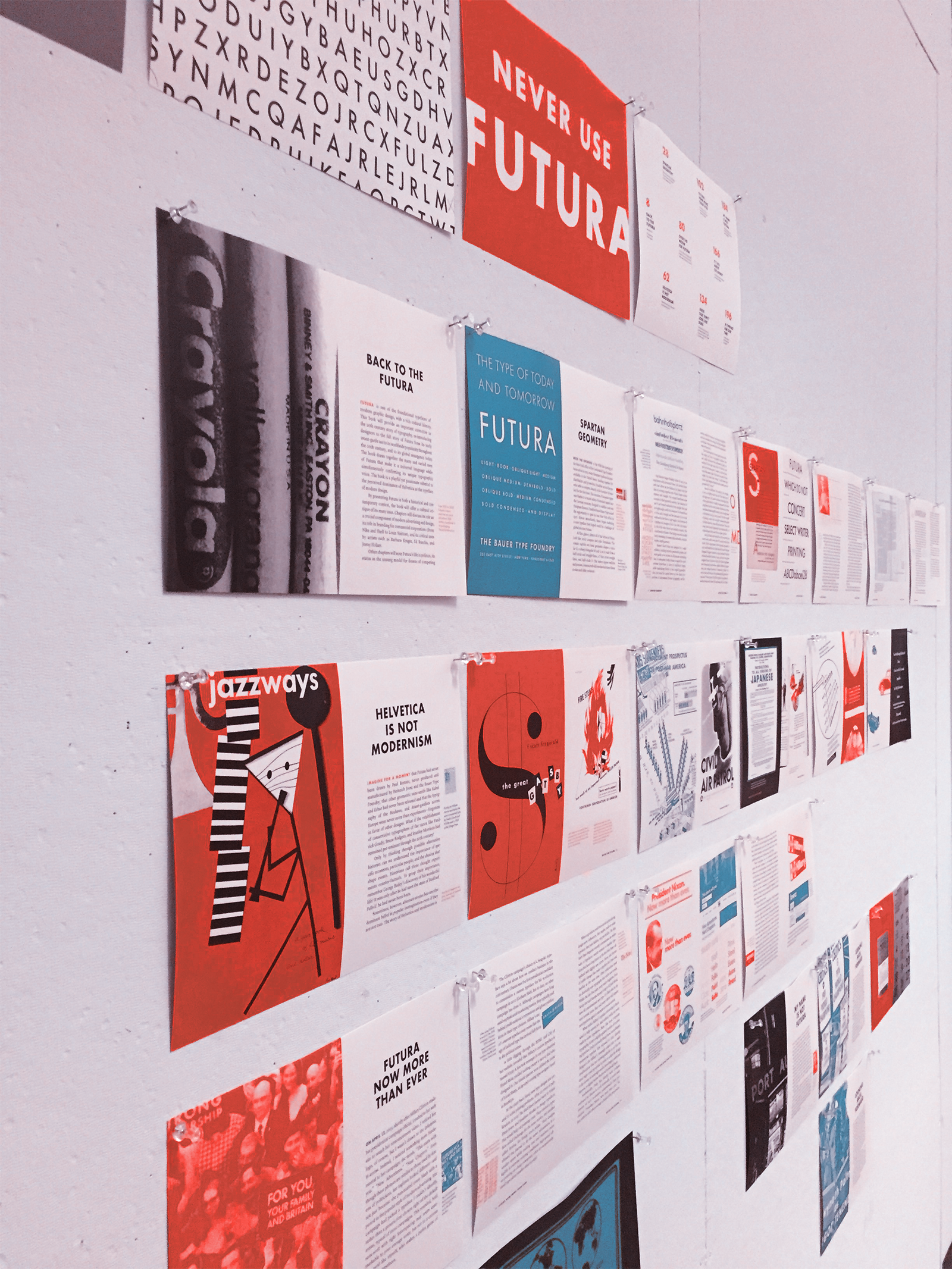
In the process of writing and designing the book, Douglas Thomas created an exhibition showcasing Futura’s cultural history.
Douglas Thomas is a graphic designer, writer, historian, and assistant professor at Brigham Young University. On the heels of the recently released Never Use Futura, and the typeface's 90th birthday, Maya P. Lim sat down with Thomas to discuss Futura’s Modernist past, present “golden age,” and unknown future. What does all this add up to? In Thomas’ words, the “biggest story in typography that no one was talking about.”
Maya P. Lim: Why is your book about Futura? Why not Helvetica? Or Arial? Or Times New Roman?
Douglas Thomas: Perhaps like many design students, Futura was one of my first type loves. I first became enamored by Futura in high school while shopping at what was then called Nike Town in Honolulu. Seeing the sleek sophistication of the logo embedded in a complete branding project got me excited about graphic design. Later, I used a similar geometric sans serif in my senior yearbook. Learning a bit about its history, I discovered it was fundamental to the beginnings of graphic design.
I had a professor warn me that Futura was so overused that if I wanted my design to stand out, I’d have to find a more unique typographic voice. I’ve found myself giving similar advice—in part because Futura is really useful and beautiful—but it’s not the easiest typeface to use out of the box. It’s more idiosyncratic than many typefaces, like Helvetica, for example. And worse, the versions of Futura included on most computers are woefully inadequate.
MPL: So Never Use Futura your way of amplifying what your professor meant? There seems to be some irony here, because under the title you list all of these iconic designers who have used Futura.
DT: At first I wanted to write a retort to those undergraduate professors who told me to never use Futura in my work, because Futura is used over and over again by most of the famous graphic designers of the last century of printing and design. But there was more to it than that. I realized that the best uses of Futura (or really, any typeface) are always in conversation with the ways it has been used in the past. And I also wrote the book to correct a popular misconception. Despite Futura’s role in establishing modernism, many people continue to associate modernism with Helvetica. As such, Futura seemed like the biggest story in typography that no one was talking about in the public at large.
The book was written as it was being designed to help ensure a tight integration of words and images.
MPL: How did your interest in type design or type history begin?
DT: What really got me interested in type history, as a corollary to design, was an intellectual history class I audited as an undergrad. I discovered that there was a broad historical context for any typeface that’s been created, and that [type] history had corollaries in other areas, like politics, culture, music, and philosophy. Understanding those connections deeply enriched both my ability to create design and use typography in more interesting ways. When I began to think about Never Use Futura, I was fascinated by the popularization of typefaces. How could a typeface like Futura be at the forefront of popularity in the 1930s, passé in the early 2000s for my design professor, and become a hot commodity again? I wanted to explore questions like those.
MPL: What are a few of the most surprising things you discovered while conducting the research for the book?
DT: Even though I knew Futura was widespread, it was amazing to see how ubiquitous it became after I started looking for it. It seemed to peek out of every street corner and sign, and even in corners of archives that I never thought would have included Futura. For me, the most shocking discovery was visiting London, walking across the street from Westminster Abbey and the Parliament buildings to see the new Queen Elizabeth II building decked out in Futura—not in Gill Sans, the icon of 20th century British modernism. Almost as surprising was arriving in a small Irish village to see a local politician running their campaign in Futura.
MPL: One of the most surprising things for me was your photo essay—I didn't realize how many companies use Futura for their logotypes, which all look different. There are many other faces with extensive families of weights and styles. Why is Futura so popular as a choice for logotypes?
DT: That was surprising to me too—how it kept showing up everywhere. From my study, its retail popularity was a confluence of a few things: Futura was enjoying a new cycle of popularity in the marketplace in general in the late ‘80s and early ‘90s, just when many big box companies were coming of age. Another factor is that since most companies start small, they often begin with typefaces that are widely available to local designers, printers, and vendors, rather than commissioning custom work. Futura also works because it has a range of distinct voices across its family. These allow Futura to appeal to high-end women’s fashion (Futura Light), industrial corporations (Futura Bold), low-end retail (Futura Extra Bold), and even quirky restaurants and clubs (Futura Black). And many companies are copycats—they use what works and has worked before.
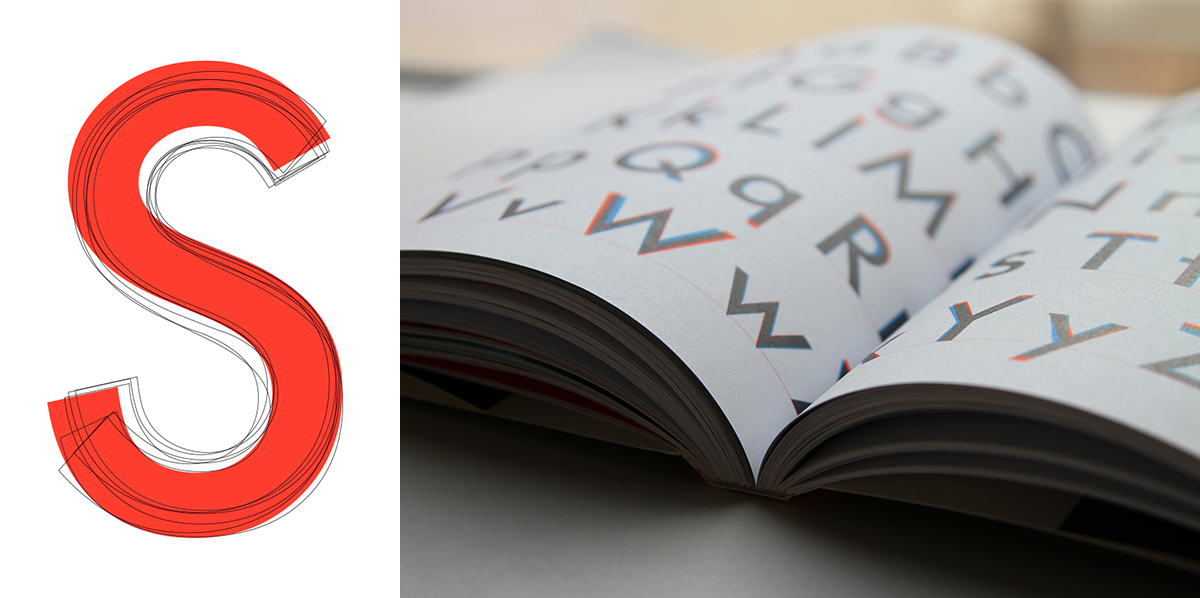
No digital Futura is exactly alike. A comparison of various modern digital Futura letter S, with Neufville Digital’s Futura in red.
MPL: You know how Massimo Vignelli said that we only need a few basic typefaces. Do you agree?
DT: I don’t agree with his assessment that there were (or are) only a few great typefaces to begin with. But I do think that a designer could make a great career using just a few typefaces—the work of Vignelli himself is proof of that. More recently, the design studio Experimental Jetset has utilized Helvetica for well over a decade in dozens, if not hundreds, of unique projects. That said, I also don’t think that sort of typographic monasticism is practical for everyone, or every project.
Every typeface has its own unique character and feeling. Because it takes time and practice to become acquainted with every typeface, I think Vignelli’s advice is good when seen from a pedagogical light. Designers who continuously flirt with new types without seeking depth of understanding cannot create well-ordered, complex typographic systems.
MPL: What excites you most about type design today?
DT: In many ways, we’re in a golden age for type design—there is a lot of great work being done, and more of it than ever before. As a graphic designer, I’m most excited that expert-level type design has finally made it to the web. After years of web-typography being an ugly duckling compared to print, it is starting to become a domain where beautiful typefaces are not just used but also expected by top brands. This is especially true of multi-lingual scripts. Not long ago, if you wanted a typeface in every language, you had to use the equivalent of Helvetica or Times New Roman worldwide. Now, there are dozens of exciting script families that incorporate not just Latin-based scripts, but Cyrillic, Greek, Indic, Arabic, and in a few insanely big families that include even east Asian ideograms—Chinese, Japanese, and Korean types, for example.
MPL: What do you see are the greatest type challenges for the future?
DT: I wonder how type will continue to be used in the future, when Cisco estimates that 82 percent of all internet traffic will be video by 2021, and how type will play in augmented reality and virtual reality formats. Add to that the sheer number of emoji and gifs being used in (or instead of) text snippets, and it is easy to imagine that our society will continue to shift from a print culture to an oral culture. Type design will need to find its place in a changing visual world. Given the creativity and skill of today’s type designers, the future is bright, and I believe that there will be incredible typefaces for every new format.
MPL: Will you assign Never Use Futura to your students?
DT: Yes, for the right classes. Futura may be the focal point, but the more fundamental questions are how and why designers choose typefaces in general, and how those choices have longstanding cultural ramifications. At its heart, I hope readers will come away with a better understanding of type as its own unique language.
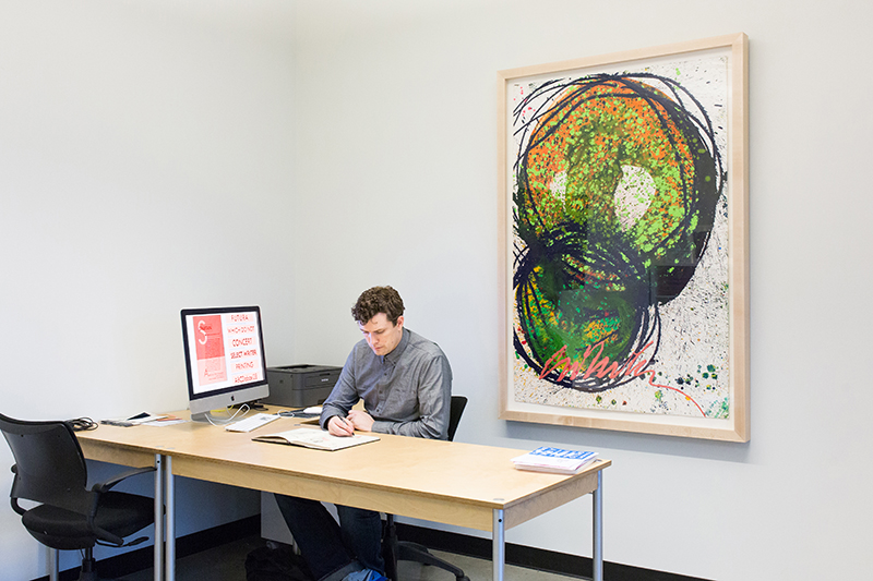
Much of the book was written and designed at the Maryland Institute College of Art.