

Fresh Fruit in Foreign Places
There’s long been an intimate link between independent record labels and fresh graphic design talent. Indie labels like Factory and 4AD emerged in Britain in the 1980s strongly aware of the need to distinguish their products visually from the offerings of the major labels. Factory’s Tony Wilson forged bonds with the young Peter Saville, and Ivo Watts-Russell handed over 4AD’s visuals to 23 Envelope, a partnership between Nigel Grierson and Vaughan Oliver. In Saville’s case, it’s still the work he’s most proud of.
I thought I’d make a little survey today of the visuals being produced for some of Europe’s independent labels just now. This is an unapologetically personal selection: it’s just stuff that’s caught my eye, on the labels that I follow (mostly “boutique” electronica labels with a folk feel). I’ve e mailed a couple of the designers involved to hear their own take on the work they’re doing.
We begin in Berlin, with Thomas Morr’s label Morr Music. Since 2000 Morr has established a reputation for quirky experimental pop, releasing records by Germany’s Lali Puna and Iceland’s Múm. The centrality of design to the label’s conception is clear from an e mail from Thomas Morr: “All our sleeves,” he explains, “are done by Human Empire, as Jan, formerly o8 Design, is my best friend and we somehow started the label together.”
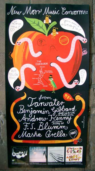
I’m impressed by the poster advertising Morr’s spring 2005 releases. In the style of a 1950s East German grocer’s shop or organic market it shows “earworms” (the German term for a catchy pop song) emerging from a big shiny apple. What I like about this is the friendliness, the healthiness, the childish sense of fun. There’s an absence of sharky cool; this poster seems the very antithesis of the 1990s techno club flyers which have ended up providing corporate identity for banks and wine bars.
I spoke to Jan Kruse, the poster’s designer, by e mail. He works in Hamburg with his partner Malte Kaune. “The letters of the earworm are hand drawn (but with the mouse and a computer),” Jan told me. “I hadn’t any template for these letters — but I remember that I had some old children’s books from the former DDR (German Democratic Republic / East Germany) some years ago. They were printed on uncoated, yellowed paper and the style of illustration was very old fashioned and maybe a bit suburban. I think the book was from the seventies or so. The drawing also was inspired by the 70s — I had these colours and objects “in my head” for a long time but I really didn’t remember if it was an old book or poster or whatever. I suppose I saw an illustration with these colours 20 years ago and liked it so much that it had to be revived now.”
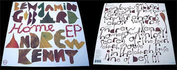
The sleeves made by Human Empire for the new Morr releases continue the organic theme. Benjamin Gibbard and Andrew Kenny’s Home EP comes decorated with dead leaves and gorgeous hand-made lettering. The new Tarwater sleeve seems to contain an allusion to Peter Saville’s original Unknown Pleasures design for Joy Division. Jan says he takes inspiration from “the Swiss/German Design (and maybe the Bauhaus) of the 60s. I had two professors in university who represented the clear, functional style and was really fascinated by it. Some years ago it was much more like this but it changed piece by piece to a more playful style. I really liked small figures, toys, stickers and collectors’ stuff. Playmobil toys were my passion until I was 15. I did some illustrations for the German weekly newspaper Die Zeit where I use Playmobil figures to visualize political themes.”
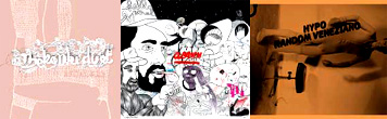
The Home EP sleeve shares something with Michael Amzalag and Mathias Augustyniak (M/M)’s design for Benjamin Biolay’s new album, and it’s to their city of Paris that we head next. My favourite Paris label is Active Suspension. The label is run by Jean-Charles Baroche, who, unlike Thomas Morr, likes to give different sleeves to different designers. Recent Active Suspension sleeves have had a hand-drawn feel, whether it’s Marie Daubert’s pink squiggles for The Konki Duet or Mehdi Hercberg’s drawing for Johann Lhuillerie (Pixel Crap)’s sleeve for o.lamm’s Hello Spiral album. Last year’s Random Veneziano album by Hypo came with a sleeve by Event10, the studio of Benoit Robert, one of the most promising new Paris graphic designers, responsible for some remarkable early Active Suspension releases featuring transparent CD jewel boxes, oddly-shaped inset cards, and thick black lettering on transparent plastic stickers.
Were there world and time enough I’d also tell you about Thorsten Lutz’ Karaoke Kalk or Tom Steinle’s Tomlab labels, places where music and graphics are equally exemplary. If Oscar Wilde’s dictum that “it is only shallow people who do not judge by appearances” applies anywhere, it’s at boutique labels like Morr, Active Suspension, Karaoke Kalk and Tomlab, companies still small enough to be oriented to one individual’s taste. If you pick up one of these records and find the sleeve appealing, there’s a good chance that the music inside it will appeal too. After all, it’s an expression of the same sensibility, a reflection of the personal taste of an entrepreneur-curator for whom music and visuals are equally important, a labour of love. Perhaps Mother Nature felt the same way when she created shiny red apples.
Observed
View all
Observed
Share on Social
By Momus
 Nick Currie, more popularly known under the artist name Momus (after the Greek god of mockery), is a songwriter, blogger and former journalist for Wired.
Related Posts

Civic Life
Bert de Muynck|Essays
Walkie talkie: An architect-turned-tour guide on designing presence in Lisbon

Business
Courtney L. McCluney, PhD|Essays
Rest as reparations: reimagining how we invest in Black women entrepreneurs
Design Impact
Seher Anand|Essays
Food branding without borders: chai, culture, and the politics of packaging
Graphic Design
Sarah Gephart|Essays
A new alphabet for a shared lived experience
Related Posts
Civic Life
Bert de Muynck|Essays
Walkie talkie: An architect-turned-tour guide on designing presence in Lisbon
Business
Courtney L. McCluney, PhD|Essays
Rest as reparations: reimagining how we invest in Black women entrepreneurs
Design Impact
Seher Anand|Essays
Food branding without borders: chai, culture, and the politics of packaging
Graphic Design
Sarah Gephart|Essays