December 31, 2009
Hey
To Kill a Mockingbird title sequence, 1962.
Stephen Frankfurt: Designer
Robert Mulligan: Director
Horton Foote: Screenplay
Alan J. Pakula: Producer
A good title sequence should exciting and thrilling, luring the viewer into the film. You might think that’s the case for every summer blockbuster, the kinds of movies that lead with titles that rely on noise and action and intensity. But you’d be wrong, and Stephen Frankfurt’s titles for To Kill a Mockingbird help to show us why.
In 1962, Robert Mulligan directed the film adaptation of Harper Lee’s Pulitzer-prize winning novel, To Kill a Mockingbird. It is in many ways a surprising book to adapt for the screen: there’s no love story, no violence, and relatively little action. The story centers on a middle-aged widower, a lawyer played by Gregory Peck, who is raising his two children in the South. The film succeeds through its graceful depiction of characters as the story unfolds with frailty, humanity, and heroism.
Frankfurt’s title sequence offers a perfect prologue for this narrative, methodically setting the tone and foreshadowing the density of symbolism to come. There are no explosions, no flying three-dimensional typography, no overbearing soundtrack. Instead, we see a cigar box, and hear the ticking of a clock over a child’s soft humming. Slowly, the items in the box are revealed, the box itself a poetic metaphor for a child’s inner life: this is the place where treasures and secrets are saved, hidden under a bed or stowed away in a closet.
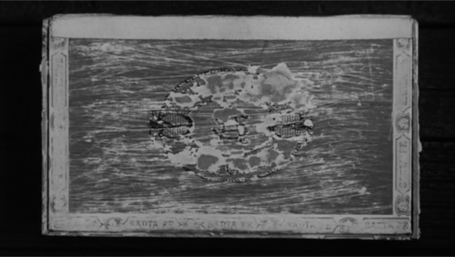
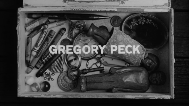
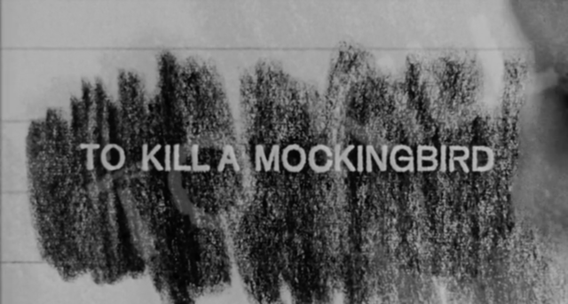
The sequence continues as a crayon is removed and the title is shown, as a rubbing, on a piece of paper. The camera then focuses on the pocket watch, its audible ticking a commentary on time itself—at once slow and languid, measured and monitored. The typography maintains a rigorous and restrained presence here—all caps, one size, one weight and face—centered top to bottom. As the sequence continues, the camera tracks slowly from left to right, typographically mirroring the clarity and simplicity of the opening credits.

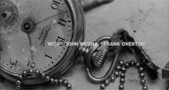
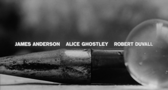
A marble rolls and when it contacts another marble, the soundtrack begins. A series of symbols is then introduced with the titles overlaid upon them: two dolls in the box representing the characters, Scout and her brother, Jem. Harper Lee’s credit appears as the camera tracks over a crayon and fountain pen tip. A whistle comes into focus and Elmer Bernstein is credited with the music. Frankfurt’s credit is accompanied with the hands of a child drawing.
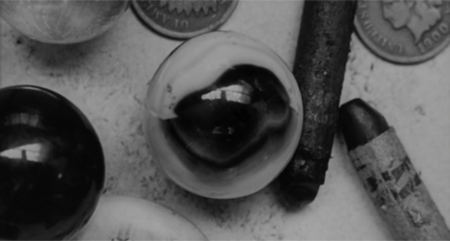

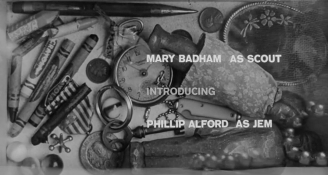

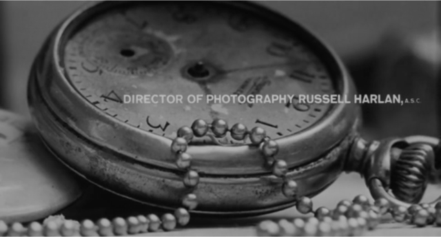

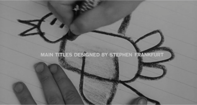
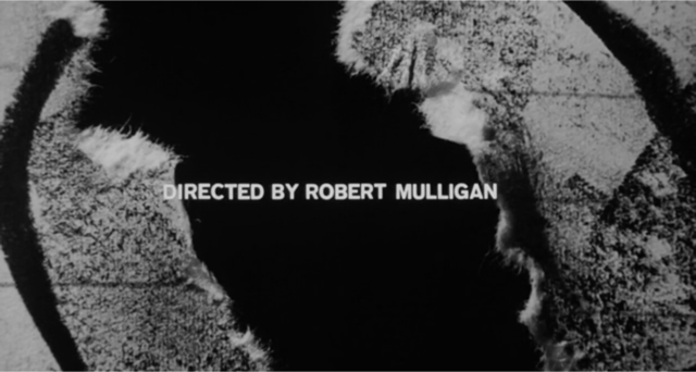
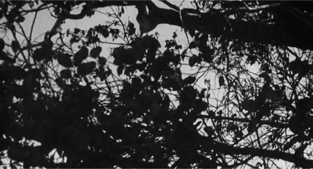
Throughout the opening, the music is matched by the slow camera moves, a child drawing waves and the ongoing audible ticking of passing time. It ends with the drawing of the mockingbird on delicate paper torn in half, revealing only a black background and credits for the writer and director, Robert Mulligan and Alan J. Pakula respectively. The last frames of the sequence weave together the symbols, characters, and tone as the camera slowly pans down and dissolves into the opening scene through a tree, literally delivering the viewer into the perspective of one of the principal characters, Scout, as she begins her story.


I’ve shown this sequence multiple times over the years, and regardless of the age of the audience or location of the venue, the response is always the same: silence, followed by sounds of awe. It is good to know that a narrative told with minimal means and a strong idea still resonates today. Not for nothing, this movie contains one of my favorite lines from any film, ever.
Hey, Miss Dubose.
Don’t you say “hey” to me, you ugly girl.
Observed
View all
Observed
By Sean Adams
Recent Posts
Mine the $3.1T gap: Workplace gender equity is a growth imperative in an era of uncertainty A new alphabet for a shared lived experience Love Letter to a Garden and 20 years of Design Matters with Debbie Millman ‘The conscience of this country’: How filmmakers are documenting resistance in the age of censorship
