January 6, 2012
Life Support: Can Architecture Make Us Healthy?

Earlier this week, Richard Florida introduced the Metro Health Index, which ranks American cities based on smoking and obesity figures gathered from the Center for Disease Control. According to Florida’s metric, San Jose is the healthiest city in the United States, followed by Santa Cruz and then Boulder. The least healthy? Unfortunately, the full index isn’t published, but the preponderance seem to be low-income, blue-collar cities (and towns, really) in the Midwest and South where people tend to commute by car. Major metropolitan areas seem to fall in the healthier end of Florida’s spectrum.
The very idea of a healthy city is, for many, something of an anethema concept. “I view large cities as pestilential to the the morals, the liberties, and the health of man,” wrote Thomas Jefferson—a stigma that remains deeply ingrained in the American psyche. That the city can be something quite the opposite of pestilential to liberty has been demonstrated of late, and quite dramatically, in urban spaces from Tahrir Square to Zuccotti Park. One might say that urban space is a necessity for liberty. Along the same lines, the city offers (or can offer) any number of health advantages, both for the environment and the individual. Of course, it poses dangers as well.

Richard Florida: Metro Health Index
What makes one city more healthful than another? Whether or not one accepts Florida’s criteria and findings, his contention that the primary (or at least a primary) factor in urban health is income should come as no surprise, and makes the recent news that Congress is slashing grants to cities especially disturbing and outrageous. Florida’s metric, if nothing else, suggests the renewed emphasis among architects, urbanists, journalists, policy makers, and citizens on the relationship between architecture and health, itself the subject of a new exhibition at the CCA, Imperfect Health: The Medicalization of Architecture, curated by Mirko Zardini and Giovana Borasi. (I review it in the January issue of Architectural Review.)
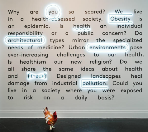
The show opens with a provocative wall graphic that asks, among other pertinent questions, “Why are you scared?” and follows up with a series of disturbing possible explanations, among them: pandemic, obesity, aging, dementia, and death. In the face of these traumas, the curators have gathered any number of projects that show us how we can make our personal, domestic, and urban environments safer and more humane: buildings with facades that suck polutants and breathe clean air; homes for Alzheimer patients that reduce anxiety; public buildings that prioritize stair-climbing and child-care facilities. Conversely, Zardini and Borasi demonstrate what happens when our best intentions backfire, as they often do. “We don’t pretend to offer solutions,” Zardini told me, “but we’d like to offer some direction. The way you define a problem leads you to the solution.”
Of course, modernists have been trying to define this problem for a very long time. As I write in the Review, “the idea of creating hygienic space…has been a fixation of the modern movement since its earliest days as a force for social reform.” In the show, we see this obsession taken to its logical extreme with Alison and Peter Smithson’s 1956 House of the Future, a molded-plastic home with an airlock door and sterilized internal environment. That house appears a droll parody of yesterday’s futurism until you arrive in the next gallery, to be confronted by a series of projects on medical quarantine, a subject that has a frightening currency in this age of SARS, anthrax, and antibiotic resistance.

Superstudio: City of Hemispheres, 1971
The exhibition concludes with Superstudio’s 1971 City of Hemispheres, a collage of rolling meadows populated by sheep and hovering domes. At its center is a crystalline plane, which text explains is an abstracted city of 10 million individuals, each “living” in a transparent sarcophagus through which they breathe conditioned air and receive anti-aging sustenance intravenously. From their pristine enclosures, they experience the world via those floating hemispheres, each of which is a “sensory apparatus” that relays information back to the immobile body. At once beautiful and terrifying, this utopian vision is the ultimate representation of what a fully medicalized city might be. It’s a long way from Santa Cruz, nevermind Brooklyn.
Finally, it’s worth noting that this show is just the latest in a series of inventive exhibitions that engage in social themes (energy consumption, proactive urbanism, war) undertaken by the CCA under Zardini, shows that together reassert that institution’s place as a center of architectural culture.
Observed
View all
Observed
By Mark Lamster
Recent Posts
Runway modeler: Airport architect Sameedha Mahajan on sending ever-more people skyward The New Era of Design Leadership with Tony Bynum Head in the boughs: ‘Designed Forests’ author Dan Handel on the interspecies influences that shape our thickety relationship with nature A Mastercard for Pigs? How Digital Infrastructure is Transforming Farming and Fighting Poverty


