December 3, 2009
Making Kids Modern: Or is it Their Moms?

Designer Todd Oldham has made recent plays for both the DIY market (with
Handmade Modern) and the boutique baby market (with Charley Harper ABCs and 123s). For this holiday season, he tries to appeal to both at once with Kid Made Modern, 52 projects “inspired by mid-century modern design” for children 5 and up. As a mom who considers herself crafty and admires midcentury modern, I simply had to get my hands on it. There is a long history of designers applying their critical eye to the world of children — Charles and Ray Eames made films that are genuinely appealing to children, most notably Toccata for Toy Trains — but so many other “modern” toys seem much more appealing to parents than to kids. My son never uses the minimalist black Brio shape sorter I bought, preferring the plastic Fisher Price versions at other people’s houses. Was this book just for the junior coffee table, or could it offer elementary-schoolers a sense of the midcentury world? I decided to take it for a test-drive.While I waited for my copy, I e-mailed a fellow preschool mom about the project and my fear that it was more about the parents’ taste than entertaining children. She wrote back that the book looks “just made for non-kid adults to give to adults with kids. I can imagine my best friend from home (gay, cool couch, no kids) giving it to me.”
I agree with her about that market segment, but I also think parents with cool couches will be attracted to the concept of starting an appreciation of modern art and design early. Who among us hasn’t wished for her children’s latest effort to exhibit a little bit more style? Magazines like Cookie and Domino (RIP) were filled with suggestions for ways to fit kids’ crafts into a carefully considered décor with ribbon-lattice bulletin boards and magnetic paint walls.
But to want your children to make something modern is to art-direct their elementary school experience. And isn’t that the opposite of creative? Aggressively aiming your children to follow in the footsteps of a pathbreakers like Anni Albers, when all they want to do is make a potholder, seems odd. I was also made uneasy by the underlying suggestion that my kid could do this. Imitating the masters is a very old-fashioned way to teach art appreciation. In Kid Made Modern, the project “Form + Fun” offers a downloadable template to help you cut the biomorphic forms of Isamu Noguchi’s 1940s sculpture out of poster board. Those forms came from European Surrealism and took Noguchi to stone-carving. The exercise seems pointless as play and derogatory to the artist.
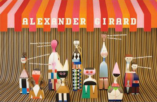
To test my misgivings I convened a panel to evaluate Oldham’s claims — and his crafts: Oliver, 7; Wilha, 5; Oscar, 7; and Elliot, 4.5. I chose two projects that seemed relatively quick and hewed closely to the work of the highlighted designer. The first was an Alexander Calder-inspired mobile, made of wire hangers (“ask an adult to cut,” easier said than done, in my experience) and adhesive craft foam. The second was the project highlighted in the book’s marketing material, “Spoon Friends”: wooden spoons painted to look like the Alexander Girard dolls now reissued by Vitra at $160 each. (Seller UnicaHome notes, “Not for small children!”)
Other projects seemed only tangentially connected to the world of design and were stuck in as filler or for color (Todd loves color). Graphic design legend Paul Rand, whose kids’ books are notable for their combinations of line art and cutout shapes, is said to be the inspiration for a project that uses a potato masher to print a hoodie. “Surprising materials were a trademark of Paul Rand’s designs,” reads the text. I fail to see the connection. If Oldham wants to teach kids about graphic design, why not have a design-your-own-trademark project and make hand-printed stationery?
At one end of my kitchen table, I showed Oliver and Wilha the Calder mobile project and offered them a stack of rainbow foam. Neither seemed all that interested in Todd’s tasteful greens and leaf shapes. Oliver started by cutting out triangles and then moved on to an ambitious star. Wilha could only manage to cut small squarish pieces of foam on her own, and these were too small to stick to the hanger ends. Oliver stayed with the mobile the longest, making four rungs before getting bored and asking to move on to the spoons. Later Oscar, like Oliver, tried to make stars — he wasn’t very interested in circles, or leaves, or Calder blobs, either. Both older boys added little flags to the center of the wires, making each one into a sort of abstract arrow. They couldn’t keep the idea of the mobile as the end product in mind as they were cutting, treating each rung as an individual project.
Down at the other end of the table, Oscar and Elliot were dying to open the little pots of paint. I showed each child the real Girard dolls in the book, but that just confused them, as the dolls look nothing like spoons. The instruction page was more helpful, and Oscar and Elliot dutifully traced their spoons on scrap paper and drew some stripes and checkerboards. Elliot then started to paint that paper, before his mother and I told him he was allowed to start on the spoon.
The idea of taping the stripes off to get crisp edges — one of Oldham’s suggested steps — was soon lost. What kid wants to wait 10 minutes in between stripes? Oscar also asked a question that hadn’t occurred to me: What can you do with the spoons after they are done? They looked cute in the photo, all set up in their painted shoe box (we never got around to that), but they are neither cuddly nor food safe. No one bothered to add faces. Later, the boys’ attention span exhausted (I clocked it at an hour and 15 minutes), they turned the spoons into swords.
What did I learn? The projects are not bad, but with children this age, the results are unlikely to be “mid-century” unless you push your kid into following the model. I might have gotten more exact results if I had done a sample for display first, but who has time for that? If the modernity is all in the execution, I am sure you can find directions for mobiles and yarn pom-poms in a million other cheaper, bigger craft books (or free blogs). Then it is up to your discretion to push your child toward abstraction.
The other selling point for the book could be the text, which on the display pages offers rhyming lessons on the importance of featured artists from Mexican architect Luis Barragan (colorful walls) to Mary and Russel Wright (colorful housewares). Oldham has loads of useful advice for the aspiring designer strewn about the pages in multicolored dots — the design of the book is also juvenile modern. He uses a few back pages to discuss careers in the creative arts. Product Design: “Whether it’s the chair you are sitting on or the vacuum cleaner, every bend, knob, and color involved are the efforts of a product designer.” Good point. Fine Arts: “Special skills and a singular point of view are very helpful in finding your way.” Awfully general. And then there’s the spread titled “Art & Commerce,” tossed in at the end as if to reassure the BlackBerrying parent that Todd is not leading their children into poverty. “You don’t need loads of money to start your own business; you just need dedication and creativity. … It is also important to have an understanding of the business side of the creative arts.”
As I hope you can tell from these quotes, the book text almost forces you to read it out loud in the robotic voice Oldham used as host of Bravo’s Top Design. There’s a nice bibliography of modern design monographs and websites in back, as well as a spotty listing of art museums in the USA and Europe. If the target audience for this book is the gay uncle, or the over-designed parent, it comes with an offer to take the kids to see some real midcentury design, like the Noguchi Museum or Russel Wright’s Manitoga. That’s the kind that can’t be faked.
This essay was originally published on Double X, December 3, 2009.
Observed
View all
Observed
By Alexandra Lange
Related Posts

Arts + Culture
Nila Rezaei|Essays
“Dear mother, I made us a seat”: a Mother’s Day tribute to the women of Iran

The Observatory
Ellen McGirt|Books
Parable of the Redesigner

Arts + Culture
Jessica Helfand|Essays
Véronique Vienne : A Remembrance

Design As
Lee Moreau|Audio
Announcing: Design As Season Two
Recent Posts
“Dear mother, I made us a seat”: a Mother’s Day tribute to the women of Iran A quieter place: Sound designer Eddie Gandelman on composing a future that allows us to hear ourselves think It’s Not Easy Bein’ Green: ‘Wicked’ spells for struggle and solidarity Making Space: Jon M. Chu on Designing Your Own PathRelated Posts

Arts + Culture
Nila Rezaei|Essays
“Dear mother, I made us a seat”: a Mother’s Day tribute to the women of Iran

The Observatory
Ellen McGirt|Books
Parable of the Redesigner

Arts + Culture
Jessica Helfand|Essays
Véronique Vienne : A Remembrance

Design As
Lee Moreau|Audio

 Alexandra Lange is an architecture critic and author, and the 2025 Pulitzer Prize winner for Criticism, awarded for her work as a contributing writer for Bloomberg CityLab. She is currently the architecture critic for Curbed and has written extensively for Design Observer, Architect, New York Magazine, and The New York Times. Lange holds a PhD in 20th-century architecture history from New York University. Her writing often explores the intersection of architecture, urban planning, and design, with a focus on how the built environment shapes everyday life. She is also a recipient of the Steven Heller Prize for Cultural Commentary from AIGA, an honor she shares with Design Observer’s Editor-in-Chief,