
October 3, 2010
Not Afraid of Color
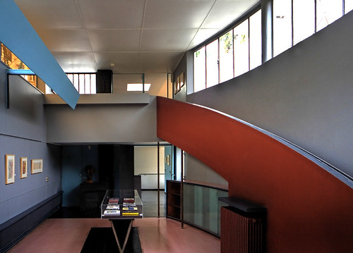
For once, Alice Rawsthorn and I think alike.
From her T Magazine piece on the Le Corbusier palette.
Whatever you imagined, I’ll bet it was in black and white. It’s a safe bet, because our perceptions of early Modernism — at the Bauhaus design school in 1920s Germany, or the purist villas that Le Corbusier was building in France — are shaped by the photographs taken at the time, and they were all in black and white.
In fact, Modernist interiors were much more vivid than the photographs suggest. When you go to those places, you’ll discover that although many of them do indeed sport gleaming glass, tubular steel and so on, there are often glorious splashes of color to complement the white walls. And one of the most gifted colorists of the era was none other than Le Corbusier himself; the vibrant shades he chose then are among the best you’ll find today.
That’s Maison La Roche-Jeanneret, now home of the Le Corbusier foundation, built in 1925.
Cranky fact-check: Can you have a nickname for a (self-bestowed) nickname? It is not as if Le Corbusier was known as such at birth. Corb is really just archi-shorthand. I always write LeC in my notes.
From “Why This Book?” in Design Research.
I wrote my dissertation on American corporate architecture and design of the 1950s and 1960s, and one of my discoveries was the amount of color and texture in the work of designers like Florence Knoll and Eero Saarinen. The black-and-white photos we typically see of their work leave that out, as do many of the history books. Caring about interiors began to seem like a subversive interest for an architectural historian, yet it turns out it was a subversive interest for architects such as Ben Thompson.
We usually see icons like Eames chairs in a vacuum: in expensive catalogues against a white background, or in minimalist apartments with white walls and oak floors. As museum pieces they seem like a cliché. But the D/R way of combining modernism and folk and crazy fabrics and fruit and flowers was much richer, more interesting, and more personal than that, as I hope this book shows. Ben Thompson was trying to overcome staid, matchy-matchy formalism; today we need to overcome matchy-matchy modernism.
Observed
View all
Observed
By Alexandra Lange
Related Posts

Business
Kim Devall|Essays
The most disruptive thing a brand can do is be human

AI Observer
Lee Moreau|Critique
The Wizards of AI are sad and lonely men

Business
Louisa Eunice|Essays
The afterlife of souvenirs: what survives between culture and commerce?
Architecture
Bruce Miller|Essays
A haunting on the prairie
Recent Posts
Raphael Tsavkko Garcia|Analysis
AI actress Tilly Norwood ignites Hollywood debate on automation vs. authenticity “I’d rather be a pig”: Amid fascism and a reckless AI arms race, Ghibli anti-war opus ‘Porco Rosso’ matters now more than everEllen McGirt|Holiday Gift Guide
Visions of sugar-plums ‘Adulterations Detected:’ on the human impulse to prettify our food with poisonRelated Posts

Business
Kim Devall|Essays
The most disruptive thing a brand can do is be human

AI Observer
Lee Moreau|Critique
The Wizards of AI are sad and lonely men

Business
Louisa Eunice|Essays
The afterlife of souvenirs: what survives between culture and commerce?

Architecture
Bruce Miller|Essays

 Alexandra Lange is an architecture critic and author, and the 2025 Pulitzer Prize winner for Criticism, awarded for her work as a contributing writer for Bloomberg CityLab. She is currently the architecture critic for Curbed and has written extensively for Design Observer, Architect, New York Magazine, and The New York Times. Lange holds a PhD in 20th-century architecture history from New York University. Her writing often explores the intersection of architecture, urban planning, and design, with a focus on how the built environment shapes everyday life. She is also a recipient of the Steven Heller Prize for Cultural Commentary from AIGA, an honor she shares with Design Observer’s Editor-in-Chief,