February 22, 2011
On My Shelf: Richard Neville’s Playpower

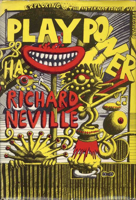
Playpower illustrated and designed by Martin Sharp, Jonathan Cape, 1970
I read Richard Neville’s Playpower in 1972. I was 15 and seriously disaffected. I took an unofficial day off school and caught the bus to a distant park where I spent several hours at the top of a hill reading Neville’s racy, insider’s guide to the counterculture, and dreaming about sticking it to the man. The author was the notorious Australian founding editor of Oz, a scandalous London underground magazine — I never missed an issue.

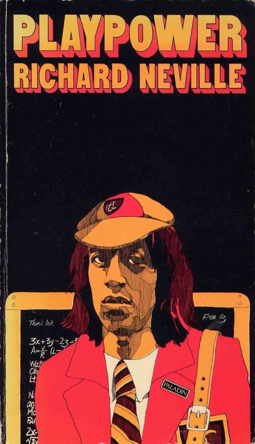
Playpower illustrated and designed by Richard Adams, Paladin, 1971
My edition of Playpower was the unusually tall Paladin paperback, published in the UK, and I didn’t see the original 1970 hardback until many years later. I bought it immediately. The jacket was designed by Neville’s friend Martin Sharp, also an Australian, who created wildly inventive layouts for Oz, as well as classic album covers and posters. Playpower doesn’t quite equal his best work, but it was a boldly iconoclastic image for Jonathan Cape, an establishment publisher with offices in Bloomsbury, then heart of literary London.
As with all Sharp’s underground art, an ambivalent satirical malaise taints the liberated psychedelic fantasy. This is a garden of queasily decadent delights where the joke is probably on the reader. The dope-smoking guitar-alien twangs his pole obliviously, a long-nosed letter A (on the back) is about to screw a convenient red loop on the end of his tongue, and the grinning author reaches for a tab of acid from behind an erupting phallic column. “Sharp drew an exuberant cover — a flying circus of joints, flutes, exploding hearts and toothy smiles — though the book was not to his liking,” Neville confides in his autobiography Hippie Hippie Shake.
Widely reviewed at the time, both celebrated and reviled, Playpower hasn’t worn well. But Sharp’s pre-emptively jaundiced (yellow!) cover still oozes menace. Its gleefully chaotic sarcasm is as far from modernist self-restraint as you can get: an anti-professional rallying cry for the coming waves of punks, postmodernists, DIYers, and other graphic dissenters.
This text appears in I Heart Design: Remarkable Graphic Design Selected by Designers, Illustrators, and Critics edited by Steven Heller (Rockport). It is reproduced here with permission.
Observed
View all
Observed
By Rick Poynor
Related Posts

Business
Kim Devall|Essays
The most disruptive thing a brand can do is be human

AI Observer
Lee Moreau|Critique
The Wizards of AI are sad and lonely men

Business
Louisa Eunice|Essays
The afterlife of souvenirs: what survives between culture and commerce?

Architecture
Bruce Miller|Essays
A haunting on the prairie
Related Posts

Business
Kim Devall|Essays
The most disruptive thing a brand can do is be human

AI Observer
Lee Moreau|Critique
The Wizards of AI are sad and lonely men

Business
Louisa Eunice|Essays
The afterlife of souvenirs: what survives between culture and commerce?

Architecture
Bruce Miller|Essays

 Rick Poynor is a writer, critic, lecturer and curator, specialising in design, media, photography and visual culture. He founded Eye, co-founded Design Observer, and contributes columns to Eye and Print. His latest book is Uncanny: Surrealism and Graphic Design.