February 19, 2010
Prisoners of Logic

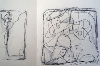
Recent pen and ink studies from my sketchbook
Respect for the value of consistency, it seems to me, is basic tenet for designers. We are after all groomed, from an early age, to view consistency not as the hobgoblin of little minds, but as the ideal to which we aspire, and against which we measure the success of our efforts. Consistency means having a story with a beginning, middle and end. It means that there’s some logic in place to guide the viewer, shepherd the audience, govern the brand. And graphic design is, after all, a logical medium.
This being the case, I am obliged to conclude that I am not a logical person — or at least my sketchbooks tell me. Let me explain.
For five or six years now, I have led a double life as a painter. Until recently, I viewed this other identity as a kind of dirty secret: I was a dilettante, a wannabe or even worse — a Sunday painter. (Mind you, some Sunday painters are pretty serious: former WGBH Boston Design Director Chris Pullman works weekly with a model in the studio and has become, in his retirement, a rather prolific artist.) Living this double life had its complexities: I felt guilty when I was painting, more guilty when I wasn’t. Worst of all, I was making such a mess in our design studio that I was exiled to a former tiny playroom in our basement, where the paintings I made were, not surprisingly, also tiny.
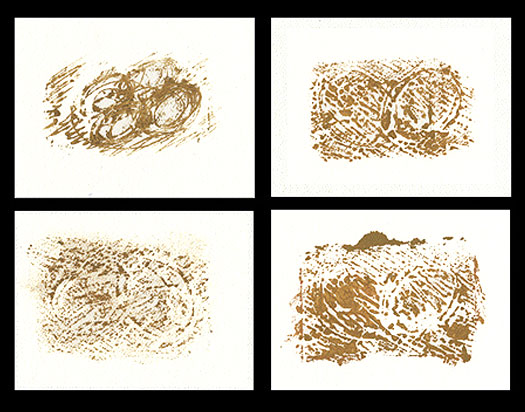
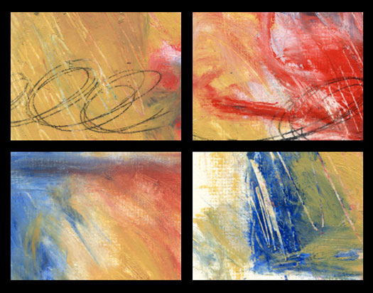
Monoprints and oil studies
Not being able to actually get myself to my painting studio with any regularity — the vicissitudes of everyday life being what they are — I began to travel everywhere with a battery of sketchbooks, including one in which I make and illustrate lists (a collaboration with our daughter, who is 11); one in which I paste in found matter (part sketchbook and part scrapbook, known informally as my “scratchbook”); another bound volume that is a pared down version of the scratchbook, with less expository writing and more cryptic visualizations; and recently, a larger format book with thin, perforated pages of newsprint in which I work primarily in graphite. Along the way, I wrote a book on the history of scrapbooks in America, and struggled to come to terms with how collage factored into my visual diaries. (I still struggle with this.)
Meantime, I assign random pages in the back of each book where I work in pen and ink and make studies for small paintings I plan to attempt at some later date. The only common denominator is that there is no common denominator. Much of this work was, for a time, loosely inspired by a kind of deconstructed study in the mechanics of penmanship, which is (to me, at least) endlessly fascinating, mostly because of the tension between the proposed action and its inevitably migratory outcome.
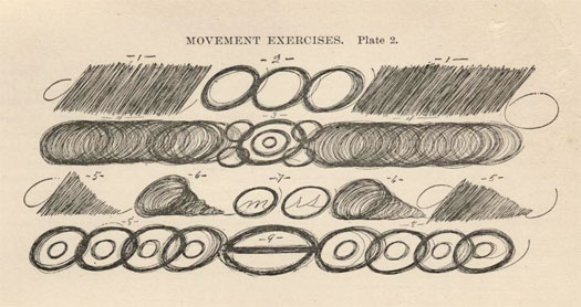
An example of the kinds of “movement exercises” given to students of handwriting a century ago
If there’s any method to my madness, it lies in a slow trajectory, beginning with a series of scratchy drawings that led to linoleum cuts; these in turn led to work on canvas and masonite, and all of it characterized by the media agnostic nature of my explorations — pen, pencil, acrylic, oil, whatever. But does it matter? Because the minute I told myself this work was not obliged to bow to some recognizable notion of clarity, I felt liberated and became, as a result, insanely more productive. By letting go of logic, it became all about form: once that happened, I was free to just think about making form. Â
Of course, many graphic designers draw and paint and do magical things with photographs: Ellen Lupton’s whimsical illustrations, which she refers to as “prose paintings” have been published in The New York Times; Stefan Bucher’s spectacular monsters have a book and website (and a serious following) of their own; Stephen Doyle’s word sculptures (also published in the Times) are intricate and exquisite formal studies of word and shape and light. Our own Michael Bierut’s sketchbooks, featured not long ago here on Design Observer, celebrate the longevity of such achievement in ways I can only dream about. I envy them all their capacity to build bodies of work framed by similar values — formal, temporal, colorful, meaningful and, by and large, logical.
I can’t, I confess, do any of this: I find that I am, in fact, an abstract painter. And it is this fundamentally experimental vocabulary  — unruly and unplanned and gestural — that characterizes the work I not only can but want to make. What’s key in this equation is the process: assuming that all sketchbooks are meant to be a clearinghouse of subconscious thought, why is it that so many of us use our sketchbooks to annihilate that which lacks clarity, so that we can set the random thinking aside and consequently, produce more resolved work on the other end? On the other hand, if you think of your sketchbook as the end goal, what then? What if you start drawing with no idea about what you want to draw? What if your relationship with the pencil and the page is the whole point?
Not at all a product of logic, it is, ergo, the antithesis of design. Or is it a new way to think about design?
Not long ago, our daughter was watching me drawing something in the basement and asked, “How come the work you make downstairs never makes its way upstairs?” It occurred to me then that the degree of random exploration that was tacitly permitted in the painting studio but verboten in the design studio was, in fact, much more than this. And here’s where I had something between a breakdown and a breakthrough: logic, I realized, was my worst enemy. And designers like me were, in fact, prisoners of logic. Having spent the first half of my life making responsible, consistency-based choices, I am now passionately committed to the opposite, and it is this abstraction that fuels my every move. My sketchbooks, not surprisingly, reveal the decidedly inconsistent pattern of this unwieldy perspective, and while I pretend to capture my explorations in some steadfast fashion (convincing myself, for instance, that if I work in identically-sized sketchbooks, the wily-nily nature of my work will nevertheless be contained in some digestible, managed way) it is abstraction that surges forward as the common thread. And that is nothing if not illogical.
Observed
View all
Observed
By Jessica Helfand
Recent Posts
The New Era of Design Leadership with Tony Bynum Head in the boughs: ‘Designed Forests’ author Dan Handel on the interspecies influences that shape our thickety relationship with nature A Mastercard for Pigs? How Digital Infrastructure is Transforming Farming and Fighting Poverty DB|BD Season 12 Premiere: Designing for the Unknown – The Future of Cities is Climate Adaptive with Michael Eliason
 Jessica Helfand, a founding editor of Design Observer, is an award-winning graphic designer and writer and a former contributing editor and columnist for Print, Communications Arts and Eye magazines. A member of the Alliance Graphique Internationale and a recent laureate of the Art Director’s Hall of Fame, Helfand received her B.A. and her M.F.A. from Yale University where she has taught since 1994.


