
John Foster|Accidental Mysteries
March 27, 2015
Released from Obscurity
Mexican-born Ramírez spent more than thirty years in US psychiatric hospitals, during which time he created a remarkable body of work characterized by repeating lines, idiosyncratic motifs, and daring perspective.
Ramírez’s art blends the emotional and physical landscapes of his life in Mexico with the modern popular culture of the United States. Although he worked mostly outside the art world in his lifetime, Ramírez is recognized today as one of the great artists of the twentieth century. He was born in 1895 in a rural community in Guadalajara, and died in a psychiatric hospital in northern California in 1963.
John Foster interviews designer
Antonio Alcalá of Studio A, who designed the Ramírez stamp in his role as an art director for the USPS.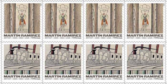
++
John Foster: I see that your firm has designed quite a few stamps for the United States Postal Service. How did this project come about?
Ramírez’s work is often large scale and stamps, of course, are not. Additionally, Ramírez often crafted his art surface out of several pieces of paper leading to irregularly shaped drawings. I quickly discovered it would be difficult to reproduce entire works, communicate his artistic genius, and have a design that worked as a stamp. I spent a great deal of time looking through his work, exploring various crops to highlight imagery that communicates his genius, works well as an individual stamp, and also within a group of four other stamps.
The selections needed to feel like equivalents yet not be repetitive. As is the case with so many design assignments, much of the work involves editing and making decisions about what to retain and what to discard.
There’s a lot of information there, but it manages to quietly compliment the artwork.

Observed
View all
Observed
By John Foster
Related Posts
Accidental Mysteries
John Foster|Accidental Mysteries
The Remarkable Mr. Deeds
.jpg)
John Foster|Accidental Mysteries
Doug Rickard: N. A.
Accidental Mysteries
John Foster|Accidental Mysteries
An Archive of Czech Film Posters
Accidental Mysteries
John Foster|Accidental Mysteries
A Visual History of Lunchboxes
Related Posts

Accidental Mysteries
John Foster|Accidental Mysteries
The Remarkable Mr. Deeds
.jpg)
John Foster|Accidental Mysteries
Doug Rickard: N. A.

Accidental Mysteries
John Foster|Accidental Mysteries
An Archive of Czech Film Posters

Accidental Mysteries
John Foster|Accidental Mysteries

 John Foster and his wife, Teenuh, have been longtime collectors of self-taught art and vernacular photography. Their collection of anonymous, found snapshots has toured the country for five years and has been featured in Harper’s, Newsweek Online and others.