
March 2, 2009
Standard Operating Procedure
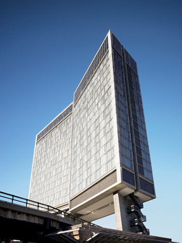
The Standard New York, Polshek Partnership Architects, 2008 (Photo: André Balazs Properties)
From the earliest days of the High Line, the new park being built from a 1.5 mile abandoned elevated rail line on Manhattan’s west side, its future was literally entwined with that of hotelier Andre Balazs’s first ground-up property, the Standard New York. The High Line passes through two other former industrial buildings, but the Standard is and likely will be the only structure built fresh over the former railbed, a portal over the park’s entrance seen in segments as you walk up Diller Scofidio + Renfro’s southernmost “slow staircase.” Other buildings touch the tracks, but the 20-story hotel straddles them. So it was with some relief that, as the hotel took shape, one could see that its concrete legs looked both shapely and tough, its underside crisply detailed and without fuss. The twinkling begins above, where the frame is filled with glass and bent at the center, so that the smaller operable windows sparkle within the grid.
It was a surprise to some that Balazs picked Polshek Partnership Architects for such a high-profile project. His William Beaver House in the Financial District was designed by Tsao & McKown, a younger firm known for contemporary, brawny luxury; the L.A. Standards are better-than-the-original renovations of mid-century buildings. Polshek, on the other hand, is perhaps better known in New York for grand glass appendages to second-tier Beaux-Arts buildings (the Brooklyn Museum, the Museum of Natural History) based on the same circle-in-square, grand staircase principles as the originals.
But, as it happens, Standard NY’s architect Todd Schliemann looked to New York precedents slightly younger than McKim Mead & White. In a recent piece in Vanity Fair, Balazs cites Eero Saarinen, Mies van der Rohe and Arne Jacobsen’s SAS hotel in Copenhagen as influences. Maybe so, but its real architecture predecessors may be slightly less impeccable. The reason the Standard is so good is that it’s a 21st Century mash-up of one of Marcel Breuer’s most destructive ideas and one of Morris Lapidus’s best tweaks of the U.N. model of modernism.
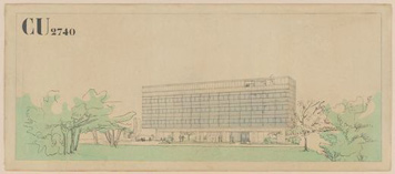
Swiss Pavilion, Paris, France, Le Corbusier and Pierre Jeanneret, 1932. Image: MoMA Collection
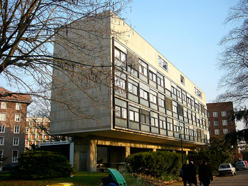
Swiss Pavilion, Paris, France, Le Corbusier and Pierre Jeanneret, 1932 (Photo: Roryrory’s Flickr Page)
First, the original. Thick legs below, hovering glass slab above? Look no further than the Pavilion Suisse by Le Corbusier and cousin Pierre Jeanneret on the campus of the Cité Universitaire in Paris. Completed in 1932, the Pavilion Suisse is quite a bit more petite than its offspring, but Le Corbusier designed many larger and unbuilt versions of this combination before adding the concrete sun-breakers that make his buildings at Marseille and Chandigarh habitable.
Then, the bulked-up offspring.
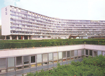
The UNESCO building, Paris, France, Marcel Breuer, Pier Luigi Nervi and Bernard Zehrfuss, 1958 (Photo: Ralph Lieberman)
Built in Paris near the École Militaire, and completed in 1958, the UNESCO Secretariat by Marcel Breuer advances the Corbusian model in a number of ways: the plan is Y-shaped, putting a curve in the slab and creating more opportunities for window offices; the piloti start simply, then split into a tree-like form popularized by UNESCO architect and engineer Pier Luigi Nervi. This means the first floor can be used as a corridor, rather than just a pass-through between trunks. But the building was criticized by Lewis Mumford (and this is still the 1950s) as “once modern modernism,” as quoted in Isabelle Hyman’s Marcel Breuer, Architect: The Career and the Buildings.
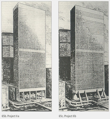
Grand Central Tower, Projects IIa and IIb, NY New York, Marcel Breuer, 1968. Images: Archives of American Art, Smithsonian Institution
Ten years later, Breuer still hadn’t moved from this office tower ideal, and proposed it again for an even less hospitable site: directly over Grand Central. The architect never lived down these 1967-69 proposals for the Grand Central Tower, a glass slab that in renderings looks much like the UN with windowed ends, stuck up on high concrete piloti — straight or slanted — that would have covered the face of the just-landmarked station. We have Breuer partly to thank, in fact, for New York’s preservation movement, as the outcry over this proposal and the subsequent lawsuit (which was finally settled by the Supreme Court in the Landmarks Preservation Commission’s favor in 1978) prevented Grand Central from going the way of Penn Station. But as the Standard proves, what was an architectural affront and an urban disaster over a train terminal looks very different when lofted over a park (even if that park is built on abandoned train tracks).
The Standard’s other innovation, the inward tilt of the slab, is also nothing new. If Breuer seems responsible for the Standard’s thick legs and glassy torso, it is Lapidus we have to thank for the hotel’s signature central dip. A clever way of creating views for more guests, and a little lilt into a typology that had become ubiquitous by the early 1960s, the form can be found uptown on Seventh Avenue between 52nd and 53rd Streets, where his 1962 Americana is now a Sheraton. From a structuralist perspective, Lapidus messed up the base, hiding the composite steel columns deep inside a glass rotunda and transparent street-level lobby, but the massive legs would have been a strange site meeting the midtown sidewalk.

The Olympic Tower, New York, NY, Morris Lapidus, 1970
Lapidus, whose autobiography is titled Too Much is Never Enough, could also not leave well enough alone, and, two years after Breuer, proposed a looming-landmark building of his own for the Olympic Tower site just north of St. Patrick’s Cathedral. Before zoning changes made it possible for SOM to build the dull bronze-glass box that eventually filled the site, Lapidus proposed a mirror-glass slab lofted 20 stories in the air on black granite legs (really shafts for elevators and other mechanical systems). At street level, there would have been a mid-block arcade and plaza squeezed between the landmark Cartier building and Best & Co. A New York Times editorial suggested that Lapidus’s arrival on Fifth Avenue was a sign of the end of its snob appeal, and he eventually lost the job.
This brief timeline is a smirky lesson in architectural ironies — and one that doesn’t even address the Whitney Museum’s probable move just south of the Standard, driven from the Upper East Side by landmarks advocates — and one that points to a couple of more interesting questions. One, isn’t it a little ironic that the work of Marcel Breuer and even Morris Lapidus looked more stylish to tastemaker Balasz than that of most contemporary architects? And two, could it be that there are no bad buildings, only colossally bad choices of site? What was so wrong in midtown looks so right in the Meatpacking District.
Observed
View all
Observed
By Alexandra Lange
Related Posts

The Observatory
Delaney Rebernik|Analysis
A story of bad experiential design
The Observatory
Ellen McGirt|Essays
Lessons in wandering

Architecture
Sameedha Mahajan|Design and Climate Change
The airport as borderland: gateways for some, barriers for others

The Observatory
Alexis Haut|Analysis
“Pay us what you owe us”
Related Posts

The Observatory
Delaney Rebernik|Analysis
A story of bad experiential design

The Observatory
Ellen McGirt|Essays
Lessons in wandering

Architecture
Sameedha Mahajan|Design and Climate Change
The airport as borderland: gateways for some, barriers for others

The Observatory
Alexis Haut|Analysis

 Alexandra Lange is an architecture critic and author, and the 2025 Pulitzer Prize winner for Criticism, awarded for her work as a contributing writer for Bloomberg CityLab. She is currently the architecture critic for Curbed and has written extensively for Design Observer, Architect, New York Magazine, and The New York Times. Lange holds a PhD in 20th-century architecture history from New York University. Her writing often explores the intersection of architecture, urban planning, and design, with a focus on how the built environment shapes everyday life. She is also a recipient of the Steven Heller Prize for Cultural Commentary from AIGA, an honor she shares with Design Observer’s Editor-in-Chief,