January 1, 2018
Stefan Bucher’s Letterheads: A Zany but Totally Methodical Take on Reinvention
The designer explains why humor is a good tool, how to overcome artistic fears, and what he means by saying he’s a “Victorian gardener of the mind.”
When you look at the world around you, what do you see? January, with its bare trees, crisp air, and snow-blanketed vistas comes to many as a carte blanche. Resolutions are set and goals made with aspirations for reinvention. But there’s no need to wait for a new calendar year to venture a fresh approach to doing things.
The trick is to see those opportunities every day. And some, with a mind for the fantastic, have made that their missive: Christoph Neimann illustrates his own kind of augmented reality by adapting found objects into something new; illustrator Jon Burgerman makes his changes on the fly, doodling over his iPhone photos to make trash cans into monsters and construction cones a bit more human with a set of googly eyes. In the early twentieth century Marcel Duchamp notoriously questioned the nature of art itself when he signed his name to a urinal and developed “Readymades,” which presented objects as art in and of themselves.
Reinvention doesn’t require upending the art world a lá Duchamp, but coalescing the real and imagined does reintroduce the challenge that art is primarily a concept rather than an individual artifact. And if that challenge is taken on, you just might start to see individual objects differently.
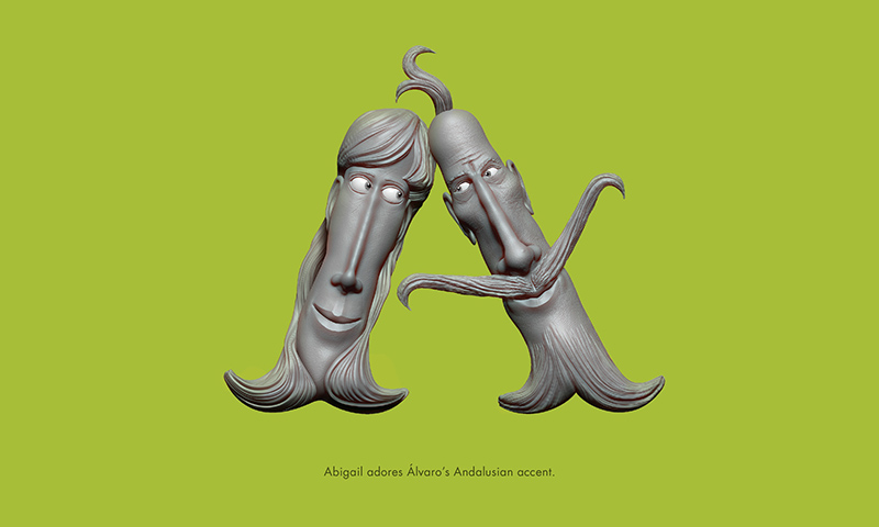

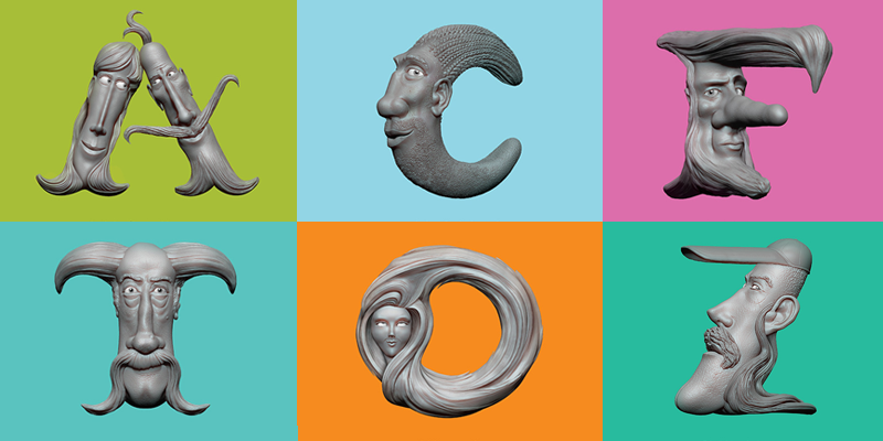
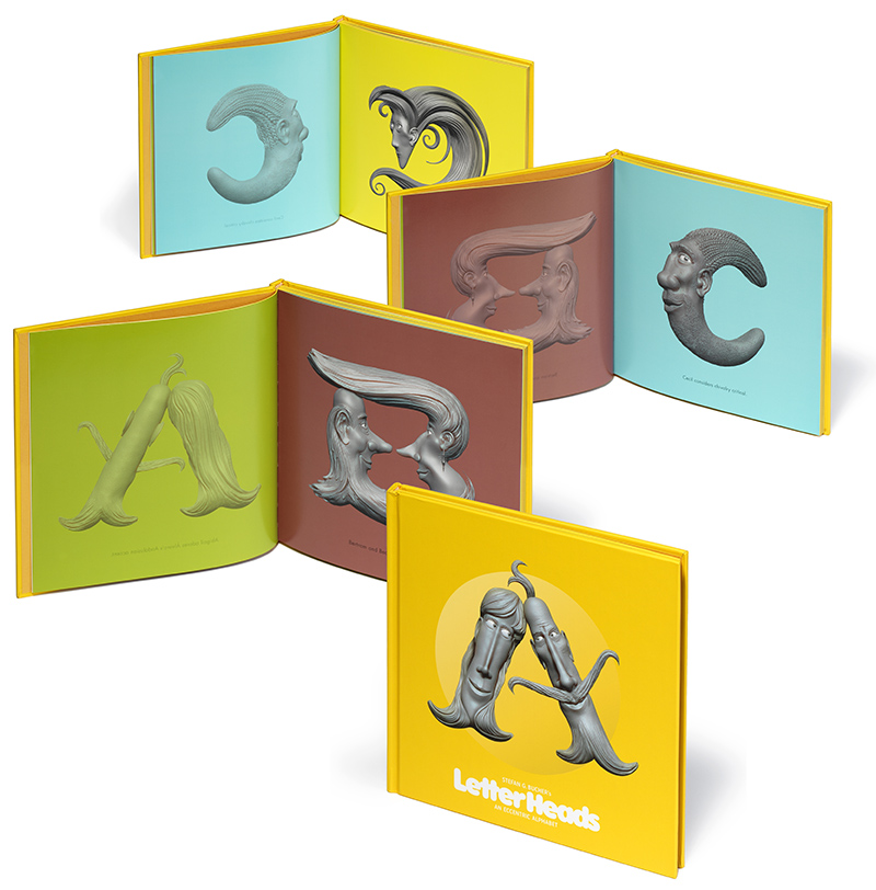
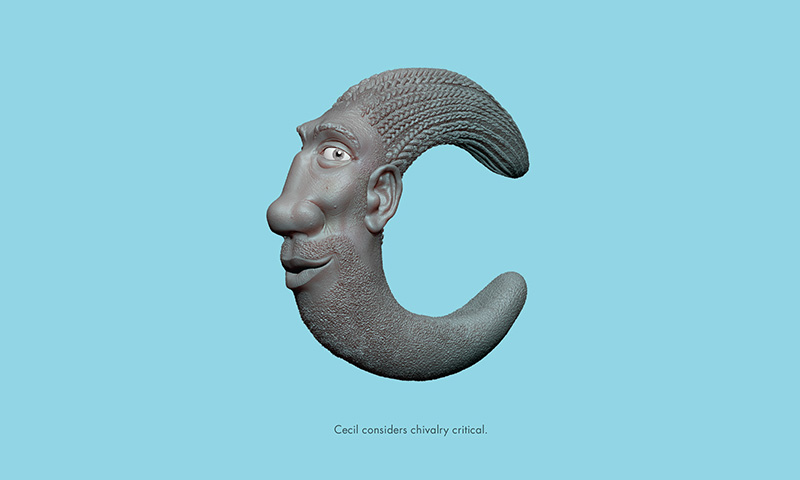
Designer and former AIGA Design Conference chair Stefan Bucher does just that with his new book, Letterheads, by changing letterforms into individual characters with meaning of their own. So with reinvention on the brain, Bucher explains why humor is a good tool, how to overcome artistic fears, and what he means by saying he’s a “Victorian gardener of the mind.”
Lilly Smith: Typically, letters create meaning when grouped together to form words, and don’t mean much when they stand alone. But you’ve reinterpreted the individual form of the letters, in essence to change their purpose. What is the purpose of Letterheads to you and what lessons can be garnered from it?
Stefan Bucher: We filter out so much of the world to make it navigable. If you were to notice and consider every tree alongside the road you’d hit one sooner rather than later. I try to break through those filters, so I can see what’s actually around me. Humor is a good tool, because humor makes it easy to change scale from the real to the ludicrous. That snaps things out of the expected and makes it visible. I try to make the world more visible with everything I do, but I also love what I love. Combining that greater mission with my love for letterforms was inevitable, really. My hope for the LetterHeads is that they’ll do for letters what Toy Story did for toys. If you can assign complex feelings and motivations to a letterform, you’ll start looking for stories everywhere!
Humor is a good tool, because humor makes it easy to change scale from the real to the ludicrous. That snaps things out of the expected and makes it visible.
LS: Your Daily Monsters project is a great example of reinterpreting what might be considered either a mistake or the mundane—an inkblot. It reminds me of illustrator Christoph Neimann’s work in that you take everyday sights and, through illustrative manipulations, ask the viewer to look again. Would you agree?
SB: To call something a mistake or mundane is already a decision, and of course the Rorschach test has a long tradition in psychotherapy. My motivation with the Daily Monster wasn’t that complex, though. I simply needed a method to break through my fear of drawing. I always loved having drawn, but really struggled with starting. I still do. The ink blots let me go straight to the part I’m good at: finishing a drawing.
Christoph later added a step I wish I’d thought of at the time: using simple objects people see in their daily lives. The ink blot still has intentionality. I have ink, I have a toothbrush to spread it, I blow compressed air on it. There is craft involved. Christoph’s genius move was to start with common objects, which makes it much more of a “Wow! I see bananas every day, and I never thought of that!” moment. There’s a guy in Germany who’s started doing a version of the Daily Monster, but based on spilled coffee. He calls them Coffee Monsters. It’s a brilliant twist, because everybody spills coffee, few people still spill ink.
LS: How can that philosophy be applied to everyday problem solving?
SB: As for applying the philosophy of the Monsters to everyday problem solving, it’s worked well for me. For better or for worse, I run just about everything I see through the filter of “What would be the funniest thing I could do here? What’s the saddest? Or the worst? Does this look like something it isn’t?” Most of the time it’s fun and appreciated by those around me, but it can also be hard to stop. If the only tool you have is an ether-soaked hammer every problem starts looking like a choir of dancing nails singing show tunes.
LS: Where does this creative approach come from and how can someone who is very methodical learn it?
SB: People tend to think that I’m a little crazy. Maybe I am. But I see all this as fundamentally methodical, disciplined work. In most of my projects I come up with a ludicrous premise fairly quickly. After that I spend most of my time building a solid bridge to take people from here to there.
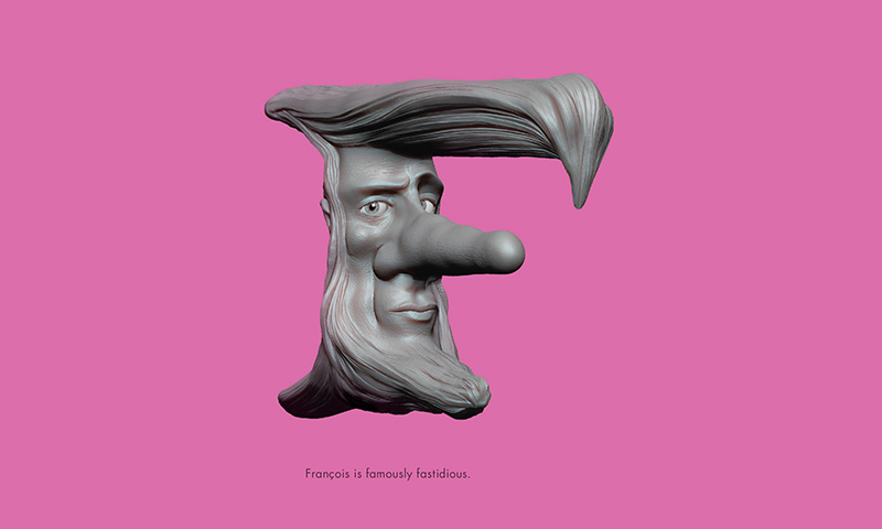
LS: You seem to thrive with projects that have a twist on the expected. Is there a benefit to working on projects that are off-kilter (not unlike your letter K)?
SB: To me, just coming up with random lunacies is useless, and useless things are boring. I have a strong sense of appropriateness. When I’m asked to create something off-kilter, I’ll spend a lot of time measuring your house first, so that what I do exactly fits the 14.3° angle of that wall you’ve never noticed. It’s not my job to be weird. It’s my job to find the perfect degree of kilter for the people I work with.
People tend to think that I’m a little crazy. Maybe I am. But I see all this as fundamentally methodical, disciplined work.
LS: What was the inspiration for this book, and how did you approach each letter? They almost seem like they could have been carved with clay.
SB: The process of creating the LetterHeads is very much like sculpting clay! The formal part of the book was inspired by watching creature designer Neville Page demonstrate sculpting aliens in a 3D modeling software called ZBrush at a conference in Dubai. I’d never seen anything like it. I flew home, bought the software, and started learning. (One of my better moves was hiring a recent Art Center grad, Sveta Kudakova, to help me through the basics. It’s not an intuitive program.) Early on I was doing the 3D equivalent of doodling—churning out alien heads—but pretty quickly the image of a letter with a face popped into my head. Next thing you know, a year had gone by and I had this book.
With each letter I start by roughing in the basic shape, and looking at it from all angles. As with the Daily Monsters, there is a process of looking for the main features—eyes, nose, mouth, ears—and then discovering the personality of each character as I go along. That’s the most fun part for me—getting to meet a new character as it takes shape.
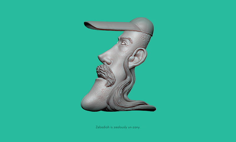
LS: Toilworn, reticent, languid, imperturbable, fastidious, besotted—although the characters are single letters, they have feelings that involve fairly sophisticated vocabulary. What was your strategy for the copy that accompanied the illustrations?
SB: My dear late friend Doyald Young always said that it’s important to know the precise meanings of the words we use, and I couldn’t agree more—especially in this strange, shame-deficient period of our history where truth has become so malleable. Beyond alerting readers that stories can hide anywhere, I hope that I can share with them my joy of language. In formal terms, LetterHeads is a children’s book, and I’ve seen kids get fascinated by the characters. Perhaps they’ll also be interested in these more complicated words and look them up. One of Doyald’s prize possessions was a 13-volume unabridged Oxford English Dictionary. He always kept one of the volumes open on a little lectern in his living room, so he could look up words. If I can introduce a little bit of his spirit to people who pick up this book, I’ll consider that a great success!
LS: How would you describe your overall design approach?
SB: I see myself as a landscape architect of sorts—a Victorian gardener of the mind. I create delightful spaces for your brain to visit. Sometimes I just pull out the weeds and give everything a good mow. Sometimes I’ll plant the right flowers or build a hedgemaze. And sometimes I get to go nuts and create a whole little world. The trick is always to give projects the shape that looks like it was always meant to be—the shape that doesn’t feel like somebody created it, but that just is. It’s my job to take things from “Wait, what?” to “Oh yes, of course!”

Observed
View all
Observed
By Lilly Smith
Related Posts
Sustainability
Delaney Rebernik|Books
Head in the boughs: ‘Designed Forests’ author Dan Handel on the interspecies influences that shape our thickety relationship with nature

Design Juice
L’Oreal Thompson Payton|Books
Less is liberation: Christine Platt talks Afrominimalism and designing a spacious life

The Observatory
Ellen McGirt|Books
Parable of the Redesigner
Books
Jennifer White-Johnson|Books
Amplifying Accessibility and Abolishing Ableism: Designing to Embolden Black Disability Visual Culture
Recent Posts
Beauty queenpin: ‘Deli Boys’ makeup head Nesrin Ismail on cosmetics as masks and mirrors Compassionate Design, Career Advice and Leaving 18F with Designer Ethan Marcotte Mine the $3.1T gap: Workplace gender equity is a growth imperative in an era of uncertainty A new alphabet for a shared lived experienceRelated Posts

Sustainability
Delaney Rebernik|Books
Head in the boughs: ‘Designed Forests’ author Dan Handel on the interspecies influences that shape our thickety relationship with nature

Design Juice
L’Oreal Thompson Payton|Books
Less is liberation: Christine Platt talks Afrominimalism and designing a spacious life

The Observatory
Ellen McGirt|Books
Parable of the Redesigner

Books
Jennifer White-Johnson|Books
