

January 27, 2016
The D Word: Vernacular Signage

That type should always be a “crystal goblet” is an ideal perpetuated by typeface expert Beatrice Warde in a 1955. “Type well used,” she said, “is invisible as type, just as the perfect talking voice is the unnoticed vehicle for the transmission of words, ideas.” But tell that to sign makers. They don’t know the meaning of invisible; their job is to make words scream—very loudly!


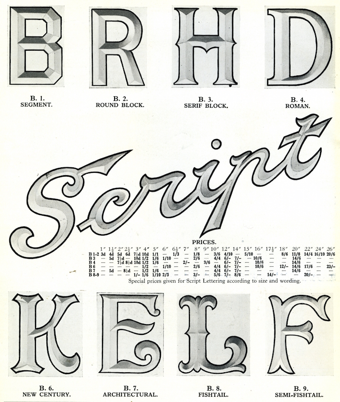

Back then, graphic or environmental designers rarely lifted a hand in the design of these quotidian signs. Although signmaking was a specialty, artists, carpenters, metallurgists and engineers were involved. This accounts for why the families of letters were referred to simply as “Lead Coated Sheet Steel” or “Recessed for Neon Lighting.” Letters were not part of a font nor were they exactly copies of the printed version. The only direction was to make them as eye-catching from a distance as possible—and customers were advised to keep them maintained lest they loose their brilliance.
Observed
View all
Observed
Share on Social
By Steven Heller
 Steven Heller is the co-chair (with Lita Talarico) of the School of Visual Arts MFA Design / Designer as Author + Entrepreneur program and the SVA Masters Workshop in Rome. He writes the Visuals column for the New York Times Book Review, a weekly column for The Atlantic online and The Daily Heller.
Related Posts
Graphic Design
Sarah Gephart|Essays
A new alphabet for a shared lived experience
Arts + Culture
Nila Rezaei|Essays
“Dear mother, I made us a seat”: a Mother’s Day tribute to the women of Iran
The Observatory
Ellen McGirt|Books
Parable of the Redesigner
Arts + Culture
Jessica Helfand|Essays
Véronique Vienne : A Remembrance
Recent Posts
Mine the $3.1T gap: Workplace gender equity is a growth imperative in an era of uncertainty A new alphabet for a shared lived experience Love Letter to a Garden and 20 years of Design Matters with Debbie Millman ‘The conscience of this country’: How filmmakers are documenting resistance in the age of censorshipRelated Posts
Graphic Design
Sarah Gephart|Essays
A new alphabet for a shared lived experience
Arts + Culture
Nila Rezaei|Essays
“Dear mother, I made us a seat”: a Mother’s Day tribute to the women of Iran
The Observatory
Ellen McGirt|Books
Parable of the Redesigner
Arts + Culture
Jessica Helfand|Essays