
Business • India • Typography

March 4, 2010
Peter Bilak & Satya Rajpurohit: Interview on Typography

Dirk Wachowiak
:

DW: Did you familiarize yourself with forms and meanings of Devanagari letters or did you just rely on Satya’s knowledge?
PB: When you set out to design typefaces for a language that you don’t understand, it’s important to do some preliminary research. True, typeface design is by definition systematic, and it’s possible to draw abstract shapes based only on the interaction between foreground and background, creating balanced letterforms that connect to form words, sentences and text. But it helps to know something about a language when you design typefaces for it — for one thing, it makes the design process faster. Knowing, for example, what letter combinations are used in the language keeps you from wasting time evaluating combinations that never occur.
DW: Some of your typefaces use OpenType features in an experimental way — as in your typeface Irma or your concept for the Twin Cities. Do OpenType features play an important role in Fedra Hindi?
PB: While OpenType features are unnecessary extras in Latin scripts, they’re essential in Indic fonts in order to correctly render the fonts grammatically. Without complex OTF scripting, the fonts simply won’t work well. This is also the reason why so many applications can’t handle Indic scripts. And it’s the main reason why it is so hard for text engines to actually handle Indic languages.

PB: We’re planning to release a Tamil version for 2010, and a Bengali version for 2011. Our goal is to develop more extensions later.
DW: Fedra Hindi is now part of the Indian Type Foundry (ITF) founded by you and Satya. How did this idea came up, and what came first — the font or the foundry?
PB: The typeface was first. After it was ready, I realized that publishing it via Typotheque (my existing company) wouldn’t reach the right audience. Satya and I gave a good deal of thought on how to bring it to the right people, where the fonts would be most useful. This is when the idea of starting a new company came up. Fedra Hindi was a good excuse!

DW: Satya, can you talk a little bit about your background? How did you become interested in type design?

DW: Fedra Hindi is a Devanagari companion to Fedra Sans. Most of us know that multiple scripts and languages exist in India. Can you explain the meaning of Devanagari within this range of scripts?
SR: Devanagari script is a Brahmi-derived writing system originally used to write Sanskrit. It is now used in India and Nepal to write many languages including Hindi, the official language of the Indian government. But it is not the only script we use here in India: in all, there are 9 major scripts being used, and they’re all equally important. But since Hindi is our national language and is widely spoken and understood, Peter and I decided to create a Devanagari companion first. In the future, our plan is for Fedra to eventually support multiple Indian scripts.
DW: Did you have a certain strategy when you started to design the font?
SR: Just like any other design project, we first analyzed the problem and then looked for a possible solution. For Fedra Hindi it was somewhat different, since we had Latin glyphs already designed and we had to design the corresponding Devanagari glyphs to match the Latin ones. Each Fedra Hindi glyph was beautifully designed, and we never forced the Hindi letters to look exactly like Fedra Latin. But personally, if I’d had a choice, I would have done it the other way round — in other words, I would have designed the Indic first, and then added the Latin to it. That way we could make sure that whatever Indic glyphs we designed were free of restrictions and independent of any predefined style.

SR: Well, the question in my mind when I first thought about this project was how can two scripts — with completely different design histories and visual appearances — actually look alike when set next to each other? Because that’s the whole idea of a companion typeface. The second challenge was to select a body height for the Devanagari characters in relation with Latin characters. Since there is no such thing as lowercase and uppercase characters in Indics, we had to come up with a unique height for Devanagari that would work well with both uppercase and lowercase text settings. The third challenge was to match the color of the Devanagari and Latin text when set next to each other. Since Devanagari is very dense in nature, we had to make the letters slightly lighter than their Latin counterparts in order to match their grey values when set in longer bilingual text settings. The fourth and most difficult challenge was to deal with technical issues. Fedra Hindi is an extremely advanced OpenType font family that can render Devanagari as it should be in a traditional sense, but unfortunately, until now there has not been a single design software (except possibly Adobe CS4 ) that supports all the features that Fedra Hindi has to offer.
DW: Fedra Hindi is now part of the Indian Type Foundry founded by you and Peter. Tell us a little about the intentions and plans for this new initiative.
SR: Our intention in starting the ITF was to make people aware of typography and to provide well-designed fonts for the Indian market. It is also important for us to educate people — both our clients and design students — about typography, fonts and font licensing. In order to do this, we’re planning on giving lectures, holding workshops and publishing related articles on the web, in books and in magazines. Eventually, we want people to understand and appreciate the effort that goes into designing typefaces, so that they can start buying them legally and using them properly.
DW: What fonts do you accept for the ITF? Do you only accept fonts for Indian scripts?
SR: While our main focus is on Indian scripts, we are open to submissions for other scripts too, especially Arabic and Latin. We’re always on the lookout for potential projects, and if a project meets our standards, we’re willing to work with designers from India or abroad. ITF is inclusive — meaning anyone can submit a font — but we maintain a high standard and therefore only except submissions that uphold our principles and share a certain sensibility, a certain quality with the work we want to do.
DW: India is known for its diversity in scripts and languages. How does the ITF deal with this demanding situation?
SR: It is indeed difficult to cope with so many scripts at the same time, and when it comes to designing a typeface family for a huge country like India, it makes no sense to make it available in only one or two scripts: after all, all the scripts are equally important. An ideal typeface family must therefore support all the Indian scripts. This is the reason we have decided to expand our in-house font families to support all the major Indian scripts, plus Latin. Right now it’s more important for us to make some good, basic typeface families that support all the Indian scripts rather than just flooding our library with cool, funky fonts. But we will be surely be publishing independent font families from time to time. These releases will mainly be ones we’ve received from other designers as independent submissions. And just like other type foundries, we’re eager to design custom Indic fonts for potential clients.
Observed
View all
Observed
Share on Social
By Dirk Wachowiak
 German-born Dirk Wachowiak received his MFA from the School of Art at Yale University, where he taught with Tobias Frere-Jones and graduated with honors in 2005. He currently works as a graphic and type designer in Stuttgart, and teaches Typography at Pforzheim University’s School of Design.
Related Posts
Design Juice
Rachel Paese|Interviews
A quieter place: Sound designer Eddie Gandelman on composing a future that allows us to hear ourselves think

Design of Business | Business of Design
Ellen McGirt|Audio
Making Space: Jon M. Chu on Designing Your Own Path
Design Juice
Delaney Rebernik|Interviews
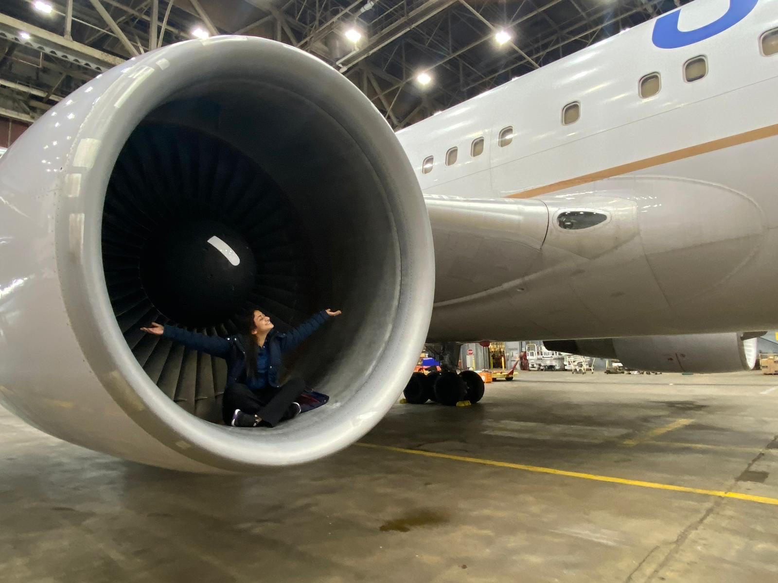
Runway modeler: Airport architect Sameedha Mahajan on sending ever-more people skyward
Sustainability
Delaney Rebernik|Books
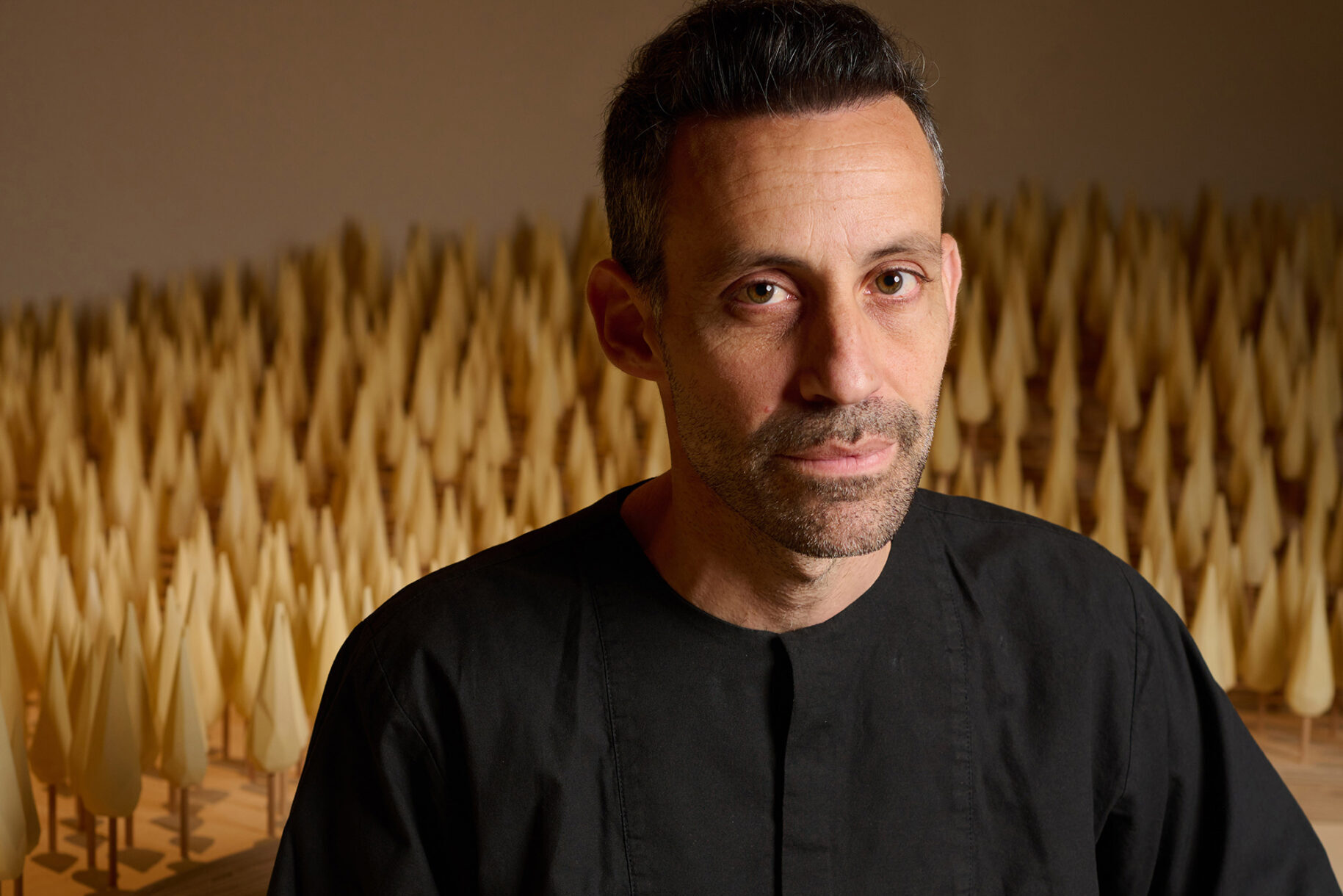
Head in the boughs: ‘Designed Forests’ author Dan Handel on the interspecies influences that shape our thickety relationship with nature
Recent Posts
“Dear mother, I made us a seat”: a Mother’s Day tribute to the women of Iran A quieter place: Sound designer Eddie Gandelman on composing a future that allows us to hear ourselves think It’s Not Easy Bein’ Green: ‘Wicked’ spells for struggle and solidarity Making Space: Jon M. Chu on Designing Your Own PathRelated Posts
Design Juice
Rachel Paese|Interviews
A quieter place: Sound designer Eddie Gandelman on composing a future that allows us to hear ourselves think
Design of Business | Business of Design
Ellen McGirt|Audio
Making Space: Jon M. Chu on Designing Your Own Path
Design Juice
Delaney Rebernik|Interviews
Runway modeler: Airport architect Sameedha Mahajan on sending ever-more people skyward
Sustainability
Delaney Rebernik|Books