
March 28, 2017
I’m With Her
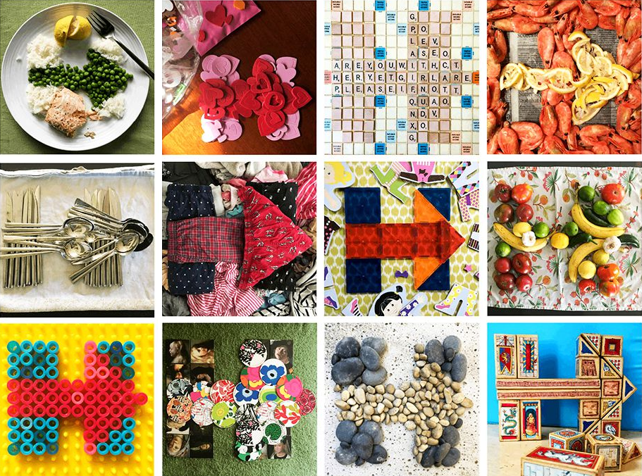
From “Ten little girls who are ready for the first woman president,” hillaryclinton. com, November 2, 2015.
November 2016
It was going to be the most thrilling night of my life. As I walked the darkening streets of midtown Manhattan toward Jacob Javits Convention Center, from blocks away I could glimpse an enormous image on the JumboTron over its main entrance, a forward-pointing arrow superimposed on a letter H. After an endless series of queues and checkpoints, I found myself about fifty feet from the venue’s main stage, VIP credentials dangling from my neck. I was surrounded by a happy throng of people who, like me, were there for one thing: to celebrate the election of the first woman president of the United States.
I had never been to a political victory party before. Like everyone else, I knew that nothing was a sure thing. Indeed, the previous weeks had brought more nail-biting revelations and abrupt reversals, capping off a grueling campaign that had been anything but easy. Yet the mood in the crowd was optimistic, even giddy. Everyone claimed to have inside information: exit poll results from contested demographics, early vote totals from swing states, all of it adding up to a Hillary Clinton landslide.
And everywhere I looked was that H logo: on badges, buttons, stickers, T-shirts, and totebags; on directional signs and video monitors; and ablaze on a giant screen that hung above the stage. It was on that stage that we expected to see our candidate before the night was over, arms raised in victory beneath an emblem that I had designed.
The night ended sooner than I thought, and differently than everyone expected. Going home, with my necktie with its pattern of H logos loosened around my neck, embarrassed by my hubris and worried about the future of our nation, I tried to figure out what had gone wrong.
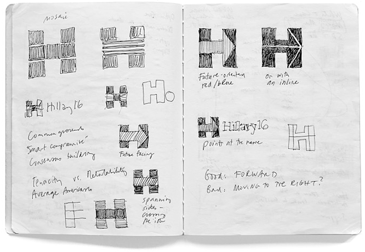
Michael Bierut, concept sketches for Hillary Clinton campaign logo, January 2015.
January 2015
Almost two years before, I was invited to volunteer my services on a secret project: the design of a logo for the possible presidential bid of the former First Lady and Secretary of State Hillary Rodham Clinton. I was excited. I had never met Secretary Clinton, but I liked her when she was my senator and I was impressed with her performance as Secretary of State. I had assumed she’d be the candidate in 2008, until Barack Obama had come along. Eight years later she was even more qualified. This was a historic moment. I said yes immediately.
I put together a three-person team: me, designer Jesse Reed, and project manager Julia Lemle. We would work in secret for the next two months. Our first meeting with the Clinton team began with a simple statement: “Our candidate has 100 percent name recognition.” There is a well-known marketing principle that is often credited to midcentury design legend Raymond Loewy. He felt that people were governed by two competing impulses: an attraction to the excitement of new things and a yearning for the comfort provided by what we already know. In response, Loewy had developed a reliable formula. If something was familiar, make it surprising. If something was surprising, make it familiar.
That same principle applies to political campaigns. In 2008 Sol Sender, Amanda Gentry and Andy Keene were faced with the challenge of branding a candidate who had anything but name recognition. Barack Obama’s design team responded with a quintessentially professional identity program, introducing—for the first time—the language of corporate branding to political marketing. Obama’s persona—unfamiliar, untested, and potentially alarming to much of the voting public—was given a polished logo and a perfectly executed, utterly consistent typographic system. In short, they made a surprising candidate seem familiar.
We faced the opposite problem. Our candidate was universally known. How could we make her image seem fresh and compelling?
Things had changed in the intervening years. For the Obama team, digital communications meant websites and email. Now the world was dominated by Facebook, Twitter, and Instagram. Voters had become accustomed to broadcasting their own voices and making direct connections. To work in this environment, whatever we designed would have to be concise and efficient, capable of standing out on a tablet, a phone, or a wristwatch.
One more thing was different now. In 2008 the Obama team had found themselves customizing their logo to appeal to different groups: veterans, teachers, the LGBT community. Looking back, some of these graphic adaptations seemed forced to me. With its concentric circles, its curves and gradations, the Obama mark was handsome but complex. It already looked finished. I began thinking about a logo that was the opposite: simple, open-ended, something that would invite participation.
The Clinton team shared our ambition to create something new and different, and in the weeks that followed, that’s what we tried to develop. The candidate had used traditional serif typography in her previous campaigns. We all agreed on a clean, bold sans serif, which its designer, Lucas Sharp, agreed to customize and make available to the campaign for free. Barack Obama’s favored all capitals. We recommended upper and lower case: friendlier, more conversational.
And although we explored dozens of symbols, the one everyone gravitated to was the simplest of all: a perfectly square H. But its simplicity was deceptive. What looked like an H was really a window, capable of endless transformations. It could contain pictures and colors, patterns and motifs. Because so much communication for the campaign would happen digitally, the logo could change at a moment’s notice. It could be customized not just by various interest groups, but by individual supporters. It was the ultimate dynamic identity system. Still, we worried that the H alone, even as an ever-changing frame, was too static. We finally found what we thought was the right finishing touch, the simplest thing in the world: an arrow, emerging naturally from the geometry of the letterform, pointing forward, toward the future.
It wasn’t clever or artful. I didn’t care about that. I wanted something that you didn’t need a software tutorial to create, something as simple as a peace sign or a smiley face. I wanted a logo that a five-year-old could make with construction paper and kindergarten scissors. Finally, the time came to present the logo directly to Secretary Clinton.
I witnessed firsthand what so many called Hillary Clinton’s greatest skill. She was one of the best listeners I’ve ever met. Walking into the meeting, I knew that a session with the logo designer had to be among the most trivial subjects on her schedule that day, or maybe that week. Yet she gave me her full attention, asked thoughtful questions, and—despite her claims that she wasn’t “an art person”—spotted a few weak points in our presentation I’d hoped no one would notice. Even more surprising was the call I received the next day. Secretary Clinton thanked me warmly for our work, elaborated on a few points from the day before, and added some new thoughts. There was really no need for her to do this personally, but she did it. She was brilliant and genuine. I had never had the chance to evaluate a future president firsthand. I was sure the country would be in good hands.
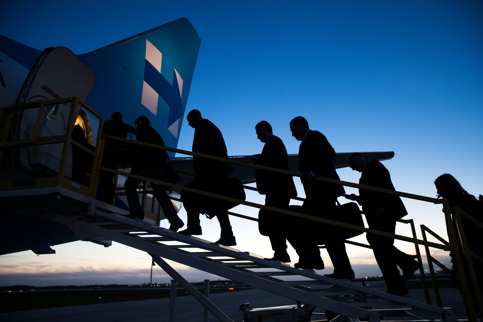
Hillary for America staff and press boarding campaign plane (Doug Mills/The New York Times).
April 2015
On Sunday afternoon, April 13, 2015, Hillary Clinton officially announced her candidacy for president of the United States. It was an open secret by then that she was going to run. Every television news organization was standing by for the announcement.
I had not heard from the campaign in weeks. We had completed our work more than a month before. I knew there had been internal controversy about whether our direction was the best and that other firms had been invited to contribute ideas. At times I had reconciled myself to being dumped, despite the candidate’s initial enthusiasm. (I would be disconcerted more than a year later when exchanges debating the merits of our work showed up, of all places, in the midst of the vast trove of emails published by WikiLeaks.)
The announcement came in the form of a two-minute video. It began with ordinary Americans talking about their plans, about making new starts. Then, wearing a red and blue suit, the candidate appeared and said she too was starting something: her campaign for president. Finally, at the end, there it was: a skillful animation, the H built from the faces from the video, the arrow entering from the left, resolving into a red-and-blue version of the never-before-seen Hillary for America logo. The colors, red and blue, matched the candidate’s suit. Or perhaps it was the other way around. What we had been working on in secret was suddenly public. It was really happening.
Then, within minutes, the social media reviews started coming in. “So what lucky third grader won the Design the Hillary Clinton Campaign Logo contest?” “Hillary’s logo was clearly designed in PowerPoint by a PowerPoint user.” (This is a deep insult for a graphic designer, for reasons not worth explaining.) People said the logo reminded them of a sign for a hospital, or the Cuban flag, or, in more extreme cases, of swastikas or the destruction of the Twin Towers. The fact that the logo was really the only new thing of significance in the announcement video made it an irresistible target for pundits. The red arrow pointing right—what did that mean about the campaign’s strategy? Then followed the think pieces. “The internet freaks out over Hillary Clinton’s campaign logo.” “Design experts trash Hillary Clinton’s new logo.” “Why everyone went nuts over Hillary Clinton’s new logo.” It all reached a surreal peak when I got an email from a writer for a prominent magazine. “So I’m sure you’ve seen the Hillary logo hysteria,” he wrote. “I think it’s a case where—and you may disagree—the internet is kind of getting it right. I think it’s a train wreck.” I was then asked to participate in an invitation-only contest to redesign my own logo. I declined.
I had already designed several controversial projects in the age of instant Twitter reviews, but nothing prepared me for this. As New York magazine said, “Basically, Hillary secretly gave America a Rorschach test, and the results are terrifying.” After consulting with the campaign, we agreed to adopt a no-comment policy about the logo. I held my tongue. The country had bigger issues to deal with. Nonetheless, perhaps because I was the only designer in the world who didn’t seem to have a public opinion about it, its authorship soon became common knowledge.
It isn’t pleasant to have talk show hosts making fun of your work on national television. And there was something all so gleefully vicious about it. It was just some simple geometric shapes and a couple of primary colors, yet it seemed to drive so many people crazy. My wife Dorothy helped put things in perspective. “Maybe,” she said, “this isn’t really all about your little logo.” Through it all, I was heartened by the resolve of the team at Clinton campaign headquarters. They were confident in the work and told me they had no intention of abandoning it. And we all knew something the world didn’t know: that the red and blue logo was just the start.
The potential of the identity system wouldn’t be revealed until a few weeks later, as the Supreme Court prepared to hear oral arguments in Obergefell v. Hodges to determine the legality of same-sex marriage. On April 28, the campaign changed the logo on all its digital platforms to the rainbow colors of the LGBT movement. As we’d hoped, the world noticed. This transformation opened the door to more and more versions of the H and arrow combination. “It’s kind of becoming the Empire State Building of presidential campaign logos,” said a writer at NPR’s website, “changing colors to celebrate any variety of milestones and holidays, from pink for breast cancer awareness to red, white and blue for Memorial Day to ‘pastel fades’ for Easter.” A month and a half later, the idea of this dynamic symbol had taken hold. “It’s official,” declared Quartz. “Hillary’s logo is actually perfect.”

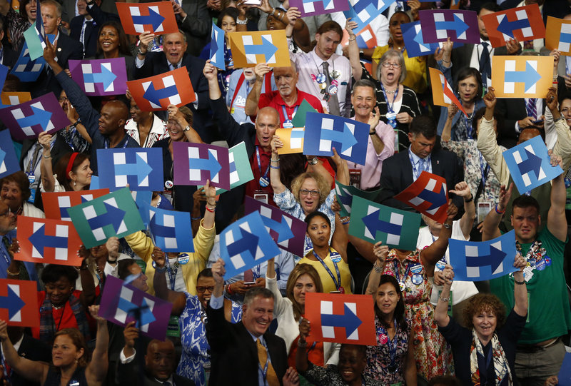
Delegates from New York hold signs in support of Hillary Clinton during the Democratic National Convention in Philadelphia (Andrew Harrer/Bloomberg via Getty Images).
July 2016
The moment had come at last. At the Democratic National Convention in Philadelphia, Hillary Clinton was to become the first woman candidate for president of the United States. Much had happened since she had announced her candidacy fifteen months before, so little of it foreseen: an unexpectedly hard primary fight, the emergence of the unlikeliest of Republican opponents.
A former colleague, Jennifer Kinon, was appointed Hillary for America’s full time design director and built an extraordinary team that worked tirelessly to ensure that the campaign’s message was being communicated consistently and creatively on every available channel: microsites, videos, GIFs, hashtags. The grassroots slogan #ImWithHer—with the now familiar logo serving as the H—was ubiquitous. And the design team’s powers were on full display in Philadelphia, minute by minute, night after night. The H-plus-arrow logo was everywhere. Every sign in the convention hall bore the campaign’s signature typeface, perfectly sized, perfectly spaced. As only an obsessive graphic designer would, I noted with satisfaction the placards that greeted Bernie Sanders in Philadelphia the night he rose to call for unity on behalf of the party’s candidate. His graphics had been almost random during his grassroots campaign; that night, Sanders faced a sea of signs bearing his name, not in Clarendon, the closest thing to a standard his team had managed to achieve, but in Unity, the Clinton font. In a concession to his staying power, a silhouette of a bird topped the lowercase i. Like everything else, it was perfect.
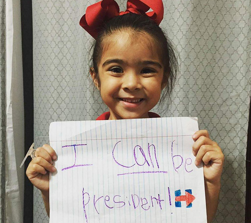
As the campaign moved into its breathless final weeks, Hillary’s supporters took her graphic identity as their own. The simple geometry of the H-plus-arrow was reproduced in thousands of forms: arrayed in patterns of seashells on the beach on Labor Day, carved into pumpkins on Halloween, stacked in beer kegs in Milwaukee, embedded in the state’s name in Ohio. The underground army of supporters who called themselves Pantsuit Nation made the logo its own. Voters posted every possible rendition online: hand drawn, crocheted, scrapbooked, appliqued. My favorites were the ones from kids. It turned out the critics were right: your five year old could do this logo.
Then there was Donald Trump. Bad typography; amateurish design; haphazard, inconsistent, downright ugly communications. When the Trump / Pence monogram was mocked for its how-did-they-miss-that salaciousness, their campaign team committed the ultimate act of weakness: they blinked and took it down without comment. The Republican convention was a gruesome and tawdry spectacle. And everything was topped off with nothing more than a red hat with a badly kerned, caps-locked slogan.
Later, filmmaker Michael Moore pointed out that where he came from, the industrial Midwest, people didn’t care about polling data or carefully calibrated social media campaigns, but they did wear baseball caps. He saw it coming. I did not.
Hillary logo variations by supporter Karen Todd.
January 2017
In many ways, going to design school is all about surrounding yourself with a beautifully crafted bubble. At least it was for me. Most normal people don’t know or care about custom typography, the fine distinctions between nearly identical colors, dynamic graphic identity—any of that stuff. Growing up in the rust belt, just like Michael Moore, I certainly didn’t. With each class assignment, with each studio critique, I became more skilled as a designer and I became further from normal. Moving to New York put me at the center of a highly specialized profession practicing what would have seemed to my old friends in Ohio like a hopelessly esoteric brand of black magic.
As we worked on the campaign, it never occurred to us to be anything less than perfect. (As our campaign contact Teddy Goff observed much later, to be imperfect would have been inauthentic to our detail-obsessed candidate.) During the height of the primary battle, Lindsay Ballant, a Bernie Sanders supporter, wrote a perceptive critique that compared the graphics of the two campaigns. “While Hillary’s visual campaign is inarguably successful by all traditional design principles, it’s also calculated, expected, and contrived,” Ballant wrote. “It reinforces the perception of establishment status, which is one of the main criticisms of her as a candidate. One of the consequences of a campaign so tightly controlled is the campaign feels so tightly controlled.” In contrast, the design of the Sanders campaign had the homespun charm one associates with do-it-yourself craft sites like Etsy. They looked and felt authentic. When I read this in the spring of 2016, I had to admit she was onto something.
On the other hand, Donald Trump’s graphics were easy to dismiss. They combined the design sensibility of the Home Shopping Network with the tone of a Nigerian scam email. Like so many other complacent Democrats, my only question was: Why is this even close?
Armies of smart people generated oceans of words in the aftermath of the election trying to figure out what happened. Talented pundits and strategists and pollsters, all masters of their craft, were wracked with self-doubt. I too wondered if the very thing I was so good at had somehow betrayed me. We had spent months developing a logo; Trump had spent years building a brand. Had Trump won not in spite of his terrible design work, but because of it?
The day of Donald Trump’s inauguration, I was on an Amtrak train to Washington, DC. Dorothy had made plans to attend the Women’s March as soon as she heard about it. The car we were in was almost all women. And everywhere we looked, we could see pink, the knitted hats with cat ears that would become the defining image of the March. The next day, we found ourselves in a crowd that seemed to stretch for miles in every direction. A forest of homemade signs became a display of wit, imagination, and passion that instantly went viral on social media. None of them matched, and all of them were beautiful. There was only one element of consistency. Those homemade Pussyhats—which began as a three-woman project in a Los Angeles knitting class and became a national cottage industry that produced more than a hundred thousand hats in a matter of weeks—were so ubiquitous that they turned every photograph of the throng into a sea of pink. There was no guidelines manual, no design direction. Instead, here was something thrilling: individual creativity in the service of collective solidarity.
I still believe in Hillary Clinton, and I am prouder than ever of the work we did for the campaign. In that vast crowd in Washington, I wore the same blue-on-blue H-plus-arrow button I did on election night. I knew how to do something, and I was good at it. But that day I realized I was just one voice among many. The future will not depend only on experts drawing the battle lines, but on the courage and enthusiasm that each of us can bring to the fight.
We are in uncharted territory now, and it is at once frightening and exhilarating. Frightening because we face extraordinary challenges. Exhilarating because I believe, more than ever, in the power of design. It can provide comfort in the face of devastating change, and it can shake us out of our complacency when action is demanded. And now, more than ever, at the moment we need it most, it belongs to all of us.
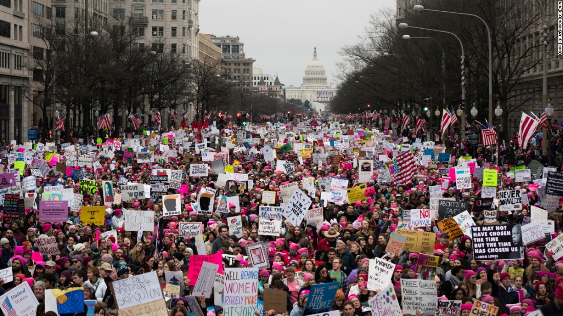
Women’s March on Washington, February 21, 2017 (Mark Kauzlarich/CNN).
Observed
View all
Observed
Share on Social
By Michael Bierut
Related Posts
Innovation
Ashleigh Axios|Essays
Innovation needs a darker imagination

Business
Kim Devall|Essays
The most disruptive thing a brand can do is be human

AI Observer
Lee Moreau|Critique
The Wizards of AI are sad and lonely men

Business
Louisa Eunice|Essays
The afterlife of souvenirs: what survives between culture and commerce?
Related Posts
Innovation
Ashleigh Axios|Essays
Innovation needs a darker imagination
Business
Kim Devall|Essays
The most disruptive thing a brand can do is be human
AI Observer
Lee Moreau|Critique
The Wizards of AI are sad and lonely men
Business
Louisa Eunice|Essays