December 31, 2009
What Does Critical Writing Look Like?

Part of the Critical Writing in Art & Design display at the Royal College of Art degree show, London, 2012
Last Friday the first cohort of students graduating from the Royal College of Art’s two-year Critical Writing in Art & Design MA presented their final projects at an evening symposium at the college. It was an enjoyable occasion and an opportunity to see early signs of the direction this unique course, open to writers coming from art or design or both, is taking. I was appointed visiting professor to Critical Writing during the past academic year, but my contact to date has been with the first-year students. Consequently, I was encountering the second-years’ projects with the same freshness as other interested listeners in the audience.
Still, I’m hardly impartial when I say that the span of topics, ranging from “Design and Politics” to an oral history of Semiotext(e)’s 1975 Schizo Culture conference, was impressive and nicely balanced between art, design and “indeterminate.” In the indeterminate camp was the presentation I enjoyed most by Natalie Ferris, who had previously studied English at Cambridge. Her subject was the radically experimental writer and critic Christine Brooke-Rose, who died in March this year just as Ferris was on the verge of meeting her in France in the course of her research. Ferris’s absorbing account immediately brought to mind the visual writing of B.S. Johnson, except that Johnson — subject of a full biography in 2004 — is a reasonably well-known figure, while Brooke-Rose is, in Ferris’s words, “deplorably neglected.” I had never heard of Brooke-Rose either. So convincing was this introduction, with illustrations of the author’s complex, conundrum-like typographic narratives, that I immediately felt the wince of private embarrassment that always attends these far too belated discoveries. Ferris has also written a short appreciation for the Guardian website.
In the RCA degree show, which runs until July 1, the Critical Writing students have a group display and it’s possible to pull up a seat and dip into their writings. Some of the final projects are screen-based — there’s a smartphone app about public art in London and websites devoted to a dictionary of design concepts and an educational resource for art teachers — but the outcome for most projects is a booklet. In deciding how best to embody their words for public presentation, all the writing students have to reach some kind of accommodation with typography and design. This might seem peripheral to a writing course and it isn’t part of the examination, where the students present their work as a standard academic manuscript. (If their project is an app or a website, they also submit a document describing its form and content.) After this, they have around six weeks to produce a displayable representation of their work for the degree show.
Some students already possess advanced design skills. Graphic designer Elizabeth Glickfeld’s Design Work Book, for instance, features some accomplished picture research and editing of photographs of designers in their workplaces. Some students have done their own thing, to mixed effect. Others have brought in designers to give form to their material. A particularly engaging collaboration can be seen in two matching booklets designed by RCA Visual Communication student Neringa Plange for Peter Maxwell’s project Almost Nothing about Mies van der Rohe’s unrealized proposal for the Mansion House Square building in London. Maxwell’s bravura discourse — his “critical fiction” tries to write the phantom building into being — gains added authority from perfectly measured columns of professional-looking type and a smoothly integrated picture section that meets the layout standards of an architectural monograph.
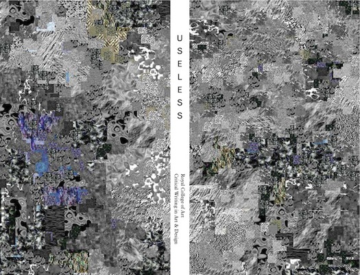
Front cover, back and spine of Useless by the Critical Writing in Art & Design students, published by RCA, 2012.
Source: Manystuff
The same design savoir faire is on display in Useless, a paperback collection of writings by the graduating students ably configured by another RCA Visual Communication designer, Pedro Cid Proença. The text typography is eminently readable, the Dutch printing and binding are nifty (the book sits and flips comfortably in the hand), and the essays are adroitly intercut with black pages on a coated stock, which carry an illustrated “User’s Guide to Oxymoronic Machines” in a sequence of short sections. Useless had its own launch event and its playful clevernesss sets a high standard of editorial polish and production for future publications from Critical Writing. If the aim is to publicize these writers and attract potential hirers and commission-givers, then readability is everything. It was an odd decision, though, to go for a wordless front cover; that might work for Pink Floyd or Martin Amis, but I’m not sure it was a great idea for a new writing course hoping to find an audience in the bookshops.
What this shows (though we already know it) is that design and production are inextricably linked to writing. This relationship doesn’t impinge greatly when reading drafts in the seminar room, though in a recent writing project with the first years I was struck by the unrequired extra effort some had put into designing their pages. When the writing and editing is done, at the crunch point of delivery in the hoped-for reader’s hands, writing will always be mediated by design, and the quality of that mediation is a factor in how the writing will be perceived, consumed, or perhaps disregarded, if the design fails to make an adequately appealing case for the words it channels. This is not to suggest that a writing course should attempt to take on the concerns of a graphic design course, at least not in any formal sense. But the issue of how best to embody the writing will always arise in the end. The obvious answer, where the critical writer is not an experienced designer, is to develop close working partnerships between the writing students and students from the Visual Communication course, which happened in some of this year’s most effective projects. This collaboration will be vital later in professional contexts, particularly when dealing with visual subject matter, and both sides of the partnership have a great deal to gain.
See also:
Another Design Voice Falls Silent
The House That Design Journalism Built
Observed
View all
Observed
Share on Social
By Rick Poynor
 Rick Poynor is a writer, critic, lecturer and curator, specialising in design, media, photography and visual culture. He founded Eye, co-founded Design Observer, and contributes columns to Eye and Print. His latest book is Uncanny: Surrealism and Graphic Design.