
September 5, 2012
A Life in Letters

Elegantissima by Louise Fili (Princeton Architectural Press)
Editor’s Note: Elegantissima by Louise Fili (Princeon Architectural Press, September 5, 2012) is the first monograph on her work, covering the breadth of her nearly forty-year design career. The following is excerpted from Elegantissima with permission of the publisher.
I can never, ever forgive my parents for having the bad judgment to leave Italy and come to America. The final indignity was that I was born in New Jersey and had to spend the rest of my life getting as far away as possible from the Garden State. My first trip to Italy was a typographic and gastronomic epiphany: quite simply, everything looked, tasted, and sounded better in Italian.
I was sixteen when I traveled with my family for the first time to bella Italia. As I recall, immediately upon arriving in Milan, in the haze of jet lag and the oppressive July heat, I was struck by a billboard featuring an art nouveau rendering of a couple in a passionate embrace against an inky night sky, with just the words Baci and Perugina. I knew that baci meant kisses, though I didn’t even know what product this advertised. It didn’t matter. The woman was clearly in a swoon, and so was I. This was the pivotal moment when I fell in love all at once with Italy, type and food. Whenever I see the iconic Baci package (though it has been ruthlessly updated over the years), it still makes me smile.
Even before I knew what graphic design was, I knew it was something that I wanted to do. This term was hardly in use at that time; it was known instead as the very unsexy commercial art. In the same summer that I traveled to Italy, I sent away for an Osmiroid pen advertised in the back of the New Yorker magazine and taught myself calligraphy; I would soon be running a relatively lucrative business making illuminated manuscripts of Bob Dylan lyrics for classmates.
I went on to attend Skidmore College, where anyone who couldn’t paint was labeled “graphically oriented.” I learned typography by getting my hands dirty. I set metal type, and, predictably, my senior project was a hand-lettered Italian cookbook.
Fast-forward to New York City, where I undertook a brief semester at School of Visual Arts (SVA), an internship at the Museum of Modern Art, and a stint at a small design studio before landing at Alfred A. Knopf, where I designed illustrated books.
On my twenty-fifth birthday, I was hired as a senior designer by the legendary typographer and art director Herb Lubalin. How did I get the job? I happened to walk in on a day when someone had just given notice. (Once I started working there, I became aware that this was his modus operandi.) The Lubalin studio was a typophile’s dream. The attention given to letterforms was unlike anything in my experience. And with my office located in close proximity to Herb’s, I was able to continually witness his work process. Watching him sketch out a design was mesmerizing, and choosing colors with him was almost comical. Herb was color-blind; we would leaf through a Pantone book together and he would say, “Let’s find a nice red.” Unfortunately, we would be looking at the green pages. Did I dare say something, or just let him choose? His preference for Pantone 452 was perfectly understandable; it was a totally neutral shade that allowed type to both surprint and drop out. Even though one of my reasons for joining Lubalin had been to get away from designing books, that turned out to be what I enjoyed most. This may have had something to do with one client, notorious art director Harris Lewine. Brilliant and brash, this Gauloise-smoking Humphrey Bogart doppelgänger had already been fired from half the publishing companies in New York; the other half had caught on and would have nothing to do with him. I designed jackets for him during his tenure at Harcourt Brace Jovanovich, his last employer. As an art director, Harris knew how to get the most out of designers — pointing them in the right directions and leaving them alone. His encyclopedic grasp of design history opened new doors for me, and his take-no-prisoners approach to dealing with editors was one that I adopted (and adapted) when I later became art director of Pantheon Books. My position was unusual: although employed by Lubalin, I enjoyed relative autonomy to work directly with Harris. I was also somewhat of a renegade at the studio; while others were cramming type together as closely as possible, I had discovered something called letterspacing. After two years, Herb decided to relocate the studio to a converted firehouse, which would cost me my private, sun-filled office. I took this as a sign to move on.
Bob Scudellari, my former boss at Knopf/Random House, mentioned that there was a staff position opening up. I half-jokingly asked if my office would have a southern exposure. He said yes. I took the job.
Pantheon, an imprint of Random House, was distinguished by its extremely mediocre jackets. It was hard to take the books seriously, although closer inspection revealed a roster of very respected European authors. The art director whom I was about to replace took me aside, inmate-style, and somberly offered one piece of advice: “Every editor has a favorite color.” After I had settled into the job, one of the editors asked me, “Why did your predecessor have to use the same vomit brown for all of my covers?”
As a colleague explained to me, “My editors have bad taste. Yours have no taste.” I had a more-or-less blank slate, so why not make the most of it? I immersed myself in book covers. I visited bookstores obsessively, constantly asking myself how I could improve on what was current in the industry. Did a cover really need to scream to be noticed? I didn’t think so. Little by little, I introduced change to every aspect of jacket design. I rejected traditional Pantone colors, opting to use paint chips from hardware stores — to the consternation of my printers. I also cut deals with the production department, like trading an extra color for an unusual paper stock. Book buyers began to take notice.
Given my Lubalin training, I automatically thought of the book jacket first in terms of typography. Without even realizing it, I was designing the title like a logo. Hand-lettering that made reference to vintage type specimens, alphabet books, and other sources allowed me to create unique type treatments. Of course, my appreciation of design history had a perfect outlet in Pantheon’s Euro- centric list. I traveled to Italy and France at least twice a year to seek new inspiration, combing flea markets and bookstores, photographing restaurant and shop signage, and collecting food packaging.
My office became a graphics test kitchen where I could experiment with a different period of type history every day. I began to find my own design voice. In addition, I had the opportunity to work with a talented group of illustrators, photographers, designers, letterers, and retouchers who helped bring my designs to life.
In my eleven years at Pantheon, I brought in just one book for publication. I am happy to say that it was this one: Maus, by Art Spiegelman. When the editors wrung their hands and worried, “How can we sell a comic book on the Holocaust?” I said, “It’s not a comic book. It’s a graphic novel.” (This was a design genre that had just started to emerge.)
Two thousand book jackets later, in 1989, I opened my own studio, Louise Fili Ltd, making a conscious decision to focus on my passions for food, typography, and all things Italian. As I already had a client base from my very active freelance work for publishers, I didn’t really need to look for work, but my goal was to diversify. I knew that if I tried to survive on book jackets alone, my future would be limited, so I took a chance and entered the curious world of restaurants. My first projects soon taught me that this realm was the polar opposite of publishing; I found myself dealing with clients who were just short of gangsterdom. (Allow me to illustrate: when I mentioned some difficulties I was having with another client, a restaurateur grabbed me by the shoulders, looked at me, and said, “Louise, what did you go to a lawyer for? Why didn’t you come to me?” I realized that [a] he wasn’t kidding, and [b] these are the first words uttered by Don Corleone in The Godfather.) This was a different world, indeed. On the other hand, I always had a table.
Do you have to be crazy to open a restaurant in New York City? No, but it can’t hurt. After I began to collaborate with architectural firms specializing in restaurants, however, I started to work with more reliable clients.
While designing restaurant identities expanded my work from paper and ink to more tactile materials, creating food packaging brought it literally into a new dimension. Once again, it was a trip to Italy that inspired me to make this transition. It all started when I uncovered a cache of vintage packaging — but more about that later.

I am very fortunate that my life and work are now one and the same. My studio is a walk-in archive of all the restaurant menus, business cards, matchbooks, and specialty food packages I have designed, as well as the many posters and flea market finds from decades of traveling in Italy and France. Surrounded by objects that I treasure, I always feel at home, and in this environment I am routinely transported to Europe. This is a workplace where I feel just as comfortable cooking lunch for staff or clients as I do designing. In addition to limiting the scope of my work, I also tend to gravitate to smaller businesses, which affords increased creative control as well as more intimate relationships with clients. Here is a perfect example: one morning, I arrive at my studio to a phone call from Mary Kocy, my client at Rusk Renovations, who is desperately trying to get a reservation at Sarabeth’s for brunch that Sunday. As it happens, Sarabeth Levine herself is due in shortly for a meeting. Then one of my assistants brings me the news that we have no hot water in the studio. I call the landlord, who informs me that it is my responsibility to call a plumber. Call a plumber?! Next, in walks Sarabeth. She is devastated that she cannot find someone to publish her cookbook. I call a publisher I know and make an appointment for her. The grateful Sarabeth asks how she can return the favor. “Can you make a reservation for a client of mine for Sunday brunch?” “Of course!” I call Mary with the good news. “And by the way, could you send a plumber over here?”
Observed
View all
Observed
By Louise Fili
Related Posts
Design Impact
Ellen McGirt|Books
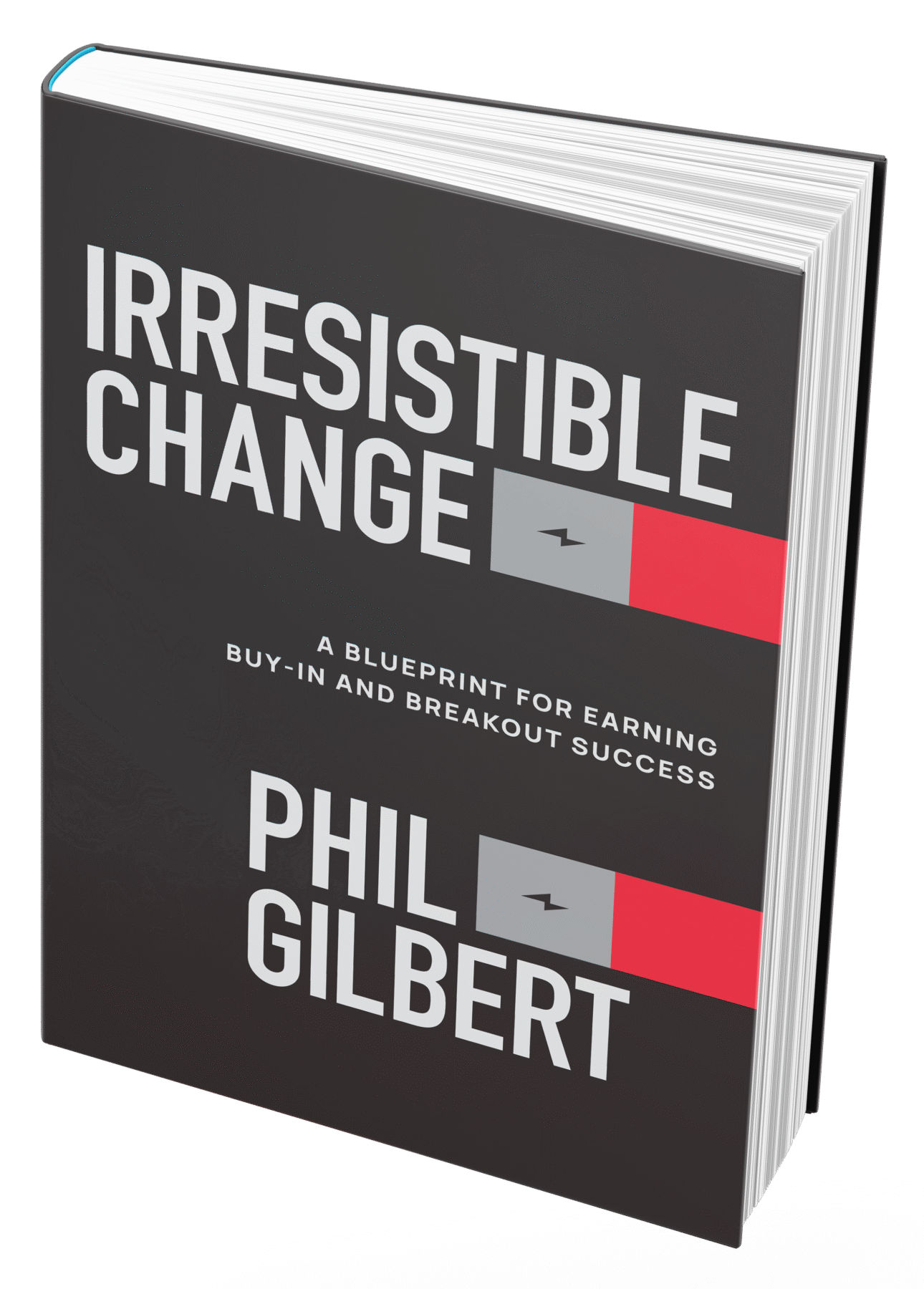
No mandates, only opportunities: IBM’s Phil Gilbert on rethinking change
Education
The Editors|Books
Your October reading list: The Design of Horror | The Horror of Design
Innovation
Vicki Tan|Books
How can I design at a time like this?

AI Observer
John Maeda|Books
Should we teach AI to reflect human values, emotions, and intentions?
Related Posts

Design Impact
Ellen McGirt|Books
No mandates, only opportunities: IBM’s Phil Gilbert on rethinking change

Education
The Editors|Books
Your October reading list: The Design of Horror | The Horror of Design

Innovation
Vicki Tan|Books
How can I design at a time like this?

AI Observer
John Maeda|Books

 Louise Fili designs specialty food packaging and restaurant identities, and is pazza for tins that speak Italian. Her most recent book, with Steven Heller, is