July 27, 2011
Andrzej Klimowski: Transmitting the Image

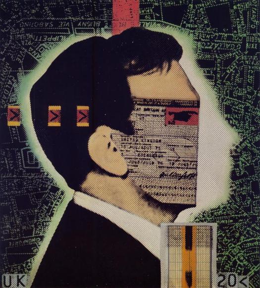
Andrzej Klimowski, “Whose computer reads your passport?” Illustration for cover of New Scientist, January 5, 1984
Andrzej Klimowski has long held a special position in British graphic design and illustration. His outlook, artistic frames of reference and manner of making images bring together influences from both Britain and Poland. Of the two nations, it has often seemed to be the Polish sources and experiences that most durably define him.
Klimowski was born in London, in 1949, to Polish émigrés, grew up in the UK and began his art education by studying painting, sculpture and graphics at St. Martin’s School of Art (now Central Saint Martins). In 1973, he moved to Warsaw to study poster design at the Academy of Fine Arts under the legendary professor and poster designer Henryk Tomaszewski, whose exacting methods and personal example were to prove a deep and lasting influence, although it is not a closeness one would be likely to detect from putting their posters side by side. After graduating Klimowski stayed on in Warsaw and before long had established himself as a poster artist, a profession that was highly esteemed in communist Poland, and enjoyed privileges to match.

Andrzej Klimowski, The Devils, theater poster, 1980

Andrzej Klimowski, The Removalists, theater poster, 1980
In 1980, not feeling ready to embrace a Polish destiny, Klimowski returned to Britain. But his Polish affinities — he maintains strong cultural ties with the country — remain the key to his art. Last year, he co-curated an exhibition about Roman Cieslewicz, another crucial influence on his work. These days, Klimowski is a professor himself, head of illustration at the Royal College of Art, and he recently published a small book titled On Illustration (in the Oberon Masters series), a gentle, likeable and at times curiously innocent meander around the subject that feels a lot like talking to the man. Klimowski, like one of the characters in his mysterious graphic novels, always manages to seem both grounded and slightly otherworldly at the same time.
Disarmingly, he announces on the first page that he has no clear theory or definition of illustration and admits that when asked to speculate about the future of the discipline he struggles to form a view. Only gradually, he says, did he begin to think about where he stood in relation to contemporary debates in art and design. In his art, though, Klimowski is anything but vague: “absorbed in his own graphic universe” would be a more accurate way to put it. It’s rare to feel that an illustrator — a practice occupationally constrained by the limits of the commission — has been able to use the medium to create a compelling alternative reality fully equal to other art forms, while also staying true, over the years, to the evolving internal principles of a private imaginary world. Klimowski has done exactly that.
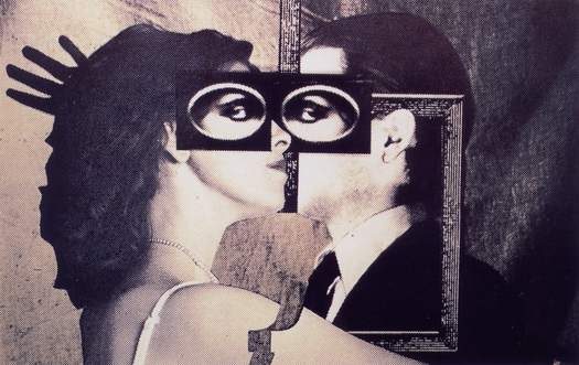
Andrzej Klimowski, Synapse, portrait of Klimowski and Danusia Schejbal, silkscreen of photomontage, 1983

Andrzej Klimowski, cover illustration for The Farewell Party, 1984
On Illustration addresses a change in Klimowski’s way of working that was already starting to happen in the mid-1990s when I profiled him for Eye, and has since proved to be a full-scale redirection of his graphic art. Klimowski’s Polish posters were based on montages of his own photographs, sometimes of his wife, Danusia Schejbal, combined with other photographic and graphic imagery. His command of graphic texture, contrast and gesture produced a tough, decisive, kino-fist style. Back in Britain, where the poster as an art form was moribund, he was obliged to turn to book covers, with only an occasional poster commission as a reminder of the full-intensity visual impact he could deliver given the chance. Even so, his style translated well into the new medium and he made an original and exciting contribution to British graphics, particularly in his covers for Faber and Faber.
By the mid-1990s, Klimowski was receiving fewer commissions of any kind and he concluded it was time to reinvent himself. The anyone-can-do-it image-fusions enabled by Photoshop made his photo-collage style seem less distinctive than before. “With the increasing and almost infinite possibilities of image manipulation offered by digital media, I consciously decided to move away from photography and embrace the limitations of the more traditional techniques of drawing, painting and printmaking,” he writes in his book.
Taking a defiant, low-tech step backwards, Klimowski began to produce linocuts distinguished by a bold, sinuous and sometimes erotic line. There had always been a strong narrative element and filmic atmosphere in his work — in Poland he made an enigmatic film, Dead Shadow (1980). In 1994, he executed his first graphic novel, The Depository: A Dream Book (1994), in a loose brush-and-ink style (a filmmaker turned it into an animation). Soon after the book appeared, he worked on illustrated introductions to Kant (1996) and Walter Benjamin (1998) and covers for plays published by Oberon, which became an important client. In the most unlikely development of his career, he then produced a big series of light-hearted linocut illustrations for popular period comedies by P.G. Wodehouse: well, an illustrator must eat. The covers might be nothing like the Klimowski we thought we knew — a denizen of a noirish, oneiric, fantastical middle Europe, where strange staircases promise unexpected revelations and an alluringly distant woman is always about to sprout a magnificent set of wings — but they are perfectly judged.
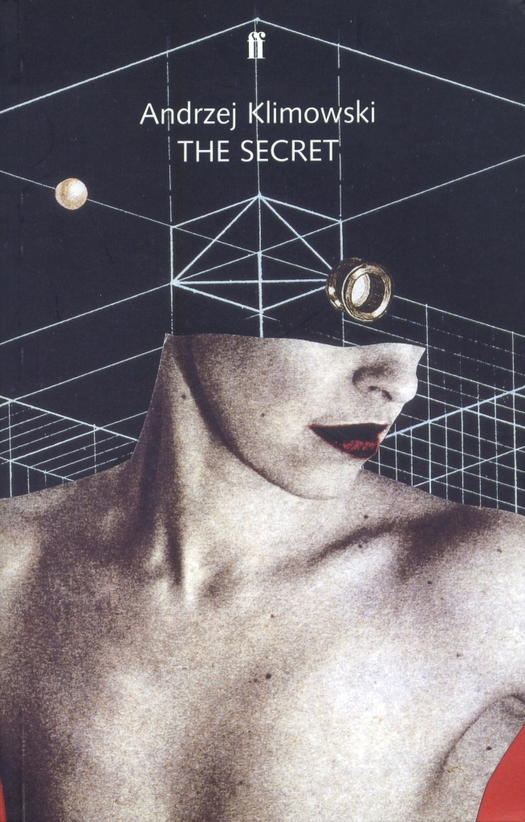
Andrzej Klimowski, cover illustration for his graphic novel The Secret, 2002
A second graphic novel, The Secret (2002), was a refinement of technique, a welcome synthesis of drawing and his earlier collage style, and a sign that Klimowski was totally serious about a change of direction that I can’t be the only one to have had doubts about at first. At that stage, though, he still tended to place a single, slightly undersized image on an otherwise empty page, and he seemed reluctant to embrace the full narrative, dramatic and compositional possibilities of the medium by uniting multiple panels on a spread in dynamic relationships.
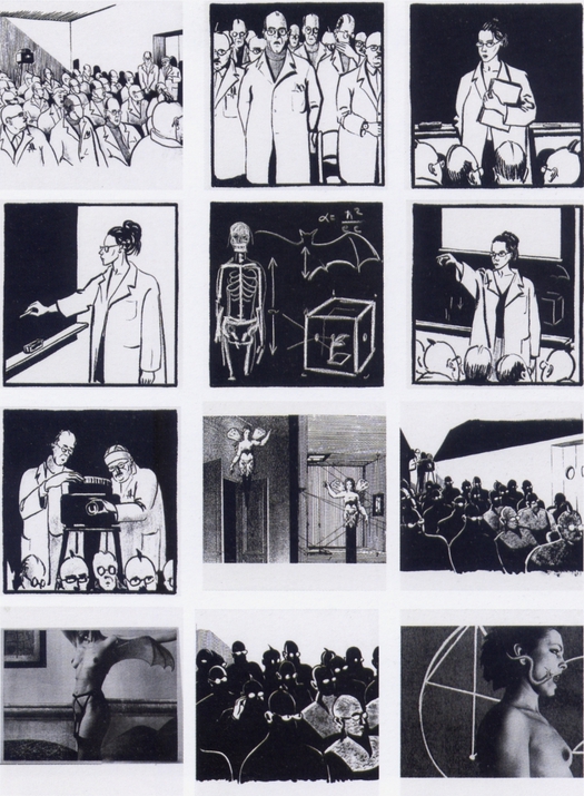 Andrzej Klimowski, sequence from The Secret (each image occupies a separate page or spread in the book), 2002
In the past decade, Klimowski has continued to pursue opportunities to work with narrative. His novel Horace Dorlan (2007) combines black-and-white linocuts with his own written text. He has also, in tandem with Danusia Schejbal, adapted two literary classics, Bulgakov’s The Master and Margarita (2008) and Stevenson’s Dr. Jekyll and Mr. Hyde (2009), into full-blown, multi-paneled graphic novels for the London publisher Self Made Hero. The pair are currently adapting and illustrating two stories about robots by the Polish science fiction writer Stanislaw Lem, a timely choice of material: Lem is a hugely original figure, an intellectual giant of international SF, who is less read now than he deserves to be. Klimowski continues to find his footing in the medium, energized by his collaboration with Schejbal (they each work on their own pages), and one senses that his, and their, most fully achieved and satisfying graphic novels could be yet to come.
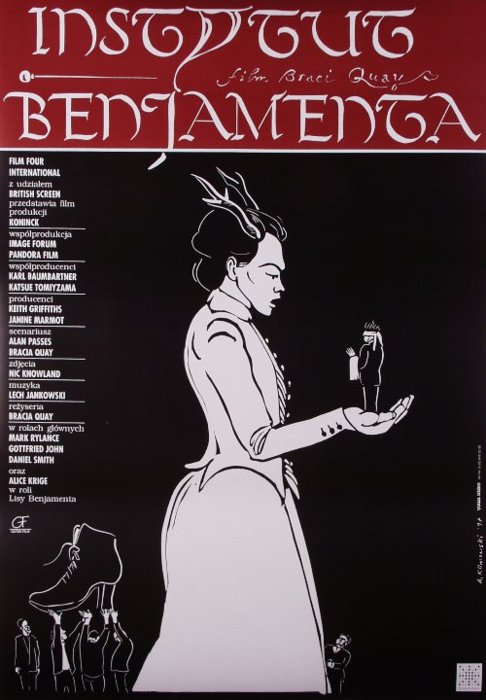
Andrzej Klimowski, Institute Benjamenta, film poster for the Quay Brothers, 1997
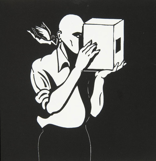
Andrzej Klimowski, The Secret, linocut, 2002
The closest this modest but dedicated graphic artist gets to offering a theory of what he does occurs in a section of On Illustration about Brno in the Czech Republic. I had included him in my exhibition Uncanny and Klimowski was in the city to speak at a conference (the book is loosely structured around cities). “I see the illustrator as a transmitter,” he writes, “one that receives messages and transforms them into images.” The source of these images is the unconscious and his own deep depository of obsessions. Klimowski is like the man peering into the box in the linocut above — or is it some kind of dream camera? — with his winged muse whispering secrets at his ear.
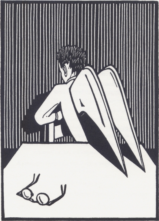
Andrzej Klimowski, Untitled (from On Illustration), linocut, 2010
Observed
View all
Observed
By Rick Poynor
Recent Posts
Runway modeler: Airport architect Sameedha Mahajan on sending ever-more people skyward The New Era of Design Leadership with Tony Bynum Head in the boughs: ‘Designed Forests’ author Dan Handel on the interspecies influences that shape our thickety relationship with nature A Mastercard for Pigs? How Digital Infrastructure is Transforming Farming and Fighting Poverty
 Rick Poynor is a writer, critic, lecturer and curator, specialising in design, media, photography and visual culture. He founded Eye, co-founded Design Observer, and contributes columns to Eye and Print. His latest book is Uncanny: Surrealism and Graphic Design.

