Is there anything less contemporary than a Christmas card? (As the daughter of a Jewish father I only send cards that read “Happy New Year!” but I call them Christmas cards anyway.) In my memories of childhood December brought a flood of two types of card: the folded kind, with a red or green background and Santa-snowmen-snowflakes-pine trees embossed in silver or gold; and the photo card, long and thin, with a white right-hand strip reading “Joy!” or “Happy Holidays!” from my parents’ graduate school friends, my aunts and uncles and cousins. The first kind sometimes had a school photo or a high amusing Xeroxed Christmas letter inside. The second kind simply was. As I became a teenager I began to make fun of the photos, which often featured matching outfits, one sulky family member, or wildly inappropriate out-of-season snaps.
Then the cards began to taper off. My mother can now count on two hands the number she receives but she, as a graphic designer, continues to send a card of her own design each year. They used to sometimes feature me and my brother. The year she welcomed two (!) grandchildren, they got pride of place. But I always thought, once I had a child, I would send a photo card.
Two years ago I did, and I did. The “Joy” cards seemed to have disappeared by then, to be replaced with a mash-up of types 1 and 2, photos floating over red and green (and sometimes blue, for the Jews) backgrounds patterned with Santas-snowmen-snowflakes-pine trees. But sprinkled amongst the traditional designs, with their scripty fonts, and their cutesy family appellations, were a few tagged “Modern”. These never seemed to me to actually be modern, as they replaced snowflakes with wallpaper and red and green with baby blue and brown. What they were were Domino, made into a card. The faux scallop-edge label, the voluptuous serif lettering, the new traditional color combination. Domino freed women from the traditional, moved them to transitional and Shutterfly and Co. noticed.
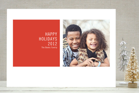
This year, some smaller sites have gone further, but only in a small way. Minted, which seems to be winning the UrbanBaby race for hip alternative, has only two designs I would consider. The rest still suffer from script, or stars, or foliage. One is above, the other my friends and family will soon receive. (I feel a pang about not designing my own, using VistaPrint, but decided my husband could use a break from our design process. I get to be art director.) Mango Ink is the other alterna-provider, but when I looked at their cards I realized that I do have a traditional side. Graffiti-style lettering, sullen-on-purpose kids, faux-antique lettering? Or big type and white backgrounds? The first seems like the Freeman’s of holiday cards, and I think its moment has almost passed. The second seems like inserting your family into a Gap ad. I would rather just spread some joy.


