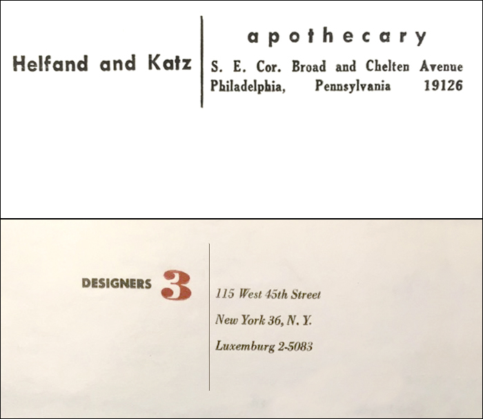
Top: return address on envelope from my grandfather’s pharmacy, early 1960s. Below: letterhead from Designers Three, New York, 1952.
Like many designers, I swoon when I see glorious typography. Crazy neon shop signs. Over-the-top engraved letterheads. I find myself perhaps particularly smitten by anything indulgent and ornamented—swashes and ampersands, gilded letterforms and calligraphic flourishes—as well as examples of clumsy minimalism and aspirational artistry. Together, these things provide a kind of dossier of visual evidence that illuminates the everyday nature of communication history—a time before listicals and tweets, before the visual monotony that characterizes the typical contemporary digital exchange.
That history gets a lot more interesting when it mysteriously begins to intersect with your own experience—as it has, of late, with mine.
Recently, I came upon an envelope from grandfather‘s drugstore. I've written in the past about the anonymous designer who crafted the Helfand and Katz matchbook and wondered if this was another example of his or her handiwork? I marvel at the heavily letterspaced lowercase letters, at the bizarre forced justification on the address line, at what might just be the strangest series of typographic alignments I’ve spotted in ages. And then, well, there is that pipeline: a vertical stroke that separates and anchors the whole constellation, even more effective since the whole block of type actually ran up the side, perpendicular to the envelope’s orientation. Did the pharmacists use it as a visual cue for initiating the address line? Did they instruct the compositor—because surely there was a mechanical for this thing—to extend the pipeline past the type itself? (Have I mentioned that it was printed by letterpress?)
The protected bubble of my typographic infatuation was pierced last week when I received a screenshot of another example of pipeline genius, this time via a writer whose research led him to a small design firm which happened to be my very first employer. Long before the early 1980s (when I was the one doing those mechanicals), their logo had sported the sexy red “3” against an elegant, italicized address, the whole lockup united by a long, narrow rule: here, the pipeline looks almost ribbon-like, thin and light, floating buoyantly amid all those other fonts. Years later, Designers Three would refashion their logo as a big, solid confab of Helvetica Bold caps, the “I” in DESIGNER expressed as three I’s—DESIIIGNER—making the whole thing hang together like a solid, inpenetrable brick. (Pipelines in triplicate, I wonder?)
Both of these letterheads are brilliant in their wonkiness: not quite aligned, trying to be arty, bizarrely composed yet endearingly unified by that single, narrow stroke. Might the pipeline be due for recognition, celebration, even? Now that words like hashtag and slash are expressed in spoken language, how marvelous it is to see that simple geometric gesture holding its own. All hail the mighty pipeline, hanging tight at ninety degrees—and never, ever letting go.


Comments [1]
06.07.16
10:01