At yesterday’s Future Perfect: What’s next in book design event co-hosted by AIGA and Design Observer, the panel discussion started with describing the elephant in the room: What do we see as the future of books, with e-readers holding strong and technology taking up much of our attention?
“All you do when you read a lot is read more,” said panelist Juliette Cezzar, a professor of communication design at the New School’s Parsons School of Design. She went on to say how she’d likely read a damp pile of paper, if that was what was available, because she simply loves to read.
This made me wonder: Can suboptimal book design discourage you from reading? Can the design of something ever stop you from doing something you love?
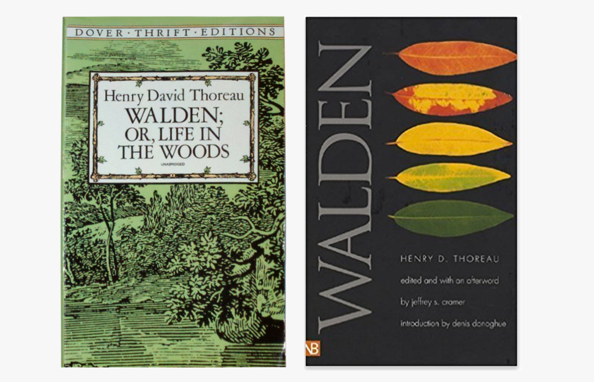
That led me to think about arguably the most common, worst designed books: Dover Thrift Edition classics. They have incredibly narrow margins, dense text blocks, and paper that feels like the packing stuff you can grab for free in IKEA’s checkout area. The covers are flimsy and the designs are templated. Everything shouts, “MASS MARKET PRODUCTION!”
And yet, when I think of Dover Thrift Editions, I think of my favorite college English professor, who once told us that he owns something like 40 editions of Walden, and that of all of these editions, his most beloved one is the Dover Thrift Edition. Because it was the first copy he owned.
For class, however, he assigned us a paperback edition by Yale Nota Bene, with generous margins and well-researched endnotes by Jeffrey S. Cramer. The paper is thick and the leading comfortably loose; the resulting book is about 1.2 inches tall (the Dover Thrift Edition is less than an inch). I love my copy of Walden resulting from that course; it was easy to mark up and is filled with my margin notes, sticky tabs, and memories of that course.
But I also love my edition of Walden from Shambhala with sumptuously smooth pages and woodcut prints peppering the text, which I discovered on the remainders table (!) in the bookstore where I worked in high school. And then there’s my little red edition of Walden from Everyman’s Library that I rescued from a discard pile, in which a previous owner had lovingly affixed a postage stamp of Thoreau’s face. And there’s Random House’s fully annotated behemoth version of Walden that my professor presented me with when I graduated, which contains more notes than editions from Penguin Classics, Oxford Classics, or the one assigned for class.
I generally have little patience for hoarding things, but I don’t see the multiple copies of Walden as excessive. Each provides a different use case to me. The assigned edition is too full of my own notes that I can no longer read the text without hearing the class discussion again, but it is a breeze to navigate because of the spine creases I’ve made over time in the best sections. The Shambhala edition feels far too fancy for me to read, but is such a joy to behold and dip into, like coffeetable reading. The Everyman’s Library edition is hardcover, a bit too rigid to be comfy with, but it is compact, has the most pleasing weight in the hand, and carries just the right level of old book musty smell. The design of Random House’s fully annotated edition is worst for travel or reading when lying down (you practically need a podium for the thing), but it holds more information than any of the other editions…and holds more meaning to me than my own diploma.
Despite these design shortcomings, not one these editions could ever stop me from reading them, nor will they lose their spot on my shelf. (Same goes for the series of Dover Thrift Editions, out of which I own a few titles.)
The design of a book might discourage one particular use case, but just as uniquely serves another use case. If nothing else, this only speaks to the many facets of the reading experience that can be designed, or left for the reader to design—through marginalia, spine creases, affixed memorabilia, worn corners, or inscribed messages. These are aspects of book design that cannot be automated, templated, or rendered irrelevant by e-readers and technology.
For as long as reading is important to us, both form and content will matter. And for as long as memories are important to us, both book design and books will matter.