Olivetti machines in the window (my photo)
My family spent spring break in Venice, along with an international crowd of vacationers. It seems impossible to say anything about Venice that hasn't been said before (and in fact, the center city seemed like an excellent example of cupcake urbanism, all masks and gelaterie and Bellinis) but because of the glories of Carlo Scarpa, I'm going to try.
I finally had the opportunity to visit three of Italian modernist architect Scarpa's major works in Venice: the Olivetti showroom of 1957-58, the Querini Stampalia Foundation of 1961-63, and the Museo Correr of 1957-60. About ten years ago, my husband and I drove around the Veneto in search of Scarpa and Palladio, so this was the completion of a very worthwhile architectural quest. What wasn't clear to me when we saw Scarpa's other works, including the Brion Family Cemetery and the sublime Castelvecchio Museum in Verona, was how influenced Scarpa was by Venice's peculiar approach to architecture, and how the quirks of his practice – his appreciation for relics, his asymmetric and textured approach to facades, the intricacy and gleam of his detailing – are a 20th-century reaction to that particularity.
All three of these Scarpa projects are close by St. Mark's cathedral, and we saw all four on the same day. What struck me about San Marco this time was that it was like a crazy quilt. Its makers, over centuries, seemed united by a desire to acquire and incorporate treasures. A quilter would have a scrap of patterned silk, a bit of velvet, a piece of old lace. At St. Mark's the porphyry doges, the multicolored marbles, the intarsia peacocks, the golden mosaics, the bronze horses, have all been applied and updated and inserted with an eye not to symmetry or proportion but to too muchness. These were the best things they saw in their mercantile and marauding travels, and they would go together by virtue of quality. Or really, going together was hardly the point: design was used to make room within the frame of the church as within the border of the quilt.
Olivetti facade (via The Milanese)
In the Venetian context the Palladian churches of San Giorgio Maggiore and Il Redentore, just across the water, look like Protestant correctives. Or minimalism. After the intensity of San Marco, their interiors seem like afterthoughts. The dialogue is between their white, careful, Golden Mean facades and the additive and patterned buildings around the Piazza San Marco. If I wasn't so horrified by the building-size Diesel ads on the library, I think one could argue that the Doge's Palace can take commerce, while Palladio can't. When it was Scarpa's turn to add to the quilt, he didn't look across to Palladio but back at down the piazza.
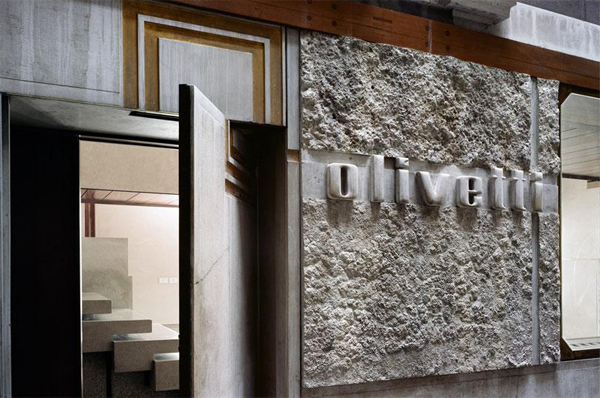
The side facade of the Olivetti showroom, on your left as you approach St. Mark's square, is arranged like a concrete crazy quilt. A gilded Olivetti logo overlaps the edges of a plain lintel and door. The company name, in modernist lower case, is carved out of a textured square. A window offers a glimpse of the linear structures within. An old arch and its traditional cornice are left hanging above. On the St. Mark's side there is a glass corner for display and a security gate of wood and metal. When closed, it also refuses symmetry.
Olivetti floor (via The Milanese)
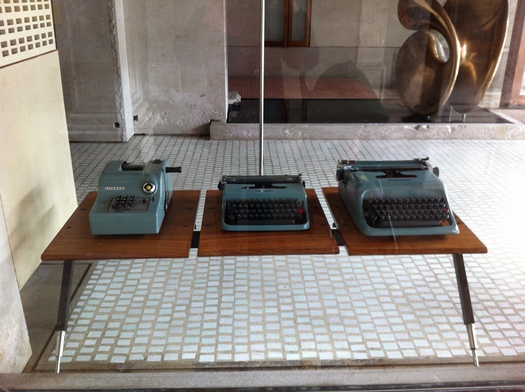
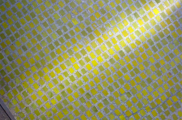
Inside, much has been written about the level changes and the floating shelves, the red, yellow and blue terrazzo (a modern update on all the amazing intarsia pavements in the churches), the narrow upstairs walkways that lead you past the adding machine processional. The interior is a three dimensionalization of the overlapping and not-quite-lining up organization of the facades. It's wonderful that the Fondo Ambienti Italiano is maintaining the Olivetti showroom as a museum of itself, free to architecture students.
Meanwhile, the Olivetti typewriters are displayed in exactly the same way as the religious artifacts in the Museo Correr: on intricate, wood and brass mounts, moa re akin to watch-making than typewriting. I've currently lost my previous knowledge and appreciation for Renaissance painting, but the way Scarpa sets a stone bust, a merchant's portrait, fragmentary altarpiece, makes them look special even to me. The high point of his Correr installation is a stone-lined room in which a Bellini painting of Christ has been inserted into a custom frame carved into the wall. It's another overlap of treasures, where one century's luxury supports another's without overwhelming it.
Querini Stampalia, the garden (my photo)
Because we were traveling with children, we spent more time at the periphery of Venice than at the center, including a trip to the Lido because my son wanted to go to the beach. The Lido reminded me of my (possibly fictional) idea of a British seaside resort that has seen better days. Faded restaurants, futuristic architecture of the past, and street lined with hedges. It seemed to cry out for an update on Edith Wharton, where artistocrats cast out of their proper place, by virtue of income or affront, seek to maintain their gentility on the edge of the known world. I could imagine a faded duchess in one of the Stile Liberty buildings, trying to ignore the hordes in shorts that must swarm the beach in summer. For her, Venice's treasures would be a reminder of all that she had once had, and she would appreciate that the Venetians are still trying to hold on to their loot. And even update it, in the form of Francois Pinault's dull contemporary art palaces. The Jeff Koons Hanging Heart, installed at the point of the Punta della Dogana gallery, seemed both terrible and appropriate, while Tadao Ando's minimalism was overwhelmed.


Comments [1]
04.19.12
10:45