09.30.08
Michael Bierut | Essays

Mad Men: Pitch Perfect

   
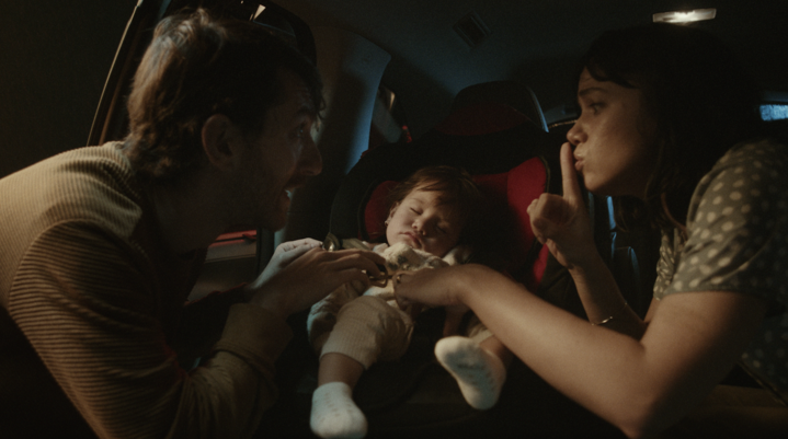
Bryan Batt as Sterling Cooper art director Salvatore Romano, sizing up the competition in Season One of AMC's Mad Men

One of my first bosses taught me an important lesson. 

Good designers are a dime a dozen, he said. Coming up with a great design solution is the easy part. The hard part, he said, is getting the client to accept the solution. 

"But if the work is good, don't the clients know it when they see it?" I asked. 

My boss just looked at me silently for a long time. And then, with gentleness and no small amount of pity, he reached out and patted me on the head: Poor kid. 

He was right, of course. In any creative activity where clients are involved, you have to make the sale twice. Before you get to the customer, you have to sell the client. 

And that's what I love most about the AMC series Mad Men, which starts its second season later this month. It gets so many things right about its subject, the advertising business, but it absolutely nails one thing: the art behind the art of the pitch. 

As its fans know well, Mad Men is the brainchild of Matthew Weiner whom, on the the strength of its unproduced, written-on-spec pilot episode, got hired as a writer and executive producer for The Sopranos. Production on his pet project didn't start until the HBO show had run its course. On the surface, Mad Men, a drama set at Sterling Cooper, a fictional New York advertising agency in the early 1960s, wouldn't seem to have much in common with the iconic North Jersey mob epic. But, like Tony Soprano, creative director Don Draper operates in a world that is almost comically foreign to us: with its nonstop smoking, drinking, and sexual harassment — not to mention the use of plastic dry cleaning bags as children's toys — it truly seems to be set in, well, another century. 

Yet beyond the anachronisms and the astonishingly casual sexism, racism, and general bad behavior, the draw is the universality of the human stories caught in the period settings. In The Sopranos, the mob business was there to punctuate the inner conflicts of the characters. And where The Sopranos had whackingsMad Men has client presentations.

In the very first episode, "Smoke Gets in Your Eyes," Don Draper, played by the amazing Jon Hamm, gets to demonstrate why he's considered one of the best creative directors in town by salvaging a meeting with unhappy clients from Lucky Strike, who are about to walk out.

Don Draper: Gentlemen, before you leave, can I just say something? 

Agency head Roger Sterling: I don't know, Don. Can you?

Don: [To the clients] The Federal Trade Commission and Readers Digest have done you a favor. They've let you know that any ad that brings up the concept of cigarettes and health together...well, it's just going to make people think of cancer.

[Client] Lee Sr.: [Sarcastically] Yes, and we are grateful to them.

Don: But what Lee Jr. said is right. You can't make those health claims. Neither can your competitors. 

Lee Sr.: So...we got a lotta people not sayin' anything that sells cigarettes. 

Don: Not exactly. This is the greatest advertising opportunity since the invention of cereal. We have six identical companies making six identical products. We can say anything we want. [Pointing to Lee Jr.] How do you make your cigarettes?

[Client] Lee Jr.: I don't know. 

Lee Sr. Shame on you. We breed insect-repellant tobacco seeds. Plant 'em in the North Carolina sunshine. Grow it, cut it, cure it, toast it —

Don: There you go. [He writes "It's Toasted" on the blackboard.] 

Lee Jr.: But everybody else's tobacco is toasted.

Don: No. Everybody else's tobacco is poisonous. Lucky Strike's is toasted. 

Sterling: [Triumphant.] Well, gentlemen, I don't think I have to tell you what you just witnessed here.

Lee Jr.: [Hesitant.] I think you do. 

Don: Advertising is based on one thing: happiness. And you know what happiness is? Happiness is the smell of a new car. It's freedom from fear. It's a billboard on the side of the road that screams with reassurance: whatever you're doing, it's okay. You...are...okay.

Lee Sr.: "It's toasted." I get it

Of course, "It's toasted" actually was Lucky Strike's slogan in the late fifties: the show generally stops at nothing in its pursuit of verisimilitude and has been justly praised for getting every period detail right. (In the third episode, when the creative team is shown sniping at a Doyle Dane Bernbach Volkswagen ad, the dialog establishes that "Lemon" was the second in a series that began the previous year with "Think Small." That's accuracy!) The model for Don Draper the adman in this case is Rosser Reeves, the Ted Bates copywriter who invented the idea of the Unique Selling Proposition. The key to Don Draper the character, however, is that speech about happiness. It's an illusion that he's as desperate to sell to himself as anyone else.
It's been observed, correctly, that the creative output of Sterling Cooper, which is barely ever shown being developed, more or less stinks. As George Lois told the New York Times: “When I hear ‘Mad Men,’ it’s the most irritating thing in the world to me. When you think of the ’60s, you think about people like me who changed the advertising and design worlds. The creative revolution was the name of the game. This show gives you the impression it was all three-martini lunches.” But Don Draper doesn't work at DDB or Papert Koenig Lois. Sterling Cooper is an old-school agency, and in 1960 big establishment agencies ran on smooth presentations, fastidious account handling, and, actually, three-martini-lunches. (Find a used copy of Jerry Della Femina's From Those Wonderful Folks Who Gave You Pearl Harbor if you have any doubt.) 

There is one outright creative triumph in the series, and it's from the hands of secretary-turned-fledging-copywriter Peggy Olsen, played by the brilliant Elisabeth Moss. Peggy's first day at Sterling Cooper is our introduction to the show, and her story, along with Don's, provides a connective thread throughout the first season. In what is seen as a surprising turn of events, humble Peggy comes up with an idea for Belle Jolie Cosmetics: each ad shows a single tube of lipstick, a portrait of a couple, and the headline Mark Your Man. For Sterling Cooper, this is as good as it gets. In another of the best scenes from the series, an account guy presents it to a grumpy-looking client (while Peggy waits nervously outside) and gets a response that will sound numbingly familiar to most creative people.

Client: I only see one lipstick in your drawing. Women want colors. Lots and lots of colors. 

Jr. Client: "Mark Your Man." It's pretty cute.

Client: Oh, you like this? Well, maybe we should cut down to five shades, or one.

[Account Exec] Ken Cosgrove: I'm not telling you to listen to anyone, but this is a very fresh approach.

Don: It's okay, Kenny. I don't think there's much else to do here but call it a day. [Rises and extends his hand.] Gentlemen, thank you for your time.

Client: [Baffled.] Is that all?

Don: You're a nonbeliever. Why should we waste time on kabuki

Client: I don't know what that means.

Don: It means that you've already tried your plan, and you're number four. You've enlisted my expertise and you've rejected it to go on the way you've been going. I'm not interested in that. You can understand. 

Client: I don't think your three months or however many thousands of dollars entitles you to refocus the core of our business —

Don: Listen. I'm not here to tell you about Jesus. You already know about Jesus. He either lives in your heart or He doesn't. [Cut to Don's colleagues, who look alarmed. Don bears down with his argument. He never raises his voice.] Every woman wants choices. But in the end, none wants to be one of a hundred in a box. She's unique. She makes the choices and she's chosen him. She wants to tell the world, he's mine. He belongs to me, not you. She marks her man with her lips. He is her possession. You've given every girl that wears your lipstick the gift of total ownership. 

[Pause. The client looks at Don, then at the ads, then at Don again.]

Client: [Quietly.] Sit down.

Don: No. [Evenly.] Not until I know I'm not wasting my time.

Client: [Conceding.] Sit down.

Jesus God in heaven! Not until I know I'm not wasting my time! From the minute Don launched his this-meeting-is-over bluff, I was on the edge of my seat, and my lovely wife Dorothy will tell you that I literally clapped my hands at that line. For me, this sequence is as close to pornography as I ever get to see on basic cable.

The climax of the season's final episode, "The Wheel," is a competitive pitch for, of all things, a naming assignment. Kodak has invented a high-tech new device to project slides, and two bland-looking suits show up to see if Sterling Cooper has come up with something to call it. Then begins one of the most emotional scenes I've ever seen on television, delivered by an actor portraying a man so consumed with self-doubt and self-deceit that we wonder if he himself understands what he's selling.

Don: Well, technology is a glittering lure. But there is the rare occasion when the public can be engaged on a level beyond flash, if they have a sentimental bond with the product. My first job, I was in house, at a fur company. This old pro copywriter, Greek, named Teddy. And Teddy told me the most important idea in advertising is "new." It creates an itch. You simply put your product in there as a kind of calamine lotion. But he also talked about a deeper bond with the product: nostalgia. It's delicate. But potent. 

[He asks for the lights out, turns on the projector, and begins showing slides. Whirr. Click. I remember that sound myself!

Teddy told me that in Greek, nostalgia literally means "the pain of an old wound." It's a twinge in your heart, far more powerful than memory alone. 

[Don shows slides of his wife, his children, picnics, celebrations, family moments.] 

This device isn't a spaceship. It's a time machine. It goes backwards. Forwards. It takes us to a place where we ache to go again. It's not called The Wheel. It's called The Carousel. It lets us travel the way a child travels, around and around, and back home again, to a place where we know we are loved. 

[The slide reads, "Kodak introduces Carousel." The lights come up. One of the agency guys is weeping and rushes out of the room. The would-be clients look stunned.] 

[New Business Guy] Duck Phillips: Good luck at your next meeting.
 
Although the pitches are the high points for me, the world of Mad Men is rich and complex. There are wives, mistresses, neighbors, colleagues, competitors, clients and kids, all caught in a complicated, entirely believable web of relationships. Like a lot of people, I tuned into Mad Men a year ago out of professional curiosity, was immediately intrigued by the incredible production design, but ultimately got hooked on the human stories. 

The last season ends on Thanksgiving Eve, 1960. The characters stand at the threshold of a decade where everything is going to change in ways they can't imagine. The song over the last episode's final credits is Bob Dylan's 1963 "Don't Think Twice, It's All Right." One assumes the anachronism, and the irony, are both very much intentional.


Posted in: Business, Media


Comments [47]

Thank you for reminding me how good a season that was. And
thank you for reminding me that it starts again soon.

And for passing on that important lesson.
Daniel Neville
07.07.08
04:55

Today's email from Steve Heller is on the Mad Men dvd packaging. Nice.
Michael Bierut
07.07.08
09:41

Michael, this is a great post. Like you I watched it out of curiosity
to begin with, because of its subject, but my wife and I both got
hooked on it (as we also did with The Sopranos).

I'm, ahem, too young to have any knowledge of work or
awareness of advertising because I was only eight in 1960, but
it's been a great series so far, and it really does seem to capture
the essence of the era, especially the old school before Geoge
Lois and Paul Rand et al.

I can't wait for the next season, as the title sequence alone is a
treat. It starts again in the UK in the autumn think, on BBC4.
Tim Masters
07.07.08
10:04

Here are the titles, designed by Imaginary Forces.
Michael Bierut
07.07.08
10:09

Thanks for this great post, Michael. I have to go catch up on Season 1 now -- I've been missing out!
Ricardo Cordoba
07.07.08
10:14

Thanks Michael. I worked for an ad agency throughout the 60s in Appleton, Wisconsin. Yes, Appleton is in the sticks, but what a highly creative agency it was! You should teach graphic design history.
pat Taylor
07.07.08
10:17

Great insight... I just watched the first episode last night and was unsure if it was worth purchasing. After reading your review, and seeing Steven Heller's comments, I am definitely going to add it to my collection. Being a somewhat young designer, it is so eye-opening to see what the industry was like years ago. Thanks for the great review.
Leigh Anna Thompson
07.07.08
10:52

We just spent the weekend watching all 13 episodes of Season 1--"On Demand"--on our cable service. Now we're hooked and eagerly anticipating Season 2 which starts July 28th. I was only 10 in 1960, but growing up in the 60's, I remember how different the attitudes were toward smoking and drinking then. I think the writers took creative license, however, with the unbelievable amount of smoking and drinking portrayed in the series. Come on! The elevator is out and they have to climb 20+ floors and Don lights a cigarette on the way up. I don't think so!
Diane West
07.07.08
11:07

I recently read Rothenberg's "Where The Suckers Moon" from Micheal's glowing review here. He's a New York Times lefty. Perhaps now I'll check out Della Famina (a renowned anti- Hillary, right winger). The former is agreat read and provides incredible insight to the art of the sale and delves farther than you'll ever imagine into the art of the sale and the creative Revolution. Since this is a design blog some of you will read with great anticipation the scenes with Tibor Kalman who provides a classic case study in what not to do in an advertising client situation. I asked one of Kalman's former senior staffers about the book and its portrayal. The response: "It's hands down the best, most real analysis of what it was actually like to work with Tibor."
felix sockwell
07.07.08
11:33

To be honest, as a woman in the industry I had a very hard time watching the the first episode, the second and the third, etc. But, if you catch my drift I kept coming back. The way women were treated, it had the allure of a train wreck where I just couldn't look away. Then I saw the emotionally fragile Betty Draper with cigarette in mouth and rifle in arms shooting the neighbor's birds and I thought, okay, maybe they're gonna deal with women as more than just scenery. All taking place in the years before, "We've come a long way, baby." So recent, yet so far away.
Donna Collum
07.07.08
11:47

@Pat Taylor: As someone with first-hand knowledge of working in advertising during the 60s, how does your experience compare with what's depicted on Mad Men? (I really enjoyed the differing memories of NYC admen-and it was all men-on display in ) Did any idiosyncrasies of the "highly creative" agency you worked for conflict or commiserate with the zeitgeist of the day? Meh, that's probably a weird/loaded question, but I'm always eager to hear from those with more experience in the field.
Margaret
07.07.08
12:19

@felix:I had the exact same reaction at both the first episode and that scene you mentioned with Betty. I'm very curious to see the choices Moss' character makes.
Margaret
07.07.08
12:25

26 years in the biz now....
the industry is pretty much the same. selling the same useless garbage in different packages. the bosses are still assholes, the young people are still grunts. women are more in position, but behind their backs the back stabbing continues. same with minorities.
Larry Mansfield
07.07.08
01:16

I remember liking all those moments you talked about. Wonder how the advertising agencies of the zeroes relate to those in the seventies? Of course, there's gonna be lot less smoking and running around. Plus a lot of the current ad agencies look like studios while that's completely missing then. I don't even remember seeing a whiteboard in Mad Men. Also, is the general assertiveness of everyone in Mad Men plain old dramatic characterization or an actual representation of its time?
Krishna Kumar
07.07.08
02:01

"the industry is pretty much the same. selling the same useless
garbage in different packages. the bosses are still assholes, the
young people are still grunts. women are more in position, but
behind their backs the back stabbing continues. same with
minorities."

Like the Taliking Heads' song: "same as it ever was", only now it's digital.

However, the biz environment does change, and I wonder how people like Rosser Reeves or David Ogilvy would see today's biz?
Ed Stockelbach
07.07.08
03:20

I'm sorry to dissent, but I don't think this show is an accurate representation of advertising in the sixties AT ALL. I won't get into too much detail, but none of what I've seen in season one is the way we did it at McMann and Tate. Sincerely, Darrin Stephens.
Darrin Stephens
07.07.08
04:45

The Wheel is an amazing bit of writing and acting on its own, even without the quasi-historical context. My opinion: The client pitch for Kodak was an inspiration. I forgot he is acting. Unforgettable. It seemlessly incorporates his personal and professional life into one brilliant moment in time...firing off synapses all over my brain. Why not transcend the often vulgar and disturbing realities of advertising (which it will always be on some level) with moments of greatness. Could you say the same about the Sopranos?
Lou Friedmann
07.07.08
05:55

The show is great, which makes its one error in period detail all the more dismaying, for those of us who notice: the IBM Selectric typewriters used in the show aren't the original Selectric I's which were in production in 1960—which were rounded in a nice Eames-ey way—but rather Selectric II's, which were squared off and clunkier (and not in production until 1969).
This has been an anal-rententive moment.

(A visual history of Selectrics: http://www.etypewriters.com/history.htm)
nogoatee
07.07.08
08:42

Mad Men came up a lot in a course I taught this Spring on design theory and discourse (the McVey salon, more or less).
My students loved it; I found it hard to watch. Not because I didn't like it, or thought it got something wrong about advertising or design; I struggled with it because it hit me so hard, way back in my mind. I was seven in 1960. My parents weren't advertising professionals, rather the products of immigrants (my mother) and the depression and the GI Bill without which college wouldn't have happened; Catholic and conservative but aware that the world wasn't perfect.
The culture that Mad Men plays on — with great accuracy and some poetic license — insinuated itself certainly into my family's life.
It's painful to watch these people, Don's wife perhaps the most (watch her jaw slacken when someone mentions that the woman down the street has gotten divorced), trying to understand their world, what they've gotten wrong. Everyone's walking through a mine field with the 60s just around the corner (and already begun, in Greenwich Village quarters).
This show is "about" the advertising business, but not only. I view the painstaking attention to detail as a sign of its makers' respect and reverence for that time and the people whose lives unravelled then.

I enjoyed the comment about the "wrong" selectric, which brought me to the visual-history-of page. The 1973 and 1980 Selectrics, which I used back then, sure look (and felt) better than the 1980 Displaywriter, not to mention my MacBook Pro today!
John McVey
07.07.08
10:16

In order to fully convey Mr Weiner's ability to reveal the
disconnect between the men and women's aspirations at that
time, it is necessary to describe the scene following the meeting
with the client in the Make Your Mark episode.

When the men emerge from the meeting and in passing show
Peggy the 'artwork' with the Mark Your Man headline, she looks at
it with dismay and says:

"That's not what I wrote. I wrote Make Your Mark."

"What's the difference?" one of the men answers.
John Zissovici
07.08.08
01:55

The fine tobaccos that went into Lucky Strikes were "toasted" by ultraviolet rays to rid leaves of any unhealthful mold, vermin, etc. (think of those medicine cabinets with the ultraviolet lamps to "sanitize" toothbrushes).

See, the other guys' stuff really WAS poisonous by comparison! Heh
Russell Flinchum
07.08.08
08:59

Great post! I've never seen Mad Men, but I love some of the scenarios you highlighted here! Thanks!
Mary
07.09.08
09:33

A cogent assessment. This show is about so much more than whether or not it's the right typewriter.
rechercher
07.09.08
09:56

AMC is doing a Season One marathon Sunday July 20. Get your TIVOs ready!
Paula
07.09.08
11:21

As a graphic design student, I was amazed at the confidence and strength of the pitches. To all you pro's out there, do the "Mad Men" pitches accurately reflect how it is really done?
Mark Morris
07.10.08
09:46

@Diane West:
Re: Walking up stairs, lighting cigarettes

Living in China, where attitudes toward cigarettes are extremely lax (go to a government banquet and every place has a fresh pack of cigarettes waiting for you!), I can say that I've seen it happen many times. My favorite, though, is when people are on crowded escalators and lifts and light up. Good times. My mother frequently comments on how it reminds her of her childhood, which would've been the late 50s, early 60s.
Therese
07.13.08
09:32

It left me cold. It paints a man's world, where women are only decorative (and useless and despised if they're not), men have the double standard of doing as they please.
The design is rather awful, the pitches unconvincing.

I am grateful I did not grow up then, if this is an accurate picture.
As enterrainment it is ok, but I want to beat up the guys and slap the women and tell them all to get a grip.

Having said that, I saw all the episodes..
boblet
07.16.08
09:15

Hey Michael, read it, bought it, enjoying it! Thanks very much. Best, George Hildebrandt
George
07.18.08
09:30

The US bear market has affected dozens of companies, many in the financial sector. US consumers have seen their disposable income decreased substantially and they are unable to refinance their homes to get some needed relief as the mortgage market has tightened. Inflation with respect to energy has really hurt commuters as we have seen gas prices shoot through the roof, and they have had no other option but to trade in their SUVs and squeeze their two kids and family dog into a Prius.
Read Full
TurkinBergs
07.22.08
07:01

Michael, I know I'm late commenting (been away) but thanks for bringing all that together. I love the excitement of the pitch scenario so was gripped by those scenes and thrilled by the details (used to smoke Lucky Strikes so got that link straight away and whooped for joy).
Richard
07.25.08
11:43

I don't watch TV often and have never seen Mad Men but I'd heard a lot about it and read a fair number of reviews of the show when I stopped in the Apple store on Prince Street one day and saw a documentary running on the back screen there. My jaw dropped open when I saw what was on the screen. It was exactly as I had remembered it. 

My dad was a Mad Man in the 50s and 60s but not like the creative directors I saw on screen. He was a bullpen manager at an ad agency on Madison Avenue. He had served in the Korean war as a commercial artist (as they called them then). I was born and raised in New York City (Queens) like my dad and mom were. I was a little kid in the 60s. I don't know if they show bullpens on the show, I hope to watch it soon. A bullpen is where all the press-ready execution took place. My dad managed a pretty large group of men who executed the art directors' designs. The creative director had the idea, the art director sketched many layouts in magic marker on tracing paper and gave the sketches to the bullpen manager. He then brought it to his men and they made the finished art. There were hand lettering men and type specifiers (the type was set at a typehouse), paste up artists, illustrators, technical artists, retouchers and art kids who changed the rubber cement in the cans (I used to do it. One time I wrote, Juan Coat, on all the cans and got in trouble). The finished pieces were truly hand made works of art. The illustrations were great. The precision of the mechanicals was amazing. I would go to work with him in the summertime. My dad would bring home pads of paper and markers for me and my siblings as gifts, something we totally loved. The illustrator there made portraits of my brother and I in magic markers.

There were men only in the bullpen. It was a strictly masculine environment. They all had perfect haircuts (creative and art directors had those Elliot Gould sideburns I loved so much), They all wore crisp white shirts with the sleeves rolled up perfectly, all wore simple Rogers Peet gray suits, and everyone smoked (I remember Pall Malls and Lucky Strikes. One of the guys would bum cigarettes with filters and rip the filters off) The air smelled like a concoction of cigarette smoke and Old Spice after shave which it seemed to me, all men wore. Often, even now, if I walk behind someone smoking in the street it reminds me of that time and my father. These were not men who explored their feminine side. They were tough guys, all of them I can remember. My dad was a tough guy, typical of a depression era kid. His idea, back then, of a good meal was, $5.95, all you can eat. Vinny was the retouching guy (from Brooklyn, all about Dis and dat). He called me Jiminoots. He had a shock of white hair and big shoulders. One time I was there he said, Jiminoots, want to see me draw a .0 black rule using only a paintbrush. I said he couldn't do it. He took a sable brush, dipped in into the ink well, cleaned it off carefully, and picked up a wooden ruler. He looked through the bottom of his bifocals, placed a finger on the ruler and calmly pulled the brush across the paper and created a perfect, even .0 rule. One time an art director gave him a portrait to retouch. The person in the portrait had their eyes closed. He was asked to put the eyes in. He asked the art director what kind of eyes he wanted, Ava Gardner or Spencer Tracy? He was a funny guy.

It seemed like there were a good amount of type A personalities there. All hyper charged and very willing to argue a point. The hierarchy was very distinct. Bosses were bosses and they got their way ultimately. 

One time I was there they had just done a shoot with Cheryll Tiegs. They were all excited and there were a lot of proofs floating around. A lot of the guys got one. The atmosphere there always seemed charged. One time they were working on the Speidel account (remember the twisty watch bands?) The creative director (drink on his desk) gave me about ten watchbands. They treated me nicely there but I couldn't help but think, years later, that the atmosphere was not necessarily friendly. Bosses truly seemed to be abusive and not politically correct as we mostly all are now.

When the guys would go out to lunch they would often go to Chock full o' nuts. I loved it, the Boston Cream pie was my favorite. 

I would spray the type proofs with fixative when they came in. I'd feel the impression in the paper. Sometimes I would go to the typesetters to pick up the type. I learned to use a typositor there. Years later my dad would open his own small studio and buy a typositor from York typography (who was going out of business). I did a lot of the headline setting then. I also learned to use a leroy lettering set.

One time I asked my dad what everyone thought about Pop Art when it became popular. He said they did talk about it. They found it hard to believe that people considered it art. Many of them just thought of it as their job. They didn't necessarily think of it as art. They'd throw away pieces of art after they were used. They'd give it away. If a client wanted an illustration they'd just give it to them and not even charge for it. One time years later (after I graduated from Parsons) I did an illustration for my father and he gave it to the client. I told him you don't do that anymore and I wanted it back. He was so angry at me, he yelled. He wouldn't do it. The client was higher up the chain than I was.

Anyway, Michael, I though you might find this little story amusing. The traditional hand made history of finished art is so interesting. It was quite a craft. This TV show, Mad Men, has churned up some of these memories, many of them favorable.
James Reyman
07.25.08
03:01

In the season two debut, there was a fleeting but nice shout out to legendary Doyle Dane copywriter Julian Koenig, who went on to co-found Papert Koenig Lois with George Lois.
Michael Bierut
07.28.08
08:10

Due to this post, I've now decided I really need to start watching this series. It's easiest to simply watch the second seasons first episode online, which I've done, and am already hooked by just one of Don Draper's quotes:

"One wants to be the needle in the haystack, not the haystack."

This show has serious potential. I can't wait for the new episode tonight.
Nick Burroughs
08.03.08
02:04

Further to this discussion, and courtesy of Jason Kottke:

http://whatwoulddondraperdo.tumblr.com/
Michael Bierut
08.04.08
12:20

Michael:
The only problem I have with the opening credits of MadMen (otherwise absolutely fabulous) is the typography they use with the phrase: "It's the Gift that never Fails". It doesn't fit in as period specific. In fact, I think its way off. I can't name the typeface right off the bat, but I know it can't be correct for that time period. What do you think?
Melissa Stone
08.10.08
01:41

I found myself teary-eyed when I saw The Wheel and it was one of the most satisfying moments in the entire series. The whole build-up that lead to the final pitch. If Don included pictures of him and his brother as kids in the slideshow somehow, I would've started bawling.
Eric
08.22.08
01:51

good guest page.
thank you.
Dgimis
11.18.08
10:00

I didn't like Mad Men until after the first season. The pitch scenes are always great but I didn't think the human story was too interesting (especially Draper identity storyline which I thought was a bit over the top). I guess since day one I was waiting for Peggy to be really empowered, Pete learns his mistake, Sterling change his ways, and Don's wife rebels, and all of this didn't happen until season 2.

Everybody love the carousel scene, and I do too (I watched it 10 times now) but my favorite scene is a minor one. The alternate endings to the first season's finale. The way it was cut. There are no foggy edges, no fade to character's face. Scenes that occurred in imagination, flashback, or dream blend into the story perfectly that the audience can't really tell. Like Peggy's baby. What happened to it? The director outright tricked us into thinking one thing and then we realized the scene didn't occur the way we thought it did. That is very unconventional. And to me, it adds this epic feel to it. Kind of like the Sopranos black out ending. You feel cheated and tricked, but then you applaud it for getting the audience directly involve.
Panasit Ch
01.21.09
07:54


A modern search engine of the Megaupload web is available for everybody- if you want to download some music, films or software just get the link and download from http://megaupload.name/ -everything is simple!

clever
02.24.09
03:07

Gut!
berlin
03.02.09
01:38

Great essay, Michael. Sadly, I've never seen Mad Men, but in the strength of this review, I plan to Netflix it today.
Bill Kissinger
07.24.09
02:51

I, too, am quite taken by Mad Men (though it's a wee bit closer to the Three Tenors than the Sopranos). But it's drama, and like any drama (think Hamlet) it's an exaggerated version of how things actually were. My first big job, in the mid-sixties, was at CBS-TV, where I was a lowly press agent. We did drink at lunch, and we did casually hit on the secretaries (well educated young women some of whom, to be frank, were working there to find husbands), and we did have frequent parties, with booze, after hours at Black Rock. But sexism was more covert than overt, and I don't remember anyone opening a bottle of liquor in the office between nine and five-thirty or so.

On the other hand, I remember that one of the things that impressed me about CBS was the quality of the ashtrays. And I didn't even smoke!
owen edwards
07.24.09
03:57

An observant review of typography used in the show.
Misha Beletsky
08.14.09
01:33

Every aspect of the show hooked me. The strength and depth of the characters, the plot and witty dialogue, the hierarchy of the office layout, the sharp suits and pointy bra's, the downtown male dominated corporate world vs the baron suburban reality that betty is forced to inhabit. Fantastic show. I keep asking myself could I work there? (I'm still deciding!)
Kevin Blackburn
11.01.09
10:59

And I didn't even smoke!
Fashion News
01.11.10
02:49

"You're not an artist Peggy, you solve problems." 
-Don Draper

Pretty much explains designs, for me.
Joseph Cuillier
07.21.10
02:21

Mr. Bierut,
Nobody could have better spotted and explained the amazing lessons in this great show, nor in my opinion, anyone is more qualified to do so.

You have recently become my hero!
Nima Et.
11.27.11
07:02


Jobs | April 16