07.01.14
The Editors | Essays

The New Design Observer


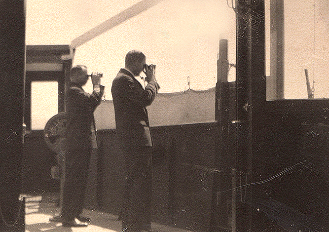
Found photograph of two unknown people observing something equally unknown, circa 1930


Good morning and welcome, wherever you are, to the second half of 2014.

And welcome to the New Design Observer.

Ten years ago, when we launched Design Observer, we vowed to cast a wider net around design in the hope that the ensuing conversation would include a bigger, broader audience, reflecting concerns and opinions that veered from ours, to challenge us to reconsider design theory as well as practice all over the world. 
We remain, as ever, deeply committed to thinking about and reacting to the visual world. Design, writ large  — as both a process and a product, a set of formal conceits and a platform for social engagement — remains for us at the epicenter of it all.
With this relaunch, we renew our promise to becoming more timely. More dynamic. More critical and daring. More democratic in our reach. And more committed to international coverage. On this subject, we hope you will join us in welcoming three new European correspondents: Véronique Vienne in Paris, Adrian Shaughnessy in London and Erik Spiekermann in Berlin. We hope to add contributors in Asia, Africa and Australia by early 2015. 

We renew our commitment, also, to the ways we think about design. Gone are the channels that formerly siloed our conversations: in their place, we've gathered our archive into easily searchable topics. We're introducing a more spirited, daily set of posts reflecting the more arguably porous boundaries that separate such things as media, design and urbanism. (Places will launch their own redesign this fall: for now they're still reachable here via our navigation and masthead.) We've included dates at the top of each article page to make it easy to locate and return to stories of interest. With a homepage link to our Twitter feed and easy access to our social media, we invite you to share and distribute our content as you like. And we'll be grouping job postings categorically to make finding them easier and more actionable.

Perhaps most importantly, we are pleased to introduce with this redesign a new social platform that encourages our readers to share, interact and instigate new conversations. We invite you all to register, fill out your profile pages, and think of the new Design Observer as we do: now more than ever, a critically engaged destination for dialogue, debate, disagreement, celebration, altercation, imagination — and more. 

It's the same old site. But it's a brand new conversation. We hope you'll think so, too.

Posted in: Media


Comments [13]

Your picture in this post is too wide and is crossing into the RH column. At least for me, in Firefox on a PC.
steve portigal
07.01.14
03:35

Which DO logo do you love?

logo

logo logo

Congratulations DO“!”

Carl W. Smith
07.01.14
10:51

This is such a missed opportunity. You're still treating the web like a limited platform for design. Which, you know, it's not.

07.02.14
10:26

Very nice. Looking forward to more. VR/
Joe Moran
07.02.14
11:11

In some ways it feels like you’re moving in the right direction (less cramped, less stuff on each page, larger type), but there are so many decisions that puzzle me. During the period when the registration form wasn’t working (it is working now, but the “My Profile” link does not), I tried my best to articulate my questions at Typographica. I hope they are helpful.
Stephen Coles
07.02.14
11:38

I kind of like it. I had to clean my glasses and lean in to read the tiny text, but then again I needed to clean my glasses anyway. . Hope ya'll listen to criticism about the typography it really is hobbit-sized. But then, we should all give it a go around the block and see how it does beyond the first introduction. Congratulations for leaping forward in your own design identity.
Andresen
07.03.14
03:07

looking good. week done
Jonathan
07.04.14
11:25

I liked the old site better....maybe I am not good with change. I liked being able to look at the whole page to pick a topic vs scrolling. Scrolling seems so typical ie Fast Company.
Tammis
07.07.14
09:12

Perhaps I am in the minority—Archer is ridiculously tough to read on-screen.
Thomas Lowry
07.09.14
10:33

Clean, cool, very difficult to read. In general, the new design isn't doing for me.
Dan Lewis
07.09.14
02:31

I suppose commenting on the re-design of a design blog makes sense, given that most of us are designers. But I know that we are dealing with professionals here, and so I figure they will work that stuff out. (I should mention that Bryony and Armin at Brand New seriously do listen to their readers, and are very open-minded and considerate about the design of their online publications. Truly incredible, when you stop to think about it.) Anyway, I was curious about the decision to neglect responsive design. Let's face it, I want to ingest this incredibly engaging content on my tablet while watching TV, on my cell phone in the bathroom, and on my desktop at the office. So I think most of the criticism so far merits consideration. The type is too small, and Archer doesn't work very well as a web font – it's an image true, not a web font in this case, but it becomes bit-mapped. With that said, I will continue to read the articles, as long as the quality of the content remains as strong as it has always been. It would be nice, though, if the designers and programmers helped make delivery of the articles just a little easier to read.
John Rudolph
07.09.14
10:24

You are definitely following the redesign trend, but I can't say I'm fond of it. Your home page is more or less useless. The only information presented about each article is the title, the author and a single sentence, and I have to hover my cursor over the article to see even that. How am I supposed to decide if it is worth clicking through or not? The large graphics are pretty, but completely uninformative. They add nothing to the function of the design. A lot of sites have gone this way. I find it so annoying that I've written a little script to grovel over the home page, extract each article and just present the first paragraph or so along with a link, so I no longer actually have to look at the Boing Boing or Barrington Coffee home pages. If I read Design Observer more often, I'd probably modify the script to make browsing easier. In other words, your new home page serves no purpose save as an impediment. I come here for the articles, though, judging from the redesign, I imagine most come here for the clip art. This trend is kind of ridiculous. People used to joke about restaurant home pages being full of atmospheric "Click to Flash" icons, but not being able to find the address, the hours, or the phone number or reservations link. Surely, you could extract a paragraph or a pull quote from each article to give me some idea if my click is likely to be rewarded.
Kaleberg
07.10.14
11:40

I really dig a lot of the design decisions made here! I am calmly consuming this content on my iPad with no difficulty to speak of. I love the colours and clarity. Impressive!
Emme Stone
07.21.14
04:48


Jobs | March 28