Logos fight for center stage in the theater of our attention—but not when we’re holding a book. Publishing houses tuck their marks away. Each book is an autonomous property, best known by its cover—more than ever, in the flat light of the internet. Most readers can’t tell you who published the books that they hold dear—our relationship is with the author and/or story.
Yet, publishing firms have been purposefully crafting their identities for more than 500 years. When viewed chronologically, patterns of thought become apparent across the field. How was a symbol chosen and how did its symbolism evolve over time? The answers produce stories, which speak volumes about the entwined histories of book publishing and brand strategy. What follows is a survey of the stories behind the logos of 20 publishing houses.
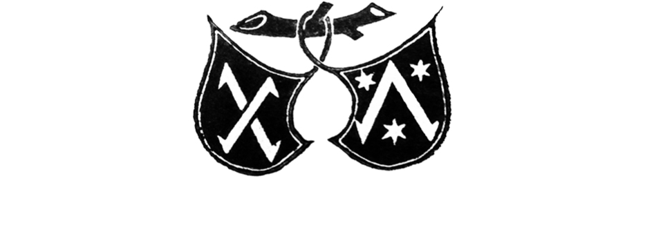
Fust & Schöffer (est. 1457)
Johann Fust and his son-in-law Peter Schöffer employed the first printer mark when they established their firm in 1457, four years after Gutenberg produced the first typographically printed book. Twin shields hang from a branch — each one sporting a Greek letter to represent their respective families.
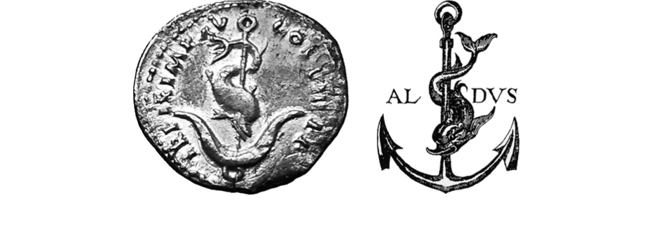
Aldine Press (est. 1494)
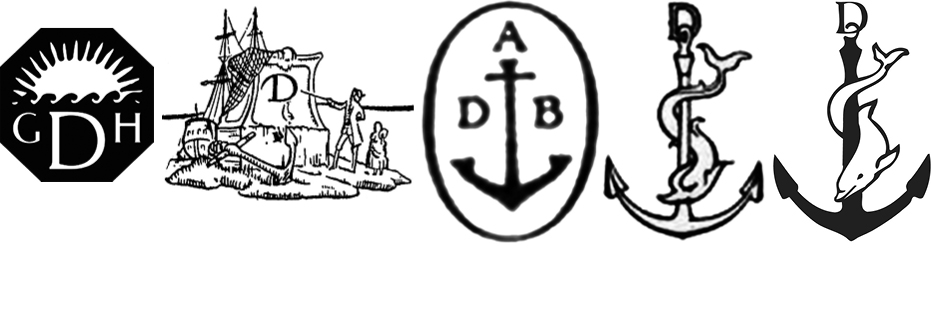
The image of a dolphin wrapped around an anchor that Aldus Manutius chose for Aldine Press is a visual metaphor for “Fastina Lente”—the Roman version of the classical Greek motto, which is often translated into English as “More Haste, Less Speed.” A silver medal of Vespasian featuring the dolphin and anchor, which was gifted to Manutius by Cardinal Pietro Bembo, was likely the inspiration for its adoption. The oxymoron in the metaphor cleverly captures the spirit of book production. Manutius, who understood and appreciated books from every angle, invented italic type, the portable octavo trim size, and was renowned for the quality of his craftsmanship. Numerous presses employed the dolphin and anchor after him, a testament to the suitability of his logo’s adage and his reputation for invention and precision. Examples include Antoine Tardif (est. 1584), Chiswick Press (est. 1787), William Pickering (est. 1820), and Doubleday (est. 1897).
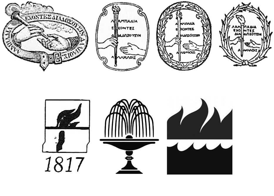
Harper & Row (est. 1817) and William Collins, Sons (est. 1819)
The waves and flames of HarperCollins represent the merging of two firms—Harper & Row and William Collins, Sons. In 1817, James and John Harper opened a print shop. Before long, they began publishing their own books and adopted a colophon that featured a torch changing hands. It was supported by a quote from Plato’s The Republic that refers to a torch race: “Running in the race they pass the torch one to another.” In 1962, the firm merged with Row, Peterson & Company to form Harper & Row. They retained the mark of the flame but abandoned the connection to Plato and the core idea of the flame being passed — that is, until it was passed to William Collins, Sons.
It is difficult to find a record of the reasoning behind the fountain mark of William Collins, Sons. That said, in 1881 when the firm was still branded by their family coat of arms, a fountain was built in Glasgow to honor Sir William Collins II — the son of the firm’s founder. We can hazard a guess that the trademark and landmark refer to the same fountain.
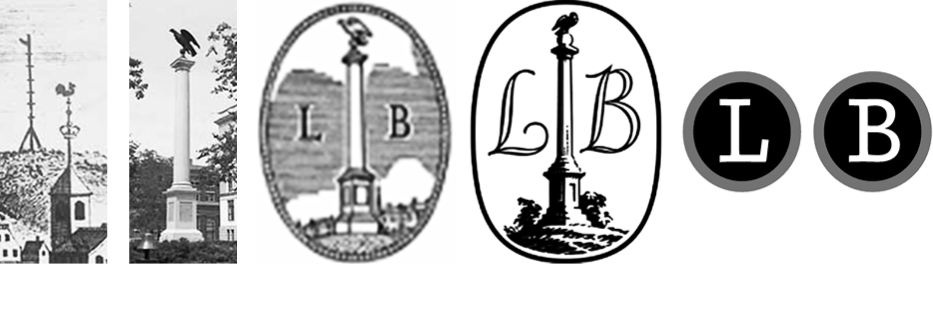
Little Brown & Co. (est. 1837)
Little Brown’s original colophon featured an illustration of the Charles Bulfinch monument atop Beacon Hill in Boston , where the firm was originally located. The monument commemorated the location of the city’s earliest alarm system : a beacon to announce a fire or attack. In 2009—after 172 years—the original logo was replaced by a more legible, but less storied, set of typewriter’s keys.
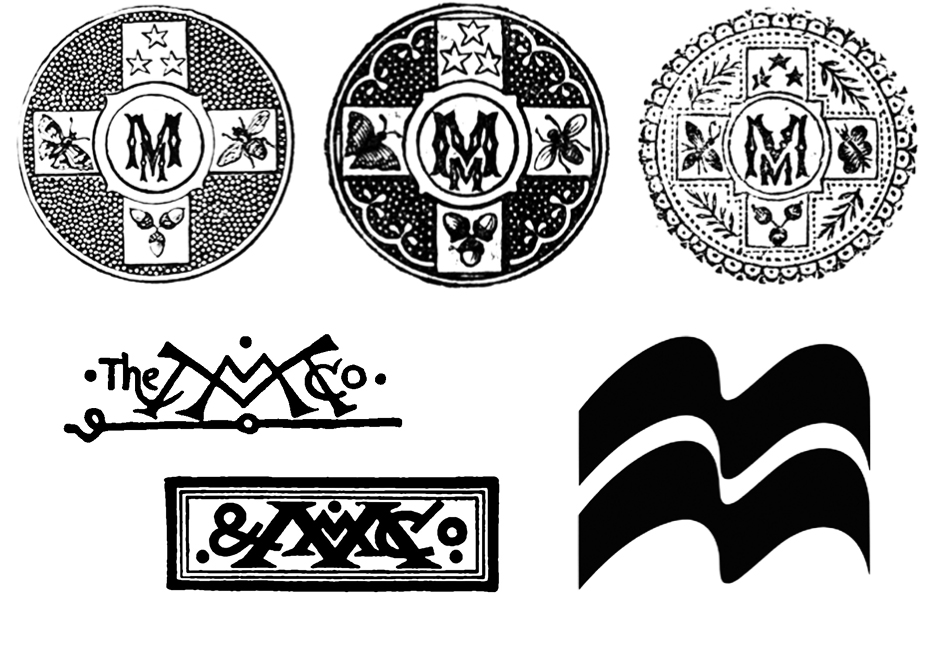
Macmillan (est. 1843)
It is difficult to find mention of the who and why behind Macmillan’s mark but the graphic record allows us to unpack a narrative. Starting as bookstore owners, the Macmillan brothers eventually began publishing works that were branded with a monogram. The monogram evolved over many years but always retained a prominent double “M.” Eventually the two “Ms” made the leap to become the iconic banners that they are today.
Doubleday (est. 1897)
The Doubleday family ran through a series of publishing partners and colophons built on trees, books, and laurels before landing on the decision to co-opt the anchor and dolphin wholesale from Aldus Manutius’ Aldine Press (est. 1494). Superficially, it seems that the aim was to imbue Doubleday with Manutius’ reputation for quality and innovation—and it was that—but the anchor symbol was also a direct response to the firm’s own history. In 1927, Doubleday had merged with George H. Doran Co. to form Doubleday Doran. Doran brought a water symbol, which had been absent from Doubleday to that point. The new firm chose a mark that featured an anchored boat with a man pointing at the house’s double D initials. In 1946, when the company changed its name to Doubleday & Co., it dropped a D. Then in 1954, when Ken McCormick and Jason Epstein founded an imprint of Doubleday, Anchor Books, the scene was reduced to anchor and initials alone for their imprint. It was from there that they jumped to Aldine’s colophon, and this became a logo that went on to represent the whole company.
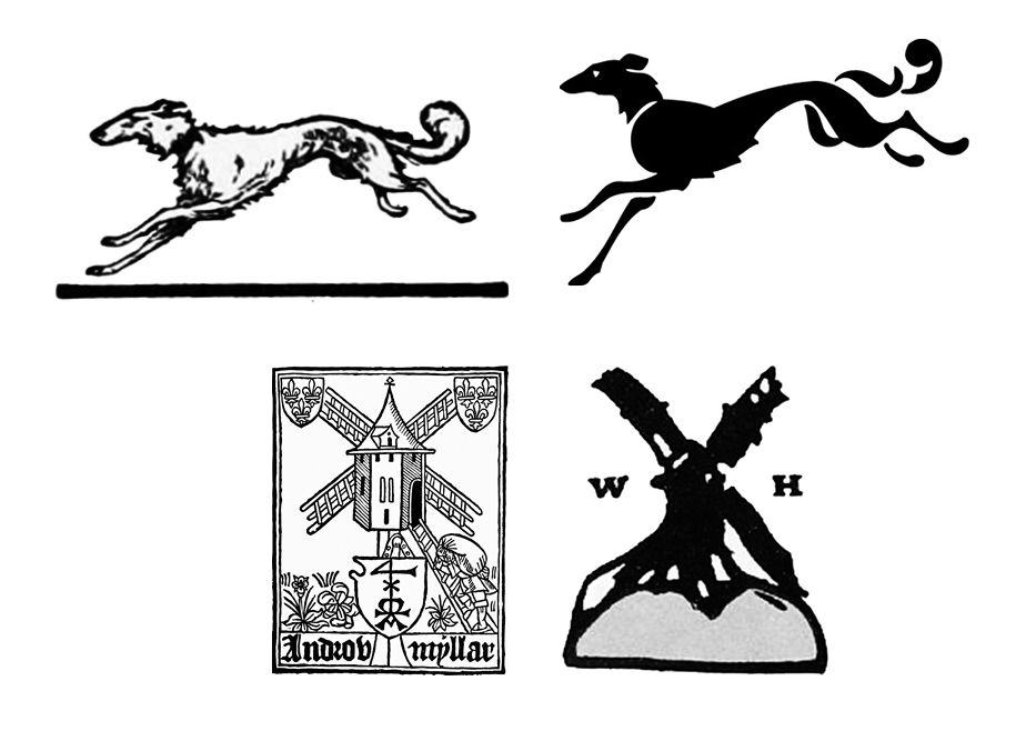
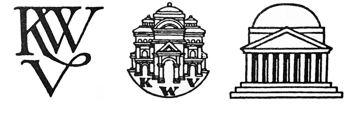
Knopf (Est. 1915), Heinemann (est. 1890), and Androw Myllar (est. 1507)
“When I started in business the publisher I admired most was London’s William Heinemann, and the sign of a Heinemann book was a windmill, drawn for him, I think, by William Nicholson. Since a windmill obviously had nothing to do with books, I saw no reason why we could not adopt the Borzoi as our mark.” —Alfred Knopf
Also known as Russian Wolfhounds, the Borzoi, as described by the American Kennel Club, is a “regally dignified, loyal, and affectionate” breed. Blanche Knopf (née Wolf) suggested the Borzoi—possibly in reference to her maiden name—prior to owning one. Amusingly, after owning a Borzoi she described the breed as “stupid, disloyal, and full of self-pity.”
Wolfhounds aside, Knopf was mistaken about the lack of connection between windmills and books. Scotland’s first printing press—founded by Androw Myllar—also marked its books with a windmill. It was common at the time for printers to design their colophons in playful reference to their surnames , and Myllar meant “mill worker.” Perhaps Heinemann was aware of Myllar’s press and mark, but the windmill on his books was in fact a portrait of Beacon Mill in the village of Rottingdean, which was also home to William Nicholson, who—as Knopf speculates—was the artist behind the woodcut.
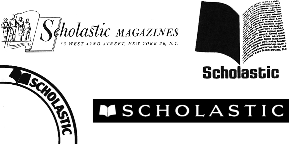
Scholastic (est. 1920)
The Scholastic Publishing Company, founded by Maurice Robinson, began by publishing magazines. In 1926, it started to manufacture books, but did not approach the establishment of a mark until 1940. Business correspondence and financial documents were branded with the Scholastic Magazines logo, designed by Mary Jane Dunton, though books and magazines did not receive this mark. In 1970, Scholastic adopted a spread of flying pages, designed by Morton Goldshow, as its first public-facing trademark. Dick Robinson—the son of Maurice, and current CEO—strongly advocated for the adoption of the pages. The flying pages were eventually set into an arc that was anchored to the lower corner of covers. In 1986, the identity was updated by longtime creative director Russell D’Anna, who straightened the arc and placed the flying pages within the now iconic red bar to the left of the company name, which is typeset in Newtext Demi-bold.
Simon & Schuster (est. 1924)
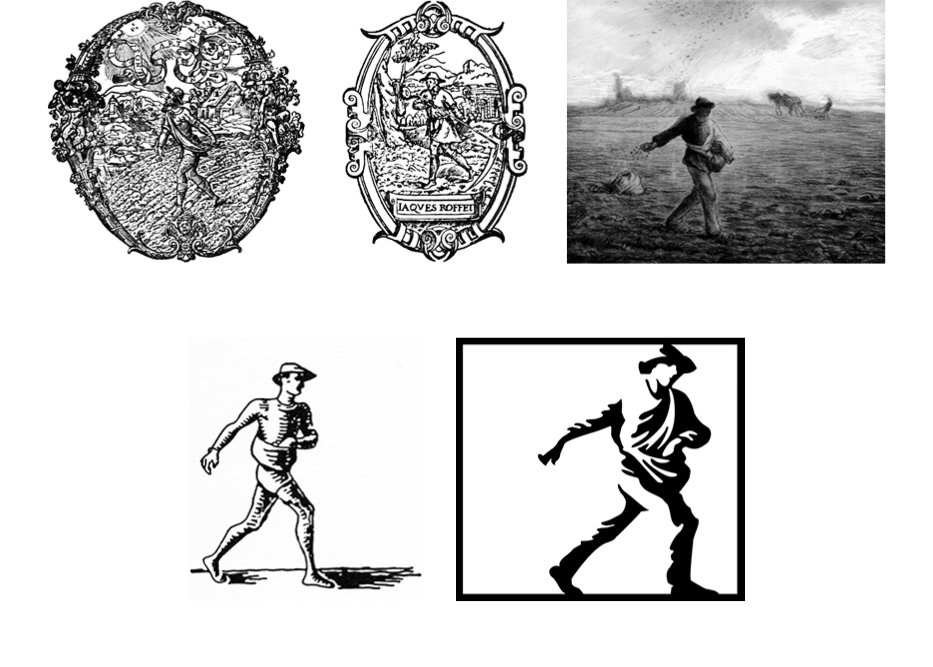
Richard Simon and Lincoln Schuster stumbled upon “The Sower,” a painting by Jean François Millet, as they strolled through a gallery during their first week of publishing. It occurred to them that the image of a man sowing grain was the perfect publishing metaphor for “planting seeds of wisdom.” So they hired John Everett Millais to render a reproduction of the painting for their colophon. This story suggests that they were possibly unaware of the long tradition of using agricultural symbolism to brand presses, with Jean De Tournes (est. 1542) and J. Roffet (est. 1549) as two examples.
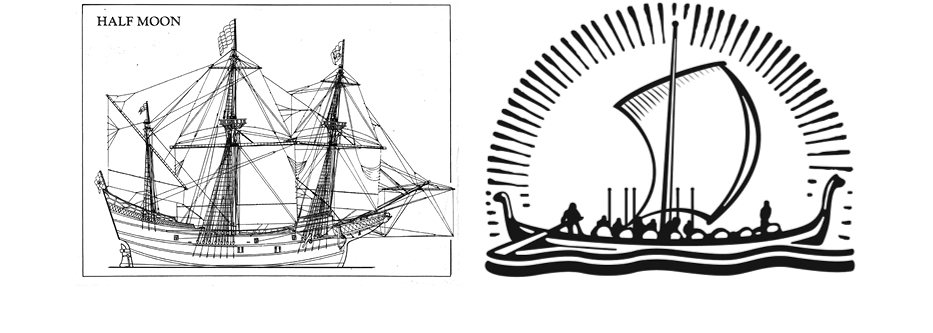
Viking (est. 1925)
In 1925, Harold Guinzburg envisioned the Half Moon Press, named after Henry Hudson’s famed flyboat. He hired Rockwell Kent to render the vessel but Kent delivered what could only be interpreted as a Viking longboat. Though initially angry that Kent had missed the mark by such a wide berth, Guinzburg eventually embraced the Viking ship and name for its associations with enterprise, adventure, and exploration in publishing.
Random House (est. 1928)
In 1928, Bennett Cerf and Donald Klopfer published their first book: Candide, by Voltaire. The limited edition volume was illustrated by Rockwell Kent , who had unintentionally charted a new course for Viking three years earlier. Rockwell included a picture on the colophon of the house where Candide lived at the end of the book. The drawing was lifted from the book and used to brand all of their subsequent titles.

Schocken Press (est. 1931)
Brothers Simon and Salmon Shocken began by founding a department store in 1926. Salmon branded the store with a distinctive “S,” inspired by the geometric style of Piet Mondrian. Reportedly, he designed the mark himself , and the store’s initial advertisements were executed by László Moholy-Nagy. Then in 1931, two years after Simon’s untimely death, Salmon founded Schocken Press and branded it with the same “S” that had marked the store. Over the course of its life, the original Schocken “S” was used to sell both books and pots. When Salmon passed away in 1958, his son-in-law T. Herzl Rome rebranded the firm to mark the signal change. The “S” was reimagined again in 1987 by Louise Fili and in 2011, Rome’s “S” was revived and refined by Peter Mendelsund. Today Schocken employs a flexible brand strategy by blessing the use of all three marks.
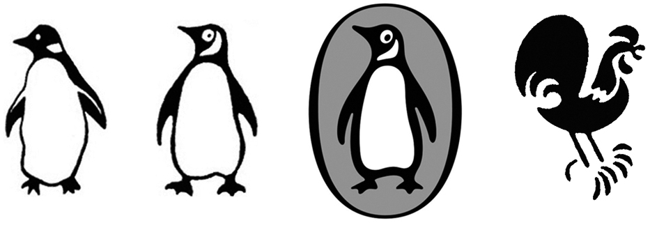
Penguin (est. 1935) and Bantam (est. 1945)
Twenty years after Alfred chose the Borzoi , Allen Lane decided that his new house should also be branded with an animal. His office manager suggested penguins because they are “dignified, but flippant.” Lane sent Edward Young—a 21-year-old with some drawing experience—to the zoo. Upon returning, Young reportedly said, “My God, how those birds stink!” Still, with his sketches, the mark was set. Fourteen years later, Jan Tschichold evolved the bird and brand strategy into a beacon of excellence in book design. And 54 years after that, Pentagram refined it further still.
In 1939, Lane tapped 23-year-old Ian Ballantine to head Penguin’s U.S. office. While running that office, Ballantine identified a need for paperback originals—his graduate economics thesis was on the potential of paperbacks—but Lane didn’t agree. So Ballantine left Penguin to form his own house, which he named Bantam Books. A bantam being a louder, prouder show bird, it appears the choice was made to mark the start of Ballantine’s campaign to disrupt the publishing pecking order.
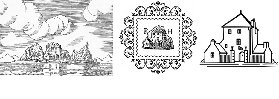
 Pantheon (est. 1941)
The story of Pantheon is the story of Kurt Wolff. In 1908, Wolff began his publishing career at the age of 21 as the silent partner of Ernst Rowohlt. Four years later, his name was on the colophon and in the 18 years that followed he made an indelible mark on the history of celebrated literature. But by 1930, facing increasing financial and political pressures in Germany, he was forced to retire from publishing and left the country to live in France and then Italy. The 1930s were colored by fear, as Hitler’s horrific agenda unfolded across Europe , and the Nazis destroyed many of Wolff’s titles in the book burnings of 1933. In 1941, Wolff fled Europe and landed in New York City. Once settled, he began a new publishing venture from his Washington Square apartment with his wife Helen and a partner, Jacques Schiffrin. America had already entered WWII, and Wolff was technically an enemy alien, so he felt it would be unwise to use his name for the firm. So, he incorporated his new business as Pantheon Books, Inc., perhaps referencing his time in Italy.
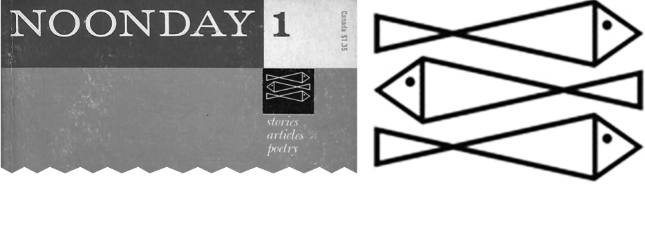
Farrar, Straus, & Giroux (est. 1960)
The three fish of Farrar, Straus, and Giroux were pulled directly from Noonday Press upon its acquisition in 1960. They had been employed on the cover of Noonday’s short-lived, self-titled literary magazine, which was edited by Noonday’s founder Cecil Hemley and published during 1958 and 1959 in the lead-up to the sale. The three fish were set above the same three words on the cover of each issue, “stories, articles, poetry.”
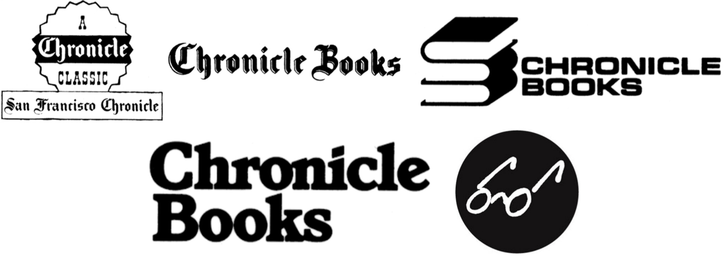
Chronicle Books (est. 1967)
Phelps Dewey—an executive at the San Francisco Chronicle—was responsible for expanding the company’s publishing stance to include books. Early marks drew a connection between the imprint and its newspaper roots. In 1991, then president Jack Jensen decided to pivot away from the logotype that was used at that time. He asked then—and current—creative director Michael Carabetta to explore other options. Carabetta tapped Tom Suiter who came up with the glasses as a playful reference to reading. When the mark was first launched in 1992, it was accompanied by the tagline “We See Things Differently.”
As publishers press forward into the quickly shifting 21st century, they will increasingly rely on merger and acquisition to hedge against an uncertain future. Mike Shatzkin, son of legendary publishing executive Leonard Shatzkin and founder of The Idea Logical Company, a consulting firm that analyzes the book industry, recently told the New York Times, “I’d be so bold as to say we’ll have two big trade publishers 10 years from now, and no more.” Many publishing brands will be combined or abandoned in the near future as the industry converges under pressure from the digital era. But the stories unearthed above reveal that these identities have been in flux for centuries—long before the death of the print became a point of speculation. One thing is certain: Publishing’s brands will continue to be farthest from our minds when we’re lost in a book.
Acknowledgments
In addition to the works cited below, the stories told above were researched and refined thanks to the generous assistance of Michael Carabetta, Scott Clemons, Russ D’Anna, Altie Karper, Chip Kidd, Ralph LaRossa, Maureen Mulligan LaRossa, Maya P. Lim, Paul Soulellis, Marian Steffens, and Deimosa Webber-Bey.
Bibliography
David, Anthony. The Patron: A Life of Salman Schocken 1877–1959. New York: Metropolitan Books, 2003.
Epstein, Jason. Book Business: Publishing Past, Present, and Future. New York: W. W. Norton & Company, 2002.
Gress, Edmund Geiger. The Art & Practice of Typography. New York: Oswald Publishing Company, 1917.
Lippert, Jack K. Scholastic, a Publishing Adventure. New York: Scholastic, 1979.
Mackay, Ralph. Publisher’s Devices: Harper & Brothers Passing the Torch. chumleyandpepys.blogspot.com. Link (retrieved 6/18/16).
Michael, Ermarth. Kurt Wolff: A Portrait in Essays & Letters. Chicago: The University of Chicago Press, 1991.
Roberts, William. Printers’ Marks: A Chapter in the History of Typography. New York: G. Bell & Sons, 1893.
Thompson, John B. Merchants of Culture. Cambridge: Polity, 2010.
The Book Buyer: A Summary of American and Foreign Literature, Vol V. New York: Charles Scribner’s Sons, 1891.
The Book Buyer: A Summary of American and Foreign Literature, Vol VII. New York: Charles Scribner’s Sons, 1891.