August 10, 2016
In Praise of Slow Design

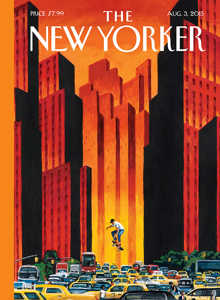
The New Yorker cover: “The Endless Summer,” by Mark Ulriksen.
This essay was originally published in January 2006.
I got what I wanted for Christmas: The Complete New Yorker, which, as you probably know, is a digital archive of every issue of the weekly magazine since its first on February 21, 1925 on eight DVDs: every cover, every page, every story, every cartoon, every ad. I’ve been going through it compulsively ever since. I’ve read the work of Dorothy Parker, J. D. Salinger, Robert Benchley, Pauline Kael, Robert Caro and Raymond Carver as subscribers first did; wallowed in the nightclub listings that conjure a lost world where “there’s Billie Holiday to listen to” at the Downbeat on 52nd; and gaped at covers, funny and tragic, by Charles Addams, Saul Steinberg, Art Spiegelman and Maira Kalman. From a journalistic, literary and historical point of view, the New Yorker archive is endlessly fascinating.
And from a design point of view? Unbelievably boring. Or, I should say, unbelievably, wonderfully, perfectly, exquisitely boring. To a field that today seems to prize innovation above all else, The New Yorker makes a case for slow design: the patient, cautious, deliberate evolution of a nearly unchanging editoral format over decades. And the case they make is — let’s admit it — pretty hard to argue with.
Incongruously, the magazine that set the standard for sophisticated urbanity for much of the 20th century was founded by (in the words of playwright Ben Hecht) “a man who looked like a resident of the Ozarks and talked like a saloon brawler.” Harold Ross was a Colorado miner’s son and high school dropout who worked as a journeyman reporter and editor of the U.S.’s Army’s newspaper before arriving in New York in 1923. There he fell in with a group of writers and artists, many of whom, like George S. Kaufman, Alexander Wollcott and Dorothy Parker, already had established reputations in the city, and who would become the core contributors of a magazine he started two years later. “The New Yorker will be a reflection in word and picture of metropolitan life,” Ross wrote in his prospectus for potential investors, adding that it “will be the magazine which is not edited for the old lady in Dubuque.” He would be its editor for the next 26 years.
Rea Irvin was a member of Ross’s original circle, and more than anyone else, was responsible for the way The New Yorker‘s first issue looked and, to a remarkable degree, for the way it looks today. An artist and art director most recently of Life magazine, Irvin established the visual conventions that would endure through the publication’s history, including the logo, set in a handdrawn font used throughout the magazine and still referred today as “Irvin type,” and the first cover, which introduced the monocled dandy “Eustace Tilly” as the magazine’s de facto mascot. It also created the basic format for all the covers to come: a full bleed illustration, the subject of which seldom if ever had any relationship to the issue’s contents, with a band of color down the left hand side.
Many of the magazine’s most idiosyncratic conventions bespoke an almost neurotic reticence. For 45 years, The New Yorker had no table of contents. Ross’s successor William Shawn introduced them without comment in 1969. Until the October 5, 1992, issue, bylines were placed unobtrusively at the end of articles, when they appeared at all, almost as an afterthought. “Regular readers of The New Yorker will note in this issue a number of changes in the magazine’s format and design,” warned the magazine’s fourth editor, Tina Brown, and beginning with that issue, bylines finally appeared beneath the headlines. In the following months, le deluge: Brown would introduce brief article summaries (a.k.a. “decks”) and photography to the interior, bringing in Richard Avedon, Gilles Peress and Robert Polidori as regulars. The incorporation of these features — a table of contents, bylines, photographs — utterly commonplace in nearly every other general interest magazine on earth, were each regarded as a revolutionary, even shocking, innovation within the pages of The New Yorker. Nonetheless, a comparision of that first issue to the one that arrived in my mailbox last week reveals more similarities than differences.
Publication design is a field addicted to ceaseless reinvention. Sometimes a magazine’s redesign is generated by a change in editorial direction. More often, the motivation is commercial: the publisher needs to get the attention of fickle ad agency media buyers, and a new format — usually characterized as ever more “scannable” and “reader-friendly” — is just the thing. In contrast, one senses that each of the changes in The New Yorker was arrived at almost grudgingly. Designers are used to lecturing timid clients that change requires bravery. But after a certain point — 80 years? — not changing begins to seem like the bravest thing of all.
There is a slow design movement out there. “Daily life has become a cacophony of experiences that disable our senses, disconnect us from one another and damage the environment,” say the designers of the not-for-profit slowLab. “But deep experience of the world — meaningful and revealing relationships with the people, places and things we interact with — requires many speeds of engagement, and especially the slower ones.” Inspired by other global “slow” movements in food and city planning, slow design is not just about duration or speed, but about thoughtfulness, deliberation, and — how else to put it? — tender loving care.
I imagine there are designers who would find The New Yorker exasperating. And certainly its timelessness can be interpreted as an attempt to hold on to a fantasy, an idea of the way life should be lived, against all odds. As onetime Design Observer contributor Momus observes on his site in a discussion about slow magazines, for their readers, “magazines, as well as representing lived lifestyles, also represent aspirations, dreams and compensations for lifestyles they don’t show.” Or, to quote a letter the magazine received in 1956, after Ross had rerun — for the 25th time — the same illustration of Eustace Tilly to celebrate The New Yorker‘s anniversary: “Since we have been subscribing since 1926 or ’27, I feel I can address you as a close friend. I just want to thank you for the February 25th cover. The sight of Eustace Tilley cheered me, so unchanged in a chaotic world (from a doctor’s wife in Albany to a widow in Nebraska)…Please don’t change, ever.”
But The New Yorker has changed, and will keep changing. The latest update happened in 2000, when current editor David Remnick decided, among other things, to restructure the typography of the theatre and movie listings and commissioned — are you ready? — the ultimate modernist, Massimo Vignelli. To his credit, Vignelli fully understood the delicacy of the situation and acted (unnoticed by nearly everyone) with the precision of a surgeon.
That delicacy has seldom been demonstrated as effectively as in the magazine’s issue of August 31, 1946. Like many others, I read John Hersey’s book Hiroshima in high school. I only found out much later that this account of the dropping of the first atomic bomb had been commissioned by The New Yorker, and that upon its receipt William Shawn convinced his boss Harold Ross to run the entire piece in a single issue. I was curious to see the article as it first ran, and it was the first thing I looked up once I had The Complete New Yorker loaded on my computer. On the opening page is the following note: “The New Yorker this week devotes its entire editorial space to an article on the almost complete obliteration of a city by one atomic bomb, and what happened to the people of that city. It does so in the convinction that few of us have yet comprehended the all but incredible destructive power of this weapon, and that everyone might well take time to consider the terrible implications of its use.” At the top of the page sits Eustace Tilly in his customary spot. The story continues through the customary cartoons and ads for luxury goods. Any other magazine, I’m convinced, would have broken with convention and run a huge SPECIAL ISSUE! banner on the front. Instead, the cover is a pleasant summer picnic scene by Charles Martin.
Shawn and Ross urged Hersey to make the devastation as immediate as possible to their magazine’s readers. It begins: “At exactly fifteen minutes past eight in the morning, on August 6, 1945, Japanese time, at the moment when the atomic bomb flashed above Hiroshima, Miss Toshiko Sasaki, a clerk in the personnel department of the East Asia Tin Works, had just sat down at her place in the plant office and was turning her head to speak to the girl at the next desk.” In effect, it was an everyday moment, no more significant than the moment depicted on the cover. And, presented between the covers of a seemingly changeless magazine to creatures of habit expecting comfort, a devastating reminder of how quickly everything can change.
Observed
View all
Observed
By Michael Bierut
Related Posts

Innovation
Ashleigh Axios|Essays
Innovation needs a darker imagination

Business
Kim Devall|Essays
The most disruptive thing a brand can do is be human

AI Observer
Lee Moreau|Critique
The Wizards of AI are sad and lonely men

Business
Louisa Eunice|Essays
The afterlife of souvenirs: what survives between culture and commerce?
Related Posts

Innovation
Ashleigh Axios|Essays
Innovation needs a darker imagination

Business
Kim Devall|Essays
The most disruptive thing a brand can do is be human

AI Observer
Lee Moreau|Critique
The Wizards of AI are sad and lonely men

Business
Louisa Eunice|Essays
