October 28, 2011
On My Shelf: Continuum’s 33 1/3 Series

No. 29, In the Aeroplane Over the Sea (by Neutral Milk Hotel), Continuum, 2005
In the field of popular culture, there are two superb, long-running series of critical monographs. These projects, intellectually ambitious yet accessible and popular, should be inspirational case studies for any publisher, writer or writing student that aspires to produce equally engaging writing about design for a broad audience. One series is the BFI Film Classics, which devotes an entire volume to each film — I might return to these books another time. The other venture is Continuum’s 33 1/3 series. Here, too, each volume concentrates on a single work, in this case an album of enduring impact and artistic value.
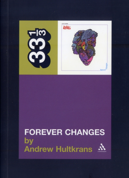
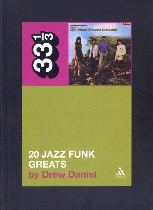
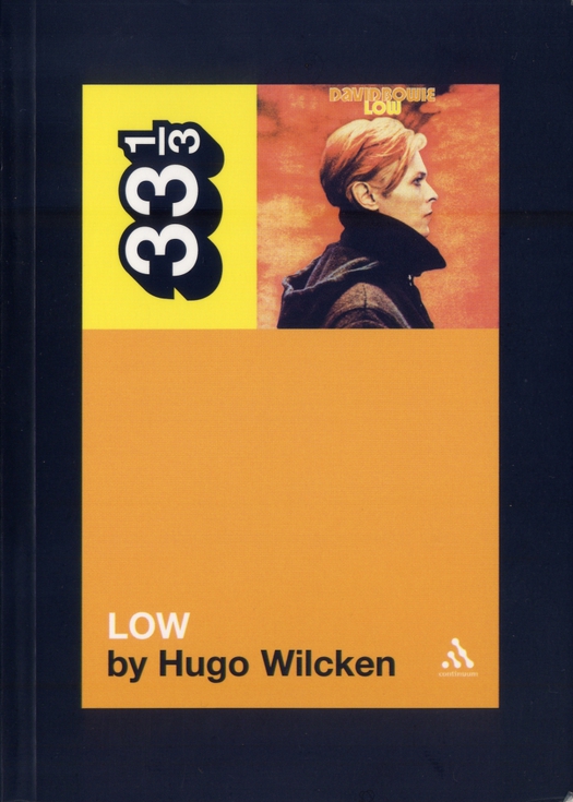
The 33 1/3 books are a perfect example of how design can help focus an editorial idea and make it irresistible. The books are enticingly small, but their width in relation to their height makes them feel considered and substantial. The series identity is powerfully projected by the upended 33 1/3 logo, defined by a heavy drop shadow, which is always the dominant typographic element. A miniature reproduction of the original album cover is the only pictorial device; it’s celebratory, serious, archival and a little bit fetishistic all at the same time — exacty right for the audience. The album’s colors generate the areas of flat color used for the cover box, back cover and spine. Even the black border, like a frame around an illustration of the actual cover, adds a note of distinction and gravitas, enshrining both title and image.

No. 2, Forever Changes (by Love), Continuum, 2003
The first volume, devoted to Dusty Springfield’s Dusty in Memphis, appeared in 2003. Since then another 82 of the numbered titles have been published. The books I have read so far include Forever Changes (Love), Kick Out the Jams (MC5), Low (David Bowie), Unknown Pleasures (Joy Division), OK Computer (Radiohead) and In the Aeroplane Over the Sea (Neutral Milk Hotel), the series’ bestselling title. I have American poet Tony Tost’s recent volume about American Recordings, Johnny Cash’s extraordinary 1994 comeback, waiting in my in-pile. A few days ago, I finished 20 Jazz Funk Greats, which deals with the third album (1979) by Throbbing Gristle, originators of the “industrial” music genre and, in their time, one of the UK’s most alarming and controversial bands.
In some of the finest writing I have seen in the series, Drew Daniel, a member of the electronic group Matmos and a teacher in the English department at Johns Hopkins University in Baltimore, undertakes a dizzyingly attentive and eloquent critical reading of TG’s ironically titled album. Daniel’s imaginative ability to penetrate from afar the climate and culture of dour, politically reactionary 1970s Britain, which he didn’t experience, is impressive, and he effectively anchors his reasons for undertaking the book in his teenage attraction, living in Kentucky, to the morbid and extreme. His closely argued chapter on the band’s sly, saccharine, “easy-listening” cover artwork — the grassy cliff edge where they pose in their suspiciously ordinary leisurewear is a notorious suicide spot — warrants immediate reprint in a Looking Closer-like volume. At a time when graphic design writing lacks critical energy and commitment, a musician and English professor provides an object lesson in delving deeper and thinking harder about design as communication.

No. 54, 20 Jazz Funk Greats (by Throbbing Gristle), Continuum, 2008
I like the series so much that a few years ago I approached 33 1/3’s editor, David Barker, with a proposal. I wanted to write about Brian Eno’s second album, Taking Tiger Mountain (By Strategy) (1974), a concept inspired by postcards of a Chinese revolutionary opera of the same name. In 2003, Doug Hilsinger and Caroleen Beatty re-created Eno’s entire album as a homage. My first book was a collaboration with the artist Russell Mills about Eno, and I thought there was more to say. My timing was off, though. It turned out there was already a project in Continuum’s pipeline focusing on the more obvious Eno classic, Another Green World (1975).
I’m hardly impartial, but for me that book didn’t come off. The American writer felt too distant from her British subject and there were no great revelations for long-term fans. The best 33 1/3 titles, like Drew Daniel’s, have an urgent personal mission, even obsession, and they tunnel deep down into an album’s defining moment and milieu: dark sixties Los Angeles in Forever Changes, isolated seventies Berlin in Low, creative nineties Athens, Georgia in In the Aeroplane over the Sea. (“There are no great records without great sleeves,” writes the author, Kim Cooper, “and Aeroplane’s is a stunner.”) Usually around 30,000 words, these detailed studies are hugely challenging to research and write. Continuum has let it be known that a batch of previously announced titles has been canceled after initial high hopes: the authors just couldn’t deliver. Even so, the publisher won’t be signing up any more titles for some time. I hope this isn’t an indication they are starting to slow up. The well of exceptional popular music albums is so deep that the series could run for decades, and the listener’s attachment to a favorite album is often fierce.

No. 26, Low (by David Bowie), Continuum, 2005
Observed
View all
Observed
By Rick Poynor
Recent Posts
DB|BD Season 12 Premiere: Designing for the Unknown – The Future of Cities is Climate Adaptive with Michael Eliason About face: ‘A Different Man’ makeup artist Mike Marino on transforming pretty boys and surfacing dualities Designing for the Future: A Conversation with Don Norman (Design As Finale) Innies see red, Innies wear blue: Severance’s use of color to seed self-discovery
 Rick Poynor is a writer, critic, lecturer and curator, specialising in design, media, photography and visual culture. He founded Eye, co-founded Design Observer, and contributes columns to Eye and Print. His latest book is Uncanny: Surrealism and Graphic Design.


