April 19, 2012
Phil Sayer, Designer of Photo-Portraits

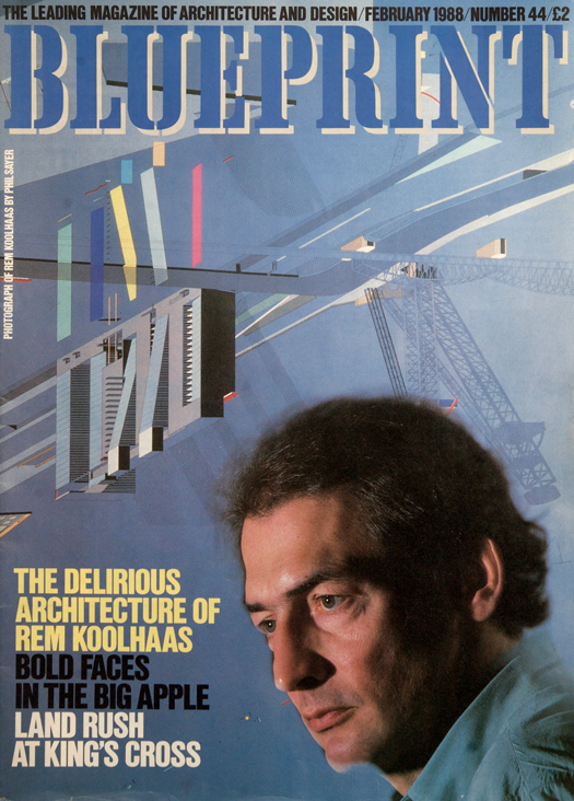
Rem Koolhaas. Photograph: Phil Sayer. Art editors: Simon Esterson & Stephen Coates. February 1988
A few weeks ago I learned that the British photographer Phil Sayer had launched a website — and not before time. I have been a fan of his pictures for many years and it gives me a good reason to talk about his work.
Like a lot of viewers, I first encountered Sayer’s photographs in the pages of Blueprint in the 1980s. Then, in February 1988, I got a job on the magazine as deputy editor and met the man himself. Photography was absolutely central to Blueprint under Deyan Sudjic’s editorship, and a whole cast of photographers — among them Ian Dobbie, David Banks, David Townend, Steve Speller and Steve Pyke — did great work for the magazine. But for my money, Sayer was always the best, an image-maker whose way of shooting people defined the classic look of Blueprint in those years, helping to give it a visual impact and an editorial presence that it has never equaled since.
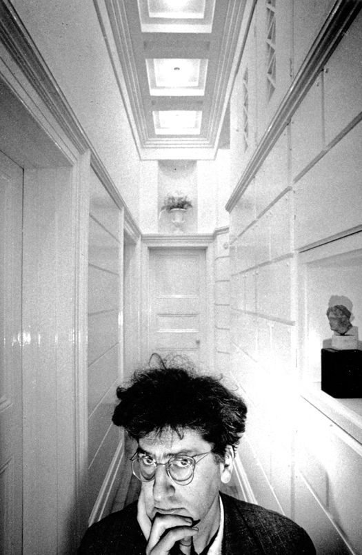
Sayer takes all kinds of pictures, including landscapes and buildings, but I want to concentrate here on the portraits he shot for the magazine’s designer/art editor Simon Esterson and art editor Stephen Coates. Looking back at those 1980s issues, it’s remarkable how many photographs of architects and designers they contain; almost no story would be published without one. Blueprint had over-sized pages so the pictures needed to work hard to justify all the space they were given and the cover, always a portrait in the early years, was the most critical of all. Sayer, an associate editor, became a master of the magnetically appealing cover shot. As well as the portraits shown here — Rem Koolhaas, Arata Isozaki and Daniel Weil (now a Pentagram partner) — he gave the Sayer treatment to Philip Johnson, Frank Gehry, Norman Foster, Cesar Pelli, Tadao Ando, James Stirling, Philippe Starck, Antonio Citterio, Peter Saville, and many others.
Leon Krier. Photograph: Phil Sayer. Taken for Blueprint, 1983

Daniel Weil. Photograph: Phil Sayer. Art editor: Simon Esterson. November 1983
Sayer is a superb practitioner of the so-called “environmental portrait” where the subject is shown in surroundings and with props that help to illuminate who they are or what they do. The great American photographer Arnold Newman, acknowledged by Sayer as an influence, is often described as the father of the genre. Sayer admires the use of space in Newman’s pictures, as well as those of Bill Brandt — his interest in portraiture was sparked by Brandt’s monograph Shadow of Light (1966). His other crucial influences came from magazine design. He cites the 1960s German magazine Twen designed by Willy Fleckhaus, a legendary art director who made phenomenally strong use of photos in rigorously constructed spreads. Twen also made a big impression on Simon Esterson and Sayer recalls donating some of his copies to Esterson’s collection.
 Arata Isozaki. Photograph: Phil Sayer. Art editors: Simon Esterson & Stephen Coates. May 1988
It is Sayer’s design awareness, his concern with the page as a complete unit, not just as a vehicle for showing his pictures, as some photographers see it, which sets his work apart. “Phil thinks editorially,” says Esterson. “He’s always concerned about the content and sequencing of pictures. Do they tell a story? He’s also aware of how a designer might want to use a picture in a layout: here’s space for the titlepiece; here’s an area for coverlines.” The Isozaki cover (above) is a perfect example. The main headline hangs from the vertical line formed by the glass’s edge like the weight at the end of a motionless pendulum. Isozaki’s blurred, raised hand behind the glass defines a secondary zone for the subsidiary coverlines, and Sayer leaves exactly the right amount of space at the top for the titlepiece, just as Esterson says. The effortless integration of elements looks easy, almost obvious. In reality, it takes a rare combination of photographer and designer sharing a common aim to achieve this kind of harmony. This is a quintessential Blueprint cover from those years.

April Greiman. Photograph: Phil Sayer. Art editors: Simon Esterson & Stephen Coates. May 1988
A profile of April Greiman inside the same issue has another Sayer portrait, which he shot for Blueprint in California while working on an annual report for someone else. The yellow rule she holds like a slender, glowing ingot could have seemed mannered and awkward. But the photograph’s play of angles and atmosphere of pop mysticism, with Greiman, shot from below, becoming a kind of cult priestess, is immediately explained and even intensified by the collection of multifaceted graphic works shown opposite. Again, the ensemble looks somehow inevitable.
Sayer is self-effacing about his pictures. “I can’t claim any penetrating insights into character with these portraits,” he says. “They are really designed images, making use of both the subjects and elements of their surroundings, sometimes rearranged for effect.” When I asked him how he went about devising these images, he sidestepped the issue by sending me a famous passage from Newman, taken from Interviews with Master Photographers: “Influences come from everywhere but when you are actually shooting you work primarily by instinct. But what is instinct? It is a lifetime accumulation of influence: experience, knowledge, seeing and hearing. There is little time for reflection in taking a photograph. All your experiences come to a peak and you work on two levels: conscious and unconscious.” I don’t doubt that’s exactly how it is for Sayer, though he isn’t the kind of photographer who would engage in protracted self-analysis about work he regards as a craft.

Jasper Morrison. Photograph: Phil Sayer. Art editor: Stephen Coates. November 1989

Erik Spiekermann. Photograph: Phil Sayer. Taken for Blueprint, 1989
All the pictures shown here were shot on 35mm, which Sayer prefers to larger formats for mobility and speed of working, though he does set up the camera on a tripod with a cable release when taking portraits, so he can maintain eye contact with the subject. The Koolhaas portrait (at the top) is a double-exposure, a technique he developed during his time working for Blueprint. Print quality is paramount and he has always done his own printing. He hates his pictures to be cropped, another reason why he composes them with such care. The Jasper Morrison portrait (above), taken for one of my own features, was created in the darkroom using two negatives. In 1989, I was in Berlin with Sayer and Stephen Coates on a research trip when Sayer shot the portrait of Erik Spiekermann (above). It captures the precise but loquacious designer perfectly — he had yet to become quite so famous — no matter how modest Sayer might be about his insights into character. He still uses film for black and white when time and budget allow, though he went digital for color some years ago — the Sottsass portrait for Domus in 2004 (below) is a transparency. The old Blueprint team had reassembled at Domus, where Deyan Sudjic had become editor, and Esterson was art director.
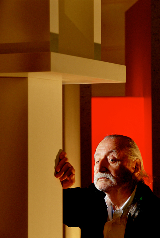
Ettore Sottsass. Photograph: Phil Sayer. Taken for Domus, 2004
You don’t often see portraits with this kind of conviction and panache in design magazines now, and no other design magazine that I know took portraiture as far as Blueprint. These are visions of design leaders from a decade in which it felt necessary and even challenging (at least in London) to assert the case for design by presenting designers and architects as compelling figures whose creative inventions justified larger-than-life treatment in visual journalism. Today we talk dismissively of “design stars” and “starchitects,” seeing these overexposed, globe-trotting publicity-chasers as symptoms of the systemic malaise of design under capitalism, rather than as bold visionaries offering vital panaceas. Design, we insist now, is made by teams of designers in collaboration with clients and users. A true “portrait” of design would be worthily thronged with cooperating stakeholders. The last thing we should do any more is to elevate and glorify designers as heroic individualists. In the early 1990s, when we launched Eye for Blueprint’s publisher, we were already reacting against the lavish designer portrait. In most issues, only the featured interviewee had a portrait, and these were relatively conventional, focusing on the subject’s face. (With Esterson now co-owner of Eye, more elaborate portraits, some of them by Sayer, are winning back page-space.)
None of these issues bothered me in the 1980s. Blueprint’s aim was to produce the best possible magazine and then to do it again a month later, and aside from the writing, that meant commissioning excellent pictures and showing them to maximum advantage on the page. No, we obviously can’t go back to how it was (though Sayer still takes great photographs) but it’s a sad truth that what’s good for us, usually involving some kind of abstinence, is often rather dull. The devil has the best tunes, as they say. Or pictures.
Observed
View all
Observed
By Rick Poynor
Related Posts

Innovation
Ashleigh Axios|Essays
Innovation needs a darker imagination
Business
Kim Devall|Essays
The most disruptive thing a brand can do is be human

AI Observer
Lee Moreau|Critique
The Wizards of AI are sad and lonely men
Business
Louisa Eunice|Essays
The afterlife of souvenirs: what survives between culture and commerce?
Related Posts

Innovation
Ashleigh Axios|Essays
Innovation needs a darker imagination

Business
Kim Devall|Essays
The most disruptive thing a brand can do is be human

AI Observer
Lee Moreau|Critique
The Wizards of AI are sad and lonely men

Business
Louisa Eunice|Essays

 Rick Poynor is a writer, critic, lecturer and curator, specialising in design, media, photography and visual culture. He founded Eye, co-founded Design Observer, and contributes columns to Eye and Print. His latest book is Uncanny: Surrealism and Graphic Design.