March 30, 2026
Protestors at “No Kings” rallies are making their mark.
The crown joins a long history of resistance symbols
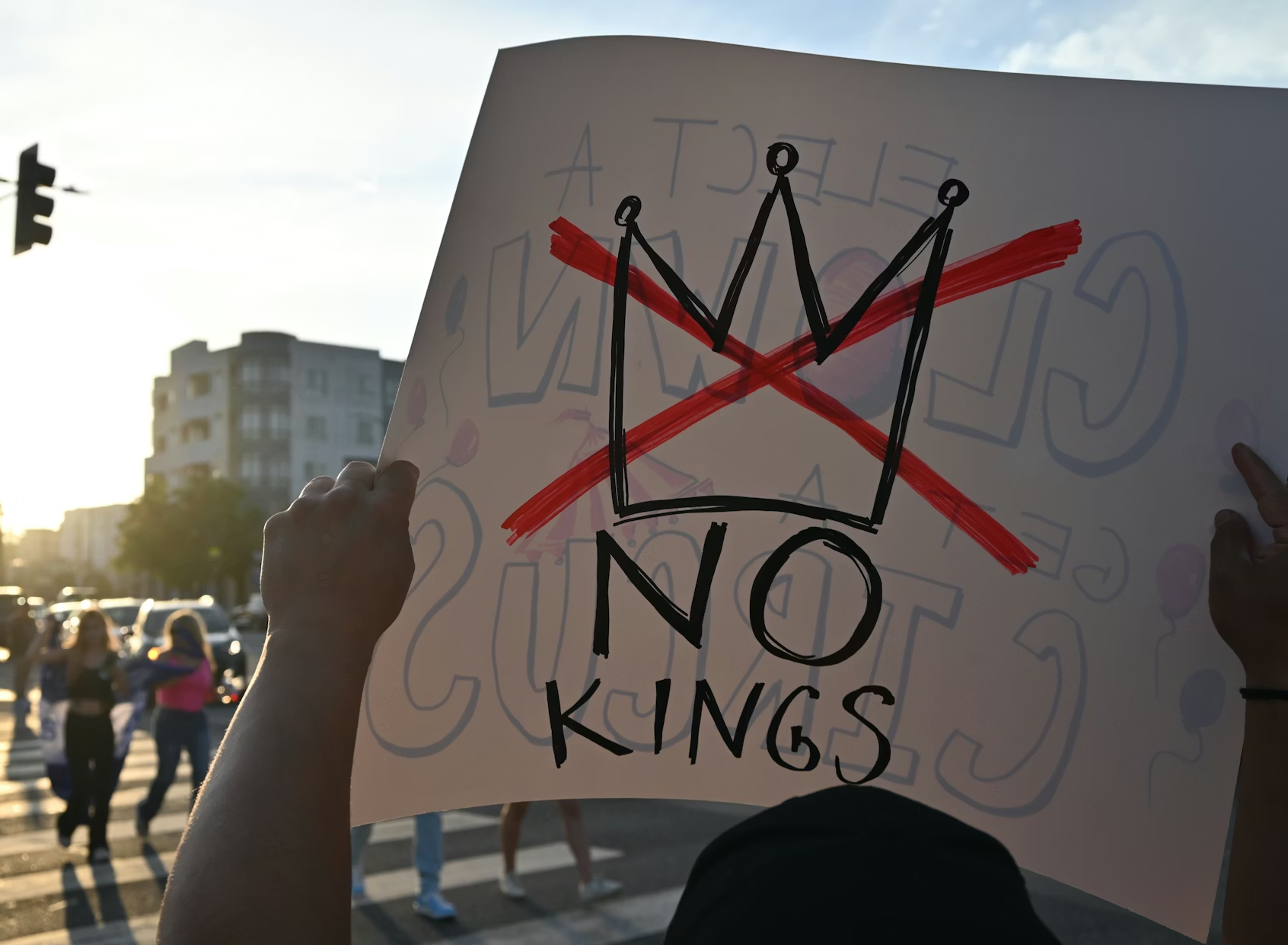
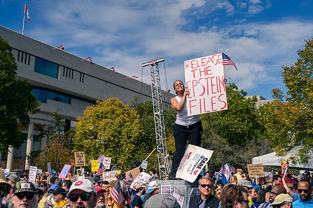
Some eight million people attended thousands of “No Kings” rallies in the U.S. this past Saturday, turning out to protest the Trump administration’s violent immigration policies, the escalating war in the Middle East, and to send a message that regime change was coming. “Grab ’em by the midterms,” read one sign held by a protestor at the rally in Trump’s newly democratic Mar-A-Lago district.
More than 100,000 people showed up at Minnesota’s State Capitol. CNN covered the fashion. Indianapolis turned out the signage.
Actually, everybody did.
The visual language developing from the No Kings rallies has become increasingly rich: inflatable baby Trumps, Handmaid’s Tale costumes, hand-painted versions of resistance memes, and, of course, a never-ending array of crowns, the ultimate nod to Trump’s abuse of power.
And yet, some fret. What’s the point? “Can the protests harness that energy and turn it into victories in the November midterm elections?” asks Jeremy W. Peters in the New York Times. “How can they avoid a primal scream that fades into a whimper?”
History can provide an important frame, in part by widening the scope of resistance beyond a single — albeit vital — goal.
Resistance movements, even narrowly defined ones, have long been condensers of unformed thought, helping disparate stakeholders find each other to debate and compare notes, and generating meaningful energy in communities under siege in different ways.
That’s exactly what happened when gay men co-opted the pink triangle from a symbol of persecution to one of liberation in West Berlin in 1975. Once used to physically identify gay men in Nazi concentration camps, the image became the Pink Triangle when, after much public debate, activists in Berlin understood that the symbol could accommodate a broad array of LGBTQ stakeholder needs (specifically drag queens) under a single umbrella of pride and identity. It took two years of movement building before the triangle became ubiquitous. “Adopting the Pink Triangle connected the Gay Rights movement with a history of oppression,” writes Dr. Dorna Safaian, an art and media researcher.
In May 1968, more than a million students and workers, with no central organization or charismatic leader, nearly toppled the De Gaulle government in France. Calling themselves the Atelier Populaire, or popular workshop, they communicated their concerns — specifically, the growing totalitarianism in France — through compelling, rough and unattributed posters, which they called “weapons in the service of the struggle.” Along with developing a new facility for discussing workers’ rights, “the movement produced an important visual language for protest that still resonates half a century later,” says graphic design lecturer Daniel Cookney.
Another example is Solidarność (Solidarity) or the Solidaryca typeface, which emerged in Poland in 1980. The lettering came to define Poland’s first independent trade union movement and its opposition to communist rule. Designed by graphic artist Jerzy Janiszewski, the Solidarność logo quickly came to symbolize broader European values of freedom, struggle, and democracy.
More on all of these in a special Observed section, below.
With history in mind, I predict that the act of image-making, mark-making, and craft, specifically made by real people, will become an essential part of what is clearly an organic and powerful resistance movement.
In a 2016 essay published in the WCCW’s Feminist Organization’s Handbook and discussed in detail in this must-read Monotype piece, designer, anthropologist, and educator Dori Tunstall argues that it’s important for people to “eliminate false distinctions between art, craft, and design” to circumvent the hierarchies that define even the best-intentioned community work. “[A]rt-based activism receives higher press recognition and, oftentimes, more financial support,” followed by “craft-based activism… because of the perception of grassroots authenticity.” In this regard, amateur design wins the day. “Design-based activism comes last, as it is considered too ‘professional’ for the grassroots but too ‘mass’ for artistic expression.”
Which brings me back to crowns.
While “crown” imagery has become so accessible that it’s easily deployed by many non-luxury or un-earnest brands — think Burger King, Juicy Couture, and Corona beer — I believe it could actually hold promise as a symbol of resistance in the U.S.
The crown is easy to wear and create, and because it refers to autocracy as a concept, not a specific person, it’s adaptable for many graphic uses. And it gets noticed: Liz McQuiston, a graphic designer and independent scholar whose work on political protest graphics has become an archive of its own, says the most enduring protest graphics are those “that refuse to go away.”
That makes it ripe for the most human thing we do.
“Humans, we seem to be universally compelled to make, mark, organize, and acquire things,” writes brand expert, writer, and podcaster Debbie Millman. “Humans have been using emblems of all sorts — religious icons, flags, shields, clothing, make-up, hairstyles — to telegraph who we are as a species and where we stand as individuals for almost as long as we have been on this planet.”
If the No Kings crown is more mark-making than logo, then it belongs to the same continuum as the very successful Solidaryca typeface and the pink triangle.
So, stop worrying about strategy and go make your mark.
Ellen McGirt
Editor-in-Chief
LinkedIn
Instagram
Threads
Ellen@designobserver.com
P.S. Did someone who loves you send you this newsletter? Welcome! Subscribe here.
This edition of The Observatory was edited by Rachel Paese.
This is the web version of The Observatory, our (now weekly) dispatch from the editors and contributors at Design Observer. Want it in your inbox? Sign up here. While you’re at it, come say hi on YouTube, Reddit, or Bluesky — and don’t miss the latest gigs on our Job Board.
Some fine print
In her first opinion piece for Design Observer, Jessie McGuire, Managing Partner of an independent design and creative studio, explores the ways systems are built to protect the powerful. According to her, accountability needs a different blueprint: making power visible and open to scrutiny.
“I’ve carried [an idea] with me since working with Milton Glaser’s studio in 2016: his belief that being a good designer is being a good citizen. Citizenship, as he understood it, wasn’t symbolic. It meant participation in shared systems, and responsibility to the public beyond any single client or brief.
Being a good citizen is no longer just about doing the right thing. It’s about understanding how power operates and whether the systems around us make that power visible and accountable. Communication design helps make that participation possible, showing people how systems work and how collective pressure can shift power from the few to the many.”
Observed
Resistance observed: the Suffragette Color System. One of the earliest documented cases of a brand strategy in service of a social campaign was the suffragettes fight for voting rights for women, first in the UK and then in the U.S., beginning in 1908. Organizers typically used three colors — green, white, and purple — on ribbons, sashes, and storefronts to signal solidarity. The colors also became part of a lively merchandising strategy, which helped local suffragettes raise money for the cause.
Resistance (is futile) observed: The Lichtdom / Cathedral of Light, Nuremberg Rally 1934. While Leni Riefenstahl’s Triumph of the Will may be the most famous — and studied — propaganda film of the modern era, it was German architect Albert Speer who created the enduring imagery used in the rally it documented, which cemented Nazi ideology in the imagination of ordinary German citizens. Speer placed 152 searchlights in a ring around the Zeppelin Field, beaming vertically into what became known as “Cathedral of Light” and described as “the single most dramatic moment of the Nazi Party rallies.” In his essay, “The Work of Art in the Age of Its Mechanical Reproduction,” German philosopher Walter Benjamin describes the design as enforcing submission rather than liberation. “The logical outcome of fascism is an aestheticization of political life.”
Resistance observed: The three words that changed American history in 1968. After two colleagues were crushed to death in a garbage truck, Black sanitation workers in Memphis went on strike in 1968 and marched through the streets wearing simple placards that read “I Am A Man.” The Memphis Sanitation Strike galvanized the movement. “The phrase distilled the entire civil rights struggle into a statement so fundamental it could not be ignored,” says the Museum of Protest. “Within weeks, Martin Luther King Jr. had joined their cause—and was assassinated in the city while supporting them. The workers won their strike, but more importantly, their slogan became immortal, proving that the right words at the right moment can shift the ground beneath power itself.”
Resistance observed: “The posting took place under the cover of night.” In May 1968, more than a million students and workers, with no central organization or charismatic leader, nearly toppled the De Gaulle government in France. Calling themselves the Atelier Populaire, or popular workshop, they communicated their issues — specifically, the growing totalitarianism in France — through compelling, unattributed posters, which they called “weapons in the service of the struggle.” The movement also produced an important visual language for protest that still resonates half a century later, says graphic design lecturer Daniel Cookney.
Resistance observed: the Solidarność or the Solidaryca typeface, Poland, 1980. The distinctive broad-brush-painted lettering came to define Poland’s first independent trade union movement and its opposition to communist rule. Designed by graphic artist Jerzy Janiszewski, the Solidarność logo quickly came to symbolize broader European values of freedom, struggle, and democracy. On the 20th anniversary of Poland’s first semi-free elections in 2009, the logos of most Polish daily newspapers were rewritten in Solidarność, with permission from the artist. In his must-read “The Graphics of Solidarity,” writer Lawrence Weschler describes the visual power of the logo. “It came surging forward like a crowd: the S hurrying the straggling O along, the A and the R striding confidently, the dot over the I and the accents over the second S and C reading like heads craning forward to where the C was pointing, the N holding its rippling banner proudly aloft—the red and white flag of Poland.”
Resistance observed: reclaiming the pink triangle, by gay men in West Berlin, 1975. Originally, pink triangles were used to physically identify gay men in Nazi concentration camps. But the use of the Pink Triangle was reclaimed, after some internal struggle, by gay activists in Berlin in 1975, to repurpose a well-known symbol of persecution and violence into one of pride, resilience, and survival. “Adopting the Pink Triangle connected the Gay Rights movement with a history of oppression,” writes Dr. Dorna Safaian, an art and media researcher. The debate about its symbolism, its wearability, and its adoption across protest forms fueled essential conversations. “The Pink Triangle…integrated into the everyday life of the activists, e.g. on posters or buttons. It becomes the object of private exchange and, in other forms, of visualizations, texts, and oral conversations.”
End marks
With the war in Iran entering its second month, it is increasingly falling to the Iranian diaspora to speak to the needs of Iranians under siege. This is not new.
In 2022, the “Woman, Life, Freedom” political movement was launched and led almost entirely by young Iranian women, after the death in police custody of a 22-year-old Kurdish-Iranian woman named Mahsa (Zhina) Amini.
In response, Nila Rezaei, an Iranian-Australian designer living in Sydney, Australia, created Crafted Liberation, a now internationally recognized collaborative activism project that draws on the experiences of Iranian women worldwide. “It sparked something in us that we couldn’t ignore,” she says.
This is the web version of The Observatory, our (now weekly) dispatch from the editors and contributors at Design Observer. Want it in your inbox? Sign up here. While you’re at it, come say hi on YouTube, Reddit, or Bluesky — and don’t miss the latest gigs on our Job Board.
Observed
View all
Observed
Share on Social
By Ellen McGirt
 Ellen McGirt is an author, podcaster, speaker, community builder, and award-winning business journalist. She is the editor-in-chief of Design Observer, a media company that has maintained the same clear vision for more than two decades: to expand the definition of design in service of a better world. Ellen established the inclusive leadership beat at Fortune in 2016 with raceAhead, an award-winning newsletter on race, culture, and business. The Fortune, Time, Money, and Fast Company alumna has published over twenty magazine cover stories throughout her twenty-year career, exploring the people and ideas changing business for good. Ask her about fly fishing if you get the chance.