March 8, 2011
The Baseball Card as Design Inspiration

Like so many American boys, when I was a kid I collected baseball cards. Until my teens I think I liked baseball cards better than professional baseball itself, which I sometimes found boring. Baseball cards I never found boring. There was a sense of excitement you had when you opened a pack — would I get any of my beloved Yankees? A Reggie? — and then the various pleasures of examining each one, categorizing it by team, perhaps trading it to a friend for something better. Looking back, I now see baseball cards as my gateway drug into the world of graphic design. In a sense, the baseball card is a pure design object, its singular purpose being to deliver a sense of aesthetic satisfaction.
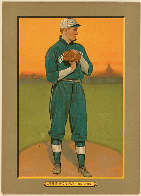
If you’re looking for aesthetic satisfaction in a baseball card, I would start with the Turkey Red series of 1911, a set of beautiful color lithographs that could be redeemed with a coupon in a cigarette package. [Above is Walter Johnson, the great Washington pitcher, with the Capitol dome in the hazy distance.] I’m also partial to this Roberto Clemente, from 1972. In Steve Heller’s new book, I Heart Design, I have a short piece about this 1887 Allen & Ginter John Ward, who was the Derek Jeter of his day as well as a Columbia-trained lawyer and union advocate.
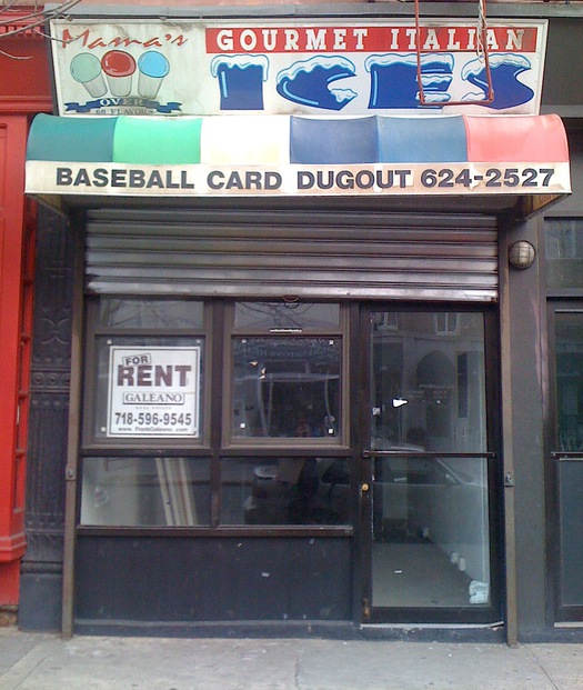
Though I no longer collect baseball cards — and was really never that obsessive about it, even in my youth — buying a pack of the latest Topps set (always Topps for me; I’m a traditionalist) has always been an annual spring ritual, and one that over the last few years I’ve made sure to transact at the local card shop here in Carroll Gardens. Sadly, the Baseball Card Dugout, run by inimitable Brooklyn institution Joe Rock, closed last fall, which means I’ll have to satisfy my card fix elsewhere.

Observed
View all
Observed
By Mark Lamster
Recent Posts
A quieter place: Sound designer Eddie Gandelman on composing a future that allows us to hear ourselves think It’s Not Easy Bein’ Green: ‘Wicked’ spells for struggle and solidarity Making Space: Jon M. Chu on Designing Your Own Path Runway modeler: Airport architect Sameedha Mahajan on sending ever-more people skyward


