May 11, 2016
The D Word: Untutored
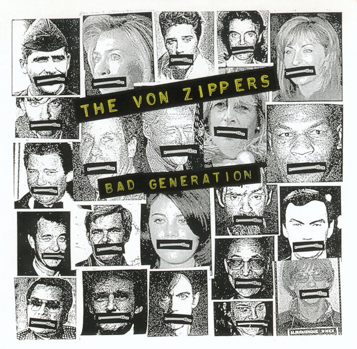
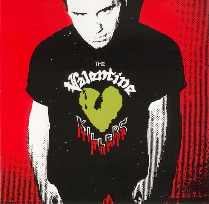
Seattle poster designer Art Chantry’s deliberately untutored approach stemmed from his youthful interest in and sampling of surfer and hot rod culture, psychedelia, comic books, and monster magazines. As a designer, Chantry developed a cut-and-paste style that included quirky typography, distresssed lettering, and anarchic collage. “I’m basically an artist masquerading as a graphic designer,” he said. “I have a degree in painting, though my teacher used to scream because I put type on my paintings.”
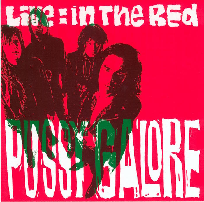
 When Chantry left school in 1978 the punk scene was in full pitch, and scores of posters by seasoned unprofessionals were plastered everywhere. He knew that this was someplace he could fit in.
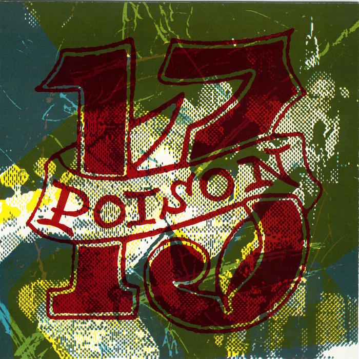


The crudeness achieved by craftsmen isolated from professional design movements held great appeal and years before vernacular became an official 1980s graphic style, Chantry said he “unearthed the work of naïfs and then tried to ape it. Ultimately it became part of my general vocabulary and all of a sudden my language expanded.” He added that other “outlaw” or anti-canonical styles, such as tattoos and “the Hallmark card idea of what hippie stuff looked like in the 1960s” informed his work, too.
Observed
View all
Observed
By Steven Heller
Recent Posts
DB|BD Season 12 Premiere: Designing for the Unknown – The Future of Cities is Climate Adaptive with Michael Eliason About face: ‘A Different Man’ makeup artist Mike Marino on transforming pretty boys and surfacing dualities Designing for the Future: A Conversation with Don Norman (Design As Finale) Innies see red, Innies wear blue: Severance’s use of color to seed self-discovery
 Steven Heller is the co-chair (with Lita Talarico) of the School of Visual Arts MFA Design / Designer as Author + Entrepreneur program and the SVA Masters Workshop in Rome. He writes the Visuals column for the New York Times Book Review,
