December 31, 2009
The Incidental Pleasures of Street Art

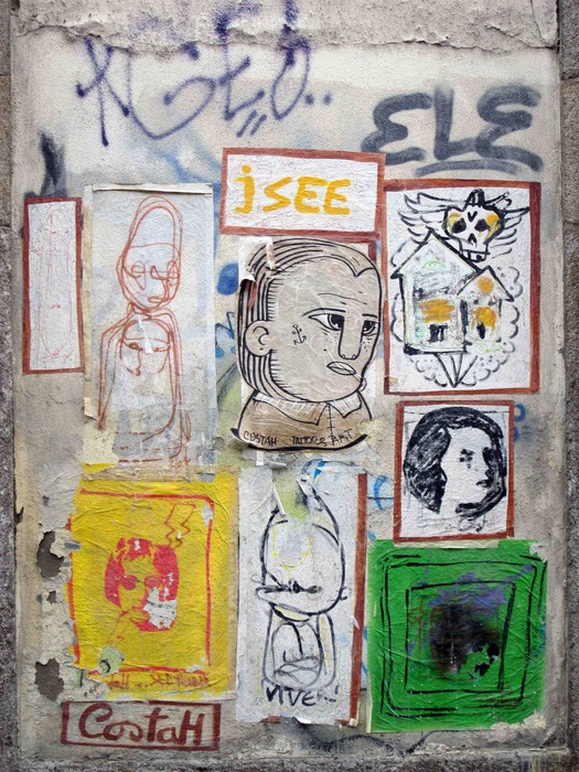
Street art by CostaH, Porto, Portugal, 2012
A few weeks ago, Rob Walker posted some examples of recent street art that he admired. His article reminded me of a set of photographs I took in Porto in Portugal, in November 2012. I had wondered at the time about posting some of them here and do so now, along with a few more recent pictures, as a response to the images and ideas in Rob’s piece.
I make no claim to be a devotee of street art in the sense of following the scene, obsessively checking out the websites and knowing the leading names. I’m not particularly interested in the large-scale, wall-filling pictures that used to be known as murals because I find a lot of them too dominating in their environment and too highly finished. Irrespective of the legal issues, I feel the same reservations about the more self-consciously artistic and all-over forms of aerosol graffiti. The “one-liner” kind of sub-Banksy intervention (modified street signs and street furniture, and so on) is of limited appeal to me, too — it’s often not much more than the return of corny “big idea” graphic design thinking in another guise. I don’t share Rob’s sense of wonderment at this kind of intervention, though I am totally committed to the pursuit of visual wonderment.
The street art that grabs me, if street art is even the right term, is much looser and messier than these manifestations. It’s less a resolved image with a clearly stated intention and definite physical boundaries, and more a sprawling, evolving process of layering and accretion. It’s often the work, over time, of multiple hands, most likely to be anonymous. For some reason Porto was especially rich in elaborate examples of this kind of collectively composed street marking. These chaotic fusions of collage, scribble, stencil and runic symbols sprang out wherever I walked. I’d barely arrived in the city before seeing the images in the photo above, across the street from where I was staying. Here’s a picture showing the piece’s immediate context.
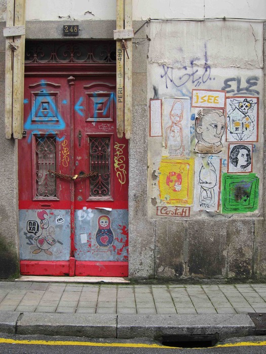
Porto, 2012
As it happens, this strangely charming example of street art is signed prominently by its creator, who goes by the name of CostaH. Wandering around the area, I found other pieces by CostaH whose website reveals that he is Nuno Costah, a tattooist, illustrator and street artist in his early 30s who lives in the town of Maia in the Porto area. This apparently self-promotional piece, which he shows on his site (scroll down), turns out to be a little untypical and I identify with its air of provisionality, like a visual annotation of the building, more than I do with his usual stylized painted figures. Here, the prepared sheets of paper sit on top of earlier graffiti, which gives the piece grit and depth, and the scratches and peeling edges add another dimension to these impermanent papers. The section of wall forms a natural frame.
In fact, a wall’s grain, fissures and discoloration often interest me as much as the markings. The excitement of getting in so close comes from the way these elements interact. The wall should be part of the work, its network of pits, cracks and bruises should show through, as in the photos I post below, but ambitious street art often ends up blanketing and obscuring the surfaces it depends on. The most seductive embellishments draw out and celebrate the vital texture of the streetscape and they don’t need to be big or commanding to do this.
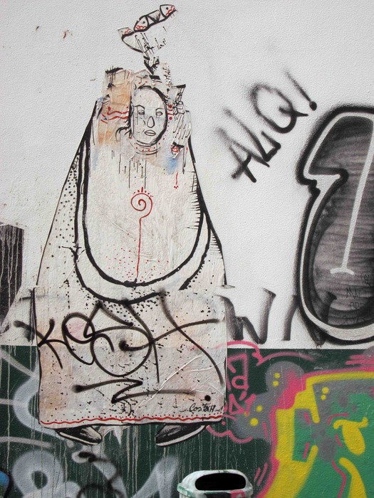
Porto, 2012. The paper cutout of the figure is by CostaH
When the material is so casual or random, there’s no reason to be precious about its treatment. For me, the pleasure of looking at this type of street communication or babbling urban unconscious (take your pick), wherever I happen to be, is closely connected to the pleasure of transforming it into a picture. If street artists and graffiti writers can appropriate parts of public space for their own purposes, then the itinerant viewer with a camera is just as free to appropriate their interventions, edit them, recompose them, find new possibilities in them, confer an alternative visual order, and turn the source material into self-contained images for equally personal purposes. Brassaï’s famous photographs of graffiti scored into stone, taken from the 1930s to the 1950s, work in this way and these still-startling pictures are all the better for not weakening their central images with superfluous information about the places where the weird totems were discovered. My preferred position when taking this kind of picture is to be as frontally placed as possible. I want the images to be as flat as canvases, as if their contents had been composed with clearly defined edges within a frame.
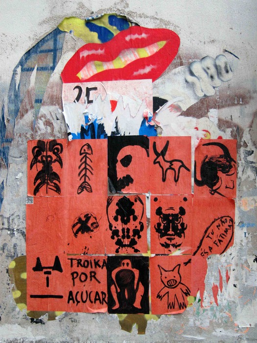
Porto, 2012
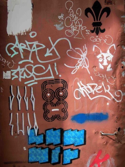
Porto, 2012
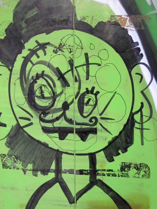
Porto, 2012

Porto, 2012
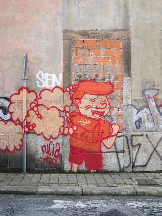
Porto, 2012
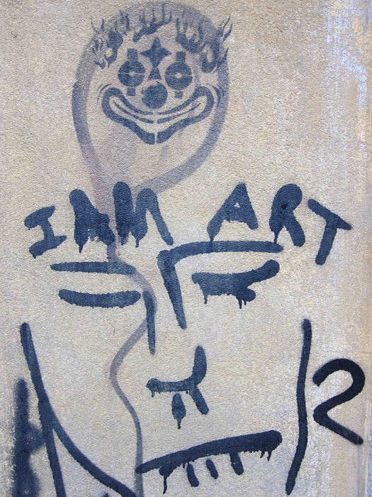
Porto, 2012
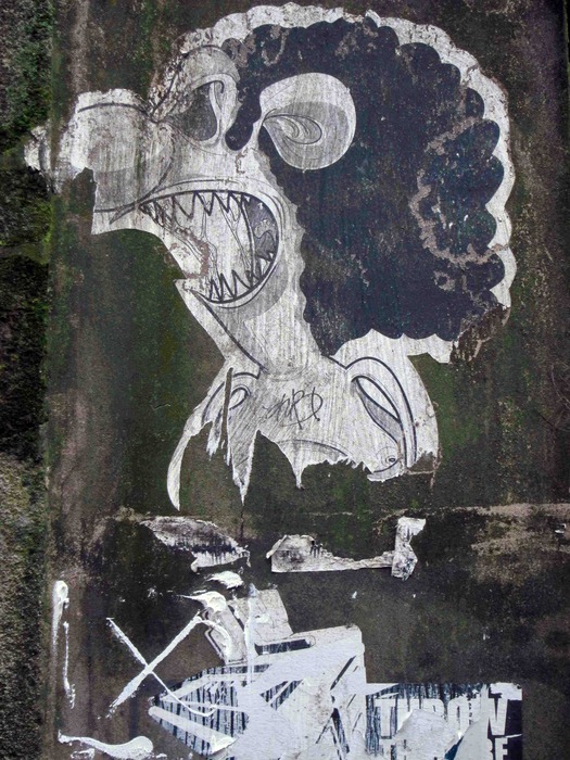
Porto, 2012
The following four pictures of human figures were taken on a recent trip to Spain. All the images have been constructed by the street artists in response to their settings so I show more of this context than in most of the Porto pictures. The final picture below is a detail of a landscape-shaped painting that occupies a long wall next to a river. The larger, unshown part of the image is of a similarly dappled crocodile (there are other examples online). I prefer the separated-off motif of the man struggling with the rope and the way that the artist, Lolo, has placed him in relation to the black pole, the course of bricks on which he appears to kneel, and the steps that emerge behind the wall.
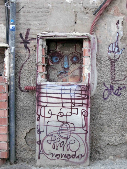
Granada, Spain, 2013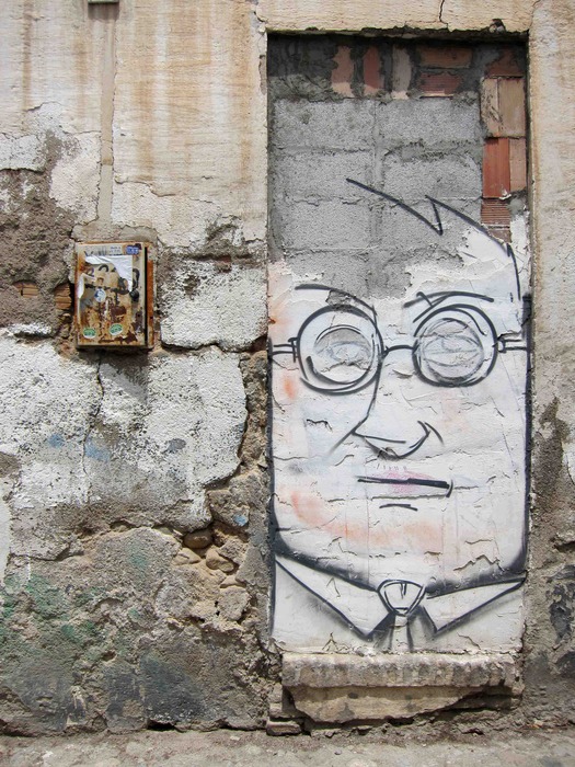
Granada, 2013
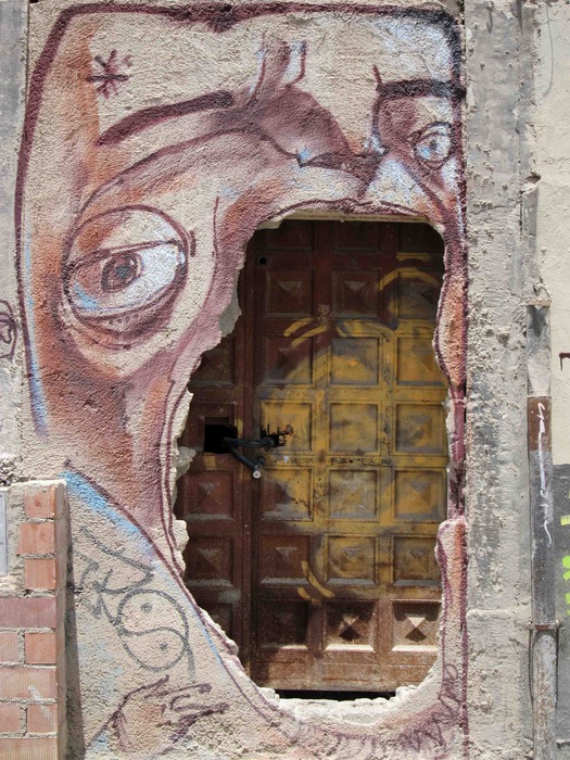
Granada, 2013
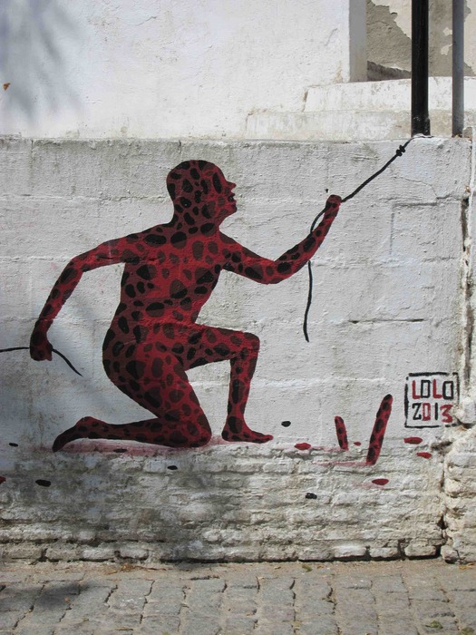
By Lolo, Seville, 2013
Photographs: Rick Poynor
Observed
View all
Observed
By Rick Poynor
Related Posts

Equity Observer
Ellen McGirt|Essays
The Design Observer annual gift guide!

Equity Observer
Ellen McGirt|Essays
Gratitude? HARD PASS
Equity Observer
L’Oreal Thompson Payton|Essays
‘Misogynoir is a distraction’: Moya Bailey on why Kamala Harris (or any U.S. president) is not going to save us

Equity Observer
Ellen McGirt|Essays
I’m looking for a dad in finance
Recent Posts
The Design Observer annual gift guide! ‘The creativity just blooms’: “Sing Sing” production designer Ruta Kiskyte on making art with formerly incarcerated cast in a decommissioned prison ‘The American public needs us now more than ever’: Government designers steel for regime change Gratitude? HARD PASSRelated Posts

Equity Observer
Ellen McGirt|Essays
The Design Observer annual gift guide!

Equity Observer
Ellen McGirt|Essays
Gratitude? HARD PASS

Equity Observer
L’Oreal Thompson Payton|Essays
‘Misogynoir is a distraction’: Moya Bailey on why Kamala Harris (or any U.S. president) is not going to save us

Equity Observer
Ellen McGirt|Essays

 Rick Poynor is a writer, critic, lecturer and curator, specialising in design, media, photography and visual culture. He founded Eye, co-founded Design Observer, and contributes columns to Eye and Print. His latest book is Uncanny: Surrealism and Graphic Design.