The Insignificance of a Logo (Even When Significant)

About two years ago, I had lunch with my old friend Hussein from college. After undergrad, he had done a master’s in theology and doctorate in Islamic studies at Harvard. I had recently received my MFA and was freelancing as a graphic designer in New York and feeling a deep disconnect between my daily reality of working for a mass cosmetics brand, and my ideal of making world-helping design.
As Hussein and I chatted, an opportunity for collaboration emerged. Branding and graphic communication, it turns out, are not discussed in the curriculum of the Harvard Divinity School. I waxed on about all the benefits I believed mission-driven organizations could derive from more attention to graphic design, and Hussein was intrigued. He was consulting for an organization, he told me, and thought it was in a perfect position to benefit from a rebrand. A couple of weeks later, I had the job. A couple of months later, Cordoba Initiative had its new logo and visual identity system. Yes, that’s right, Cordoba Initiative, a tiny nonprofit at that point, which has recently ignited a national controversy around its proposal for a Muslim community center blocks away from Ground Zero.
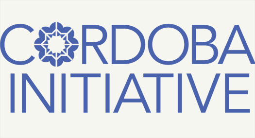
The logo I designed reflected Cordoba Initiative’s mission to bridge the divide between the Muslim world and the West. I turned western peace signs into a Moorish-inspired star motif, creating a nice pattern when it tessellated out. Everybody agreed that this was a wonderful graphic demonstration of the organization’s ideals. I delivered the work and went happily along my way. My client built a website with a firm that had slightly more “web 2.0”-ish tastes than mine, but the logo’s basic form and concept remained intact.
So I was quite surprised, a month or so ago, when I finally read that Cordoba Initiative was the organization behind all this mosque frenzy. My little client had provoked Sarah Palin and President Obama to interrupt their busy days to make public statements? I had a strange sense of excitement to be associated with such a notorious entity — as if I had gone to high school with Monica Lewinsky.
And yet, in all of the press coverage of the issue, Cordoba Initiative’s logo has not been mentioned once (and least not that I could find, via Google). As commentators debate the organization’s motives and character, no one has said, “But look, their logo incorporates the western peace sign into a Moorish-inspired pattern. They obviously have good intentions.” Or anything like that.
I did my best to pack Cordoba Initiative’s symbol with positive significance, but It has failed to convey the group’s peaceful and progressive message. It has just stood for a Logo that identifies a Real Organization, passed over blindly in the race to express predetermined positions on this very heated issue.
Would it be different if it weren’t such an intense, emotion-laden issue? Would it be different if Cordoba Initiative had been more consistent and proactive with their branding program overall? Perhaps yes — under those circumstances the logo might have had some minor impact. (I keep thinking, for example, that BP’s happy green flower must be affording them some modicum of unconscious and undeserved protection from negative public opinion in the wake of their environmental armageddon.) However, mainly I’ve been reminded of what I guess I already knew: when something is a Big Deal, graphic design means very little.
Observed
View all
Observed
By Kate Howe
Related Posts

Innovation
Ashleigh Axios|Essays
Innovation needs a darker imagination

Business
Kim Devall|Essays
The most disruptive thing a brand can do is be human

AI Observer
Lee Moreau|Critique
The Wizards of AI are sad and lonely men
Business
Louisa Eunice|Essays
The afterlife of souvenirs: what survives between culture and commerce?
Related Posts

Innovation
Ashleigh Axios|Essays
Innovation needs a darker imagination

Business
Kim Devall|Essays
The most disruptive thing a brand can do is be human

AI Observer
Lee Moreau|Critique
The Wizards of AI are sad and lonely men

Business
Louisa Eunice|Essays

