October 6, 2017
The Meticulous Bruce Rogers
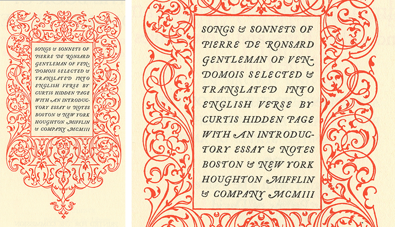
Title Page, Songs and Sonnets of Pierre De Ronsard, 1903
It was 1986. I graduated from college and started my career as a designer at The New York Public Library. My typographic education over the previous four years was rooted in Bauhaus asymmetry and experimentation. The Library, however, maintained a strong preference for classical symmetrical layouts and a predilection for serif typefaces. Learning how to design within these constraints felt as if I had been restricted to speak only Ancient Phoenician. However, I soon came across a book plate (and designer) that taught me otherwise.
Bruce Rogers (1870–1957) is one of the most celebrated book designers of the 20th century. He was not hip or edgy, but urbane, scholarly, and meticulous. He revered classical structure and beauty and disdained modernism. During the second half of the 20th century, at the height of the international design movement, the design establishment disregarded him and deemed his work antique and irrelevant as modern design and sans serif typefaces moved to the forefront.
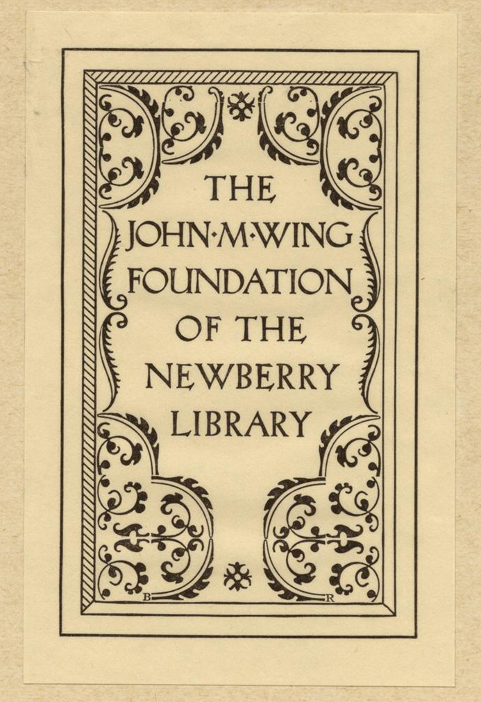
Bookplate, The John M Wing Foundation of the Newberry Library, 1920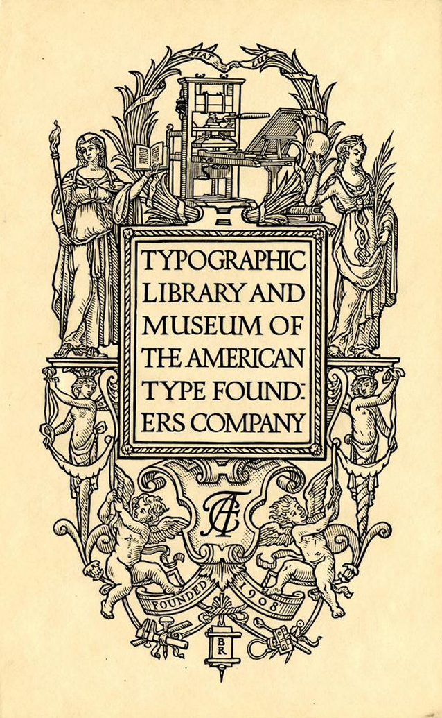
Bookplate, Typographic Library and Museum of the American Type Founders Company, 1919
We can look back now without the prejudice and dogma of the 1950s, and recognize the brilliance of Rogers. Rogers was born in the Midwest. He studied to be an artist at Purdue University, but after seeing work from William Morris’ Kelmscott Press, Rogers moved to Boston to learn about book design and book making. In 1895, he began designing books for the Riverside Press using Morris’ theories and techniques. Morris, a founder of the Arts and Crafts movement, promoted a philosophy of a return to the handmade; an appreciation of skill, craft, and the natural world. Rather than looking forward, Morris looked back to medieval practices and forms. Rogers integrated Morris’ concepts into his work, printing on handmade papers, adopting natural elements into the ornament and borders of a page, and favoring symmetry, and order.
In 1912, Rogers left Boston and moved to New York to take a position as the in-house designer for The Metropolitan Museum of Art. During this period, he continued to align his work with the arts and crafts movement and designed his most well known typeface, Centaur, for use on the Museum’s 1915 limited edition of The Centaur. He based Centaur on the letterforms of Nicolas Jenson’s edition of Eusebius Caesariensis (1470). Rogers later designed the italic version, Arrighi, based on the work of Ludovico Vicentino degli Arrighi (1475–1527). Today, a digital version of Centaur includes Centaur Italic. But while at the Library, when I asked a white-haired editor in an old tweed jacket if Centaur Italic was appropriate for a headline, he responded with shock and terror in his eyes, “Young man, there is no such thing and never will be. There is only the correct pairing with Arrighi.”
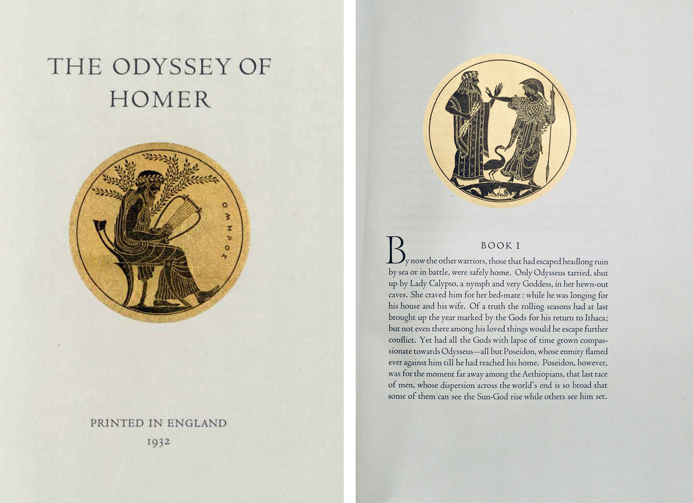
Book, The Odyssey of Homer, 1935
In 1928, Rogers traveled to England with the plan to produce an edition of Homer’s Odyssey translated by T.H. Lawrence, the British archeologist who, after his service with the British Army during World War I, became known as “Lawrence of Arabia.” Although Rogers was academic and scholarly and Lawrence was an eccentric adventurer, they became good friends during the four years it took to complete the book. In early 1929, Oxford University Press hired Rogers to design a new edition of the Bible. The Oxford Lectern Bible was an enormous undertaking, taking six years to produce. It is a masterpiece of book design, with traditional and elegant typeset in Centaur, that stepped into the modern age by eliminating excess ornament and decorative elements. The Oxford Lectern Bible is one of the most important and notable typographic achievements of the twentieth century.
Rogers’ genius was in his ability to merge finely handcrafted typography with the machine, and to retain artistry and finesse in the transition. He brilliantly manipulated type and ornament, without creating unnecessary decoration. And while he never considered himself a modernist, his work follows the dictates of truth in materials, simplicity of form, and pride of craft. Like a chair designed at the Bauhaus. Rogers did not design a book to be displayed only; Rogers made books to be read and treasured.
Rogers was one of the first AIGA Medalists in 1925. Later in life, even when modernism had set aside Rogers, his work continued to appeal to a small group of classic designers. Yale University, Purdue, and Harvard University all awarded Rogers honorary degrees by the end of his life. The American Academy of Arts and Letters awarded him a gold medal for graphic arts. The influential writer, Joseph Blumenthal, wrote about Rogers in 1977, “The forces that converged to produce an American typographic renaissance found their finest realization in the work of Bruce Rogers.”
When I was at the Library, opening a book and finding a bookplate designed by Bruce Rogers from 1900 rescued me and provided an epiphany. Here was an example of classical structure and typography, paired with a modern aesthetic. Symmetry did not equate to dull. In fact, Rogers’ work proved the opposite. 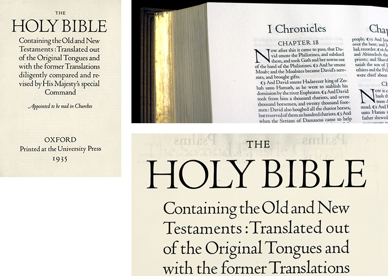
Book, The Oxford Bible, 1935
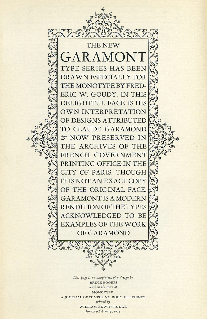
Cover, Monotype: A Journal of Composing Room Efficiency, 1923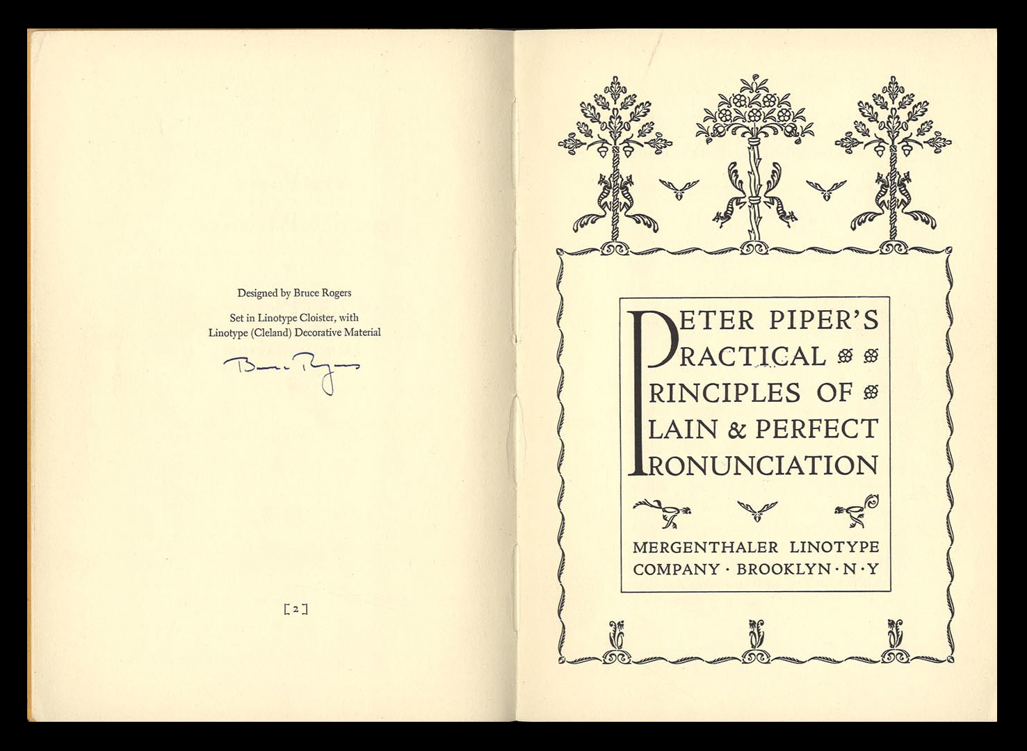
Title Page, Peter Piper’s Practical Principles of Plain and Perfect Pronunciation, 1936
Observed
View all
Observed
By Sean Adams
Recent Posts
Jessica Helfand|The Icarus Diaries
17: Solar Complex Sam Furness got serious about investing in his curiosity. Now, he’s helping others do the same. Corporate crisis is design’s opportunity In a world that feels impossible to change, emerging designer Deborah Khodanovich is starting small
