June 15, 2012
Underappreciated in Ft. Worth

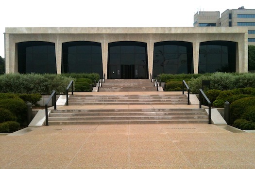
As anyone who has written thoughtfully about Philip Johnson knows well, he has a tendency to surprise. Sometimes these surprises are pleasant, and sometimes they are not—this is, in part, what makes him such an interesting character. This past week I found myself surprised by Johnson, and in the good kind of way. I was in Texas to explore Johnson’s work in the Dallas/Ft. Worth area, and most of what I found confirmed my expectations—some good, some mixed, some terrible. The exception was his Amon Carter Museum in Ft. Worth, a project that undermined my preconceived ideas, which were in no way positive.

In this I was not alone. The Amon Carter was among the first projects in which Johnson publicly broke with Mies, introducing a brazen classical element into a design—modernist apostasy. Several employees quit his firm in protest over the change in the atelier’s direction, dubbed derisively in the press as “ballet school” styling.
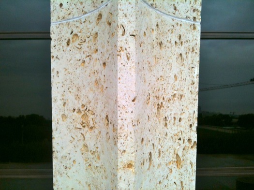
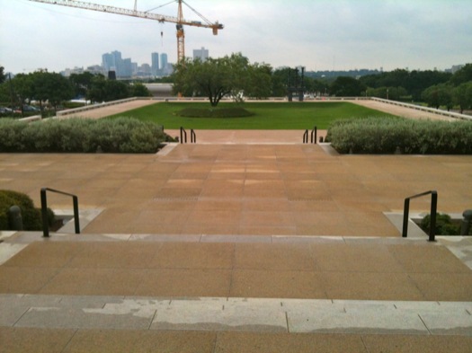
If you can get beyond the rather dated polemics (admittedly, hard), what you find is an impeccably made building that is beautifully sited, scaled, and suited to its contents. The four-square monumentality of the facade is actually somewhat easier to take intellectually if one considers that it was first conceived as a memorial to its namesake, one of the leading figures of modern Ft. Worth history. The limestone, from Texas, is something particularly special: it appears like travertine from afar, but up close it is riddled with impressions of fossilized shells trapped in the stone that have since disintegrated. Turn around and you face a terrace that extends out dramatically toward downtown Ft. Worth, several miles away, though that view is presently somewhat obscured by construction at the neighboring Kimbell.
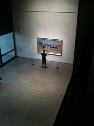
Step inside and you find yourself in a double-height hall that runs the width of the facade, with galleries running off this spine featuring works of Frederic Remmington, Charles Martin, and other masters of the American West. The spare hall gives those works a kind of dignity they generally don’t receive in rooms with lots of Americana festooned about. The museum has been expanded several times, but its integrity remains intact.
I found myself comparing the Carter not so much with the Kimbell next door—a jewel of an even higher order—but with Tadao Ando’s Modern Art Museum, which is the newest addition to this museum row. It is an impeccable work of modernist design, the experience of visiting akin to what I imagine it would be like to sit inside a Bang & Olufson stereo system. While the Carter works very hard to make itself an object that is visually a part of the city, a place to see and to see from, Ando’s museum takes a cloistered view of Ft. Worth, closing itself off behind large berms so it is invisible from the major intersection on which it sits. 
That it is invisible is from the street is especially odd, as the museum is almost pathologically obsessed with its own image. The entire complex seems designed for architectural photography, but it is a serious challenge to get to the privileged spot from which one would take the money shot: you must traverse the lobby, walk through the restaurant, and across a wet grass field to reach it. This is very hard to do, and there is no “desire path” worn into the grass suggesting many try. For all their monumental iconicity, the galleries, once you’re inside them, are actually rather small. It’s a great deal of architecture for the limited payoff. Or, as they say in Texas: all hat, no cattle.
On the subject of underappreciated architecture in Ft. Worth, I would be remiss not to mention Lawrence Halprin’s Heritage Park, which sits behind locked gates, closed to the public, for lack of operational funds. That is a shame. The city, to its credit, keeps up Johnson’s Water Garden beautifully, and spent lavishly on a spectacular new community college by the architect Bing Thom. But the day of my visit, Tea Party activists, whom I presume are suspicious of such spending, were very vocally present in the city, campaigning for their senate candidate. These projects, all of them, represent to me the pride and ambition and expansiveness that make Texas Texas, and Ft. Worth Ft. Worth. If there’s any state that should be able to maintain its glories, Texas is it.
*
A final thought about Johnson’s Water Garden. Though it is, in total, a great success, we should all be able to agree that its blank central plaza is a failure. It would not destroy the integrity of the overall design to add some kind of programming, and especially some tree cover, to this space, so it is more hospitable and inviting. The entire park would surely benefit.
Observed
View all
Observed
By Mark Lamster
Recent Posts
A quieter place: Sound designer Eddie Gandelman on composing a future that allows us to hear ourselves think It’s Not Easy Bein’ Green: ‘Wicked’ spells for struggle and solidarity Making Space: Jon M. Chu on Designing Your Own Path Runway modeler: Airport architect Sameedha Mahajan on sending ever-more people skyward


