Helen Armstrong, Maddie Bone, Madeline Bone|Essays
May 15, 2017
Virtual Reality. No One Can Tell You, You Are Doing It Wrong. Yet.
We live in the moment before Virtual Reality (VR) coalesces into uniform interface systems—the verge of standardization. This juncture is not unlike that historical moment when the Futurist and Constructivist movements tore apart—and then reconstructed—typographic form. Or the moment before designer and typographer Jan Tschicold codified those movement’s experiments through New Typography, standardizing their approaches; the kind of moment in which designer Muriel Cooper stood up and demonstrated how a screen-based interface could work—before Apple and Microsoft taught us how they thought it should.
At the Ted Conference in 1994, Cooper presented a new kind of interface: an information landscape.
We’ve become accustomed to the user interface (UI) conventions of web and mobile design: menus, buttons, nav bars or burgers, gestures, and icons. UX standards urge us to hover, click, and slide. We habitually build web pages using pre-existing templates, following specific HTML and CSS-based design frameworks. A plethora of content management systems and code libraries guide us. WordPress alone powers 27% of the web.
In the mobile world, Android and iOS dominate. Apple permeates the UI terrain with Flat design; Android preaches Material, their own clean, intuitive standards. Newly ingrained gestures—pinch, zoom, touch, tap—push our fingers to engage with muscle memory, allowing us to confidently maneuver through these systems.
For better or worse, we know how to interact with web and mobile. We understand how to design for screens. What we don’t yet know is how to engage with VR.
Ever since Palmer Luckey harnessed contemporary head tracking and processing power to produce the Oculus Rift, we’ve been teased by the possibilities of this medium. And rightly so. VR can transport users into story worlds. Virtual games, tourism, modeling, marketing, and other adventures lie before us. The term VR encompasses a range of experiences—from the desktop-driven interactive environments produced by the head-mounted Oculus to the mobile-based lower resolution of the Google Cardboard.* But, how do we interact effectively—and happily—with these worlds?
Conflicting tech and industry have slowed progress toward standardization. Competitive operating systems and smartphone manufacturers prevent devices from connecting. Screen sizes vary inside VR viewers, preventing correlation with content guidelines across platforms. The prime players—HTC, Sony, Oculus and Google—squeeze out or buy up promising rivals.
Yet, perhaps counterintuitively, this delay is a good thing. We have time to explore.
In the physical world, we interact with the environment using our bodies. We walk through a space, pick things up with our hands, shout using our mouths. In a VR space we strive to access these natural gestures. Holding controllers—a concept that goes back in the gaming world to the 1970s—is one method for achieving this. High-end ergonomic devices like the Oculus Tilt Brush fit inside the hand, allowing the user to paint within a 3-dimensional virtual space. Maneuvering the new Oculus Touch controller, users can grab and manipulate objects within an environment, pushing simulated floppy disks into an old computer or catching digital butterflies. HTC Vive controllers provide a similar approach. Manipulating in-world UI elements helps participants–and designers—to move toward a tactile richness. We can leave behind the screen mentality that designer Bret Victor derisively calls “Pictures Under Glass” in “A Brief Rant on the Future of Interaction Design.”
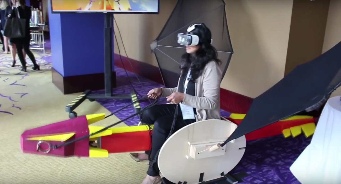
In addition to mainstream multi-function controllers, designers are crafting quirky input structures for specific experiences. Consider, for example, the How to Fly Your Dragon experience created by independent VR developer, Abhishek Singh. After hopping on a sensor-laden dragon structure, brave participants can fly around a virtual game world via physical reins. They can feel the dragon beneath them and the reins in their hands. Try doing that using only your iPhone.
In contrast to this rough-around-the-edges dragon experiment, Audi has harnessed the knowledge of twentieth century mechanical aviation simulators and various gaming apparatus, to produce the Sandbox VR Experience. This project puts a custom built steering wheel into users’ hands so that they might drive around a virtual track of their own making.
What’s interesting about this project is not just the actual steering wheel beneath your fingers, but the user’s role in modeling his or her own experience. Participants first create the custom terrain for their adventure by moving sand around. Cameras use infrared light to map the resulting landscape and then the participant can virtually enter the space. Not only is Audi experimenting with UI in a digital space, but they are also exploring what it means to be a participant. How much agency can the user have over the design of the environment itself?
Far less sophisticated than Audi’s smooth, cool reality is Paperstick’s clever VR Controller. Participants can print the Paperstick out via regular paper on their own printer and then assemble it for basic—very basic—interaction. Just as the Google Cardboard viewer brought VR devices to the masses, such inexpensive, on-demand controllers could spread DIY gestural interface opportunities to the public.
Exploring VR UI beyond hand gestures opens up even more possibilities. We use a wide array of sensory cues to connect to the physical world, all fodder for virtual UI. Gaze-based interaction, audio, light-based and olfactory navigation—we’ve been considering many of these ideas in simulated spaces since the 1960s, but we just now can access the processing power to easily try them out.**
Standardization is coming. But, until then, let’s set aside some time to play. Before everything becomes uniform, let’s have a little Mad Max.
*The term virtual reality can also reference VR films. However, since these films are not interactive, I’m not including them in this discussion.
**To read more about early VR experiments, check out Morton Heilig’s Sensorama and Ivan Sutherland’s The Sword of Damocles
Observed
View all
Observed
By Helen Armstrong, Maddie Bone & Madeline Bone
Recent Posts
DB|BD Season 12 Premiere: Designing for the Unknown – The Future of Cities is Climate Adaptive with Michael Eliason About face: ‘A Different Man’ makeup artist Mike Marino on transforming pretty boys and surfacing dualities Designing for the Future: A Conversation with Don Norman (Design As Finale) Innies see red, Innies wear blue: Severance’s use of color to seed self-discovery


