
October 26, 2017
What’s That Crashing Sound, Or, Eisenman in Cincinnati
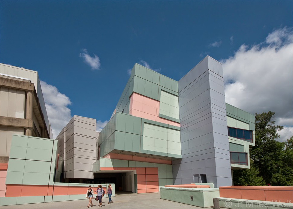
The Aronoff Center for Design and Art at the University of Cincinnati by Eisenman Architects. Photo by J. Miles Wolf
In September, 1975, I arrived at the University of Cincinnati to study graphic design at what was then called the College of Design, Architecture and Art (DAA). I had decided to become a graphic designer without ever having met one; I had decided to study at DAA without ever having visited it. The day I moved into my dorm room was overcast and drizzly. A funny smell hanging in the air turned out to be the cooking of Ivory Soap; P&G’s giant Ivorydale plant was just upwind of us.
Sometime later, thumbing through a guide to colleges — God knows why; it was too late to do anything about it — I discovered that I had chosen to spend five years in a place that many considered the ugliest college campus in America.
High in the hills of Clifton above downtown Cincinnati, the University had assembled by the mid-seventies a collection of buildings almost heartbreaking in their banality. There was some halfhearted collegiate gothic (Memorial Hall), third-rate colonial revival (McMillan), heavy-handed neoclassicism (Wilson Auditorium) and a remarkably unpoetic Louis Kahn knockoff, Crosley Tower. I myself lived in a ghastly, nine-year-old, 27-story glass tower called Sander Hall that was both airless and soulless and that would be imploded, in the style of Pruitt-Igoe, shortly after my tenth reunion.
The design school complex was more of the same. The older part dated from the late 50s: a pair of connected Suburban Modern buildings, Alms (1953) and DAA (1958), approached via a footbridge that would shortly be overshadowed by Corbu’s at Carpenter Center. Connecting to them from the east was Wolfson, DAA’s brand new homage to Paul Rudolph, a grim exercise in brutualism that, like many things in Cincinnati, had arrived 10 years too late. All three buildings sat at odd angles to each other that seemed as careless as everything else on campus.
In was in this ensemble that I would spend most of my waking hours for the next five years. The design school, then as now, housed an admirable range of disciplines: architecture, planning, industrial design, fashion design, interior design, and graphic design. I was impressed and somewhat intimidated by the students in the other fields. The industrial designers seemed to be guys from Kentucky who liked to draw cars and were pleased to discover you could major in this in college; they were also good at using power tools. The fashion designers were beautiful TaB-addicted Miss Indianas who, even en charrette at two in the morning looked ready to don tiaras, hop on floats, and deploy blinding smiles. And so on.
The architects, naturally, dwelt at the top of the pecking order. It is ever thus. But there was a delicious irony in this, for their position entitled them to a dubious honor: the occupation of the newly built Wolfson Building. This was desirable only in theory, as the new addition turned out to be soul-crushingly Orwellian. Meanwhile, the quarter-century-old DAA building, where we designers lived, was careworn and cheery by comparison. The architects were trapped in concrete boxes. We designers were surrounded by big banks of dirty windows looking out on Burnett Woods, battered full-height movable walls covered in graffiti, and an endless supply of industrial four-legged metal stools in various states of deterioration.
It was one of these stools that caught our attention late one bleary night. Finding a good one was always a challenge. Years of hard use had rendered many of them wobbly and worse. Several were unusable and, one might conclude upon examination, actually dangerous. I forget who said it first: “You know, we should just put this thing out of its misery before it hurts someone.” Nor do I remembered who said what followed: “Yeah, we should just drop it down the Wolfson stairwell.”
So it came to be that a half dozen of us were stationed in along the multiple landings of the Wolfson stairwell, the windowless six-story volume that was the fulcrum between the shambles of the DAA Building and its harsh addition. A volunteer carried the doomed stool up to the top floor. The others stood to view the event from various angles and, thoughtfully, to make sure no stranger chose that moment to come along and stick their head over the handrail. I was in my fourth year. It was two in the morning. The stool was suspended over the void. Countdown and release. Utter silence as each of us glimpsed the silvery blur falling downward past our landing. And then, an explosive, ear-splitting crash, far louder than any of us would have predicted, one that seemed to reverberate off the concrete walls for minutes. It was physically transporting. It was better than sex. None of us spoke as we carried the mangled piece of metal, nearly twisted beyond recognition, out to the dumpster by the Wolfson loading dock, and tenderly set it to rest. We were still a little shaken from the experience.
We would reprise this event only one or two more times: it was too thrilling to make a regular event out it, plus there was a finite supply of stools. But how pleasing it was to bring violent life to the design school complex! How great it was to find a use for the battered furniture of DAA, and, better still, the sterile, panopticon-like stairwell of the gruesome Wolfson building! And: how great was that crashing sound?
Less than a year after my graduation, as if by some prearranged signal, the University of Cincinnati undertook the first of a series of planning projects under DAA Dean Jay Chatterjee that would completely transform the campus. George Hargreaves and Associates devised a pedestrian-driven master plan, Chatterjee instituted what is now referred to bluntly as the Signature Architect Program, and the University of Cincinnati at last acquired some decent buildings by architects who liked their signatures writ large and unmistakable. Alumnus Michael Graves contributed a robust engineering building; Harry Cobb, the elegant College Conservatory of Music; Frank Gehry, the rather charming Vontz Center for Molecular Studies; and Thom Mayne, the university’s remarkable new recreation center.
But the centerpiece is Peter Eisenman’s transformation of the DAA complex, The Aronoff Center for Design and Art, housing the renamed School of Design, Architecture, Art and Planning (DAAP). “What is that thing?” was the headline of a story on the building in the March 2000 issue of the university alumni magazine, and indeed the Aronoff Center is by far the campus’s most provocative newcomer. It was baffling to many: that same issue of the UC magazine took pains to debunk a litany of “rumors” that included “There are no square rooms,” “Everyone will get lost,” “Too much space is wasted,” “The building cost too much,” and “One corridor goes nowhere.” (Regarding this last, the magazine helpfully points out that it’s actually a staircase at Eisenman’s Wexner Center in Columbus that goes nowhere: but, hey, everyone makes that mistake!) It’s telling that the (false) rumors together paint what one suspects is a more vivid (and accurate) portrait of the building than would a dry recitation of the (true) facts.
Me, I loved the building the minute I saw a picture of it. Even after working for 15 years in New York, I still felt vaguely provincial: this building changed that. Form follows function? If your desired function is to get a story above the fold on the front page of the arts section of the New York Times, Eisenman’s building had assumed the ideal form. So I was honored to be asked by Monacelli Press to design a book on Aronoff Center timed to its grand opening. Along with a fellow alum, Asya Palatova (nee Esther Bridavsky), I sorted through dozens of plans and hundreds of images and worked my way through essays by Sarah Whiting, Kurt Forster, Silvia Kolbowski and Jeffrey Kipnis, who, among others, had been asked to explain this building. It was reassuring in this sometimes baffling thicket of words to discover an aphorism by Frank Gehry: “The best thing about Peter’s buildings is the insane spaces he ends up with. That’s why he is an important architect. All that other stuff, the philosophy and all, is just bullshit as far as I’m concerned.” I too loved the spaces, but I can’t say I understood them. Until I visited the Aronoff Center for the first time on the day it officially opened.
I entered the building through its non-entrance, got lost in one of its corridors that only seemed to go nowhere, and finally found my way back into the original DAA building. Like the Alms and Wolfson buildings, the old DAA was largely unaltered by the addition. However, the three old buildings had, in effect, provided the blueprint for the transformation; it was the extrapolation of their seemingly random spacial relationships that had dictated the geometry of the building that now joined them. I crossed from DAA to Alms and back to Wolfson and finally into the new addition.
That’s when it hit me: Eisenman had done exactly what we had done in that stairwell twenty years before. Through some impossible feat of topology, he had simply taken the existing building complex, dropped it straight through its own bleak heart, and smashed it. Then he took the gloriously twisted result, and built it, full size, right where it landed. And there it stands, ten years later.
I can’t say it made sense to drop those old metal stools back when I was a college junior. I can’t say that Eisenman’s spaces make sense. I don’t know why we did it, and I don’t know why he did it. All I can say for sure is that sometimes something just feels right. And all these years later, I can still hear that crashing sound.
This essay was originally published on October 12, 2006, and appears in the new essay collection, Now You See It and Other Essays on Design, available November 7, 2017, from Princeton Architectural Press
Observed
View all
Observed
By Michael Bierut
Related Posts
The Observatory
Delaney Rebernik|Analysis
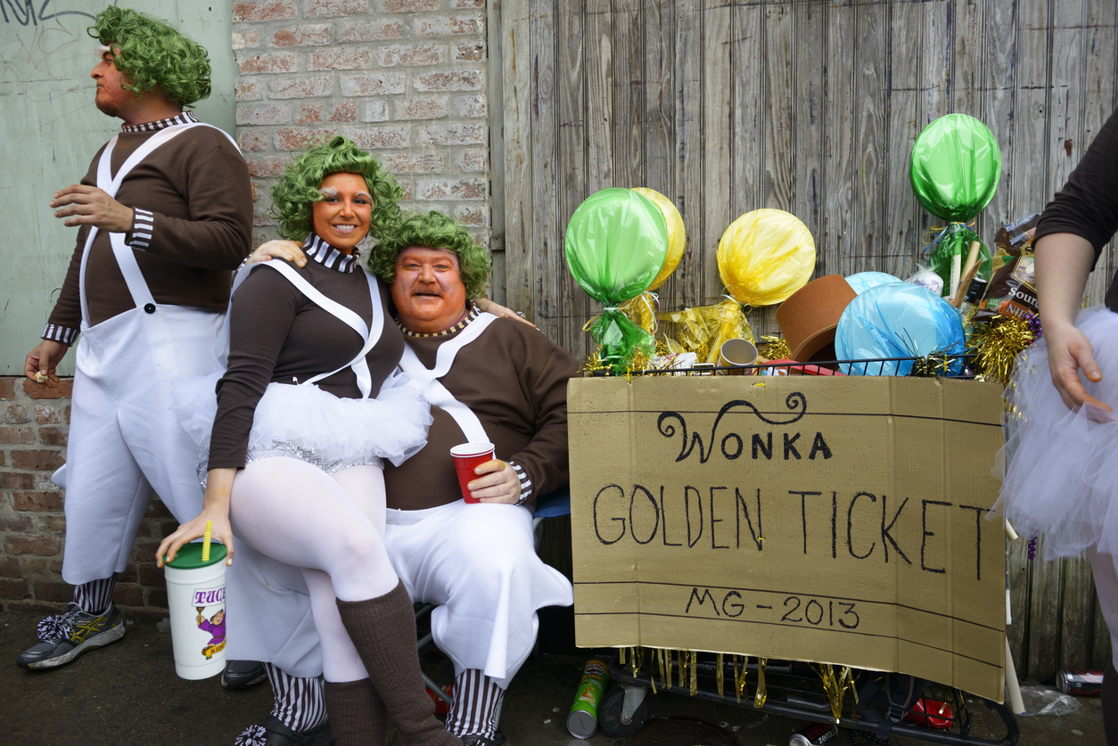
A story of bad experiential design
The Observatory
Ellen McGirt|Essays
Lessons in wandering

Architecture
Sameedha Mahajan|Design and Climate Change
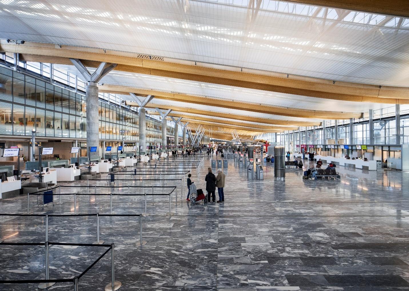
The airport as borderland: gateways for some, barriers for others

The Observatory
Alexis Haut|Analysis
“Pay us what you owe us”
Related Posts

The Observatory
Delaney Rebernik|Analysis
A story of bad experiential design

The Observatory
Ellen McGirt|Essays
Lessons in wandering

Architecture
Sameedha Mahajan|Design and Climate Change
The airport as borderland: gateways for some, barriers for others

The Observatory
Alexis Haut|Analysis
