December 31, 2009
Return of the Standards Manuals or Revenge of the Rigid
The 1977 US EPA Graphic Standards System from Standards Manual on Vimeo.
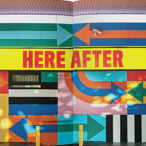
In 2015, Jesse Reed and Hamish Smyth started a Kickstarter campaign to reprint the NASA Graphics Standards Manual, designed Danne & Blackburn in 1975. Recently, Reed and Smyth, as Standards Manual, with AIGA, have launched another Kickstarter campaign to reprint the EPA Standards Manual. Chermayeff and Geismar designed the identity and system in 1977. To date the suite of manuals also includes the Manuals for the Official Symbol of the American Revolution Bicentennial, and the New York City Transit Authority.

Official Symbol of the American Revolution Bicentennial system and manual. Bruce Blackburn, 1975.
The commonality with all of these manuals, beside their overwhelming popularity now, is the rigidity of the graphic systems. The manuals clearly mandate how to use the logo, how not to use the logo, what color is acceptable, and the only typeface option. Examples of applications show the grid structure and type of imagery. As many possible examples are identified from a satellite to a Telephone Directory cover. These are not systems to be messed with.
What is contrary here is the current fascination with these hard-line identity systems in a design culture that proselytizes the virtues of flexible logos and customizable systems. Let’s identify the differences. The classical post-war identity program followed the strict guidelines. Designers working with the program followed the rules in the manual and produced work that maintained a consistent visual system. By the 1980s, the idea of a flexible identity—that is, a logo that can change—came to the surface in the graphic design industry. The MTV logo (Manhattan Design, 1980) is a prominent example of the flexible identity system. Designers working with a flexible system were encouraged to bring their own creativity to the project and create dynamic and surprising results.

MTV identity, from Fred Seibert. Manhattan Design, 1980
Over the past twenty-five years, the majority of identity systems I designed have a flexible component. It proved to be necessary to maintain the system with a large group of other designers and creative partners. A hard-line simple logo was doomed to fail. A reed that will not bend, breaks. The changeable identity also spoke to the contemporary audience, now with shorter attention spans and a constant need for the different. But was that true? Or simply another narrative?
It is reasonable that the classic identity program was a post-World War II invention. For a generation that had suffered through the unstable ground of the Great Depression and then fought the largest conflict in history, a simple and clean logo that never changes makes sense. Designers working with these rigid visual systems came from a wartime mentality of following orders, whether in the service or as a civilian. If the logo was black, it was always black. There are stories of an in-house design department that had clear rules in addition to the identity: the uniform was a white shirt and black tie for men and grey tailored dress for women. No personal effects, such as photographs or plants, could be set on a desk. And to add to the warm environment, each designer had a triangle template to verify that all desk lamps were set at the same angle.
In contrast, after the counter-culture movement of the 1960s and hedonistic 1970s everyone was told he or she was creative. Authority should be questioned and the establishment could not be trusted. If you conformed and were not an individual who expressed yourself, you were taken to a therapist. In this setting then, a rigid logo system was anathema. Free to be… you and me.
Free to Be… You and Me. Marlo Thomas, Executive Producer, 1972
By the 2000s flexible logos and loose visual systems were to be expected. In the right hands, typically the originator’s, the system could be dynamic and living. But too often, the license for creative freedom led to a disintegration of the brand’s message and visual presence. New colors appeared and soon the corporate blue was missing. Someone’s friend was an illustrator, so that person was hired to make images for the advertising that had nothing to do with the brand’s communication. The designer or creative director managing this system was faced with the choice of allowing the visuals to evolve and mutate, or to lay down the law and demand consistency. The choice would seem clear—a brand message is competing with millions of other messages daily. A cohesive communication is critical. I do recall, however, an angry designer feeling abused and quitting his job because he had to use a corporate color he didn’t like.
![]()
Library Foundation of Los Angeles identity system. AdamsMorioka, 2012

City of Melbourne identity system. Landor, 2010
Perhaps the fascination of these hard-line standards manuals comes not just from the incredible design, but the longing for a simpler time when our roles as designers was clear. How wonderful it would be to design one logo, with a simple color palette, one typeface, and consistent image style and then stick to it.

NASA logo. Danne & Blackburn, 1975
Observed
View all
Observed
Share on Social
By Sean Adams