December 31, 2009
Jan van Toorn: The World in a Calendar

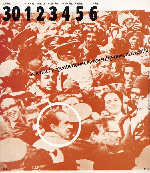
Cover of the 1972/73 “People calendar” for Mart.Spruijt. Designed by Jan van Toorn
Jan van Toorn’s calendar for 1972/73, designed for the Dutch printer Mart.Spruijt, is one of the most extraordinary and provocative graphic artifacts of its era. The calendar proposed a new form of engagement for the graphic designer as a mediator and manipulator of photographic meaning. The project still looks utterly remarkable 40 years later. How did such an uncompromising object get made? In collaboration with the designer Simon Davies, I published the piece in its entirety in Jan van Toorn: Critical Practice, my monograph about Van Toorn. Until then the Dutch designer’s masterpiece was known by just a handful of frequently reproduced pages. Now Mark Schalken at de Ruimte, a design company in Amsterdam, has photographed and reprinted the entire calendar — it was launched at a public event to mark the designer’s 80th birthday — giving a chance to experience its 50 pages at their original scale.
The reprint comes with a detachable folding-poster essay by Els Kuijpers, a design writer who collaborates regularly with Van Toorn. There are 800 copies in Dutch and 200 with an English translation. Kuijpers does a thorough job of explaining the ideas — the epic theater of Bertolt Brecht; Hans Magnus Enzensberger’s “Building Blocks for a Theory of Media” — that lie behind the calendar, though I suspect she attributes a greater degree of theoretical sophistication to Van Toorn in 1972 than was really the case. (See also the discussion of intellectual influences on his thinking in my book). Yet the knotty character and intractable demands of the object itself remain somehow elusive. We aren’t told much in the essay about what the calendar contains, or how it works as a sequence of pages. Van Toorn employs only photographs for his visual essay. The calendar has no text, no slogans and provides no explanation of what it shows. Many of the people seen in the photomontages are anonymous members of the public, but others are (or were) public figures who will mean little or nothing to contemporary viewers without some elucidation. Only in a few cases does Van Toorn keep the original caption where a picture came from a newspaper or magazine.
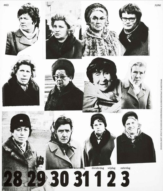
Page 5, May/June 1972. Women of Amsterdam
He organizes his piles of photographs of people by category. The calendar, which begins and ends mid-year, might not be encyclopedic, but in its relentless accumulation of visual evidence it feels like an attempt to delineate the totality of western life. The picture categories include pages of ordinary men and women (specially shot by his assistant Geertjan Dusseljee); couples: children; glamorous media images of women; a French actress (Jeanne Moreau); softcore pin-ups; hair models; underwear models; celebrities (John Lennon, Liz Taylor, Frank Sinatra, Buckminster Fuller, TV interviewer David Frost); politicians (Israeli Prime Minister Golda Meir, West German Chancellor Willi Brandt, Bernadette Devlin, a radical Northern Irish MP); clergymen; crowd scenes; protesters: marching soldiers; participants in incidents of atrocity; and a fugitive American activist (Angela Davis). Source hunting has been established for many years in art history as a tool for better understanding paintings and collages that make use of existing images. The 1972/73 calendar would require a virtuosic feat of research to pin down its hundreds of sources in ephemeral publications.
Van Toorn cuts these figures out roughly, pasting them down as if assembling a scrapbook of references. Some pieces he places in a fairly regular grid, though usually with overlaps and disruptions; other pages have a more scattered or dynamic construction. While the primary purpose is not aesthetic, much of the calendar’s impact comes from the variety and play of compositions, the vigorous massing of elements within the page, and the control of negative space. Van Toorn’s skills as an editorial collagist, developed in the 1960s in the first phase of his career, here reach their zenith: he had found himself and would be a different designer from this point. The roughly chopped images grind against the belligerent Block Extra Condensed he uses for the numerals at the bottom or sometimes top of the page.
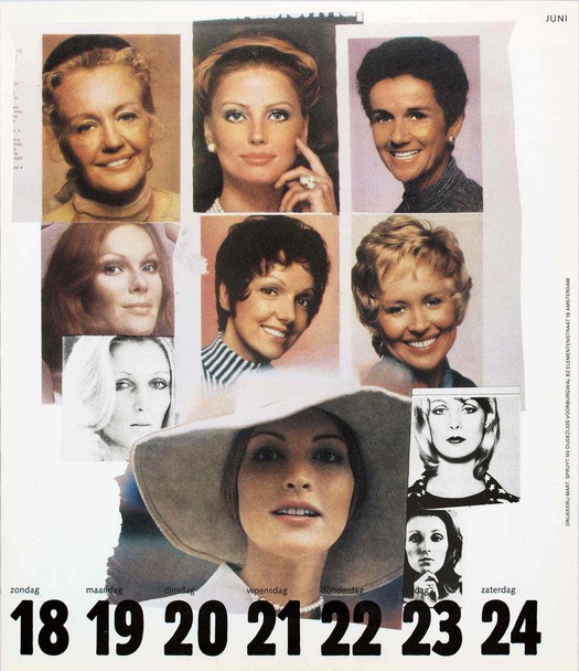
Page 8, June, 1972. Glamor
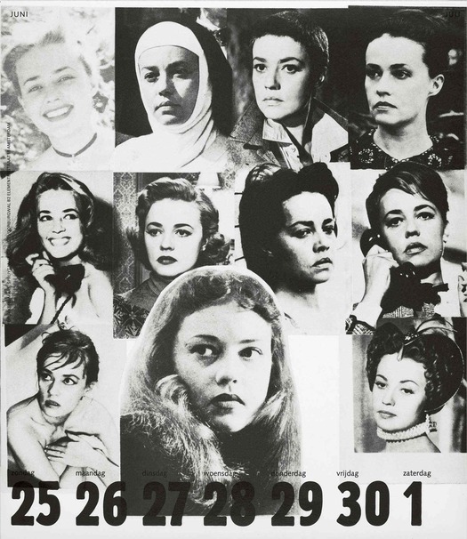
Page 9, June 1972. Jeanne Moreau
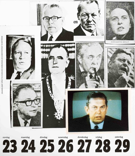
Page 13, July 1972. Politicians
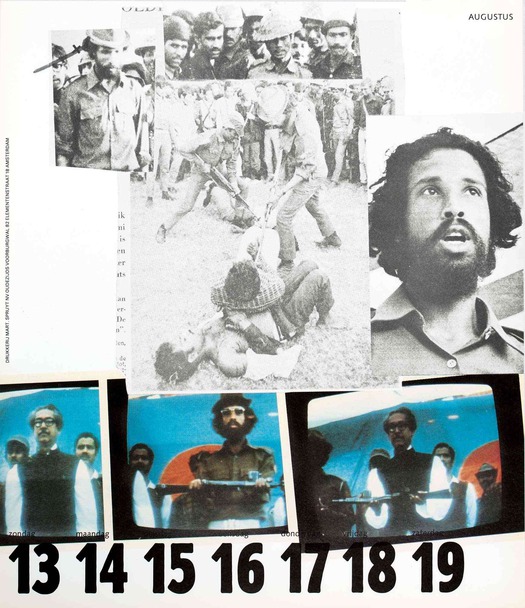
Page 16, August 1972. Bengali guerrillas killing prisoners in Dacca, 1971
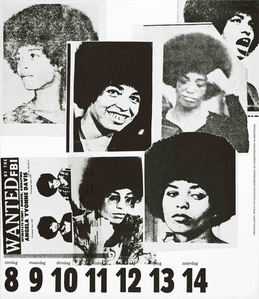
Page 24, October 1972. Angela Davis
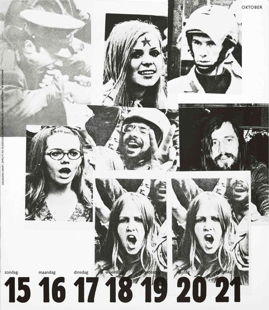
Page 25, October 1972. Protesters
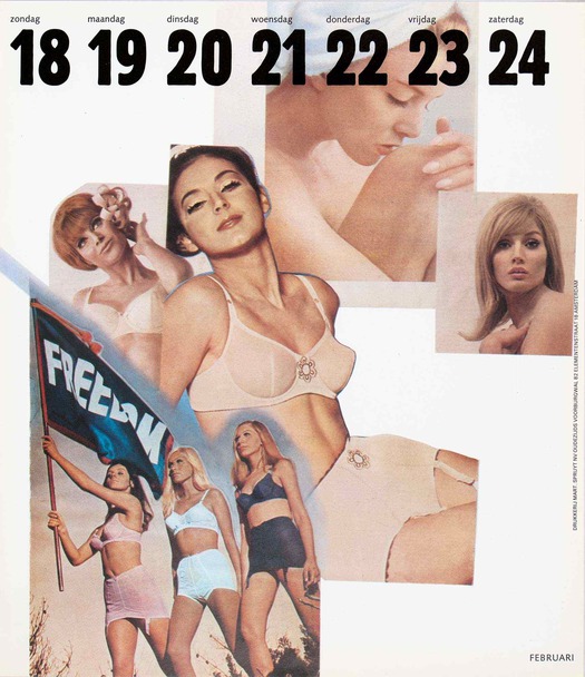
Page 43, February 1973. Advertising
Every page poses questions about the relationships between the photos: why these pictures in this configuration? Can photographs be trusted to represent reality? Who decides what pictures we see and to what purpose? Here, the designer takes full responsibility by drawing attention to his role — but more than this, his agenda — as a producer of meaning, and foregrounding his own interventions. Additional questions arise in the developing narrative, as the weeks go by, from page to page. The sequence cuts back and forth, seemingly without pattern, between four main categories of image, representing everyday life, the political sphere, military engagement, and the media and advertising. Its dialectical method is signalled on the cover (top) and following page: first a circle isolates the face of President Richard Nixon, and then it isolates the face of an unknown man in a crowd. The equivalence in presentation of these images — this week citizens like the viewer, next week a film star, later an execution — thrusts the spectator back into the picture. The calendar provides material for inquiry, but no pat answers. Each viewer must decide what to make of its visual challenges and occasional shocks, and indeed the viewer remains one of the imponderables when talking about the calendar several decades later.
“[Van Toorn’s] project looks for that situation in which the viewer — not the mass but each viewer, equal but different — can find and rediscover himself or herself in the complexity of the everyday world on the basis of personal experience,” writes Kuijpers. That’s a large and perhaps not entirely realistic claim for a piece of print meant to function, at least notionally, as a printer’s promotional item. As a continuous daily presence on someone’s wall, the calendar was an audacious choice of delivery system by Van Toorn. It was the third in a challenging series, with several more calendars to follow until the printer had finally had enough of what he called the designer’s “Marxist thinking.” Yet we still might wonder how likely it was that a calendar could generate a high level of intellectual engagement by casual viewers, though it must surely have been a talking point.
Nevertheless, seen against its contemporary background — the war in Vietnam, student protests, Godard’s films, the counterculture, the New Left, feminism, Black Power, post-structuralism, Ways of Seeing — the calendar represents, and today vividly reconstitutes, a historical moment of idealism when it seemed imperative to disrupt, interrogate and expose the seamless elision of media spectacle and manipulative political reality. As Kuijpers concludes, Van Toorn’s method “is not deployed in the first instance to communicate this or that political message. On the contrary, the method politicizes the message. In the way it treats the subject matter.” This beautifully presented reprint resurrects a key example of graphic engagement from European design history that still has the power to prompt necesssary reflections on design and photography’s role.
See also:
Jan van Toorn: Arguing with Visual Means
Counter Points
Wim Crouwel: The Ghost in the Machine
Agency or Studio? The Dutch Design Dilemma
The reprinted calendar is available from de Ruimte, and from the Nijhof & Lee bookshop at Bijzondere Collecties in Amsterdam: English version / Dutch version.
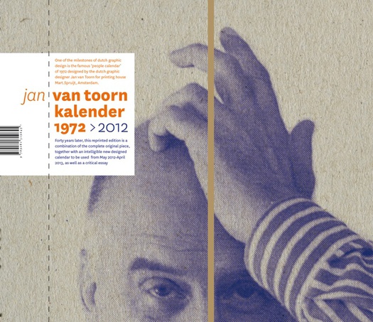
Cover of the reprinted calendar, 2012. Designed by Mark Schalken of de Ruimte
Observed
View all
Observed
By Rick Poynor
Related Posts

Design As
Lee Moreau|Audio
Announcing: Design As Season Two

Equity Observer
Ellen McGirt|Essays
The Design Observer annual gift guide!

Equity Observer
Ellen McGirt|Essays
Gratitude? HARD PASS

Equity Observer
L’Oreal Thompson Payton|Essays
‘Misogynoir is a distraction’: Moya Bailey on why Kamala Harris (or any U.S. president) is not going to save us
Recent Posts
Announcing: Design As Season Two The Design Observer annual gift guide! ‘The creativity just blooms’: “Sing Sing” production designer Ruta Kiskyte on making art with formerly incarcerated cast in a decommissioned prison ‘The American public needs us now more than ever’: Government designers steel for regime changeRelated Posts

Design As
Lee Moreau|Audio
Announcing: Design As Season Two

Equity Observer
Ellen McGirt|Essays
The Design Observer annual gift guide!

Equity Observer
Ellen McGirt|Essays
Gratitude? HARD PASS

Equity Observer
L’Oreal Thompson Payton|Essays

 Rick Poynor is a writer, critic, lecturer and curator, specialising in design, media, photography and visual culture. He founded Eye, co-founded Design Observer, and contributes columns to Eye and Print. His latest book is Uncanny: Surrealism and Graphic Design.