February 20, 2019
A Great Design Staycation: Holiday Magazine
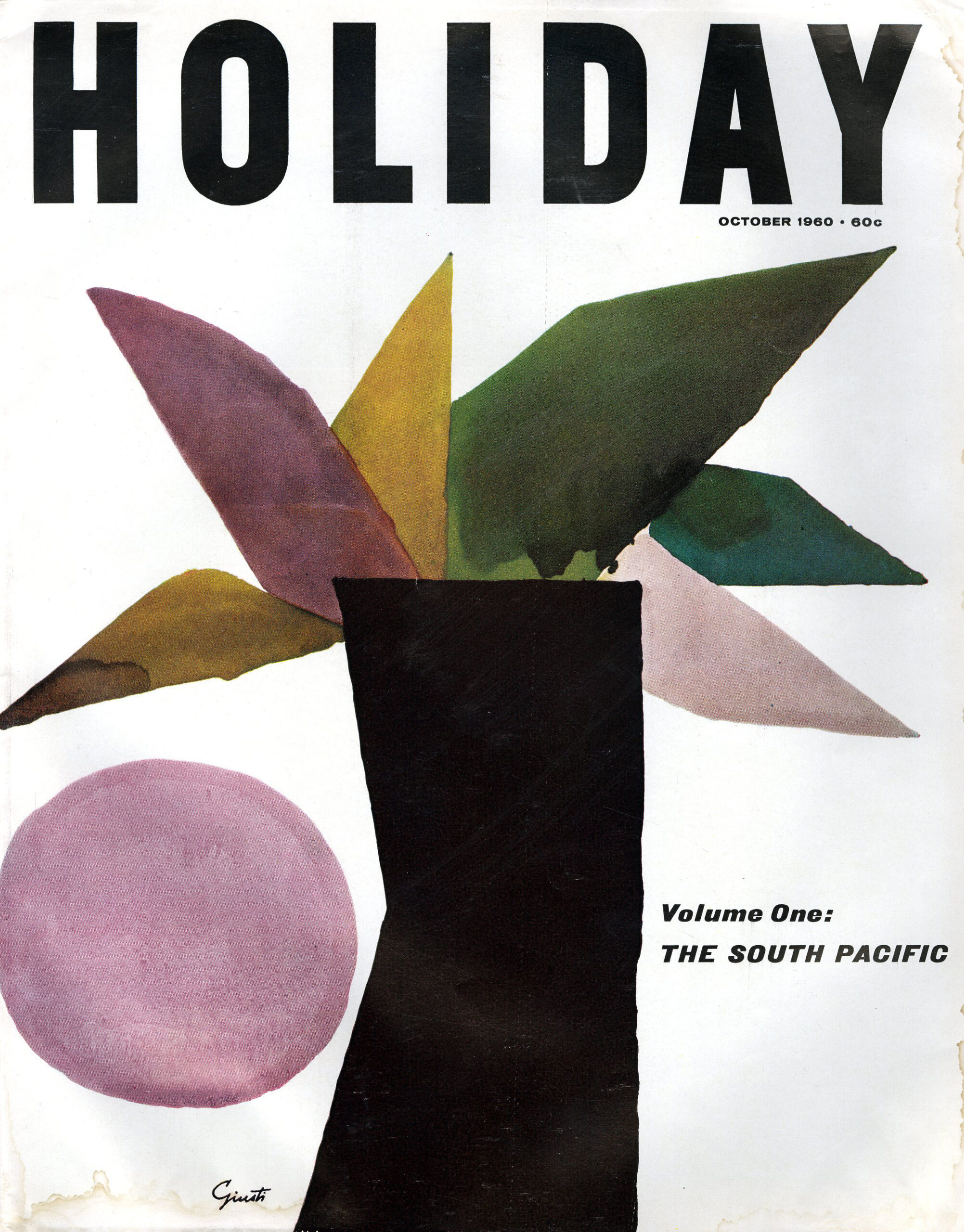
Cover by George Giusti
There are certain long defunct magazines that I miss almost as much as I do a former roommate or beloved pet. Holiday epitomizes that. When I was young it took me to magical and exotic places through its brilliantly selected illustration and photography. It was always on the bathroom magazine rack (did you have one of those?). I wish I still had that rack today.
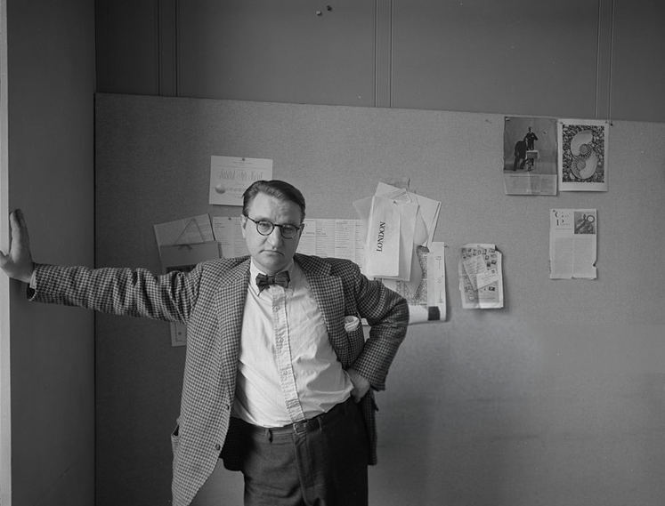
In the 1930s, Holiday magazine’s layout was made with a cookie cutter. In 1955 Frank Zachary, who had learned art direction from Alexey Brodovitch at Portfolio magazine where Zachary was editor, became Holiday’s new art director. Zachary started his career as photo editor, doing Weegee books among other things, but at Holiday, he made unconventional picture spreads that flowed cinematically in the Brodovitch tradition.
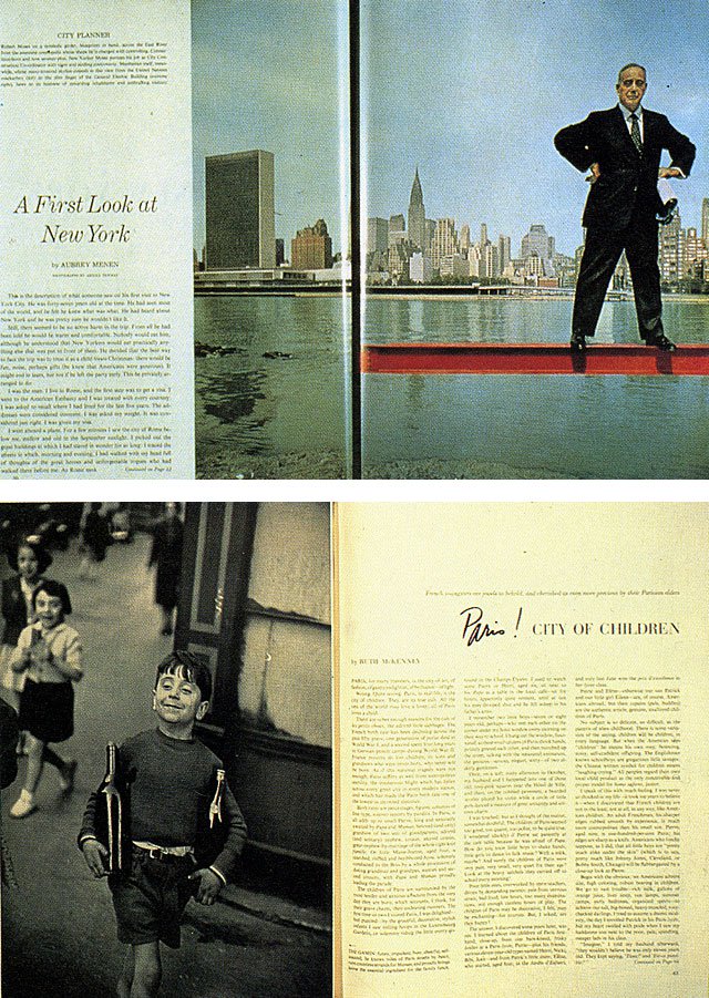
Holiday, 1958. Photograph Arnold Newman. Holiday 1952. Photograph Henri Cartier-Bresson.
Zachary saw himself as a journalist, more interested in using the photograph to tell a supplementary story than to prettify a page. “I learned the picture is the layout. If you have a great picture, you don’t embellish it with big type. You make it tight and sweet,” he told me many decades ago. At Holiday he developed a cadre of talented photographers who brought life to the magazine through thematic picture essays. Among them were Arnold Newman, Tom Hollyman, John Lewis Stage, Robert Phillips, Fred Maroon, and Slim Aarons, many of whom followed Zachary years later when he became editor-in-chief of Town and Country.

Frank Zachary in the Holiday offices by Arnold Newman
If photography was the heart of Holiday, illustration was its soul. Zachary rejected the prevailing sentimental illustrative approaches used in most American magazines; he eyed European artists, specifically from England and France, for their surrealistic comic vision. “Frank brought sophisticated illustration to American magazines,” recalled a colleague. “Other art directors brought powerful or clever images, but Frank brought an unprecedented sophistication. Of course it came from Europe since in the early 1950s there weren’t too many Americans practicing sophisticated pen work.”
Through Holiday, the artists Ronald Searle, Andre François, Roland Topor, Domenico Gnoli, George Guisti, and Edward Gorey (one of the few native Americans, along with Seymour Chwast, and Milton Glaser) were given latitude to develop their own picture essays and portfolios. Zachary avoided the reigning stars—“that would be too easy,” he argued—but rather discovered his own galaxy. In most cases the artists transformed themselves in this environment. “Frank gave me a lot of firsts,” recalled Ronald Searle. “From around 1959 to 1969 he gave me all the space one could dream of, the chance to fill it with color, the freedom to travel, and what proved to be the last of the great venues for reportage. Off to Alaska! Cover all of Canada! Bring me ten pages on the dirty bits of Hamburg! No expense spared. The years of travel for Frank gave me experience that cannot be bought. There was only one problem, he always called me ‘Arnold’ instead of Ronald. Then he probably always called [photographer] Arnold Newman ‘Ronald,’ so it balanced out.”

Holiday covers from Zachary’s tenure as art director
Zachary developed what he called “environmental portraiture,” common in contemporary magazines but unique in the early 1950s. “I would say to a photographer, ‘If a guy is a multimillionaire painter, I want to see a whole lot of his paintings in the background and on top of that I want to see his castle in the background, too.’ A photographer just couldn’t walk in and take a picture of a subject; he had to assemble the components of the subject’s life,” explains Zachary. An example of environmental portraiture is a photograph for a special issue of Holiday on New York City showing highways and parks czar and power-broker Robert Moses standing omnipotently on a red girder over the East River. The shot illustrates Zachary’s willingness to expend a tremendous amount of effort to photograph one perfect image. That is what defined his remarkable art direction.
Observed
View all
Observed
By Steven Heller
Related Posts

Innovation
Ashleigh Axios|Essays
Innovation needs a darker imagination
Business
Kim Devall|Essays
The most disruptive thing a brand can do is be human
AI Observer
Lee Moreau|Critique
The Wizards of AI are sad and lonely men
Business
Louisa Eunice|Essays
The afterlife of souvenirs: what survives between culture and commerce?
Related Posts

Innovation
Ashleigh Axios|Essays
Innovation needs a darker imagination

Business
Kim Devall|Essays
The most disruptive thing a brand can do is be human

AI Observer
Lee Moreau|Critique
The Wizards of AI are sad and lonely men

Business
Louisa Eunice|Essays

 Steven Heller is the co-chair (with Lita Talarico) of the School of Visual Arts MFA Design / Designer as Author + Entrepreneur program and the SVA Masters Workshop in Rome. He writes the Visuals column for the New York Times Book Review,