
January 8, 2006
Civilian Typography: The Power and The Fury
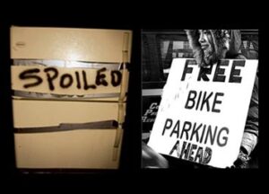
Left: Cover of Spoiled, Tom Varisco, 2005; Right: Photograph by Steph Goralnik, 2005.
John Updike once wrote that the “itch” to make dark marks on white paper is shared by writers and artists. As for designers, that same itch translates to an utter fascination with the written word. In industry parlance we call this typography, but it might also be said to include anything that resides in that fertile ground between word and message.
As communication goes, signage is perhaps one of the more obvious forms: declarative and in your face, its role isn’t to gently cajole or subtly persuade, but to call a spade a spade. A sign — particularly a handmade one — is a life preserver, a visible siren seeking immediate response. A quick search on signage in Flickr reveals numerous examples, from bumper stickers to makeshift posters to an international display of graffiti: yet some of the most compelling examples come from not from professionals, but from real people doing real things. And they’re doing it with magic markers, poster paint, and ball-point pens.
Type. It’s a beautiful thing.
When you’re stuck, or in trouble, or maybe just in a hurry, who has time for professional typography? Tom Varisco’s exquisite little book of photographs, Spoiled, turns its lens on the forgotten refrigerators of New Orleans, post hurricane Katrina. It’s a poignant metaphor for loss — for pure perishibility — and it’s rendered through a series of simple photographs of fridges, unmoored and abandoned and still. And this is where the writing comes in: with their facades bearing messages written in anger and haste, the fridge-fronts read as a kind of chorus of plaintive wailings. Somehow, the handwriting anthropomorphizes these impoverished, inanimate objects, making them read as vestigial remnants of the dead: they’re vessels for all that’s expired.
The recent serious (if decidedly less tragic) New York City transit strike brought on its own signage vigilantes. If urgency was once typified by hailing a cab with a cell phone surgically connected to your ear, last week it was all about the handmade sign: how big, now noticeable, how clearly it made itself known to passersby. Known for their perseverence and street-smarts, many (most?) New Yorkers succeeded in navigating the city, in those frigid, pre-Christmas days, by penning an ingenious assortment of handmade placards. Purposeful and immediate, it’s difficult to imagine these “do-it-yourself” signs being improved upon by typesetting — although taken on a case-by-case basis, there’s clearly room for improvement .
Not long after we moved to the country, I went to fill up my car at the gas station one day and came upon a pile of flyers which I felt compelled to send to all of my urban friends. I assumed (wrongly, it turned out) that gentrification was still a remote notion here, in our little village in the Berkshires. And I loved the logo, xeroxed to within an inch of its life — like Al was unwittingly chanelling Peter Girardi.

A year later, I found myself again at the local gas station at the start of hunting season, whereupon I saw Al’s new and improved sign.
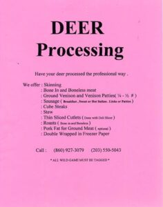
It struck me that in the misguided spirit of (technological) improvement that seems to characterize just about everything, Al had gotten himself and his dead deer to a computer, going from Taxidermy Gothic to Times Roman Bold in one huge, sad sweep. And it’s remained with me, this tale of lost typographic innocence: did someone come along and allege that Al’s handwriting wasn’t up to snuff? I noticed a different phone number: did he sell the business? And why did he retire the rarified four-headed logo from active duty? Maybe he sold it to pay for the deli-slicer.
I concluded that taxidermy is more a transaction than an art form. In any event, Al’s need to make dark marks on white paper was negligible. (At the end of the day, he just wanted to sell some meat.) But the post-Katrina refrigerators and weary New York pedestrians weren’t selling anything. And maybe that’s the point: in the end, efficiency can only take you so far. Without a cell phone, or in a flood, or barred from public transportation, the thing that separates human beings from the animal kingdom is our ability to communicate verbally. If we can’t do that, we do it graphically. When all else fails, the pen isn’t just mightier than the sword: it is the sword.
Observed
View all
Observed
By Jessica Helfand
Related Posts

Innovation
Ashleigh Axios|Essays
Innovation needs a darker imagination
Business
Kim Devall|Essays
The most disruptive thing a brand can do is be human

AI Observer
Lee Moreau|Critique
The Wizards of AI are sad and lonely men
Business
Louisa Eunice|Essays
The afterlife of souvenirs: what survives between culture and commerce?
Related Posts

Innovation
Ashleigh Axios|Essays
Innovation needs a darker imagination

Business
Kim Devall|Essays
The most disruptive thing a brand can do is be human

AI Observer
Lee Moreau|Critique
The Wizards of AI are sad and lonely men

Business
Louisa Eunice|Essays

 Jessica Helfand is an artist and writer based in New England. A former critic at Yale School of Art and one of the founding editors of Design Observer, she is the author of several books on visual culture including Self Reliance, Design: The Invention of Desire, and Face: A Visual Odyssey.