
September 6, 2017
Earnest Elmo Calkins: Founder of Modern Advertising and a Designer You Probably Don’t Know
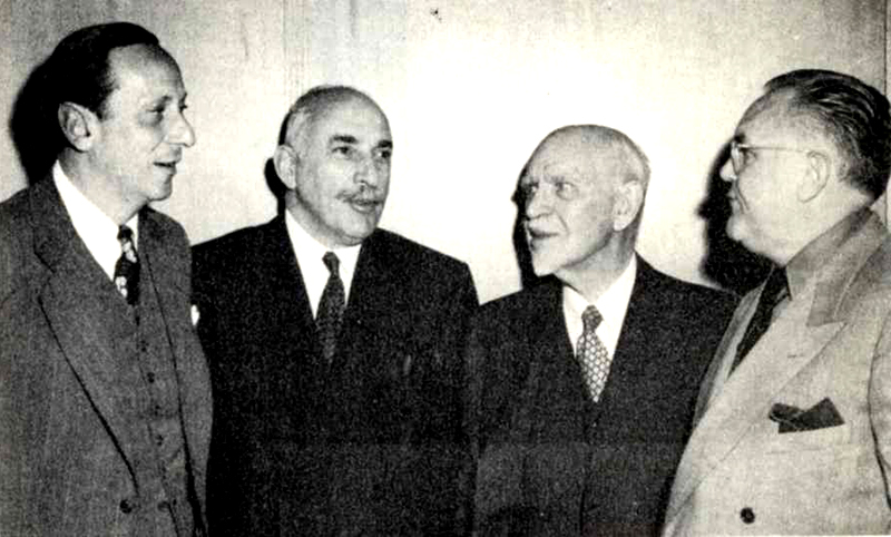
Left to right: Donald Klopfer, 1950 AIGA Medalist Alfred A. Knopf, 1950 AIGA Medalist Alfred Earnest Elmo Calkins, “Dean of advertising men,” Merle Armitage.
On the night of May 18, 1950, the advertising executive Earnest Elmo Calkins (1868-1964) was awarded, together with publisher Alfred A. Knopf, the annual AIGA Medal. A small keepsake was published to commemorate the celebration that included the following note: “An unusual and perhaps gratifying feature of the occasion is the fact that for the first time in AIGA history, the medalists were nominated by poll of the members.” That spoke volumes about the significance of Calkins to the graphic design field. Yet, I would wager that the majority of you reading this have no idea who Mr. Calkins, a minister’s son from Geneseo, Illinois, was or why indeed he was significant enough to receive this tribute.
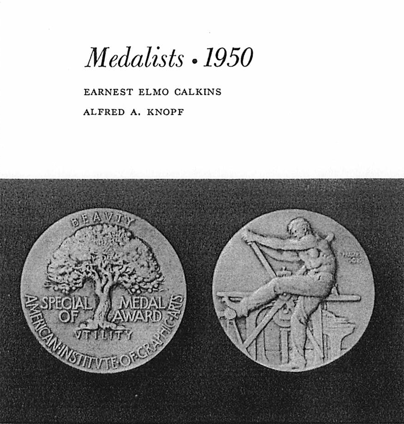
For all intents and purposes, Calkins was the father of Modern graphic design and advertising in the United States. Although he is not an unsung hero—recognized as the founder of “styling the goods,” otherwise known as “consumer engineering” or even better known as “forced obsolescence”—he is considered in the pantheon of twentieth century Modernists. Indeed he was not as well-remembered, nor held in the same esteem, as many Modern designers of his era. His AIGA citation reads:
To Earnest Elmo Calkins, Printer, Writer, Collector, Dean of Advertising Men; Founder of the Advertising Agency as we know it today; Eye and Ear in the Use of Effective illustrations and Typography in Advertising.
In recognition of this contribution, the medal is engraved:
To Earnest Elmo Calkins pioneer in the effective use of the graphic arts in advertising May 18, 1950.
It is arguable that without the puritanically-raised Calkins, Modern art would never have washed up on American advertising’s shores, creative advertising teams might not have existed, and graphic design would be a different profession today.
In accepting the award Calkins said:
“I am humbly conscious of the honor you pay me, and it is enhanced by the circumstance that I have done my work and rendered my account for good and ill, and must now stand or fall by what I have done, for at my age there is little possibility that I will add to the record. But I am forcibly reminded of something Cato once said. The wise old philosopher overheard a visitor to Rome exclaiming at the number of statues to public men in the Forum who inquired:
‘But why has Cato no statue?’
‘I would much rather you should ask that,’ was Cato’s comment, ‘than “why has Cato a statue.”’
For while it is improbable that any one ever asked why Calkins had no medal the way is open for some doubting Thomas to inquire ‘Why has he one?’
The answer to that is that I have benefitted by the company I have kept. I have been fortunate in my associates and I shine, if at all, like the moon, by reflected light.”
Calkins was modest to a fault. He thanked many great designers of his day—from William Addison Dwiggins to Dard Hunter, Elmer Adler to Bruce Rogers, and Daniel Berkeley Updike (“who gave a commercial printshop the standards and ideals of a private press…”)—for allowing him to bask in their luminosity. But his modesty must not hide his overwhelming importance as a cornerstone of advertising and design history. And it is why, as graphic design’s present and future is a multi-integrated, strategic marketing discipline, I offer this spotlight of Calkins’ legacy.
It is 1925 at a playground of modernity in Paris along the banks of the Seine. The Exposition Internationale des Arts Décoratifs et Industriels Modernes was laid out in boulevards lined with funhouses of consumerism decorated with geometric ornament, and neo-classical friezes incorporating functional and decorative designs. The world’s leading clothing, furniture, and houseware manufacturers, and many grand retail emporia were encouraged to exhibit their latest products and designs. But one player was noticeably absent. The United States declined an invitation to participate at the urging of its industrial leaders.
American products were either too nondescript, or laden with Beaux Art ornament to camouflage a mass produced look. Although mass production was the foundation on which the modern American economy was built, many cultural critics felt that items coming off the assembly line lacked good taste. While the Bauhaus, Constructivism, and other European Modern avant-gardes had already embraced the machine and proffered the integration of Modern art and industry, American industrialists, who could easily afford to aesthetically improve their products, were usually apathetic, if not resistant, to the idea. What they did not resist, however, were marketing strategies that would insure greater profits. So following a brief economic downturn in the early twenties and subsequent boom, industry frantically tried to find a new means of stimulating even further sales. It was the profit motive, not any transcendent utopian ethic or aesthetic ideal, that paved the way for commercial modernism in the United States, which was introduced to American advertising in 1925 by Earnest Elmo Calkins, founder of Calkins and Holden Advertising Co. He visited the Exposition Internationale des Arts Décoratifs et Industriels Modernes and came away inspired.
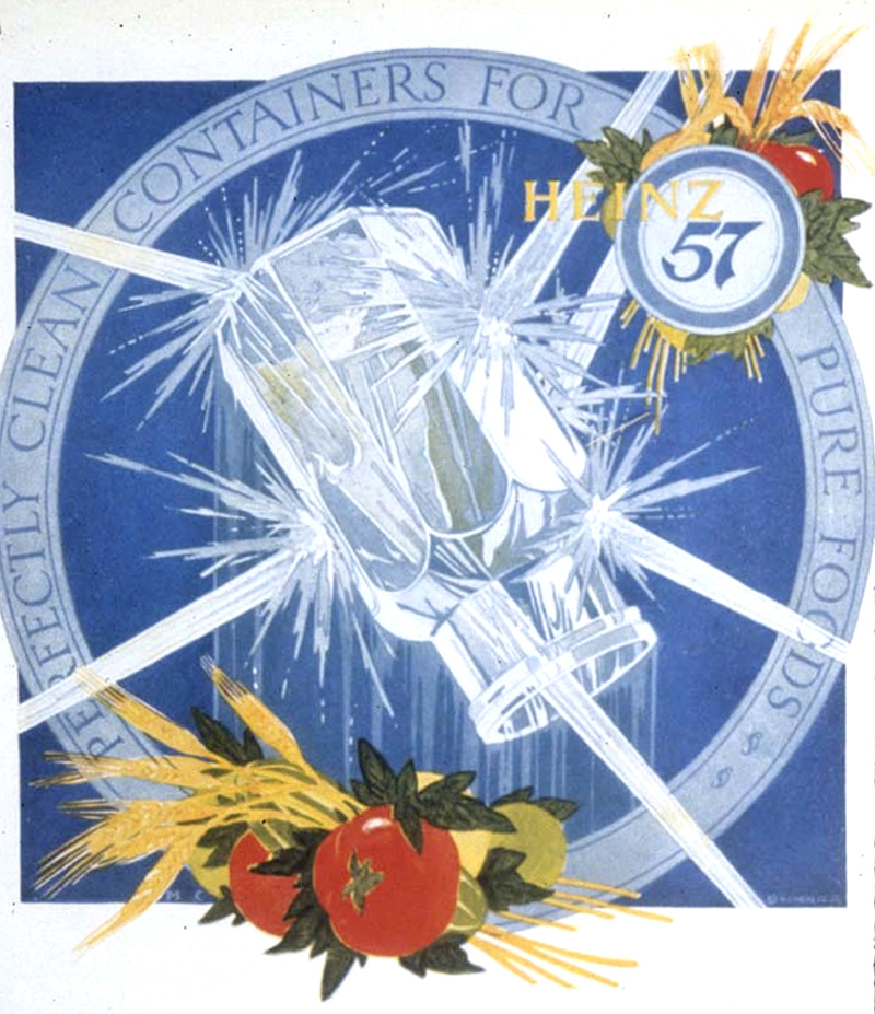
Describing the array of cubistic and futuristic graphics, packages, and point of purchase displays which he discovered in the pavilions for department stores like Bon Marché and Galleries Layfayette, Calkins wrote to his staff in New York: “It is extremely ‘new art’ and some of it too bizarre, but it achieves a certain exciting harmony, and in detail is entertaining to a degree. [Everything is] arranged with an eye to display, a vast piece of consummate window dressing….It is not always beautiful, but it is diabolically clever.” What was so different from most American advertising art was the noticeable rejection of realism in favor of abstraction. Illustration was not representational but through symbols, metaphors, and allegories exuded a “magical” atmosphere. Boxes and bottles were no longer mere utilitarian vessels for their contents, but rather represented the essence of what the product symbolized to the consumer.
Later in a 1933 article “The Dividends of Beauty,” featured in Advertising Arts, Calkins summarized the development this way: “Modernism offered the opportunity of expressing the inexpressible, of suggesting not so much a motor car as speed, not so much a gown as style, not so much a compact as beauty.” If this had a similar ring to one of F.T. Marinetti’s Futurist manifestoes, it was because Calkins studied and borrowed heavily from the European avant-garde.
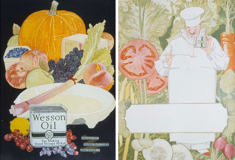
Modern art, or what the leading advertising trade journal Printers’ Ink magazine in 1928 called “foreign art ideas,” elevated advertising art to a higher aesthetic level. Advertising designers were quick to appreciate the possibilities of modernism since realistic art had reached what Calkins termed a “dead level of excellence.” It was no longer possible to make an advertisement striking, conspicuous, and attractive by still pictures and realistic groups.
Spearheaded by Calkins and Holden, and later adopted by such progressive agencies as N.W. Ayer (which opened its own galleries to display and promote their own modern advertising art), and Kenyon and Eckart, commonplace objects—toasters, refrigerators, coffee tins—were presented against new patterns and at skewed angles; contemporary industrial wares were shown in surrealistic and futuristic settings accented by contemporary typefaces with contempo names like Cubist Bold, Vulcan, Broadway, Novel Gothic, and more. Mise en page, or layout, inspired by the European New Typography, also became more dynamic in its asymmetry. Modernism offered what historian Jackson Lears calls the “aura of cosmopolitan culture and avant-garde style” and signaled the spread of an aesthetic coming of age of American advertising.
Calkins and Ralph Holden co-authored Modern Advertising (D. Appleton and Company, 1905), which proposed that fine typography must be a component of successful advertising, rather than an afterthought thrown in by job printers. The first man to specialize in advertising typography was Benjamin Sherbow, who Calkins had hired as a copywriter in 1919, but soon began to experiment with display and text type. (He later published a manual titled Sherbow’s Charts, which Calkins touted as a “must” item in agency production departments.) Around 1920 Calkins introduced the job of “type man,” later called “type director,” who specialized in providing fresh points of view to counter the clichés of the average printer. Integrating good typography and art was “a more subtle way of suggesting beauty in the products than baldly stating the fact in the text,” wrote Calkins in his autobiography, And Hearing Not (Charles A. Scribners and Sons, 1946). The title referred to Calkins’ almost total deafness, but the book referred to a special relationship created between the advertisement and goods by the style of the graphic design, something Calkins called “atmosphere”—a fetishistic trait that ultimately rubbed off on the product itself. “Improving the physiognomy of advertising had a twofold result…” he explained. “It directly influenced the taste of the public and indirectly conditioned the production of goods.”
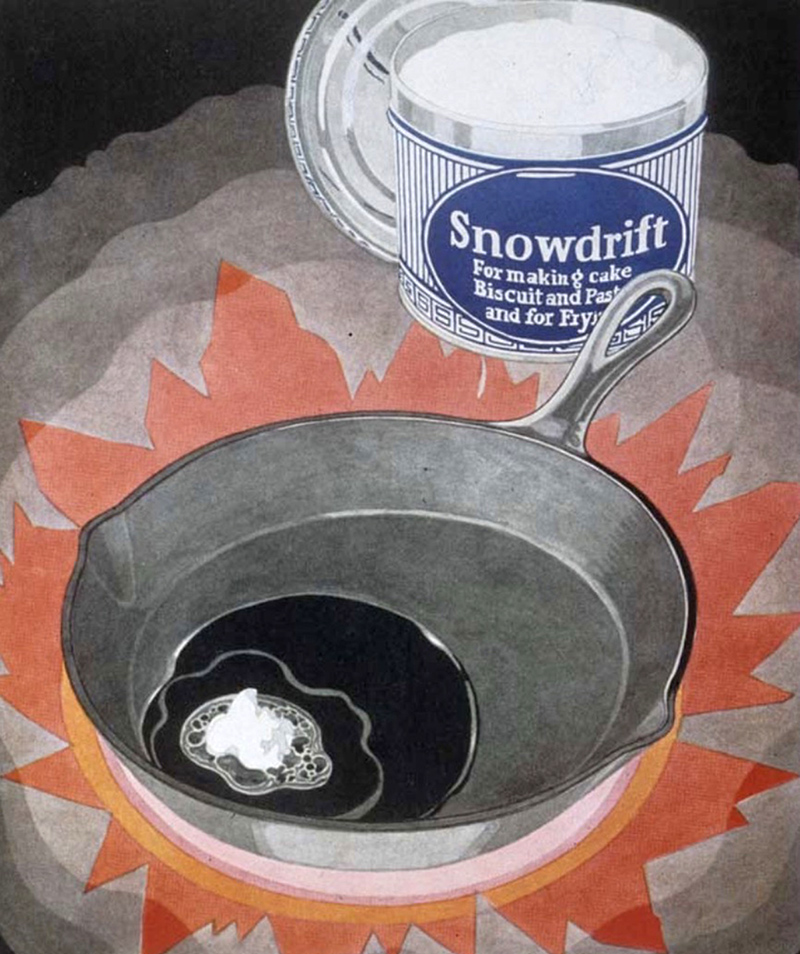
In Calkins’ view, advertising was the fuel running the engines of industry. “The styling of manufactured goods,” he wrote in “Advertising Art in the United States…” (Modern Publicity), “is a byproduct of improved advertising design…The technical term for this idea is obsoletism. We no longer wait for things to wear out. We displace them with others that are not more efficient but more attractive.” Although clothing manufacturers had for decades been changing styles annually to increase consumer interest, industry had not adopted this strategy until Calkins made it his mission. “It seemed reasonable that if design and color made advertising more acceptable to the buying public,” he wrote, “design and color would add salability of goods.” He also noted that the majority of consumers were women, who indeed were accustomed to changes in fashions and were happily seduced by the sleek new designs.
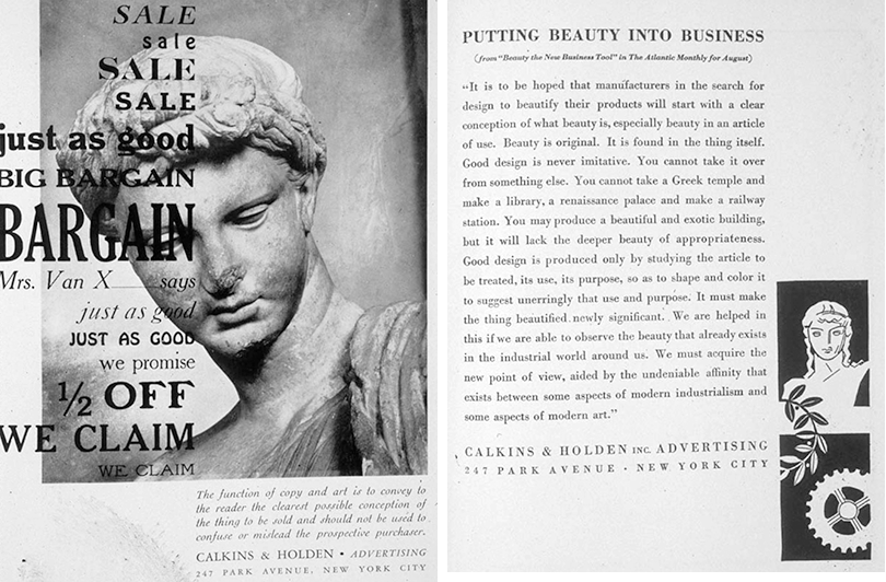
Calkins was a missionary of acceptable modernity and turned his attention to pseudo-science, where he was instrumental in such modern marketing concepts as “consumption engineering,” “forced obsolescence,” and “styling the goods.” These were the core concepts of an advertising strategy that introduced Modern art to the otherwise devoutly conservative profession whose primary responsibility was purchasing ad space from magazines and newspapers. Calkins proposed ways to control consumers’ behavior through Pavlovian methods—by incrementally feeding them new mouthwatering styles. Consumption engineering was essentially a trick that encouraged redundancy, and artificially stimulated growth. “To make people buy more goods,” he wrote in an essay titled “Advertising, Builder of Taste” in the September 1930 issue of The American Magazine of Art, “it is necessary to displace what they already have, still useful, but outdated, old-fashioned, obsolete.”
Modern art was its own value additive. “When the uglier utilities of business cannot be beautified, art is used to make them disappear,” wrote Calkins in “Advertising, Builder of Taste.” “Gasometers are being painted according to the principles of camouflage…The bottles, jars, tubes, boxes and cartons of hundreds of foods, drugs, toilet articles, perfumes, powders, pastes and creams are in the hands of artists working solely to produce a container pleasing to the eye to add color and form to the shop window, or toilet table and kitchen shelf.”
This was one of innumerable pronouncements that Calkins made through trade journals, articles in newspapers and magazines, and lectures before business and civic groups. He fervently believed that Modernism equaled beauty, and beauty was the key to economic health and well being. Like the revolutionary European Modernists, he pontificated that “We must acquire the new point of view, aided by the undeniable affinity that exists between some aspects of modern industrialism and some aspects of modern art.”
Observed
View all
Observed
By Steven Heller
Related Posts

Innovation
Ashleigh Axios|Essays
Innovation needs a darker imagination

Business
Kim Devall|Essays
The most disruptive thing a brand can do is be human

AI Observer
Lee Moreau|Critique
The Wizards of AI are sad and lonely men
Business
Louisa Eunice|Essays
The afterlife of souvenirs: what survives between culture and commerce?
Recent Posts
Sam Furness got serious about investing in his curiosity. Now, he’s helping others do the same. Corporate crisis is design’s opportunity In a world that feels impossible to change, emerging designer Deborah Khodanovich is starting small Elixir Design founder Jennifer Jerde believes in the human touchRelated Posts

Innovation
Ashleigh Axios|Essays
Innovation needs a darker imagination

Business
Kim Devall|Essays
The most disruptive thing a brand can do is be human

AI Observer
Lee Moreau|Critique
The Wizards of AI are sad and lonely men

Business
Louisa Eunice|Essays

 Steven Heller is the co-chair (with Lita Talarico) of the School of Visual Arts MFA Design / Designer as Author + Entrepreneur program and the SVA Masters Workshop in Rome. He writes the Visuals column for the New York Times Book Review,