Exposure • History • Media • Photography • Social Good
December 31, 2009
Exposure: The Eiffel Tower by Germaine Krull
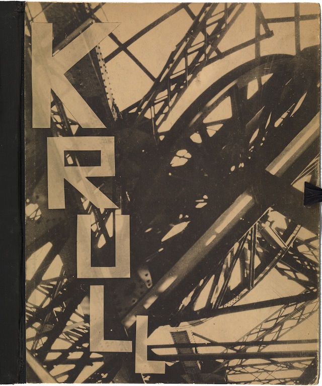
Front cover of Métal (Metal) by Germaine Krull, published by Librairie des Arts Décoratifs, Paris, 1927
Source: Museum of Modern Art
Germaine Krull’s Métal, an album of 64 unbound collotype prints published in 1927, is a photographic symphony to the age of the machine. While plenty of artists and photographers were enthralled by industrial imagery in those years, Krull (1897-1985)—subject of an exhibition at the Jeu de Paume in Paris—was one of the earliest to produce interpretations that were not merely descriptive, but an entirely modern way of seeing these mechanisms and structures.
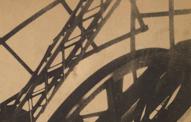
The photograph on the cover shows Paris’s most recognizable icon, the Eiffel Tower, a machine for winching people into the sky, though one would need to be highly familiar with the structure to identify it from this angle. In other pictures in the portfolio, Krull observes the tower from vantage points that make it a little more intelligible as engineering. Here, she is inside it, presumably looking upwards, and her viewpoint generates a jumble of criss-crossing girders, so that it’s hard to be sure what is up or down. Beyond the angular cage of wrought iron only pale brown emptiness can be seen. The picture shoots out diagonally from the corner, and all the elements appear to be tumbling around each other, as though the structure is an animated machine of indeterminate purpose rather than a static tower for elevating sightseers. The lattice of riveted limbs conveys massive strength, and yet the image also tends toward a constructivist style of abstraction, with the girders and wheel semi-silhouetted and brushed by highlights, a softening that the sepia color accentuates.
The picture appears again inside the album, as plate 37, without the lettering. Although this is obviously how Krull intended it to be seen, in this case I prefer the image with the letters on it. Krull is a name with inherent vocal and typographic strength. The squared-off, industrial treatment of the hand-drawn characters is as assertively individualistic as the photograph, and the unknown designer has placed the name adroitly on the opposing diagonals formed by the two heavy left-hand girders. The letters’ expanding dimensions redouble the picture’s vertical energy, and the interplay of type and image becomes a fanfare for a vision of modernity that is both muscular and lyrical. This fusion is topped off by allowing a tint of the underlying picture to show through the letters, making each one a component of the image, infused by its light.
Observed
View all
Observed
By Rick Poynor
Related Posts
Exposure
Rick Poynor|Exposure
Exposure: Andy’s Food Mart by Tibor Kalman and M&Co
Exposure
Rick Poynor|Exposure
Exposure: License Photo Studio by Walker Evans
Arts + Culture
Rick Poynor|Exposure
Exposure: Drape (Cavalcade III) by Eva Stenram
Arts + Culture
Rick Poynor|Exposure
Exposure: Mrs. E.N. Todter by Dion & Puett Studio
Related Posts

Exposure
Rick Poynor|Exposure
Exposure: Andy’s Food Mart by Tibor Kalman and M&Co

Exposure
Rick Poynor|Exposure
Exposure: License Photo Studio by Walker Evans

Arts + Culture
Rick Poynor|Exposure
Exposure: Drape (Cavalcade III) by Eva Stenram

Arts + Culture
Rick Poynor|Exposure

 Rick Poynor is a writer, critic, lecturer and curator, specialising in design, media, photography and visual culture. He founded Eye, co-founded Design Observer, and contributes columns to Eye and Print. His latest book is Uncanny: Surrealism and Graphic Design.