
January 14, 2013
Graphic Design Criticism as a Spectator Sport
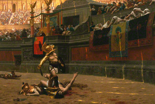
Pollice Verso (Thumbs Down), Jean-Léon Gérôme, 1872.
Part One: There’s Something Wrong with Vinny
It’s an imaginary summer Saturday afternoon in suburban Cleveland in, say, 1969 or so. I am 12 years old. My father is cutting the back lawn, and so is our next door neighbor Vinny. Each of them decides at the same time to take a break under a small tree that stands at the border between our yards. They talk about the weather, the Cleveland Indians, typical stuff. Then Vinny says, “Hey, Lenny, did you notice that new packaging for Tropicana?”
My father is taken aback for a moment. “What, you mean Tropicana, the orange juice?”
“Yeah,” says Vinny. “Did you notice they changed the packaging?”
My father is baffled. “The packaging? You mean the carton it comes in? The way it looks?” Vinny nods. My father looks doubtful. “I can’t say I have.”
“Well, they changed it, all right,” says Vinny with a slight edge to his voice. “There used to be curvy lettering, and a picture of an orange with a straw through it. Now it’s plain lettering and the orange and the straw are gone.” Vinny looks at my father’s blank expression. “I can’t believe you didn’t notice.”
“I don’t know, I’ll have to, um, take a look. It sounds like…” My father isn’t sure of his words here. “…quite a change.”
“Well, I don’t like it,” declares Vinny. “In fact, I’m going to write a letter to the company and tell them how much I hate it. You should take a look and write something, too.”
My father nods, and then looks over his shoulder. “Well, listen, Vinny, I think I’d better check in with Anne Marie. Take it easy.” My dad walks back to the house and into the kitchen, where my mom is at the sink. They both look out the window at the back yard. “Anne Marie,” says my dad, “I think there’s something wrong with Vinny.”
Of course, this never happened, at least not in 1969. But forty years later, Vinny would not be seen as someone to be watched carefully and perhaps medicated, but rather as a spokesperson for a highly desirable audience. In 2009, PepsiCo Americas Beverages commissioned Arnell Group to redesign the packaging for its flagship juice brand, Tropicana Pure Premium. Thanks to the internet and social media, what followed the introduction of the new packaging were not a few unnerving backyard conversations with eccentric neighbors, but an outpouring of complaints from consumers as well as demands that the suddenly beloved previous packaging be reinstated. The New York Times told the story.
It was not the volume of the outcries that led to the corporate change of heart, [PepsiCo North America President Neil] Campbell said, because “it was a fraction of a percent of the people who buy the product.”
Rather, the criticism is being heeded because it came, Mr. Campbell said in a telephone interview on Friday, from some of “our most loyal consumers.”
“We underestimated the deep emotional bond” they had with the original packaging, he added. “Those consumers are very important to us, so we responded.”
The response was to throw out the new package design and return to the old. The people had spoken, and not for the last time.
Part Two: Everybody Wants to Go to Harvard
Earlier last year, the University of California quietly unveiled a new logo. Much has changed since 2009, including the notion that you can quietly unveil a logo. The logo was, eventually, inevitably noticed. After Tropicana, after the “epic fail” Gap debacle, after the seizure-inducing London 2012 affair, no one should have been surprised by what happened next. In fact, you almost had a sense that we all knew our roles in the drama to come: New logo? Game on! Graphic design criticism is now a spectator sport, and anyone can play.
The review on Brand New, Armin Vit’s amazingly popular logo review website, was mixed. The new UC logo was contemporary and abstract, and sat at the center of a smart and attractive new visual system, a very professional job by the University’s in-house design team. Significantly, it was meant to represent the University of California system, the holding company, in effect, for UCLA, UC Berkeley, UC Davis, and the other schools in the network. All of them would keep their existing logos. Brand New commenters tend to be other graphic designers. Some liked it, some didn’t.
There was no such ambivalence on the part of the UC community of students, faculty and alumni. They basically went crazy with rage. A petition on Change.org — “Stop the new UC logo” — got over 54,000 signatures. The outcry spread to the general press coverage, who called it “one of the worst logo rebrands in history“, “revolting” and “a fiasco.” Some in the graphic design community attempted to rally around the embattled designers, including Armin Vit, who wrote a none-too-subtle response to the critics that included the suggestion: “Shut up. Seriously. Shut up.”
The University held their ground for a week or so before capitulating. Said Daniel M. Dooley, UC’s senior vice president for external relations: “While I believe the design element in question” — you can almost hear him choking on the word logo — “would win wide acceptance over time, it also is important that we listen to and respect what has been a significant negative response by students, alumni and other members of our community.” “Pleasant news,” said the opponents. “Awesome victory.”
Dooley decried the “false narrative” that had surrounded the controversy, specifically the idea that this newfangled modern thing would replace the century-old traditional University seal. (The official line was that the seal would continue to be used on old-looking stuff like diplomas.) As usual, no one had expressed much passion for the good old seal until it was threatened by the arrival of the new logo. Suddenly, people were lining up to testify to its virtues.
The University of California seal, of course, is nothing more than a banal pastiche of the kind of stuff of which university seals are always made: open books, celestial bodies, slogans, type arranged in circles. Which is exactly the point. As one surprisingly revealing Brand New commenter, a UC alumnus, said, “Please take the time to look up the websites and logos of Oxford, Cambridge, Harvard or Princeton, they all feature the seal or coat of arms of the university to the left of the institution’s name. Lesser and/or newer learning institutions will tend to have newer, more corporate designs because a seal or traditional coat of arm would not be a good fit, almost usurpatory in fact.” In short: don’t you dare mistake my alma mater for one of those second-rate places that doesn’t have a proper seal as its symbol. (Cruelly, the same commenter pointed out with undisguised distaste the logo of Armin Vit’s own college, “a second-tier private school in northern Mexico called ‘Anahuac University.'” In this case, Vit is right: shut up.)
But all the UC logo dissenters remind us of how different designers are from regular people. Designers tend to overvalue differentiation and originality. We are taught this in design school. The best solutions are created ex nihilo, break new ground, resemble nothing else in the world. Everyone wants to stand out, or else what’s the point? But this isn’t true. Most people don’t want to stand out. They want to fit in. More precisely, they want to fit in with the people they like, or want to be like. At one point in the debate, Armin Vit linked to a Google image search result of university seals. Did anyone wonder why they all look the same?
When people imagine going to college, what most of them are imagining is going to a place like Harvard. If you’re not going to Harvard, it’s best not to have some funny-looking logo reminding you of that fact. Once you’ve graduated, the University seal stands for the experience you’ve bought and paid for. Changing it after the fact is like coming into people’s houses, taking away the things they own, and replacing them with things they didn’t ask for and don’t want. No wonder they get mad.
Part Three: When the Chips are Down
In October 2011, the exhibition “Graphic Design: Now in Production” opened at the Walker Art Center. Co-organized by the Walker and the Cooper-Hewitt National Design Museum, the show surveyed a wide range of contemporary work with a strong bias towards small-batch work by sole practitioners, small studios, and people with no professional design training. The work on view, by designers and artists like Daniel Eatock, Keetra Dean Dixon, MetaHaven, Mike Perry and Christien Meindertsma, was strong and provocative, and the show was largely well reviewed.
Most of the exhibited pieces were experimental and designed for extremely limited audiences, if they were designed with audiences in mind at all. The biggest exception was an area devoted to contemporary identity design. Elsewhere viewers were invited to contemplate the mysteries of, say, the “poster” Daniel Eatock created by setting a blank piece of paper on dozens of upended Magic Markers. In the entrance corridor they confronted the familiar, frankly commercial logos of Starbucks, Comedy Central, AOL, and Popeyes Chicken and Biscuits. The contrast was stark and rather disorienting.
This area was curated by Brand New‘s Armin Vit and Bryony Palacio-Gomez, whose online commenters are invited to vote on each new identity presented. At the Walker, the installation’s designers created a charming low tech homage to Brand New’s digital polling system: visitors could vote on the redesigns by placing poker chips in two transparent tubes in front of the “before” and “after” versions of each logo, creating a bar-charted popularity contest in real time each day the exhibition was on view.
After the Walker, the next stop for “Now in Production” was the Cooper-Hewitt National Design Museum in New York. This represented a challenge. The Cooper-Hewitt is in the midst of a multi-year renovation, and the museum building is closed. This means that alternate venues had to be found for all its exhibitions. The New York team found an interesting one: Governors Island, a 172-acre decommissioned military base and National Park 800 yards off the southernmost tip of Manhattan, reachable only by ferryboat on weekends during the summer. The exhibition opened in Building 110 on Memorial Day weekend.
Building 110, located adjacent to the point where the ferries load and unload, is not particularly suited to museum-quality exhibitions; its low ceilings and rough surfaces are quite different from the clean, well-lit galleries at the Walker. But it had two notable characteristics. Not only was it the only air-conditioned building on the island during one of the hottest New York City summers on record, it housed the island’s only indoor bathrooms. To get to the bathrooms, one passed down a long corridor like that in a typical public school. The Cooper-Hewitt’s exhibition designers had the inspired idea to start the show in the corridor, and it was there that they located the logo voting apparatus. This guaranteed that it would be seen not just by a self-selected audience of graphic design enthusiasts, but by a cross-section of the general public: moms with strollers, skateboard kids, joggers, tourists.
It was fascinating to watch their reactions and the shifting tabulations. I was surprised by how often the civilians got it “wrong,” voting enthusiastically for the cartoony old version of the Comedy Central logo, the needlessly fussy and insecure pre-redesign Starbucks, the dated Clarissa Explains It All-era Nickelodeon splat. After a few hours of air-conditioned anthropological observation, a number of precepts emerged, almost all of which rang as true in my professional experience as in Building 110.
First, in logo design, people prefer complicated things to simple things. Simple things look too easy to do, and it baffles people that professionals must be enlisted to design something like the USA Today logo, which is basically a blue circle. “How much did they pay for this?” and “My four year old could do this” are responses so predictable you wonder if they’re hardwired into people’s brains. (Invoking the Target circle or the Nike swoosh as a counterargument is a red herring: imagine the four year old designers that would be invoked if Target unveiled its Unimark-designed dot-in-a-circle logo today.)
Second, people prefer literal things to metaphoric things. People like actual splats on their Nickelodeon logos, not metaphoric splats, actual drawings of Saturn on their SciFi logos, not metaphoric alternate alien spellings. And they react with suspicion, if not outright contempt, when designers refer to the mystical characteristics of colors and shapes, to meanings that are open to interpretation or that will emerge only upon examination. (A rare and legendary exception to this is the hidden arrow in the FedEx logo. Everyone loves that arrow!)
Third, and most crucially, people prefer the thing they’re used to rather than whatever new thing you’re foisting on them. Now, some will point to evidence that people like new things when the new thing is really good: in debates like the one over the new University of California logo, many will argue that the problem was that the new logo wasn’t well-designed. In a piece on what he calls the “crowdsmashing” phenomenon, New York writer Paul Ford argues that people, in fact, like change. He equates change with “novelty,” naming as examples “tablet computers with smaller screens, iPhones with bigger screens, new Batman movies, ‘Gangnam Style.'” Sorry, change isn’t introducing an iPhone with a bigger screen that you can voluntarily purchase. Change is replacing a perfectly good map application on your iPhone with a new one. And you know how that turned out.
Part Four: Please Tell Me This is a Joke
I know from personal experience how much consumers dislike change, and I have a clue why. Several years ago, Pentagram received an assignment to redesign the logo for the Big Ten college athletic conference. This wasn’t change for change’s sake. The existing logo incorporated a number eleven, FedEx arrow-style, to acknowledge the fact that the number of teams in the conference did not correspond to the conference’s name. Now the conference was expanding to twelve teams, requiring a new logo, and ideally one that didn’t incorporate its own obsolescence.
If there’s one group that gets even more agitated about logos than college alumni, it’s sports fans. That made this particular job, which combined both, a perfect storm. Moments after our new logo (which incorporated the number 10 into the word “big”) was unveiled, the reaction started pouring in, almost all negative: “Epic fail,” “looks like it took 25 seconds to make,” “the gayest thing I’ve ever seen,” and, of course, the inevitable conclusion that it looked like “a four-year-old from Chicago designed it in her sleep.” What is it about four year olds, anyway?
Then there were the emails that were sent to us directly. “You should be completely embarrassed.” “Lame and boring.” “So bad.” “Please tell me this is a joke.” “My 13 year old could have done better with a blank piece of paper and a pencil.” (This last represents a kind of progress, at least.)
Reasoning that people who took the time to look up our email address and send a note — no matter how filled with swear words — deserved a response, we replied with regret for their disappoinment in our work and our hope that the logo would grow on them. And we always ended with an acknowledgement of the passion of our correspondents; as I told Fast Company, “It’s that exact same passion that fills the seats at every game.” Almost every person we answered to wrote back. Some softened their criticism, some did not, but all expressed surprise that anyone wrote back at all. Clearly, part of the anger this change aroused was based on the idea that it was being imposed on them by remote, detached “experts” with no concern for the feelings of loyal fans, fans who have their own unique histories with their brands, histories that had abruptly been rendered null and void.
And this sense of alienation, more than anything else, is the fuel for the rising tide of logo crowdsmashing. Here New York‘s Paul Ford got it exactly right: “People don’t like their stories messed with. You expect a certain continuity, and when the opposite happens…you react out of proportion to external measures of the offense but very much in proportion to the internal anxiety and anger you might feel.” In this case, our (wonderful) client held firm, the anger subsided, and two years later people do seem to be getting used to the logo.
Part Five: How Many Psychiatrists Does It Take to Change a Lightbulb?
Whether it’s from the general public or the professional design community, this kind of criticism always has an underlying tone: I could have done better. And you know what? You may be right. But designing a better logo usually isn’t the hard part.
Six years before Tropicana outraged its brand loyalists with its new package, another company changed its logo to great outcry. The company was UPS, the logo was the “package, bow and shield” mark designed by Paul Rand in 1961, and the outcry was mostly limited to the design community. But loud it was, so loud in fact that it became the hottest subject to date on Speak Up, a fledging blog created about a year before by two young Mexican émigrés who have been so central to our story, Armin Vit and Bryony Gomez-Palacio. The discussion ran to 169 comments, overwhelmingly negative: the redesign by Futurebrand was “crap,” “shit,” “pointless,” “stupid,” “hideously unoriginal,” and so forth, and those quotes are from only the first dozen or so comments. Many of the commenters proceeded from an assumption that a logo by Paul Rand, especially one with 40 years of history behind it, should not on any accounts be changed. Many of them were also certain that if it had to be changed, they could do better.
I read these comments with mixed feelings because of something that was not widely known. From late 1996 to early 1999, I worked with a team at my firm on our own redesign of the UPS identity. We were hired for a simple reason: surveys kept showing the company was inaccurately perceived as being slower, more inflexible, and less technologically adept than their competition. If a logo from the Kennedy administration carried around by 80,000-plus boxy brown trucks wasn’t reinforcing this perception, it certainly wasn’t changing it. The mission was to disrupt external perception by somehow changing the face of the company. But how?
We came into the project similarly intimidated by the Rand legacy. On top of that, I personally had sentimental feelings about the brown truck, which seemed to me as much an American design icon as the Coke bottle. So my first idea was my favorite idea: don’t change the logo or the trucks at all. Instead, repaint 10,000 trucks each in red, orange, green, purple, yellow and blue, and leave the remainder brown. If UPS already “owned brown,” this would give them the next best thing: owning the entire spectrum. And imagine how fun it would be to spot a new color on the road. You could just hear the happy voices of America’s children shouting, “There’s an orange one!” I called this The M&M Strategy, and after I unveiled it at the first design presentation, I poured a big bag of M&Ms into a glass bowl in the middle of the conference table, convinced I had hit a home run.
The client didn’t buy it. Nor did they buy any of the design proposals we would make over the next two years of work. We received a lot of encouragement and intelligent guidance, and were paid well and treated with respect. Some of the recommendations almost got across the finish line. I remember a presentation to top management in a carefully guarded facility where one of the options had gotten far enough to be painted on a spare UPS truck. It looked great. If you ask me, everything we presented looked great. But none of it was accepted. (I learned along the way that we were not alone: at least two other well-known firms had been similarly engaged before us and were similarly unable to attain the ultimate consummation.) Our suspicion was that the client simply was not ready to make a step this dramatic. I was reminded of the joke about the number of psychiatrists required to change a lightbulb: one, but the lightbulb has to really want to change.
About four years later, UPS finally was, evidently, ready to change, and the Rand logo was superseded at last with the swooshy, shiny, gradated logo that we all know today and that at the time was so widely criticized by the design community. But not by me. Did I like it? Not really. (I agreed with my colleague Tracey Cameron, who had studied with Rand at Yale and called it “The Golden Combover.”) Was it better than the logos we had presented? Not necessarily. But Futurebrand had done something that we and the others had failed to do: they had convinced the client to accept their solution.
The basic starting point of Graphic Design Criticism as a Spectator Sport is “I could have done better.” And of course you could! But simply having the idea is not enough. Crafting a beautiful solution is not enough. Doing a dramatic presentation is not enough. Convincing all your peers is not enough. Even if you’ve done all that, you still have to go through the hard work of selling it to the client. And like any business situation of any complexity whatsoever, that process may be smothered in politics, handicapped with exigencies, and beset with factors that have nothing to do with design excellence. You know, real life. Creating a beautiful design turns out to be just the first step in a long and perilous process with no guarantee of success. Or, as Christopher Simmons put it more succinctly, “Design is a process, not a product.”
I do not propose here that this complex process should be an excuse or a crutch. Few things in the design world sound as sad as “the client made me do it.” Nor do I argue that the final result shouldn’t be held up to scrutiny. We should be judged by what we make. But perhaps the question in these logo discussions could be more than: could I do better? Perhaps we could also ask: what was the purpose? What was the process? Whose ends were being served? How should we judge success? But we seldom look any deeper than first impressions, wallowing instead in a churning maelstrom of snap judgments. Should we be surprised when the general public jumps right in after us?
Part Six: I Had A Dream
Ah, the general public. Years ago, people like my dad and our neighbor Vinny would have been no more likely to have a backyard conversation about orange juice packaging or university seals than particle physics or the Treaty of Westphalia. Yet I dreamed of a day when regular people like my dad would be aware of graphic design, of typefaces, logos, packaging, when these things would be discussed as seriously as movies or books. And look how it all turned out.
Thoughtful criticism of graphic design once seemed to have a bright future. Ten years ago, a growing number of blogs on the subject provided more than any curious person could absorb, led by the pioneering Speak Up. In 2009 Vit and Palacio-Gomez, finding the traffic generated by frantic logo debates too irresistible to ignore, closed it down and launched Brand New, replacing the discursive, eclectic writing of their earlier site with the addictive, shallower thrills of up-down votes on logo after logo after logo.
That same year, ID Magazine closed after 55 years in print. Last week, F&W Media fired the senior staff of the US’s oldest design publication, the 73-year-old Print, and announced they were moving the magazine’s operations to Cincinnati. (Although this was supposedly in the service of “synergy,” it’s more like a wayward Soviet diplomat being summoned back to Moscow, where a posting to Siberia was usually followed by an appearance before the firing squad.) From 1994 to 2006, I helped edit five anthologies of graphic design criticism, culled from magazines, journals and blogs, nearly 1,400 pages of thoughtful, in-depth writing about our field. With the drying up of so many oases of intelligence, I wonder if it would be possible to scrape together enough content for a sixth volume.
“Pretty pictures can no longer lead the way in which our visual environment should be shaped. It is time to debate, to probe the values, to examine the theories that are part of our heritage and to verify their validity to express our times.” That was Massimo Vignelli, writing in 1983, in a call for criticism that is yet unfulfilled. What do we settle for, thirty years later? A seemingly endless series of drive-by shootings punctuated by the occasional lynch mob, conducted by anonymous people with the depth of barroom philosophers and the attention span of fruit flies.
All this is happening at a time where more people than ever are engaged with design, and where designers, when given a chance, can be articulate, inspiring advocates for the power of design. We need these voices more than ever. Maybe it’s time to stop shouting from the sidelines and actually get back on the field.
Observed
View all
Observed
By Michael Bierut
Related Posts

Innovation
Ashleigh Axios|Essays
Innovation needs a darker imagination

Business
Kim Devall|Essays
The most disruptive thing a brand can do is be human

AI Observer
Lee Moreau|Critique
The Wizards of AI are sad and lonely men
Business
Louisa Eunice|Essays
The afterlife of souvenirs: what survives between culture and commerce?
Related Posts

Innovation
Ashleigh Axios|Essays
Innovation needs a darker imagination

Business
Kim Devall|Essays
The most disruptive thing a brand can do is be human

AI Observer
Lee Moreau|Critique
The Wizards of AI are sad and lonely men

Business
Louisa Eunice|Essays
