
July 21, 2004
Graphic Design: The Movie
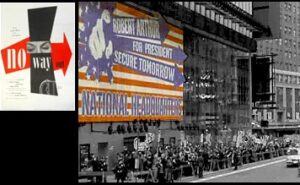
Above Left: Paul Rand, No Way Out, 1950;
Right, production still from The Manchurian Candidate, 2004.
Some time ago, I pondered about the future of graphic design as a reality show, but recently I’ve become convinced that its real future lies in its actual integrated presence onscreen: design as part prop, part protagonist. Sure, designers have long been called upon to contribute to a film by creating posters or crafting evocative title sequences: Michael’s recent post on the magical work of Pablo Ferro reminds us that titles (even — and especially — the low-tech kind) continue to be a ripe area for design exploration.
But what happens when design becomes a kind of dramatic catalyst itself — a plot point, even a character?
In An Actor Prepares, Constantin Stanislavski described a technique for summoning the creative power of the subconscious, a method for harnassing the memory. (His theory of the unbroken line — a passionate defense of coherence, is one of several theatrical notions that apply rather compellingly to design.) If there’s any truth to the notion that design is destined for better and more pivotal roles, then how, incidentally, does the designer prepare?
In Steven Spielberg’s recent movie, The Terminal, Stanley Tucci plays the kind of irritating bureaucrat viewers love to hate: his xerox machine face-off with Tom Hanks’ Viktor Navorsky spawns a barrage of handprints that subsequently become a sort of crude logo for the power of the underdog. Like a high-five caught in mid-air, Navorsky’s multi-copied palm is plastered all over the airport. (You could almost characterize it as outsider art if it weren’t a movie about, um, never going outside.)
Indeed, there are many such examples — from the Marauder’s map in the new Harry Potter movie, where the type moves to indicate the presence of others; to Bill Nunn’s “Robbie” Robertson, the meek copy-editor in Spiderman II who manually produces a cover page layout by pushing the type around on his boss’s desk; to trailers for the new remake of The Manchurian Candidate that feature a fleeting homage to Paul Rand in the form of a political poster.
More Than Just A Pretty Font
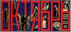
Sometimes the most powerful design in film is also the most silent: consider this anonymous poster for Sergei Eisenstein’s third major feature film, October 1917: Ten Days that Shook the World — a reconstruction of the events leading up to the Bolshevik’s overthrow of the czarists. The poster is by an anonymous artist, (true to communist philosophy, there was no “lead” or main character; hence, the carefully composed balancing act that is, in this poster, essentially hierarchy-free) — yet here, too, it almost seems as if the letterforms are more important than the characters. A precursor to design’s evolution, onscreen, into something more than just background material?
Clearly, neither Stanislavsky nor Eisenstein required sophisticated technology to advance their work. (Arguably, neither did Sofia Coppola: she just took her cinematographer to Tokyo, where the cultural confusion reached an entire new level of visual intrigue through the sheer phenomenon of graphic signage.) Still: what would these Russian masters make, I wonder, of the kinetic type, the living book jackets, the moving figures in paintings in Harry Potter’s orbit? Would they be moved, or might they invoke, alternatively, Diderot’s famous Paradox of Acting — an early 20th century theory proposing that in order to move the audience, the actor must himself remain unmoved? It is hard to imagine an actor — any actor — dispassionately inhabiting his character onscreen, and engaging the audience in so doing. What, then, does this say of a director? And to the degree that design’s fifteen minutes of fame may be approaching more rapidly than we think — of the designer?
Observed
View all
Observed
By Jessica Helfand
Related Posts

Innovation
Ashleigh Axios|Essays
Innovation needs a darker imagination

Business
Kim Devall|Essays
The most disruptive thing a brand can do is be human

AI Observer
Lee Moreau|Critique
The Wizards of AI are sad and lonely men
Business
Louisa Eunice|Essays
The afterlife of souvenirs: what survives between culture and commerce?
Related Posts

Innovation
Ashleigh Axios|Essays
Innovation needs a darker imagination

Business
Kim Devall|Essays
The most disruptive thing a brand can do is be human

AI Observer
Lee Moreau|Critique
The Wizards of AI are sad and lonely men

Business
Louisa Eunice|Essays

 Jessica Helfand is an artist and writer based in New England. A former critic at Yale School of Art and one of the founding editors of Design Observer, she is the author of several books on visual culture including Self Reliance, Design: The Invention of Desire, and Face: A Visual Odyssey.