
June 30, 2008
Homage to Velvet Touch Lettering

“Letraset U.S.A Instant Lettering,” Compacta Light 120pt, copyright 1968
It was the wee hours of Monday morning some months back when my computer died while I was designing a brochure that had to be finished later that day. Without a computer what could I do? Dependency is a horrible thing. But rather than self-indulgently wallow in misfortune, I walked over to a flat file where I stored dozens of old press type sheets. It had not been open for a decade. Although I hadn’t worked with pressure sensitive materials since 1988 B.C. (before computer), I still knew how to use the burnishing tool (like riding a bike, you never ever forget), and began searching for any face I could find that included multiple letters of a full alphabet. The one that came closest to what I needed was Compacta Light (120pt).
I know this was a bit rash. A few hours later my office building would be open and I could use the computer there. But the intense and obsessive anxiety of missing a deadline drove me to do the imponderable — return to those primitive, time-consuming methods when many like me spent hours making comps from Letraset, Formatt, Normatype, Letragraphica and Chartpak Velvet Touch lettering.

“Normatype Transfer Letters,” made in Holland by Mecanorma
I was so happy to forget that process. But you know what? The press down experience wasn’t half as bad as I remembered it. In fact it was kind of a Zen-like pleasure to revisit the old velum sheets of black-and-white letters I once so delicately placed on illustration board when metal or phototype was unavailable (or too expensive).
Most young designers will never know how difficult it was to set type, unless you leased your own Compugraphic or PhotoTypositor. It took hours, sometimes days to spec and then get back galleys. Today it is as easy as opening a suitcase. So during the B.C. era press type was the poor-man/woman’s best means of hastily and cheaply composing display type. And it took real skill too. Pity those whose hands were unsteady. Expert burnish-people were worth their weight in gold, although they usually earned minimum wage.
I recall the first time I was introduced to Letraset’s revolutionary “Spacematic,” a system of broken lines that when matched up served as a baseline. I thought I had found god — the results were so seemingly precise that even I could do it, (or that’s what I told myself.) When I looked at the type I set in this manner, I easily found many flaws. So I decided to make a virtue out of failure, and, proceeded to copy Dada typography with multiple styles used in a single line or word. It’s easy to become good when you start with mistakes as the standard.
Recently, while throwing things out, I found yet another cache of my ancient “instant lettering.” There was not a single sheet that was not missing a few letters, and some were more decimated than others. The sheets serve as a mini-history of typographic style, and personal proclivity. At least a dozen sheets of Avant Garde (med. 36pt) were in the folder, but with the exception of the AV combo, I never touched those dreadful ligatures. Other faces I remember using were Neon (I once composed an entire 200-word story at 24pt), Circus (there was something that said loving when using this face), Horatio Light (whatever came over me?), Delfin (pressure-sensitive elegance), and Welt Extra Bold (a replacement for all those News Gothics). Of course, there were standard faces too: The first time I ever used Univers 45 + 75 was in this format. And my introduction to Helvetica, though it was called Geneva, was thanks to press type.
I can’t bear to throw these sheets away. Someday (if not today) they may be seen as valuable artifacts from that interregnum between hot and cold type, and between photo and digital composition. The computer put pressure on the pressure-sensitive type companies to find alternatives (or go out of business). But there is something to be said for working with type in this way. As for me, I finished the brochure using Compacta Light and it looked wretched. So I went into the office early and redid the job.
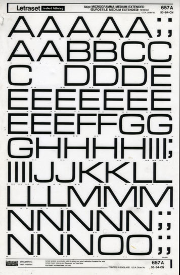
“Letraset Instant Lettering,” Eurostile Medium Extended 84pt
Observed
View all
Observed
By Steven Heller
Related Posts

Innovation
Ashleigh Axios|Essays
Innovation needs a darker imagination
Business
Kim Devall|Essays
The most disruptive thing a brand can do is be human

AI Observer
Lee Moreau|Critique
The Wizards of AI are sad and lonely men
Business
Louisa Eunice|Essays
The afterlife of souvenirs: what survives between culture and commerce?
Recent Posts
Sam Furness got serious about investing in his curiosity. Now, he’s helping others do the same. Corporate crisis is design’s opportunity In a world that feels impossible to change, emerging designer Deborah Khodanovich is starting small Elixir Design founder Jennifer Jerde believes in the human touchRelated Posts

Innovation
Ashleigh Axios|Essays
Innovation needs a darker imagination

Business
Kim Devall|Essays
The most disruptive thing a brand can do is be human

AI Observer
Lee Moreau|Critique
The Wizards of AI are sad and lonely men

Business
Louisa Eunice|Essays

 Steven Heller is the co-chair (with Lita Talarico) of the School of Visual Arts MFA Design / Designer as Author + Entrepreneur program and the SVA Masters Workshop in Rome. He writes the Visuals column for the New York Times Book Review,