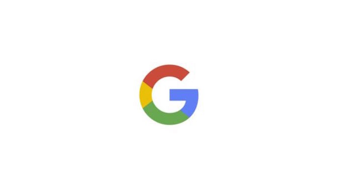
When did changing corporate logos become such a monumental event that it sends the media into a reporting frenzy? In the past two to three decades the status of logos and trademarks has become red meat for journalists—from the harsh critiques of vintage politically incorrect sports mascots to contemporary graphic overhauls of massive media corporations … like Google. Perhaps it started with the famous Coca-Cola fiasco, when they
introduced Coke Classic. Or maybe it was when Steve Jobs revealed he paid $100K to Paul Rand for the
NeXT mark. Or the GAP
crowd-sourcing fiasco. Whether an old logo is retained or refined, or a new one succeeds or fails, media attention to logo designs is virtually at movie star proportions.
Living in a logo-saturated world, these letters, words, and marks do, indeed, have an elevated cultural status for what they represent. When Enron was in the news in late 1990s for its corruption scandal, Paul Rand’s logo became a target, the representative of all Enron’s corporate ills. And because today altered or refined logos are somehow indicators of shifts in corporate positioning, scrutiny makes sense to a degree.
On Tuesday, September 1, Google announced its second major logo change in over a month. The first was the introduction of Alphabet, the new holding company for Google and associated media mogul ventures. Interest was sparked by the logo’s simplicity, prompting various online media outlets to seek out experts, like me, to weigh in on the aesthetics, philosophy, and over-all functionality of the wordmark. I had to craft at least three different ways to say the simple answer: I like it (i.e. “the formulation of pristine geometry combined with the lower case informality, suggests a less eclectic relationship with the future”). With the new Google animated mark, the email barrage I received came from even more outlets. Reporters were so anxious to know what “designers think of the logo” that virtually every designer I spoke with at an event that night had been called by one or more publications.
I recall not too long ago listening to designers complain about how difficult it was to get mainstream press attention. While the trade magazines took every opportunity to reflect or showcase a new design, the lead-times were so long as to make the work irrelevant. But mainstream attention came with immediate validation. And even more important, neither the trades nor the scraps from the mainstream table were critical. There may not have been a lot of media coverage, but what there was was usually neutral.
Reporters today, however, want the critical assessments, not ad hominem. Every detail and motivation is examined, but is it news?
Designers have long wanted their place in the media spotlight, and now in business, culture, and art sections the coverage is up and so is the ante. With logos receiving so much attention, negative criticism can have an impact on the client/design relationship. Moreover, in the frenzy to harvest quotes, everyone is an expert. In some instances, what used to be a comment on a blog or message board is now a reasoned opinion. Although that is not to say reporters choose indiscriminately from the expert pool, but commenting for publication about a logo or trademark requires more than a knee-jerk response. Still, it is curious how the media has picked up on logos and trademarks as possibly the most important thing designers do, and contribute to making that so.
By the way, regarding the new Google logo: It makes me smile.


 Steven Heller is the co-chair (with Lita Talarico) of the School of Visual Arts MFA Design / Designer as Author + Entrepreneur program and the SVA Masters Workshop in Rome. He writes the Visuals column for the New York Times Book Review,