Krisztina Somogyi|British Telecom, Essays
November 29, 2011
[MB][BT] Modern Call

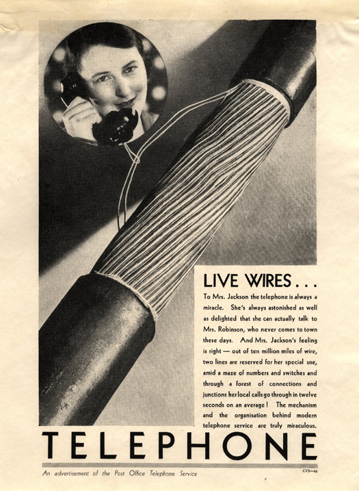
Print ads running in the general national press in the mid-1930s emphasized the technical parameters and achievements of the telephone system. Image TCB 475/ZB 16 courtesy of BT Archives.
I am not a technical person. Nor am I interested in the mechanical. But I fell in love with how exchange houses, cables, switchboards and control panels were visually represented in 1930s GPO adverts. I rummaged through a big blue box in BT Archives, and I was drawn to live wires: an ad with an oversized stripped section of a phone cable that dominates the page. Squished into the corner, a “Mrs. Jackson” peers reservedly with a phone in hand. The ad reads ‘To Mrs. Jackson the telephone is always a miracle. She’s always astonished as well as delighted that she can actually talk to Mrs. Robinson, who never comes to town these days’.
As most people do, I enjoy the advantages of the technical innovations without understanding how they work. This is a common situation, an important fact for the advertising industry. Consequently, the human factor of telephone is overemphasized in the visual language of publicity, while the technical is almost of no interest. This is also true for most of the prints I leafed through in BT Archives. Amongst nice artistic images I found a dozen others with oversized mechanical elements in the centre. There is no visual narrative or artistic grandeur to them, the design focuses on the ordinary life of the system, and copy explains the progress by numbers and facts. This campaign stands out from the logic of usual communication aimed at the Mrs Jacksons. It belongs to another design paradigm: modernism.
But would Mrs Jackson pay any interest to wires and switchboards in an ad? Was there a public for these ads? There is little known about the creation or the reception of the campaign. However, we know that the 30s was a golden age of public communication, and by then the “modern” style was being adopted by some British shops like Simpson’s in Piccadilly or Peter Jones on Sloane Square. Institutions like the London Transport or the newly formed BBC were also aware of the importance of visual communication and the modernist aesthetics was there to fit the new age.
Focusing on the GPO, the work of the Film Unit is the best known for its publicity activity. With over 30 documentaries made during a short period of time, these are an important source of information but also outstanding pieces of British film history. My first encounter with the machine aesthetic used in the communication of GPO was also through a film. The Coming of the Dial is a 14 minute long masterpiece from 1933. It celebrates the new achievement of the telephone network by explaining how it works, and emphasizes the progress it brings to people. Fitting this philosophy, an oscilloscope or test machines are the main visual elements. Close-ups of these objects create an atmosphere of intimacy bridging the gap between the everyday of people and the technical reality to be presented. The objects are taken out of their original contexts; they are reformulated from an interesting personal angle, an unusual perspective and they are resized. This technique is the design method used in the print ad campaign. The recontextualisation of these objects is part of the creation of the new type of beauty, “reflecting the spiritual force of the modern era” to quote Moholy-Nagy the experimental artist and theorist of the modern movement. In the film, the steel structure of a new exchange house symbolically reaches the sky as high as the building in its proximity St Paul Cathedral.
It was The Coming of the Dial that caught my interest and pushed me to search for other examples of modernist work in the communication of the GPO. I was expecting to find more materials in the archive but was surprised to have a print ad campaign with imagery that echoes almost the spectacle of this film. It is not only that they both speak about a time when man is proud “to apply the laws of science to everyday problems”. Even with the technical emphasis, the human factor is never forgotten in these visuals. Innovation has its clear aims: the progress of civilisation. Consequently, objects are always related to the human body; an eye or a hand appears on screen as an abstract reference point for the technical and mechanical world. In the print ad campaign the idea of communication between two different worlds/qualities is suggested in many ways, by photographic situation or graphic links made between the image and the texts.
In this progress of new civilisation, the artist plays an important role. This was not only a modernist doctrine, but also a clear intention on behalf of GPO. “The artist — and I use the world in a large sense, by no means restricting it to those who carry paint boxes under their arms — appears to have the quality of selecting the essential elements of any given material and of presenting them to other people in a way which touches their imagination and so secures their attention, their just appreciation and, if need be, their action.” — stated Sir Stephen Tallents, during a lecture given on the 15th of October 1934. Described as a “marketing genius” by David Hay, present Head of Heritage at BT, Tallents encouraged artistic experiments with image, text and sound. The Post Office Publicity booklet of the once Public Relations Officer is kept safe in the archive: it sets down the principles for the work of many designers.
But who were the artists working for the GPO? London in the 30s was a meeting place for intellectuals coming from different parts of the world. They were also different in their formation, background and interest. This variety can be seen in the films thanks to John Grierson, first director of the Film Unit. Animators like the New Zealand born Len Lye, Norman McLaren or the German Lotte Reininger; musicians like Walter Leigh or Benjamin Britain, poet WH Auden, directors Alberto Cavalcanti (with a French avant-garde silent film background) or Stuart Legg, a graduate of Cambridge in engineering formed a loose group of artists happy to work for public interest.
Their ideas influenced many people as public viewings of the films were organised all over the country. To Mrs Jackson, the GPO film projections was possibly the first occasion to meet new ideas like the new photographic visions of the Bauhaus. It seems she was presented this new aesthetic without the “real Mrs Jackson” even knowing about it. The opening sequence of The Coming of the Dial is a long shot of Moholy-Nagy’s Light Display machine. A close-up of the rotating statue, the vibration of the reflections, the construction of the work serves as an effective visual analogy to suggest that the dial or a switchboard can also be seen as a beautiful image. High and popular culture is not separated in the film.
“The standard histories of British documentary have been unkind to his authors” — writes Tim Boon on Stuart Legg, author of The Coming of the Dial. That is even so for others whose names are not even recorded. Many of them, like the designer and photographer of ads ‘10,000,000 miles of wire’ or ‘Copper highways’ still stay in anonymity. They were in-house designers working in the Engineer-in Chief’s Drawing Office or may be ‘colleagues, to whom photography is a spare time occupation’. To value their gift and craft ask the archivists of BT for documentary photographs of the technical system. The abundant photos of chaotic cables and wires or dull equipments will convince you how important it is to have a professional eye to create beauty.
Observed
View all
Observed
By Krisztina Somogyi
Related Posts

Innovation
Ashleigh Axios|Essays
Innovation needs a darker imagination

Business
Kim Devall|Essays
The most disruptive thing a brand can do is be human

AI Observer
Lee Moreau|Critique
The Wizards of AI are sad and lonely men

Business
Louisa Eunice|Essays
The afterlife of souvenirs: what survives between culture and commerce?
Related Posts

Innovation
Ashleigh Axios|Essays
Innovation needs a darker imagination

Business
Kim Devall|Essays
The most disruptive thing a brand can do is be human

AI Observer
Lee Moreau|Critique
The Wizards of AI are sad and lonely men

Business
Louisa Eunice|Essays
